
 Studying scrapbook pages by others is a great way to get scrapbooking ideas for growing your own style. In this “study” look at how the other scrapbooker has used product and design principles and how she’s handled the 5 parts of a scrapbook page (canvas, photos, title, journaling, embellishments).
Our creative team studied pages by Emily Pitts and shares what they took from this study. This is not a LIFT of one page. Rather they made pages inspired and instructed by what you they saw in a collection of her work.
see some of Emily’s pages.
[toggle title_open=”Hide” title_closed=”See Emily’s pages yourself” hide=”yes” border=”yes” ]
Take a look at Emily’s work on our Chanelling Emily Pitts Pinterest Board and get inspired.
Here, also, are a few pages by Emily from our blog posts.

Layout by Emily Pitts | Supplies: Patterned paper: Sassafras, My Mind’s Eye, Alphabet: Studio Calico, Flair button: October Afternoon, Twine: My Mind’s Eye, Brad: BasicGrey, Stickers: My Mind’s Eye, Stamp: Studio Calico
Embossing powder: American Crafts, Embossing ink: Tsukeniko Adhesive: American Crafts, Scotch, 3L

Why the Jetta by Emily Pitts | Supplies:
Patterned Papers: Cocoa Daisy, Lily Bee Designs. Cardstock and vellum: American Crafts. Chipboard Alphabet and mist: Maya Road. Flair: Evalicious. Wood veneer: Cocoa Daisy. Enamel dot: Queen and Co. Pen: Uniball. Adhesive: Scrapbook Adhesives, Xyron.

For Your Good by Emily Pitts | Supplies: Cardstock: Bazzill Basics, Patterned Papers: LilyBee (yellow polka dot), Simple Stories (turquoise polka dot), Basic Grey (red polka dot) Fabric Paper: Amy Tangerine for American Crafts, Alphabet: Amy Tangerine for American Crafts, Tag: Maya Road, Star Pin: Maya Road, Label Sticker: Heidi Swapp, Font: CarbonCopy, Pen: Micron, Thread: Coats and Clarke

Twenty Eleven by Emily Pitts | Supplies: Cardstock: Bazzill Basics, Patterned Paper: Simple Stories, Basic Grey, Studio Calico, Sassafras, Alphabet: American Crafts, KaiserCrafts, Chipboard: Studio Calico, Fabric Yo Yo: Basi Grey

Don’t Forget to Pray by Emily Pitts | Supplies: Cardstock: Bazzill Basics, Patterned Paper: Cosmo Cricket, Button: Jillibean Soup, Alphabets: Jenni Bowlin Studios, American Crafts, Mist: Maya Road, Pen: EK Success
[/toggle]
[hr]
Celeste Smith says, “This is a little story about my vicious attack kitty, Milo.”
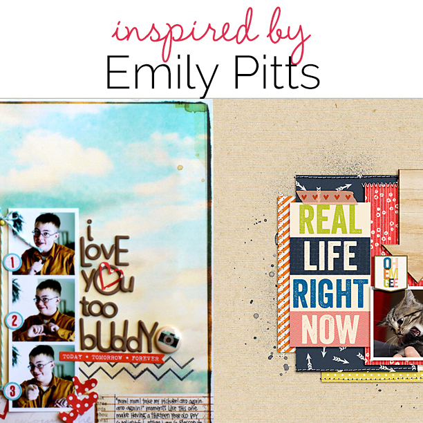
“Looking through Emily’s pages is a treat. She used to be a quilter, and it shows. She loves pattern and color. She incorporates stitching on most of her pages. I tried to borrow some of her go-to elements. In some instances I failed, for instance, I just can’t bring myself to use multi-font wonky stacked titles on my pages. My homage to that is a little cleaner with the “real life right now” large font journal card. Every example layout I looked at of Emily’s included the color red, white space, flair, stitching, straight lines, layering, everyday subject matter, small photos, playful elements and embellishments that support the story. I’ve included all of these on my page as well as a tribute to Emily’s love of kraft backgrounds, arrows, and washi. I even used my own handwriting font as an homage to her love of hand journaling. I hope I did her justice – she’s an amazing scrapper and person!”

real life right now by Celeste Smith | Supplies: Misty Cato: Chipboard Styles; Shannon McNab: This Year 2014 Washi Tape; Robyn Meierotto: In Stitches Basics Neutral; Sahlin Studio: Wood Veneer Arrows; Audrey Neal: Neutral Basics cardstock; Karla Dudley: Butterfly kit; Sara Gleason: Beech paper and elements; One Little Bird At the Moment kit; Font: DBJ Celeste.
[hr]
Michelle Hernandez says, “For this challenge I used Pinterest to gather as many different Emily projects as possible. I then looked for commonalities so I could get a good idea of her style and develop some project rules.”
“Here is what I noticed:”
- When using bright paper or card stock choose a b/w photo. (A rule I eventually broke because see rule two)
- Be brave about combining colors and patterns. Explore the color wheel. In this case I used blue and pink and added a few touches of orange which is opposite blue on the wheel.
- Make your title work. Modernize your design by reducing the amount of ornamentation and making the title the main focus by using fonts in bold colors and different sizes.
- Kraft elements. Here I added some corrugated photo mats.Description

BK by Michelle Hernandez | Supplies: Bazzil Cardstock, Me & My Big Ideas printed chipboard tag and flair, Studio Calico printed vellum, A Flair For Buttons houndstooth & chevron flair, My Mind’s Eye enamel dots, buttons and brads from Crate Paper, clocks October Afternoon, wood veneer camera from Maya Road. Veneer hearts from Cocoa Daisy, American Crafts Thickers, Corrugated Paper from Michael’s, plastic letters Crate Paper, plastic title by Heidi Swapp.
[hr]
Stefanie Semple says “This layout is about my second son who sleeps all day and games all night.”
“Looking through Emily’s gallery I noticed that she uses bright colors, imperfectly placed alphas in long titles, layered foundations with uneven edges, and (quite often) one large eye-catching dimensional embellishment. I chose yellow and navy to play off a neutral background, made a large, longish title that serves as journaling, added a foundation of splatters, and used a large 3D floral embellishment.”

He keeps Vampire Hours by Stefanie Semple. Supplies: Studio Tiffany Tilman Template: Layered looks single 006 freebie; Valorie Wibbens & Karla Dudley collaboration: The Good Stuff; Pink Reptile Designs: Laugh out loud alpha.
[hr]
Susanne Brauer says, “This page shows how happy a simple thing like sitting on his grandmother’s lap could make my son – she can get him giggling in no time.”
“To me, Emily’s style makes great use of color, often primary color, as well as generous white space. Many times she clusters more than one photo together. I especially liked her titlework, in which she often mixes fonts and always adds a fun element whether or not it’s the focal point. On my page, I spun my title off the repetition of the 100% on both a journal card and a tag – and exaggerated to add more fun. The cards I used included primary colors which are repeated in drops of mist.”

Billion Percent Happy by Susanne Brauer | Supplies: Cardstock, Bazzill Basics; Journal Cards, Elle’s Studio, Chipboard, Basic Grey; Alphabet, American Crafts; Tag, Heidi Swapp; Candy dots, Peebles and Mists, Studio Calico.
[hr]
Heather Awsumb says, “My family often shares everyday photos through Whatsapp. On this particular day the lyrics to the Sesame Street song “One of These Things (Is Not Like the Other)” popped into my head because it was snowing where the rest of my family lives while I was enjoying a beautiful, hot and sunny summer day.”
“Emily, of course, has a very identifiable style. There were many things that stood out to me while looking through her work, but on this layout I used just three:”
- She normally uses only one photo, but if she uses multiple photos they are all on a single block. I commonly scrapbook multi-photo pages, and on this one put them all together using a digital frame element.
- Her pages are perfectly imperfect. You can tell that she’s a paper scrapper because her papers aren’t all cut perfectly straight and everything is lined up in a way that it looks handmade. This is a hard look to achieve as a digi scrapper. To recreate it I used the wave filter following a tutorial on a digital scrapbooking website (The Lilypad) that I learned about during one of the monthly crops here at GIS. Even after applying the filter my papers all “waved” the same way, so I flipped them around either horizontally or vertically so they all looked like they were hand-cut instead of computer generated.
- Finally, of course, Emily is known for her large stacked titles. I used a font (My Own Topher) that I thought was similar to a font that Emily would use and went big. I simplified the layer, clipped a solid card stock to it and then applied a small shadow to make it look like I used letter stickers. I also adjusted the leading so that the title was very close together, recreating the stacked look that Emily is known for.

One of these things by Heather Awsumb | Supplies: Day Planner by One Little Bird
[hr]
Brenda Becknell says, “There isn’t really a story behind this photo – it’s just an everyday photo of my grandson being his smiling, silly self.”
“Two things that really appeal to me from Emily’s style are: 1) the way she centers her photo/paper/embellishments, leaving a wide border of white space, and 2) the mix of fonts she often uses in her titles. To get this look on my page, I matted my photo and centered it on the page, then added strips of patterned paper and a border sticker, along with a pen outline. Emily often mixes up the fonts in her title, which is a style I love. While I didn’t actually mix fonts on this page, I used some large alphabet stickers along with a long, skinny sentiment sticker to make up my title.”

You Are Incredible by Brenda Becknell | Cardstock: Michaels; Patterned paper and stickers: Bella Blvd; Enamel dots made from melted perler beads; twine
[hr]
Marcia Fortunato says, “This layout shows my happy little grandson enjoying the sunshine on the first day of his first Spring.”
“I love Emily’s work, and several aspects of her style stand out to me: use of multiple similar photos often with one that stands out, long titles using a mix of colors and typefaces, photos placed on top of a mix of patterned papers, bright bold colors and patterns, and elements that are ‘snuggled together’ generally towards the middle of the layout. To channel these ideas, I used three similar photos and one focal photo that I raised slightly with foam tape. I used a mix of bright orange, green, and yellow, with accents of blue, and I mixed typefaces on my title which also served as my journaling. In addition, all of the elements are concentrated in the middle of the page.”

…First Day of Spring by Marcia Fortunato | Supplies: Cardstock: Bazzill Basics; Patterned Papers: Studio Calico, Basic Grey, Bella Blvd; Die Cuts: Studio Calico; Letters: American Crafts Thickers, Silhouette cut (font: Thirsty Script), Studio Calico die cut, Simple Stories; Pen: Gelly Roll (Sakura); Other: baker’s twine, watercolor paper, watercolor paint.
