![]()
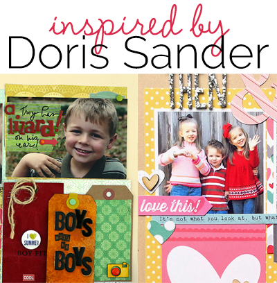 Studying scrapbook pages by others is a great way to get scrapbooking ideas for growing your own style. In this “study” look at how the other scrapbooker has used product and design principles and how she’s handled the 5 parts of a scrapbook page (canvas, photos, title, journaling, embellishments).
Our creative team studied pages by Doris Sander and shares what they took from this study. This is not a LIFT of one page. Rather they made pages inspired and instructed by what you they saw in a collection of her work.
see some of Doris’ pages.
[toggle title_open=”Hide” title_closed=”See Doris’ pages yourself” hide=”yes” border=”yes” ]
Take a look at Doris’ work on our Chanelling Doris Sander Pinterest Board and get inspired.
Here, also, are a few pages by Doris from our blog posts.
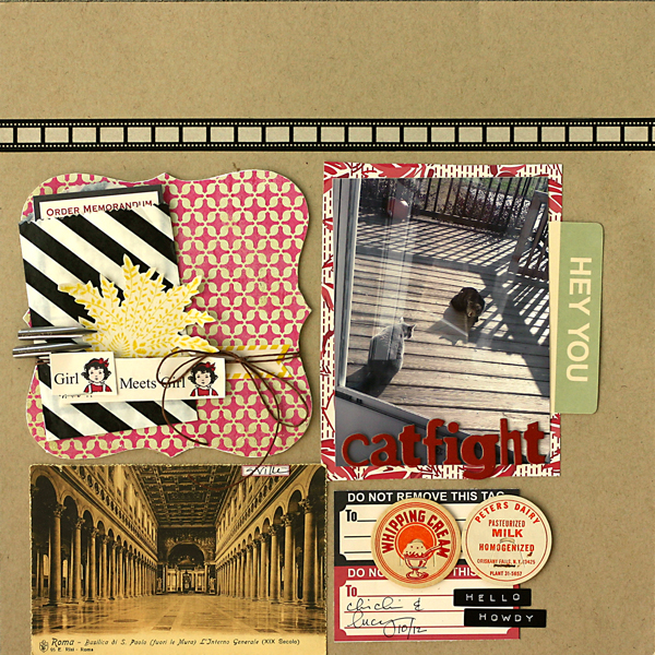
Catfight by Doris Sander | Supplies: cardstock – Bazzill, patterned paper, journaling cards, label sticker, stamp – Jenni Bowlin Studio, ink – Jenni Bowlin for Ranger, chipboard alphabet – Crate Paper, washi tape – Queen & Co., stickers – Pebblies, Inc., postcard, pen nibs, milk caps – vintage, other – treat bag, twine, staples
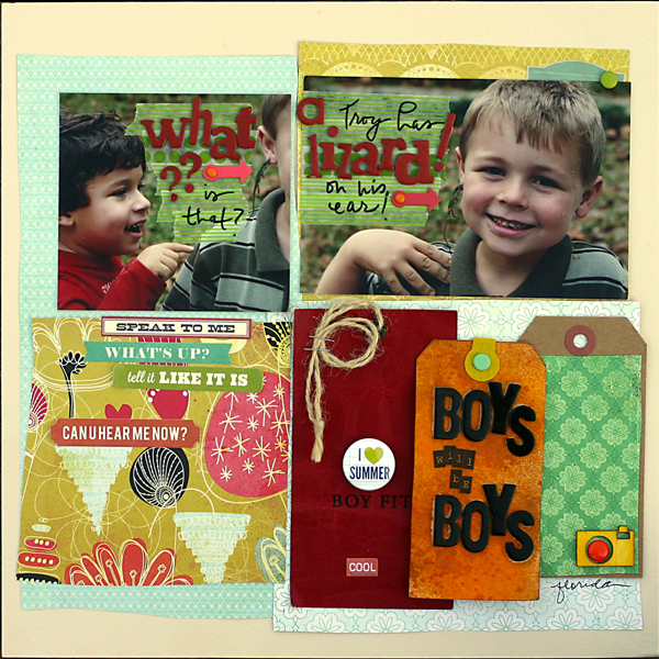
Boys Will Be Boys by Doris Sander | Supplies: cardstock – Bazzill, patterned paper – Basic Grey, Crate Paper, Prima, chipboard alphabets – Crate Paper, American Crafts, stickers – Studio Calico, Jillbean Soup, My Mind’s Eye, 7 Gypsies, brads, photo turns – American Crafts, wooden camera – Studio Calico, enamel dot – My Mind’s Eye, flair – Evalicious, washi tape – Freckled Fawn, canvas hole reinforcer – 7 Gypsies, tags – Avery, vintage, pen – Sharpie
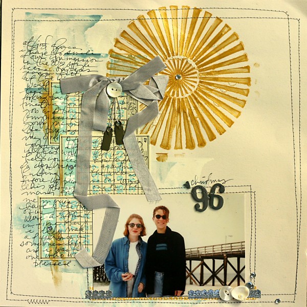
Christmas ‘96 by Doris Sander | Supplies: mini bingo cards – Jenni Bowlin Studio, stencil – Crafter’s Workshop, seam binding – Beaux Regards, alphabet – American Crafts, metal tags – 7 Gypsies, other – buttons, shell, rhinestones, acrylic paint, German foil
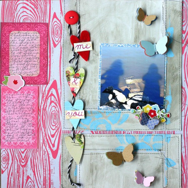
Me & You by Doris Sander | Supplies: foam stamp – Claudine Hellmuth, paint, ink – Jenni Bowlin for Ranger, overlay – Hambley, patterned paper – Crate Paper, buttons – American Crafts, chipboard, butterflies – Pebbles Inc., felt heart – Jenni Bowlin Studio, cardstock – Bazzill
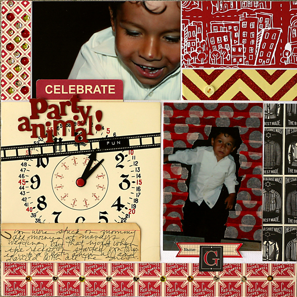
Party Animal by Doris Sander | Supplies: cardstock – Bazzill, patterned paper – Jenni Bowlin Studio, Studio Calico, Crate Paper, chipboard alphabet – Crate Paper, washi tape – Queen & Co., stickers – Jenni Bowlin Studio, Pebbles Inc., paper clip – Tim Holtz, journaling spot – Jenni Bowlin Studio, brad – American Crafts, clock hands, clock, ledger paper – vintage, other – sequins
[/toggle][hr]
layered patterned papers behind a two-up grid
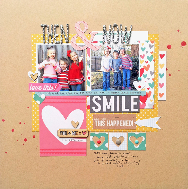
Then & Now by Ashley Horton | Supplies: Cardstock & Thickers: American Crafts; Patterned Paper, Tags, & Wood Veneers: Elle’s Studio; Patterned Paper: October Afternoon; Color Shine: Heidi Swapp; Enamel Dots: My Mind’s Eye; Tiny Attacher: Tim Holtz; Die Cut Machine: Silhouette CAMEO
Ashley Horton says, “I take photos of the kids annually on Valentine’s Day, and here I used last year’s photo with the one from this year for a comparison page.”
“There were several aspects I noticed when looking at Doris Sander’s work: solid color cardstock backgrounds, layering of multiple patterned papers, grid designs, minimal embellishments and handwritten journaling. I used a grid design for my layout and layered multiple papers behind my photos. I limited my embellishments to wood veneers and enamel dots, and added my own handwriting for the journaling on my layout.” [hr]
yellow, the unexpected, and a handmade feel
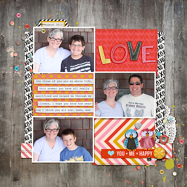
you + me = happy by Celeste Smith | Supplies: Robyn Meierotto: In Stitches Neutral Basics; Kim Broedelet: For the Love of kit; One Little Bird: Stuck on You elements; Allison Pennington: My Cup of Tea elements and papers, Once kit; Kay Winiecki: You & Me elements; Sara Gleason: Love Story elements & papers; Valorie Wibbens: Sprinkles vol. 20; Paislee Press: Eternal Sunshine papers and elements; Laurie Ann: Sugar & Cream elements; Font: Courier New.
Celeste Smith says, “This layout celebrates these three amazing boys who have done such a great job helping me through my illness.”
Doris Sander has a unique style that is carefree yet disciplined–and extremely hard for this clean lined scrapper to emulate. Things I noticed in Doris’ work that I have included on my page are: stitching, pink on a boy page, multiple photos, yellow!, neutral background, circles, and slight tilts. Doris also usually creates some kind of ground or fills the entire background with pattern. Here I grounded my photos with a large piece of paper. I threw in the doily as a representation of Doris’ love of vintage. I also thought the imperfect handcut LOVE word art was something Doris would embrace. Doris always touts adding in something unexpected. The rhinestone bauble is my unexpected – a real contrast to my boys and that wood background too!”[hr]
blocked designs and handwritten journaling
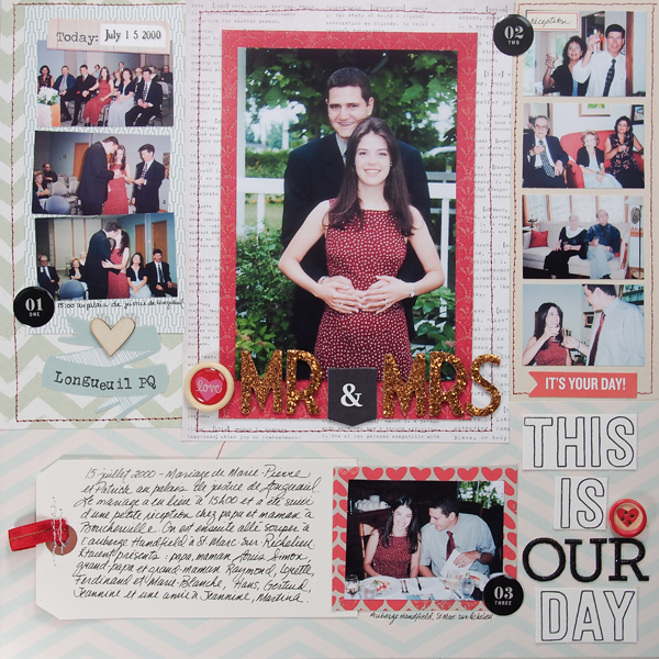
Mr. & Mrs. by Marie-Pierre Capistran | Supplies: Patterned Paper: Stampin’UP!, Kaiser Craft, Little Yellow Bicycle, Studio Calico; Die Cut Elements: October Afternoon, Studio Calico; Letters: American Crafts, Pink Paislee; Brads: Recollections; Number Embellishemnts: Studio Calico; Others: Wood Veneer, ribbon, large tag.
Marie-Pierre Capistran says, “This is a page about my civil wedding which took place a year before my white wedding.”
“When I looked at Doris’ pages, I saw she placed her pictures and elements in blocks, or collections, and that all of these gatherings are mounted on a block of pattern paper on top of the background. I noticed that they sometimes overlap and that she uses a few embellishments on these blocks, or gatherings. She also uses big titles and handwrites her journaling. The colors she uses are muted, often mixed with kraft or ivory. On my page I have four blocks of photos and each block is one specific event during the day. I used muted pale colors and some pops of red. I added a few embellishments on every block of photos and I wrote my journaling on a large tag.”[hr]
scale contrasts, organic embellishments, and a cozy feeling
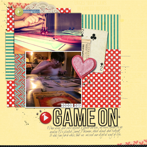
Game on by Carrie Arick | Supplies: Amanda Yi Designs: This Just In; Kaye Winecki: You & Me; Queen of Quirk: Better Than Ever Alpha;
Fonts: dearJoe 1 M&S
Carrie Arick says, “This page documents how we entertained ourselves during a long power outage.”
“There are a few things I associate with Doris Sander’s style:
- Interesting photos
- Playful blocks or grid designs
- Soft and/or organic embellishments
- Dramatic contrast in scale
- An unexpected color”
I started my page with two photos with unique perspectives, then created a foundation of patterned paper blocks for them to rest on. I added large, soft embellishments, and big title. I used tiny sequins and tiny alpha for a subtitle to achieve the Doris-esque scale contrast. The final touch was adding the light green button and blue ephemera to the cluster at the top of the page. By embracing these Doris strategies, I creted a cozy, intimate page that goes with the theme of family time.”[hr]
a loose blocked design
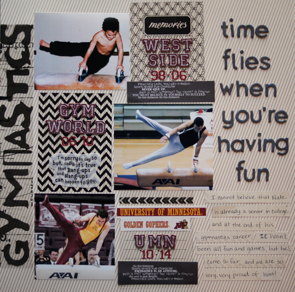
Time Flies… by Marcia Fortunato | Supplies: Patterned Papers: Studio Calico, Bella Blvd, Sports Solution, Simple Stories; Transparencies: Webster’s Pages, Daisy D’s; Letters: Basic Grey, EK Success, Making Memories; Dr. Seuss quote: EK Success; Other stickers: Sports Solution; Pen: Sharpie.
Marcia Fortunato says, “My son Nathan is a senior in college and coming to the end of his gymnastics career. I can’t believe how quickly the time has gone. This layout shows similar photos of him at different points in time.”
“One of the things I like about Doris’s style is that she uses a lot of loose grid designs – designs that are grid-based but not rigidly lined up. She also often fills in parts of the grid with patterned papers and/or embellishments. I felt that would work well with the layout I wanted to do showing my son at different ages throughout his gymnastics. Since I wanted to not only include the photos, but also tell for what club or school he was competing at that time, I had plenty of spaces to work with and the spaces did not all have to be the same shape and size.”[hr]
stitching and journaling that goes beyond the obvious
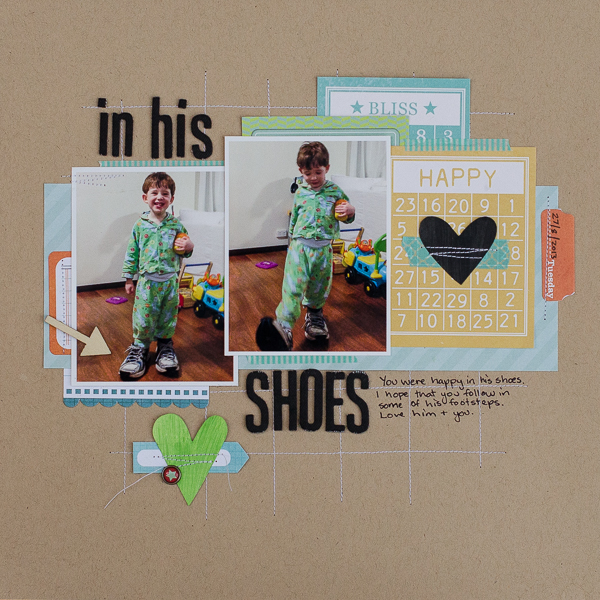
In His Shoes by Kristy T| Supplies: Cardstock: Bazzill; Papers: Simple Stories, Bo Bunny; Washi Tape: Teresa Collins, MME; Alphas: American Crafts; Stencil: Heidi Swapp; Pen: Pilot; Brad: Simple Stories; Wood Veneer: Studio Calico; Paints: Ranger.
Kristy T says, “From time to time, all of our children have all had fun wearing their Daddy’s shoes and this was one of those evenings, but the deeper story of my page is about how I hope that as my son grows up he shares some the qualities that make his Dad the man he is.”
“Doris tends to use grids and blocks on her layouts frequently, as well as 2 or more photographs. She also layers patterned paper, includes handwritten journaling and adds stitching to her layouts. She sometimes uses washi tape or strips of patterned paper to frame elements on her page. I was inspired to create this page that uses lots of those same ideas and add journaling that is a little deeper than the obvious.”[hr]
That’s how we were inspired by Doris Sander’s designs. Which aspect of her layouts are you inspired to try for yourself?

