 Photos are a key part of most scrapbook layouts, and the selection and cropping of them is an early step in the making of a scrapbook page. If you’re looking for new looks, consider photo layering.
The Photo Play class in the Get It Scrapped membership got us thinking about these possibilities–see what we’ve done below.
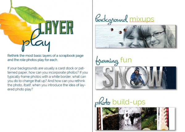
Photo Play is one of the 40+ classes in the Get It Scrapped membership, and guest teachers Anna Aspnes, Jana Morton, Emily Pitts, Christy Strickler, and Betsy Sammarco share ideas and techniques in the 100+page e-book and in 10 hours of live video interviews and office hours sessions. Check it out at https://getitscrapped.com/membership/
[divider_flat]
layer a section of your photo over the original with a color treatment change
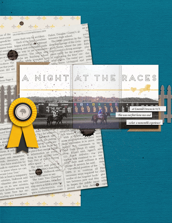
A Night at the Races by Amy Kingsford | Supplies: Mye De Leon: Hopscotch Solids; Anita Designs: Happy Horse; Audrey Neal: Pennant Pieces; Vinnie Pearce: Make It Meaningful; Valorie Wibbens: Eat Cake; Allison Pennington: Sieze; Amy Martin: Blanc Stitches.
Amy Kingsford says, “This is a photo we took at our first horse race at Emerald Downs in WA. I loved the drama created by the black and white treatment that I first applied to the photo, but I also think that the bright colors of the scoreboard and the horses’ racing colors are a big part of what makes the photo interesting. I took inspiration from layouts by Debbie Hodge and Emily Pitts in the Photo Play Issue of Masterful Scrapbook Design and layered a colored portion of the photo over top of my black and white version. I then placed the color portion of the photo inside of a plastic sleeve to frame it and help it to pop a little more on the page.
layer an extracted action shot over a close-up framed portrait
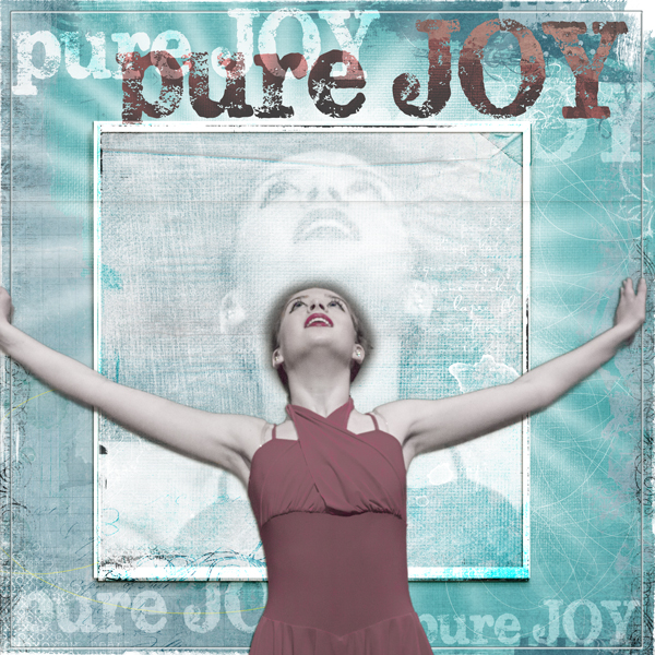
Pure Joy by Andrea | Supplies: Anna Aspnes Crazy Life Frame, Foto Glows 4, Art Play Palette No 4 paper.
Andrea says, “I loved the expression on my daughter’s face while on stage during a dance recital, and I worked with a photo of her here.”
Andrea layered an extraction of her daughter from waist up over a close crop of her daughter’s face rendered in black and white and framed more traditionally. We see her daughter in action and we get a glimpse of the emotion on her face. Andrea says, “I layered a star burst behind the photo to emphasize the energy in the photos and convey the joy I see on her face.”
layer a differently cropped section of your photo over the original
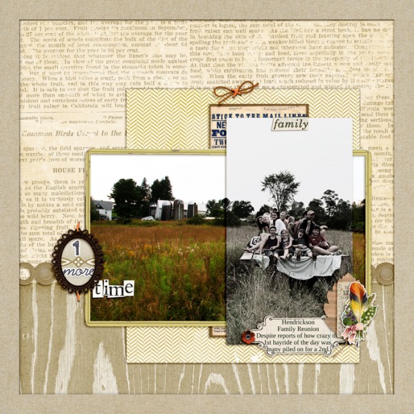
1 More Time by Debbie Hodge | Supplies: Etc by Polka Dot Pixel; Krafty Cuts Leaves, Flossy Stitches Orange, Cold Spring Element Pack, Artistry Del Sol, Krafty Canvas No 1 by Katie Pertiet, Little Bits ALpha; Interlude by One Little Bird; The Daily Details by Digi Chick Collaborative; Metamorphosis by Leora Sanford; Ransom Words by Vicky Stegall; An Additional Very Small Alpha by Allison Pennington; Artplay Palette Chevron Sweet Baby by Anna Aspnes; Build Your Own Borders by Amy Wolff
Debbie Hodge says, “This is one of hundreds of photos I took on a crazy hay-ride that my brother hosted. I got off to put a bale of hay back on the wagon and they took off without me. We were close to home and I was happy to have this view of the wagon headed back to our farm. I wanted to show family and fun and place.”
“I layered a portrait crop of the family on the wagon over top of a landscape crop of the scene (the wagon headed to our farm). It’s a way of representing—and highlighting— both a family “portrait” and the “landscape” in which this family exists. One photo is black and white and the other is color with makes the layered effect more pronounced. Cropping down the height of the landscape photo so that the portrait extends above and below makes the piece even more interesting.”
layer a framed full-color shot over a blended photo background
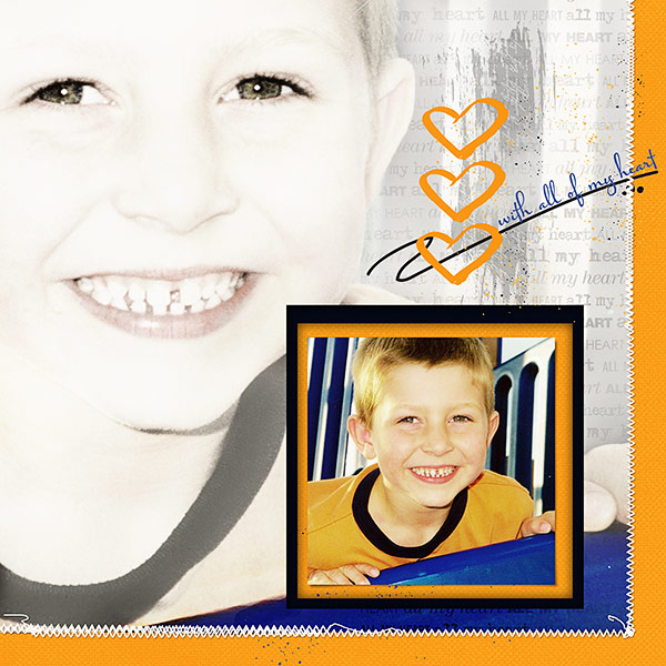
All My Heart by Deborah Wagner|Supplies: Jana Morton – Love Strokes Painted Clusters, Country Christmas Papers; Katie Pertiet – Festival Brights Card Stock, Worth Repeating Overlays No. 4; Anna Aspnes – Stitched By Anna White
Deborah Wagner says, “This is a photo of a dear friend’s son.
- The background photo has 5 layers. I duplicated the first layer, and then turned off the eye icon. I converted the duplicate layer to B&W. I duplicated the B&W photo 3 times. The first duplicate of the B&W is set to Multiply at 30% opacity. A layer mask was added to erase any harsh lines. The next layer is set to Hard Light at 100% opacity, and the top B&W layer is set to Soft Light at 100% opacity.
- I went back to the original color photo, turned on the eye icon, and brought it to the top of the layers palette. I added a layer mask and filled it with black. Using a small, soft white brush at low opacity, I brought back color to parts of the photo, especially the eyes.
- Originally, I layered the small color photo on top of the background photo, but it didn’t add enough dimension to my page. To create more depth and interest, I used my rectangle marquee tool to cut squares in the photo and papers, creating negative space to hold the photo.
- Important tip: Experiment with blend modes at varying opacities. You can always add a mask to a layer, and erase the areas where you don’t like the effect it gives.
fussy-cut the important part of your photo and pop-dot it over the original print
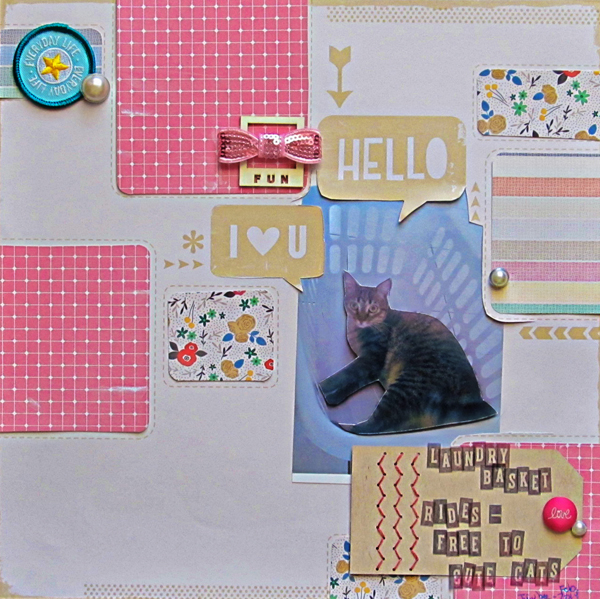
Laundry Basket Rides: Free to Cute Cats by Christy Strickler |Supplies Patterned Paper, Letters: American Crafts; Brads: American Crafts, Making Memories; Badge, Bow: Freckled Fawn; Wood Veneer: Prima
Christy Strickler says,”My cat loves to ride around in the laundry basket. The photo itself is a little drab. To make it more exciting, I printed two photos and fussy cut my cat from one of them. A layer of thin chipboard helps the fussy cut image pop upwards. I wanted the focus to be on her, despite the poor lighting in the photo. Popping the photo up also brings it on level with some of the dimensional embellishments.”
On one of Christy’s pages in Masterful Scrapbook Design Photo Play, she layered her fussy-cut details over a filtered version of her photo for a fun look.
layer extracted photo details over a scenic background
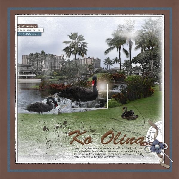
Ko Olina created by Terry Billman| Anna Aspnes: Art Play Palette Reflections, Abstract Fotoblendz 2, Art Play Palette Find My Way, Art Play Palette Crazy Life, Warm Glows 6, Art Play Palette Hummingbird, Art Play Palette Fotographie; Charlize Creations: White Christmas
Terry Billman says, “My husband was looking forward to golfing on his first trip to Hawaii. It poured down rain when we golfed Ko Olina but that didn’t keep me from taking photos of the magnificent views. I layered and extracted close up photos of the ducks over the larger background photo. All three images of the ducks are individual photos layered on the background photo. I especially like this technique to capture the essence of the larger photo and simultaneously, highlight one detail of the photo.”
create a virtual home vignette by layering photos over a home scene
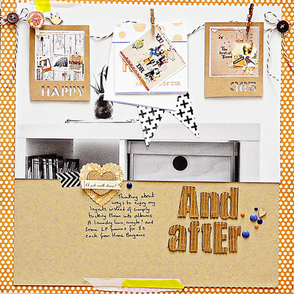
And After by Sian Fair. Supplies: Patterned Paper: Fancy Pants Design; Alpha: Jillibean Soup; Kraft Placemats Jillibean Soup; Enamel Dots Teresa Collins and Basic Grey; Clothespins from a kit by Quirky kits; Word sticker October Afternoon
Sian Fair says, “I make a scrapbook page, and I slip it into an album. But maybe there’s a better way? I’ve been thinking about display my layouts, so for this scrapbook page I replicated a display on the page.”
“I printed out little miniature photos of three of my recent scrapbook layouts and then added them to a little clothesline layered over a enlarged background photo of a bookshelf corner near where I scrapbook.”
Tip: I kept my background photo black and white and made sure it held a lot of white space so that the top layer of little colored photos would shine.

