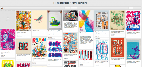
 We found great scrapbooking ideas –and a product and technique challenge for you–from something we spotted in print materials like posters and packaging: overprinting. This is the process, in repographics, of printing one color on top of another. Using overprinting inspiration from around the web, our creative team, took the challenge, and they share a number of ways to get overprint looks via product and technique.
print photos to vellum and layer over each other and patterned paper
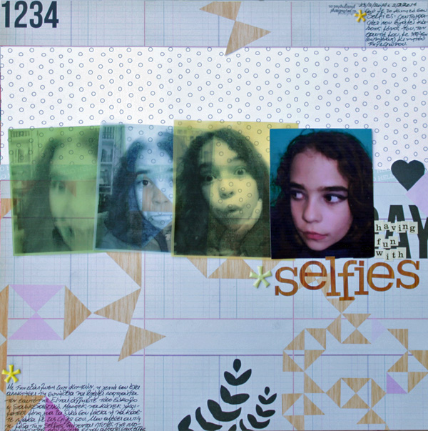
Selfies by Kiki Kougioumtzi | Supplies: Pattern paper,vellum: Studio Calico; Alphas: Studio Calico, Cosmo Cricket; Other: Twine+Ink puffy stickers.
Kiki Kougioumtzi says, “These are selfies I found on my daughter’s mobile phone. While she was just having fun taking them, they surely represent some aspects of her personality.”
“I converted most of the photos to black and white and printed them on colored vellum. I overlapped bits when I placed them on my layout. I choose photos crops that had some white space, so that when printed on transparent paper and stacked on top of each other they would yield interesting ‘overprint’ results.”
use the multiply blending mode on layered elements in Photoshop for an overprint look
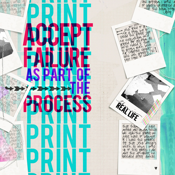
Accept Failure by Carrie Arick | Supplies: Sara Gleason: Tea Rose; Amy Martin: Blanc Stitches v. 2; Pink Reptile Designs: Tape It; Just Jaimee: Storyteller March 2014- Paint, Imprint on Me; Brandi Sutherlin Designs: Stamped Dates; Font: Bebas, Pea Twist Me Pretty
Carrie Arick says, “I have come to accept that when I use a printer, something will go wrong. I used the example of our printer one day printing everything that’s ever been in its queue as an illustration of my endless printer frustration.”
“I repeated the word print to visually create the idea of printing in action. I used the overprint technique to add the quote, which is also the title, to represent the idea that the action of printing has gone terribly wrong. In figuring out how to create the overprint look without an actual overprint blending mode or feature in Paint Shop Pro or Photoshop Elements, I found a helpful tip in a graphic design forum. The tip was to to create an overprint look by using multiply blending mode. The multiply blending mode tends to mute and darken colors. I used a light background, and created my text colors with intensely saturated color to keep the text vibrant.
layer sheer elements for an overprint effect
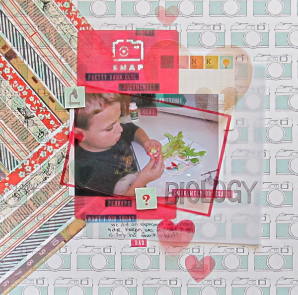
Currently Obsessed- Biology by Christy Strickler |Supplies Patterned Paper,Stickers,Transparencies, Letters: American Crafts:Letters:American Crafts;Tape: Basic Grey; Die Cut Vellum: Studio Calico; Die Cuts: October Afternoon: Other: Vellum
Christy Strickler says, “I snapped this photo while my son was examining our celery experiment.”
“To create an overprint look, I began with a strong background. I then layered sheer elements such as washi tape, transparencies and vellum over one another. Though the background has a defined pattern, it is a light color. I put the stronger red color in the middle and upper layers. I didn’t want the background pattern to be so strong that it overpowered the photo.”
stamp and stencil on patterned paper for an overprint look
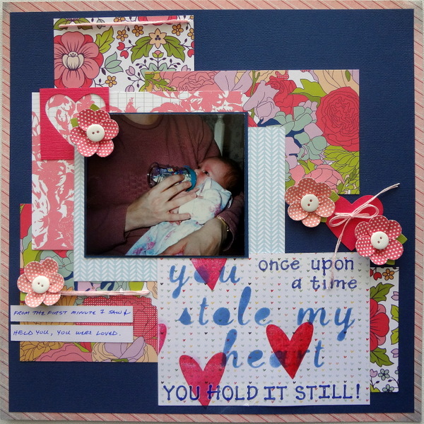
You Stole My Heart by Susanne Brauer | Supplies: Cardstock & Ink, Stampin Up; Patterned Paper, American Crafts and Crate Paper; Flowers, Peebles; Crochet floss, JP Coats.
Susanne Brauer says, “This page shows me holding my daughter on one of her first days home.”
“For an overprint look, I stamped red hearts on a patterned paper printed with much smaller hearts. I cut a stencil using my Cricut and daubed ink to make the title text. I tried this with several sizes and numbers of hearts, and found that my personal taste is not to have a lot of overlap. To make one heart stand out more, I covered it with glossy accents.”
fill a photo with type rendered with tight leading and changing colors

One In A Million by Deborah Wagner | Supplies: Katie Pertiet – Life Word Art No.1, Lens Flares Colors No. 1, Counting Trash Alpha, Counting Trash Overlays; Anna Aspnes – Art Play Palette Scholarly, GradYOUate Papers; Erica Zwart – Oceanview; Shannon McNab – This Year 2014
Deborah Wagner says, “While searching for inspiration to scrapbook this photo of my nephew in a unique way, I found a tutorial for rendering a photo with text in varying sizes and shades that had an overprint look. It was fun to make my own brushes and easy to tweak to get the look I wanted. After the overprinting in the photo was complete. I used brushes and overlays to fill in the rest of my page with a number motif. To bring it all together, I used the overprint technique again in my title.”
print digital patterned paper to vellum and layer over bright cardstock shapes
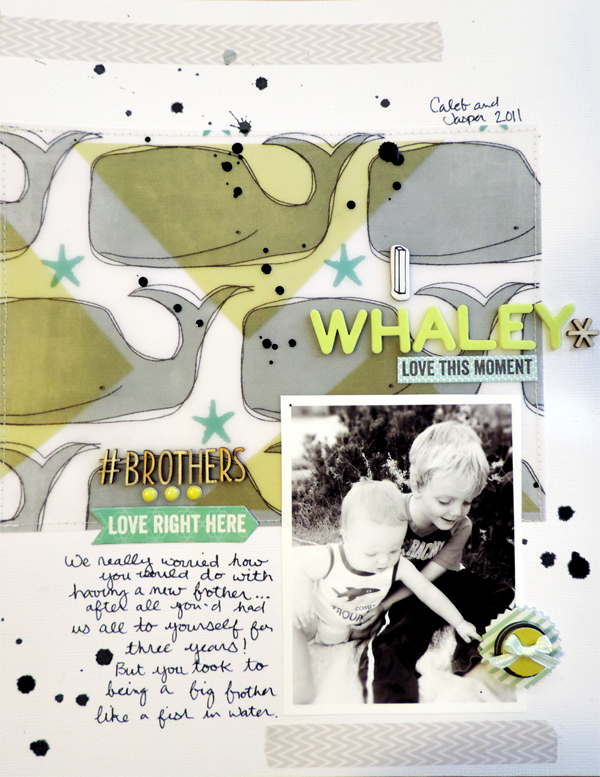
I Whaley Love This Moment by Amy Kingsford | Supplies: Cardstock: Bazzill; Patterned Paper (digital): Stickers: 3 Birds Design and Studio Calico; Valorie Wibbens; Alphas: Thickers by American Craft; Wood Veneer: Studio Calico; Ink: Studio Calico; Washi Tape: Jenni Bowlin Studio;
Amy Kingsford says, “This page is about the early relationship between my two sons. We were worried how my oldest would do with a new brother since he’d had us all to himself for so long, but he was a great big brother.”
“To achieve the overprint look here, I printed the digital whale patterned paper onto vellum and then layered my vellum mat over a few bright green triangles that I cut from cardstock. I loved the combination of the colors and the two contrasting prints. I was pleased that this technique could help me bring something special to an otherwise simple page.”

