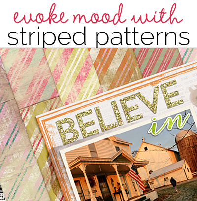
 There are so many ways to create striped patterns by varying stripe width, regularity of pattern, directionality, and color. These variations make it a print pattern that’s easy to use to set tone and mood.
stretching from earth to heaven
Sue Althouse says “This page is about my husband, who serves as a deacon at our church.”
“The wide yellow and white stripes of the page foundation run vertically, symbolically stretching from earth to heaven and suitable for a page with religious meaning. Vertical lines also have an a sense of formality and dignity that complement the photo. The thick parallel lines of uniform width and spacing suggest strength and stability, which our church leaders represent to our congregation.”
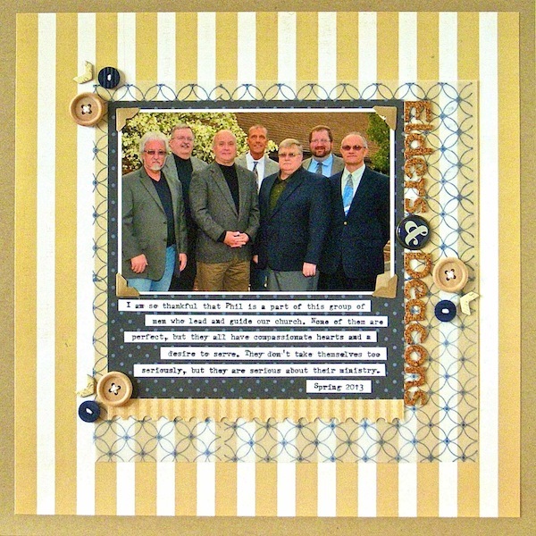
Elders and Deacons by Sue Althouse | Supplies: Cardstock: Bazzill, Patterned Paper, Alphabet, Chipboard Stickers, Buttons: American Crafts, Patterned Paper: Jenni Bowlin, Postage Stamp Border Punch: Fiskars, Stamps, Inks: Hero Arts, Brads: My Mind’s Eye, Buttons: October Afternoon, Floss: We R Memory Keepers, Photo Corners: Scrapbook Adhesives, Vellum: unknown, Typewriter: Remington
bright and girly courage
Lise Mariann Alsli says, “My daughter was ecstatic when she got a bright pink sword, shield, and cape at Legoland in Denmark this summer. She both asked and told me several times that princesses could be just as brave as knights. She played and ran across a lawn with bright colored mirrors scattered around smiled.”
“I wanted this page to convey the feeling of boldness and bright, girly courage inspiring my daughter so I chose this bright striped patterned paper from Echo Park. It was busy, so I mounted the photos on a white band running across the page. I also used sweet flower stickers and chipboard hearts to girl it up.”
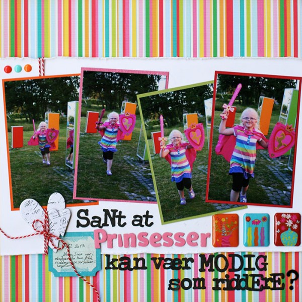
A princess can be as brave as a knight, right? by Lise Mariann Alsli | Supplies: Patterned papers and Cardstock: Bazzill card stock, Echo Park; Embellishment: My minds eye enamel dots, Crate paper phrase stickers, Pink Paislee artisan chipboard hearts, Cardmaking & paper craft soft stickers; Pens: black pen; Alphabets: American Crafts (Thickers), Prima; Other: Red string.
happy and summer-y
Heather Awsumb says, “With one photo and a mood-setting striped print, I made a page to record a weekend trip my friend and I made to the beach with our dogs. The bright colors distressed with just a bit of white and the diagonal stripes set a mood that is happy and summer-y.”
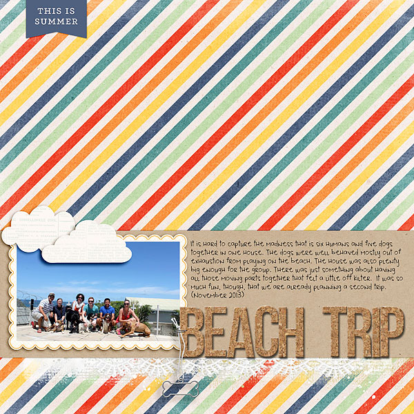
Beach Trip by Heather Awsumb | Supplies: Happiness Is (patterned paper) by Zoe Pearn; Carson Park Element Pack, Evergreen, Rise and Shine by One Little Bird; Classic Curled Photo Frames (staple), Dog Park Element Pack, Little Layette Kit (frame), Painted Lace Edgers No 1 by Katie Pertiet
a nautical theme
Ashley Horton says, “On my husband’s birthday, we went out for a family day, and “attempted” to take a family “selfie.”
“A print with narrow blue and white stripes are good “nautical”-themed supports for our dockside location. Once I’d chosen the stripes, I pulled other patterned papers and embellishments that also support a nautical theme.”
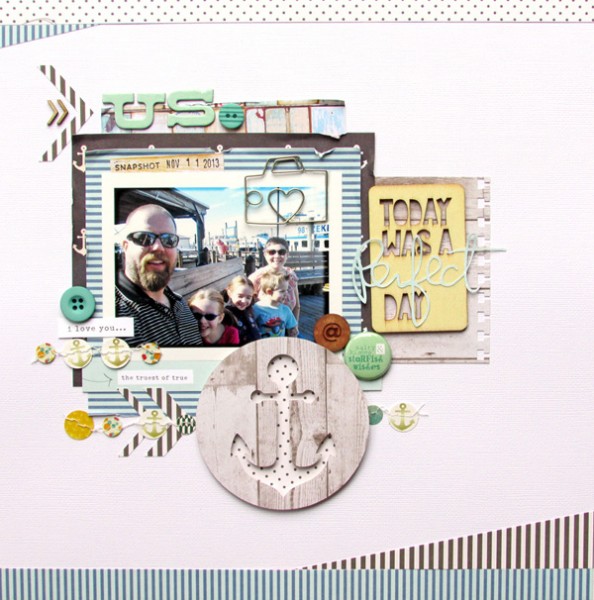
Us by Ashley Horton | Supplies: Patterned Paper, Wood Veneer Card, Date Stamp, Thickers: American Crafts; Patterned Paper: Fancy Pants & Allison Kreft; Paper Garland: Glitz Design; Wood Veneers: Studio Calico; Camera Paper Clip: Maya Road; Punch: EK Success; Buttons: October Afternoon
narrow, tone-on-tone, and peaceful
Terry Billman says, “Autumn is a favorite season of mine. I love the cooler weather and the change of colors in the foliage. Although, we live in a place where we don’t have a change in foliage, we generally travel to see those changing leaves.”
“I used narrow and evenly-sized tone-on-tone stripes in earth tone colors to evoke a peaceful and calming mood. A textured mat backs up the photo and separates the orange and brown prints. The river in the photo was still and calm, creating a perfect reflection.”
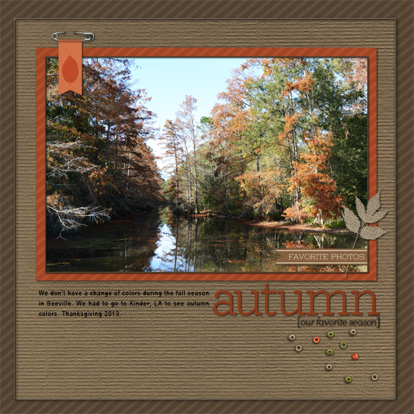
Autumn created by Terry Billman| Katie Pertiet: Striped Cardstock Cape, Textured Cardstock Cape, Folia; Cathy Zielski: Falling for Fall Word Art; Anna Aspnes: Art Play Palette Find My Way
calming and relaxing
Sian Fair says, “The year we got married, my husband started training as an accountant: in all the years we have been together I have never known him to choose anything other than a blue or white striped shirt for work, so I have saved the best of them as they wear out and I hope to make a quilt very soon.”
“A pale blue striped patterned paper with low contrast and regularly spaced stripes does double duty on this page. I think it’s a pretty obvious signpost to the subject of the page, but it also conveys a mood: a sense of the calming, relaxing effect of stitching a quilt. If I had wanted to play up a “Business” mood to make a page more about working in the city and less about sewing with the shirts, I would have chosen a deeper colored, more striking, stripe. I prefer this restful look!”
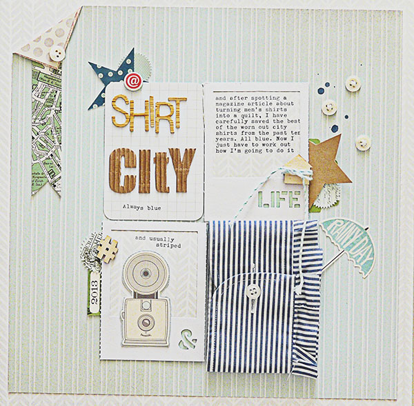
Shirt City by Sian Fair | Supplies: Patterned Paper: Studio Calico, Allison Kreft for Websters Pages; Alpha: Jillibean Soup and American Crafts; Wood Veneers: Studio Calico; Chipboard: Crate Paper; Kraft star: Studio Calico; White Frames: Jillibean Soup; Stickers: October Afternoon
eclectic whimsy
Debbie Hodge says, “This page is about the idea that, at Christmas, we want to believe in magic and the specific possibilities a child can dream on — from reindeer landing on the roof to a big old snow storm.”
“The background paper for this page is a patchwork of striped prints. The striped patters vary in color and width, but they are all diagonal. All of the “patchwork” blocks are narrow and of equal width. Thus there is unity even though so much is going on. The result is a sense of the eclectic of elements gathered together with whimsy and a spirit of fun that’s perfect for this page.”
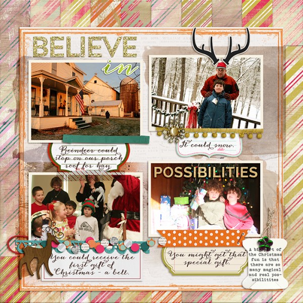
Believe in Possibilities by Debbie Hodge | Supplies: Pretty Planks, Merry Month by Amy Wolff; Don’t Stop Believing by Little Butterfly Wings; December Woods, Elastic String Tags by Katie Pertiet; Inky Dinks Page Borders by Lynn Grieveson; Autumn Reverie by Anna Aspnes; Cozy by Kristin Cronin Barrow; Documented by Mye de Leon; Joyeaux Trinkets by Allison Pennington; Blitzen Bits by LynneMarie; Glitter Styles, November Storyteller by Just Jaimee; Vintage Christmas by Laurie Ann; Anna Clara, Bohemian Typewriter fonts.

