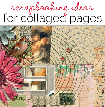
 Collage comes from coller, the French word for “to glue,” and it refers to artwork that’s put together from different forms that create a new whole. It was used by Braque and Picasso in the early 1900s when the technique was an aspect of modern art.
Collage on the scrapbook page gives you the opportunity to combine papers, colors, bit of text, parts of photographs and even found objects to make a layout that tells a complex story, expresses a feeling or just gives you an opportunity to have fun. The layouts below are inspired by collage (for some Pinterest collage inspiration check out our board).
Anja de Dobbelaere says, “I had so much fun putting this together. I went through my stock of (digital) scrapbook products to gather all kinds of paper stuff, mostly vintage style. I looked for a quote (and found one ready to use as paper strips in a kit) and built layer by layer, like you would in a real paper collage. I used tape here and there and stitching. The quote is all about nostalgia, so I tried to look for nostalgic colors and patterns.”
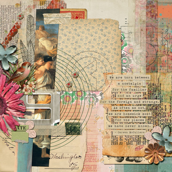
Nostalgia by Anja de Dobbelaere | Supplies: Pink Reptile Designs – One of a Kind, Soap Opera, What a Wonderful Day (collab with Michelle Godin), We Are Moving (collab with Paula Kesselring), Chatterbox, Boho Bliss (collab with Lynne Marie), Gesso It; Jen Maddocks – Basically Mask Strips, Up Up and Away, Urban II, Oh My Stars; Paula Kesselring – Virtue of Wisdom, Ephemera 2; Blagovesta – Moody, Right Here Right Now; Tangie Baxter – Art Journal Caravan August 2013; Angie Briggs – Because of You; Sissy Sparrows – Room 19, Solitary Echo, Acid Wash; Captivated Visions – Another Man’s Treasure Elements & Ephemera, Saffron Elements & Ephemera, Dreamer Mixed Media Papers; Jenn Barrette – I’m a Wildflower; Juliana Kneipp – La Bohème.
Amanda Robinson says, “I’m lucky to have these guys in my life, and I wanted to create a page to document that relationship. I used the collage technique to symbolize how the different aspects of my boys’ personalities come together to create a close bond. I used Mod Podge to adhere my papers to the page as it ensures strong adhesion without wrinkling or damaging the collaged papers. I added washes with watered down acrylic paints to some of my found papers to brighten up my layout a little.”
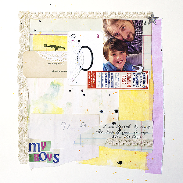
My Boys by Amanda Robinson | Supplies: Cardstock – Bazzill Basics; Mists – Heidi Swapp, Studio Calico; Other – Mod Podge, Found items and paper ephemera (vintage), acrylic paint.
Audrey Tan says, “This page is about the day we had tons of snow and went out to play. It doesn’t snow much in the UK so when there is snow, we take advantage of it! I collaged wintry patterned papers in the background. I laid a photo on top of it and embellished with a variety of elements. One of the collage pieces acted as a journaling piece too.”
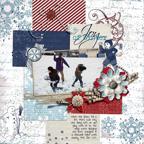
Joy Of Winter by Audrey Tan | Supplies: Courtney’s Digiscrappin: Joy Of Winter; Font: Pea Happy Girl
Katie Scott says, “I sing in the car and know all the words to random old songs like Don McLean’s American Pie and Bad Bad LeRoy Brown. My kids are familiar with songs from the 1970s and 1980s because of my vast old-school mix tape collection – even when we all have iphones with mp3s. I used collage to support this mix tape story because back in the olden days of the 1980s we used to make mix tape covers with cut up magazines and photos. I laid down a solid grid and then mixed up this page with fussy-cut photos which felt very retro to me. If you don’t do a lot of collage, use a grid as a base so that your page has a solid foundation.”
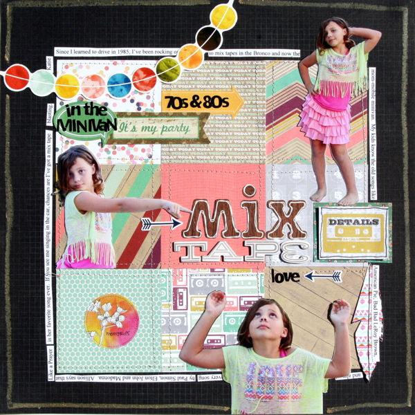
Mix Tape by Katie Scott | Supplies: Mix Tape by Katie Scott / Webster’s Pages, Crate Paper and Heidi Swapp patterned papers; Studio Calico, Glitz Design, American Crafts Amy Tangerine, Carta Bella embellishments; Sassafras and Studio Calico letter stickers; Times New Roman font.
Andrea says, “Collage was the perfect way for me to display my photos of mushrooms from the past summer. I used the technique to take many photos and blend them into the background with masks and blending modes. Using an Anna Aspnes template made this technique a lot easier. I altered the masks as needed but it gave me a great start.”
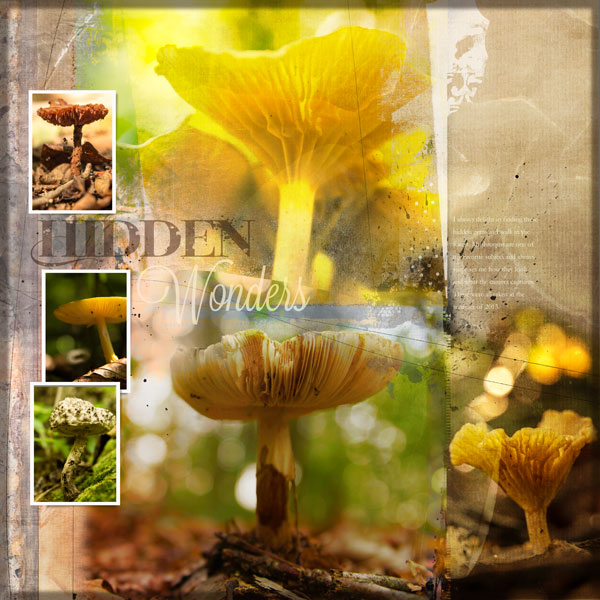
Hidden Wonders by Andrea | Supplies: Anna Aspnes Artsy Layered Template 62; Cottage Arts Marbled Hued Paper 12.
Marcia Fortunato says, “This layout expresses my frustration over the proliferation of pre-Thanksgiving ads this year for Christmas sales. I chose several Christmas sale ads from my e-mail inbox that I received one day in mid-November. I printed out parts of the ads and collaged them together, then stitched them down to add to the patchwork feel. I allowed it to be fairly chaotic to communicate the frenzied feel, and I added in Christmas embellishments and glitter to support the Christmas theme. Because there’s so much type in the collaged ads, I was afraid that my journaling would get lost if I placed it in the block. Instead I put my journaling around the edge of the layout, and I used a gold arrow clip to highlight its beginning.”
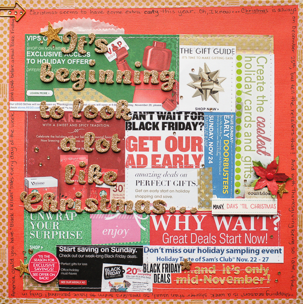
It’s Beginning To Look a Lot Like Christmas… by Marcia Fortunato | Supplies: Cardstock: American Crafts, Darice; Alphabets: American Crafts (Thickers), Basic Grey; Embellishments: Studio Calico, Lawn Fawn, October Afternoon, Making Memories, Bo Bunny, Teresa Collins; Washi tape: Studio Calico, My Mind’s Eye; Pen: Sharpie, Too Marker Products, Inc.; Adhesive: American Crafts; 3D foam: Inkessentials, Therm-o-web; Thread: Coats & Clark.
Terry Billman says, “This layout is about my husband and the nickname given to him by his golfing buddies. I repeated the headshot of Craig in each of the frames of the twisted filmstrips. I graduated the opacity of the photos in the lower strip, going from light to dark to give that feeling of a breeze—to go along with the title. To create motion in the layout, I also used the warp tool on the title to follow the same shape as the filmstrip.”

Breezy by Terry Billman | Supplies: Maplebrook Studios: Just Linens 27; Anna Aspnes: Art Play Palette Adventure, Art Play Palette Scholarly Stitched by Anna Cream, Anna Blendz Basic 1; Katie Pertiet: Twisted Strips No. 1, Emboss A Lots Basics, From My Bookshelf 2
Sue Althouse says, “This page is about the presidential limousines on display at the Henry Ford Museum. A collage of limos surrounds the presidential seal. I included each car in color and then in black and white to evoke a sense of time and history. The two-page layout is united by a common color scheme, star motif and visual triangle of circle elements. A large star die cut placed over vellum supports the black and white theme.”
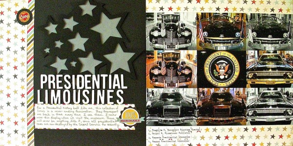
Presidential Limousines by Sue Althouse | Supplies: Cardstock: Bazzill, Patterned Paper, Stickers: Simple Stories, Circle Punches: EK Success, Stampin’ Up!, Alphabets: American Crafts, Jillibean Soup, Star Accent Die Cut: Silhouette, Vellum: unknown
Debbie Hodge says, “This is a photo of me with my cousins, mom and Aunt taken on a recent trip when they were showing me their sister energy. I collaged a variety of bright fun elements from my latest stash and then layered them with fasteners – tape and stitching and brads. The collage began as a three column arrangement which gave the piece initial structure. As I layered I broke borders and worked to get a less planned look. That initial structure though, was a great support for this piece which isn’t the kind of design I usuallly make.”
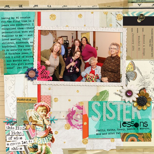
Northern Lights by Sabrina and Sahlin Studio and Laurie Ann; Comic Book by Lynne-Marie; Totally Trashed, Sweet Marie by Lynne Grieveson; Taped Together Overlays, Taped Together 2 and 6 by Katie Pertiet; Life as We Know It by Sahlin Studio and Sugarplum Paperie; Just Linens by Maplebrook Studios; Little Miss Sunshine Alpha by Zoe Pearn; Built for Two, Another Small Alpha by Allison Pennington; Sprinkles 9 by Valerie Wibbens; Vintage Tags by Jenni Bowlin; Bohemian Typewriter font

