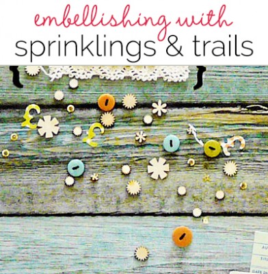
 Add a random-looking trail or sprinkling of embellishments to soften up a linear scrapbook page, fill a spot, support your page subject and mood, or just have fun. While a sprinkling should appear random, a little tweaking and attention to the balance of the elements within the sprinkling never hurts. Incorporate repetitions with variety in the elements you sprinkle.
Sian Fair says, “My daughter’s favorite part of her trip to the museum was the working bank, which took her modern day money and changed it into Victorian coins for her to spend as she toured the attractions. I gathered wood veneers in shapes to echo the coins, a few buttons in colors to enhance the ones in my paper layer, and pound signs cut with my Slice. I sprinkled them from the top left of my page down to the photo in the bottom right.”
“If you over think a trail of embellishments you will lose the natural look that is part of the charm. I really do hold my elements in my hand high up over my page and drop them. Most often, I’ll glue them down where they fall, with only minor adjustments for color balance. Try it, and if you don’t like it – nothing lost, you can just sweep it off the page and try again.”
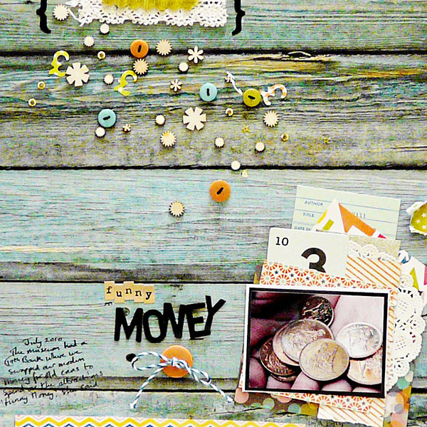
Funny Money by Sian Fair | Supplies: Patterned Paper: October Afternoon; Alphas: October Afternoon and American Crafts; Ephemera Miscellany Pack and Buttons: October Afternoon; Wood Veneers: Studio Calico
Lise Mariann Alsli says, “I don´t like winter much. I find it cold and slippery and very, very long here in Norway. I do like looking at it through the window though. I like looking at the ice roses on the window and the glittering snow laying heavy on the trees. The layout is about the beautiful winter, just as long as I don´t have to be outside in it.”
“I used my huge amounts of pearls, bling and crystals to make a sprinkle at a diagonal angle. It almost goes through the picture like ice and snow. I added white ink splatters along the same trail. I tried to make the splatters and the bling and pearls get smaller in size as the trail reached the corners of the page. Doing that you will enhance the focus on the photo in the middle of the trail.”
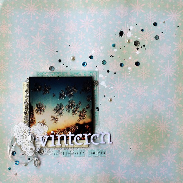
The winter is beautiful – through the window by Lise Mariann Alsli | Supplies: Patterned paper: Pink Paislee; Embellishment: Little Yellow Bicycle clearcuts shape, Melissa Frances bling chain, Basic Grey die cut shapes, Prima Vintage trinkets, Prima chrystals and pearls, Melissa Frances pearls; Ink: Dylusions ink spray; Alphabets: American Crafts (Thickers), Making memories; Other: Frame.
Heather Awsumb says, “This page is about the Lady Gaga concert I attended with friends back in November 2012. It was the best concert I’ve ever attended.”
“I used a combination of pre-made bead sprinklings to create a shelf and add extra emphasis to the focal point photo. It didn’t look natural when I layered the three different sprinklings on top of each because they were layered oddly. I used the eraser tool to selectively erase beads to make it look more natural. In addition, two of the elements are from the same pack but with different colors so they fit exactly on top of each other. To change this up I changed the orientation of one layer by flipping it vertically and then horizontally.”
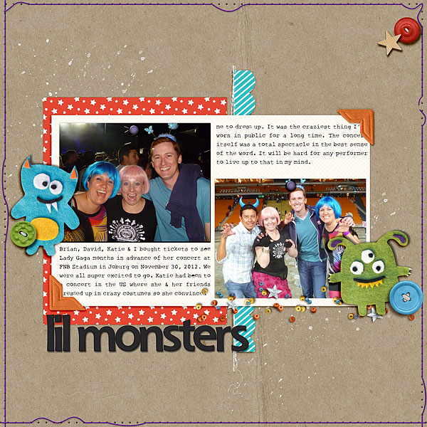
Lil Monsters by Heather Awsumb | Supplies: Naturally Krafty No 14, Astro Add-on Paper Pack, Pattern Mix Happy Boy, Little Layette Kit, Bead Scatterings, Astro Element Pack, Be Buttoned: Energy, Photo Corners Colors, Splatters No 3 by Katie Pertiet; Soap Opera Alpha by Pink Reptile Designs; Star Gazer by One Little Bird; I Heart Monsters by Karah Fredericks; Brad Bonanza by Patti Knox; Stitched by Anna White No 3 by Anna Aspnes; Bad Sewing Machine 12 by Traci Reed; Scrap Your Heart Out No 6 by Janet Phillips
Rosann Santos-Elliott says, “My son has really invested himself in his karate classes. For over a year, he has gone willingly and happily three times each week for 45 minutes a session. It’s been amazing to see his development. In this photo he is walking onto the dojo floor for his belt promotion ceremony. To create the trail that moves from the bottom left to the top right of my page I created a trail of ink drops and then added small wood veneer shapes, enamel dots and puffy stickers along the path created by the ink.
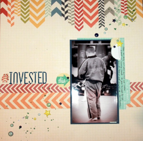
Invested by Rosann Santos-Elliott | Supplies: Elle Studio – You and Me Tabs, Journal Dots; Simple Stories – Urban Traveler; Studio Calico – Wood Veneers, North Star patterned paper; Heidi Swapp Sticker Alpha; Twine and Ink Puffy Stickers; Mr. Huey Mist
Kiki Kougioumtzi says, “These photos are of my daughter posing with her first evening dress. The quality of the photos isn’t good at all but they were the only ones I had with her in this dress.”
“I made an eye-catching embellishment cluster and to further enhance it, I added a of sequin flowers and snowflakes that lead into it and out the other side. When I placed my sequins, I felt like they were floating on the page, not belonging there, so I made a background for them with paint splotches. This addition makes the trail more obvious and anchors the sequins to the page.”
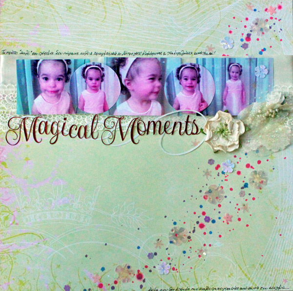
Magical moments by Kiki Kougioumtzi | Supplies: Pattern paper: Rouge de Garance; Glitter cardstock: DCWV; Other: ribbon, lace, sequins, leaves, Prima flower, Tattered Angels glimmer mist, Silhouette Cameo.
Deborah Wagner says, “The is a photo of my kids and my sister’s kids on the beach in Jamaica.”
“I used two sprinklings of sequins to highlight the heart and butterfly embellishments, and to give a feeling of floating. The trail of bubbles from the fish also gives the page an upward energy.”
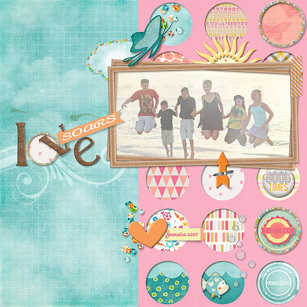
Love Soars by Deborah Wagner. Supplies: Eva Kipler – Soaring High; Pixels & Co. – In Good Company; Katie Pertiet – Looking for Love, Anchors Away, Lucy Lou, Little Shores, Blue Bird, Stamped Sentiments No. 6, Splatters No. 2, Lens Flares No. 3; Pattie Knox – Acrylic Bubbles No. 3, In The Swim; Lynn Grieveson – In Distress: Spring Fever
Susanne Brauer says, “These are my daughter’s high school yearbook photos. They are standard shots that don’t highlight her personality that well, but they did make me wonder what she might be thinking during this very significant year. Like many teenagers, sometimes she shares those thoughts with her mom, and sometimes not. Like all moms, I would love to know all the time.”
“I added a pretty sprinkling above her monogrammed initial – like thoughts popping out of her head. I used a somewhat unusual arrangement of the two photos, leaving a big gap between the two of them so that I could highlight one by tucking it closer to the monogram. Separating the two photos makes the viewer give each shot its due.”
“I made the embellishment sprinkling by dropping sequins on the page – several times. When that did not produce interesting results, I picked up the layout and swirled the whole thing round at a slight angle until I liked the effect. I tucked a butterfly in the middle which forms part of a visual triangle. Lastly I filled in with quick dotting using both the wide and narrow ends of a marker.”
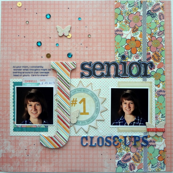
Senior Closeups by Susanne Brauer | Supplies: Patterned papers and journal cards, SEI; Die cuts, My Mind’s Eye and Stampin Up, Butterflies, Sassafras, Alphabets, Sassafras and American Crafts, Ink and Markers, Stampin Up, Gems, K & Co., Sequins, Studio calico, Chipboard monogram, unknown.
Stefanie Semple says, “A friend and I took my mother to a local nursery for breakfast, and she spotted these baby African Grey parrots and was smitten. One of the things she told their owner was to give them a smaller toy on top of their cage, which he did. The birds wasted no time pulling the bits apart and fighting over the winnings.”
“On the page, I wanted to echo the untidiness of the scene as the chaos of the noise and the activity of these youngsters. It was almost like having a toddler running loose in the house, spreading toys far and wide. I kept adding little goodies, resizing and adding scattered beads and small groupings. I also added a visual triangle of stitching holes, not unlike what parrots do to newspaper, biting and shredding it. Just keep adding until you’re happy.”

15 Nov 2013 by Stefanie Semple | Supplies: Scrapyrus Designs: I do (kit); Papyrus (kit); Inburst mode volume 2 (Template)
Michelle Houghton says, “This page is about my oldest daughter’s 10th birthday. I used a sprinkling trail of brads from one corner of the layout to the other for my embellishment. I think sprinkling is all about randomness so I usually place one element at a time and try not to repeat patterns like color and spacing.”
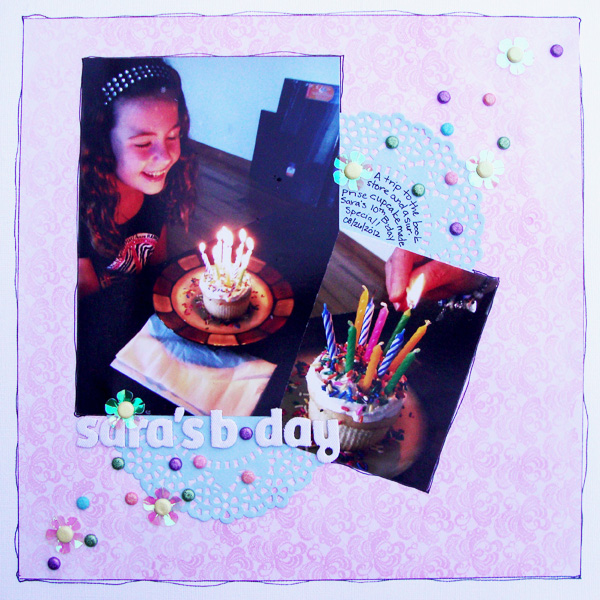
Sara’s B-Day by Michelle Houghton | Supplies: cardstock and chipboard letters; American Crafts, patterned paper, doilies, flowers and brads; SEI, ink: Sharpie
Marie-Pierre Capsitran says, “Around Thanksgiving, my daughter came home singing.”
There are many things I am thankful for.
I can see them near and far.
There are many things I am thankful for.
Let me tell you what they are.
“She was so cute, it brought me to tears, and I knew I had to make a page about what I am thankful for, taking this song as a prompt.”
“The layout started with one page and then I wanted to bring in more pictures, and it started to feel heavy. To lighten things, I used tiny bits sprinkled here and there. I started sprinkling around the title, and then I just dropped some stars on the page, and every time things were finding their way onto the page I felt like they need to stay there. In the end, maybe I sprinkled too much, but the feeling of the page is soft and light-hearted, and the sprinkles all work toward that.”
2. Try not to go too crazy with the colors. Pick 2 or 3 and balance them. I used pink, blue, gold/yellow and silver. I try to keep my triangle in mind when I embellish. I do the same with sprinkling. If I sprinkle pink stars on one spot, I’ll try to repeat them at two other spots to guide the eye through the page.
3. To glue these sprinkles down can be fairly challenging. I used mini glue dots for the sequins and stars and for the very very small stars I used my glue ball point pen.
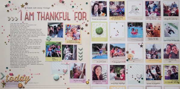
I am thankful for by Marie-Pierre Capistran | Supplies: Patterned paper: Dear Lizzy; Chipboard letters and Foam number: Dear Lizzy; Stickers: Dear Lizzy, Heidi Swapp; Star sequins: Studio Calico; Brads: Dear Lizzy; Chipboard elements: Dear Lizzy, Heidi Swapp; Spray mist: Heidi Swapp; Gold Stars: punched with a Fiskar punch in gold cardstock; Rhinestones: Heidi Swapp.
Debbie Hodge says, “This page with a photo of my youngest son posed with friends at a party is about how lucky he is to have nice friends who gather and celebrate frequently and well.”
“My sprinkling is of buttons and starts all in blues, greens and whites. The sprinkling starts with a large star punctuating the title, and it curves around the photo cluster creating a long arc. The sprinkling works thematically with the idea of lucky stars–and these stars are falling from the skies on these lucky kids.”
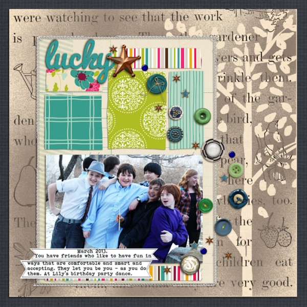
Papers: Cafe Garden by American Crafts, Haven by Jenni Bowlin, You Make Me Happy by Mye De Leon; Buttons and brads: Smart Aleck by Zoe Pern, Sprinkles 9 by Valerie Wibbens, Teak by Sara Gleason, Kitschy Christmas by Sahlin Studio, Big Ideas by One Little Bird, Brad Bonanza by Pattie Knox, I Am A Prince by Little Butterfly Wings, Artplay English Rose by Anna Aspnes; Word Label Template, Stitched by Anna Borders by Anna Aspnes; Drawn Branches, Classic Cardstock Festive Brights by Katie Pertiet; Mist brushes by Splendid Fiins; Bohemian Typewriter, Pacifico fonts

