 No matter how you turn it, a circle shape stays the same. There’s a perfection in this shape. And it presents challenges. The space outside of the circle has an odd shape that’s not as easy to work with, especially when you’re combining circles.
Below are ideas for designing with circles that include:
- a concentric rings of circles
- layered circles
- die-cut circular frames–organic and grid
- negative-space circular frames
- rows and columns of circles (shake it up by removing some of the circles from the grid)
- circles aligned in rows but with the columns “offset” (think polka dot patterns).
fill concentric rings with photos
Ronnie Crowley says, “Our annual road trip means another album for me and a title page to provide a summary of the trip.
“The layout was inspired by this image. I liked the concentric rings of pictures and how so many pictures could be included to give a nice summary of the road trip.”
“I remembered seeing a digital template like this. Knowing the styles of template makers made it easier for me and I guessed first time that it was a Scrapping with Liz template. The template wasn’t exactly what I wanted but it was a great start. I always find it easier to change things that exist rather than starting with a blank page. I was able to adapt it to include another row of pictures. Once I had the amended template ready it was easy to add my pictures. I re-enforced the circles with the background paper – I actually took two papers and changed the blending of the top one to multiple so I got the brown background with the red lines.”
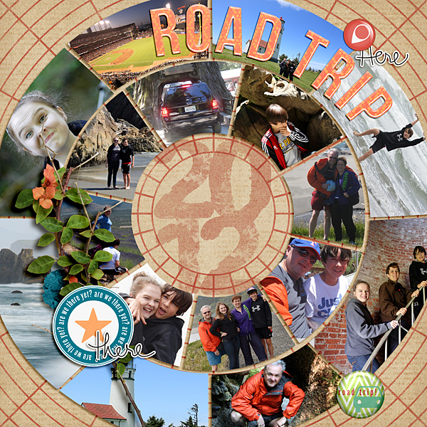
Road Trip By Ronnie Crowley | Supplies: Ardent Sparrow – Going Places; Chelle Creations – Apple My Eye; Carrot Patch; Gennifer Bursett – Endless Summer, Far and Away; One Little Bird – Going Places; One Little Bird – Going Places; Paula Kesselring – Ink Alphabet
Based on a Template by Scrapping with Liz – TemplateRevisited9
make a die cut frame of connected circles
Sue Althouse says, “This page is about celebrating Christmas in our home with family. The Christmas Ornament Frame was cut with my Silhouette. The holiday balls represent the season and their circular shape represents our family circle coming together to celebrate the holidays.”
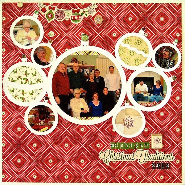
Christmas Traditions | Supplies: Cardstock: Bazzill, Patterned Paper, Alphabet Stickers, Stickers, Brads, Chipboard: Echo Park, Die Cut: Silhouette (Christmas Ornament Frame)
layer circles for an organic cluster
Michelle Houghton says, “Our family got to take a wild ride down the Arkansas River during our vacation in Colorado, and these are the photos I got with our disposable water camera.”
“Many of the photos from our white water river experience were blurred and a little off lighting wise because of the camera and the situation. I love the images, though ,of the girls and John all tucked in, the rest of our family in the raft behind us and everyone on shore after our adventure. Solution: crop the photos down as tightly as I can and focus in on the faces and people. Circles worked perfectly for tucking the important parts of each shot into a nice neat frame. I really like how the cluster of photos ended up looking like the undulating river we were riding on.”
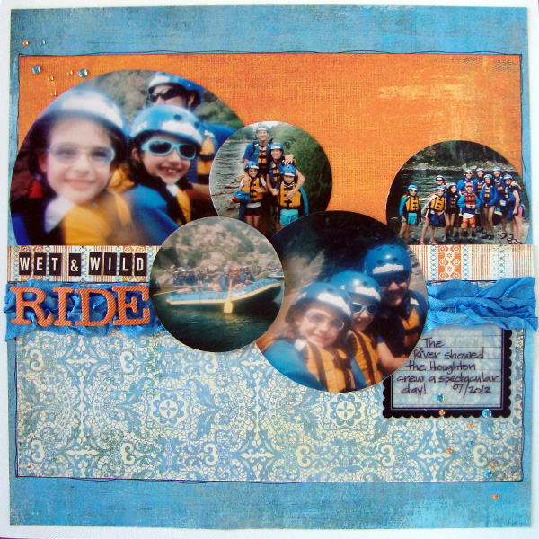
Wet and Wild Ride by Michelle Houghton | Supplies: cardstock and chipboard letters; American Crafts, patterned paper; Basic Grey, small sticker letters; October Afternoon, ink; Sharpie and Copic, journaling tag; Maya Road, dots; Mark Richards, trim; unknown
add playfulness and contrast with circles
Celeste Smith, says, “My son was so inspired by the cardboard arcade made by a boy named Caine that he saw in videos, that he created an entire mini arcade in our basement.”
“To scrapbook these photos, I created a base of circles for my photo and journal card to sit on top of. I think the circles give the page a playful feel. The square photo and journal card are a nice juxtaposition to the circular elements. Note that all of my embellishments – the buttons, flair, and confetti – are circles as well. The splatter underneath adds an organic element to the otherwise very graphic design.”
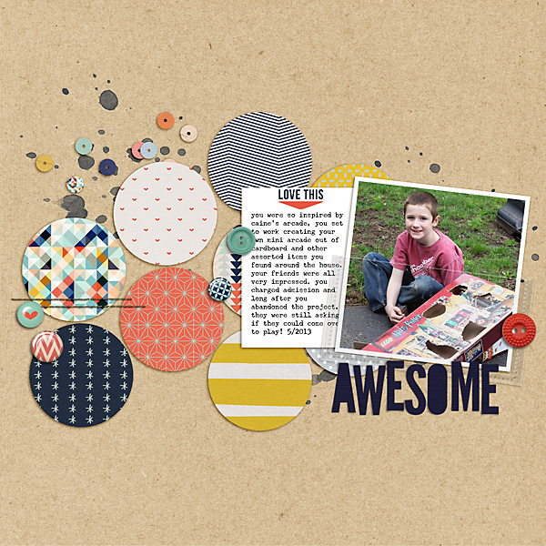
Awesome by Celeste Smith | Supplies: Karla Dudley & Valorie Wibbens: The Good Stuff kit; Audrey Neal: Neutral Cardstock; Gennifer Bursett: Made of Awesome kit; Font: Underwood Champion.
punch circles from your canvas and use the negative space as frames
Marcia Fortunato says, “This layout showcases photos I took of my new grandson (and his parents) and how amazing we think he is. I used my new Silhouette Cameo to cut a series of circles from patterned paper. I backed this with solid white cardstock and then punched my photos into slightly smaller circles and placed them in the cut-out circles. I made the family photo the focal point by making it larger and using foam adhesive to raise it off of the page.”
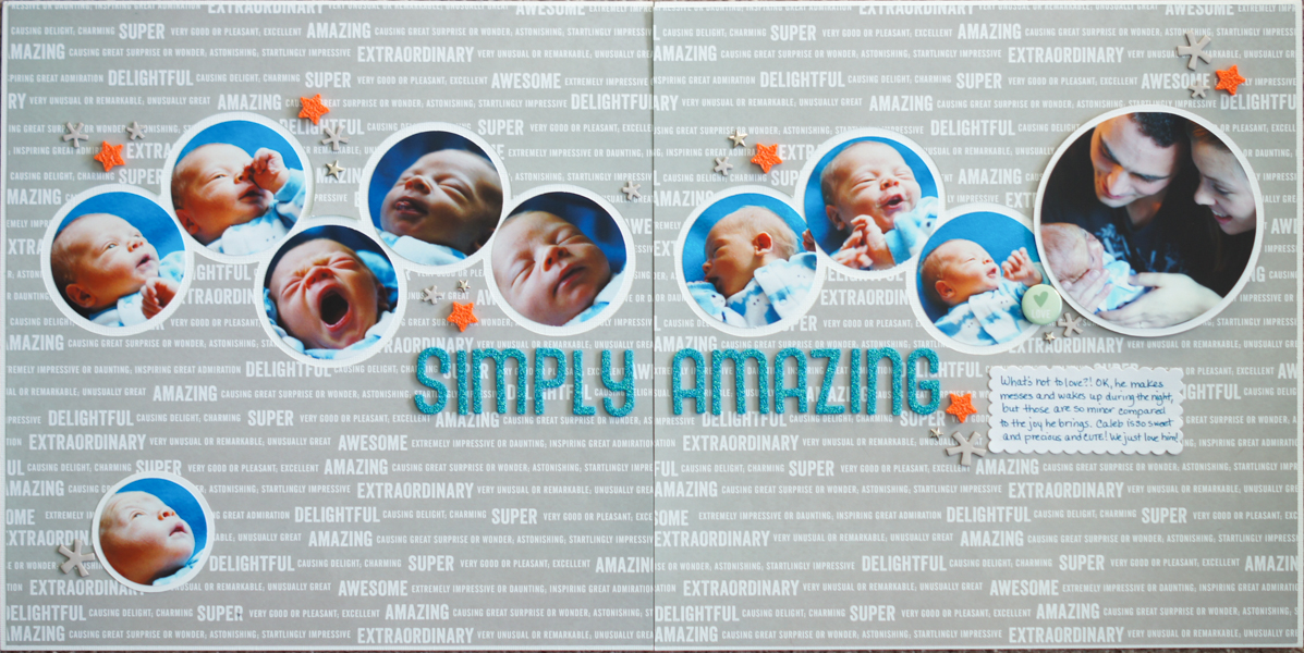
Simply Amazing by Marcia Fortunato | Supplies: Patterned paper: Amy Tangerine/American Crafts; Cardstock: Bazzill Basics; Alphabets: American Crafts (Thickers); Embellishments: Studio Calico, American Crafts, Basic Grey; Pen: Marvy (LePen); Adhesive: American Crafts; 3D foam circles: Inkessentials, Other: Silhouette Cameo.
Kristy T says, “This page is about some of the ways we like to spend time as a family at the moment.”
“I was inspired by the pins on the Get It Scrapped Pinterest board of circles in layout, particularly this one. I used an uneven number of colored circles and varying sizes to create emphasis on my main photo and to include other photos showing some of the activities we like to do together. After die cutting the circles with my Cricut I added gelato to the edges but made sure that I tapped away any excess specs before adding my photos behind. I added white circles outlined with a black pen and arranged them to help create flow across the page. The black painted border keeps all my circles contained and the eyes on the page.”
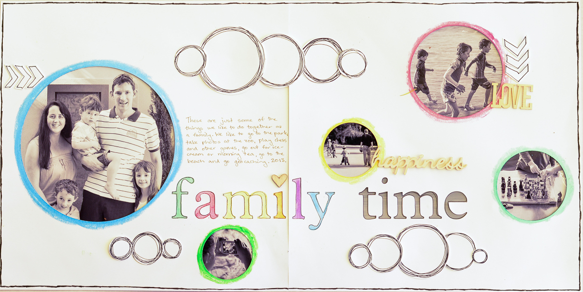
Family Time by Kristy T | Supplies: Card: Artee; Gelatos: Fabercastell; Plantin School Book Cartridge: Cricut; Markers: Pilot; Pumice Stone Distress Marker; Paint: Jenni Bowlin, Adirondack by Ranger; Distress Stain: Ranger; Wood Veneer: Prima, Studio Calico.
arrange circles in columns and rows
Audrey Tan says, “This page is about my youngest son trying on a Ratatouille hat at Paris Disneyland. While capturing him, he came up with half a dozen of cute expressions. Made use of a series of circles to depict the frivolity and cheerfulness of the page.” Audrey’s design is a twist on typical grid layouts. A column of circular photos intersects with two partial rows of circles.
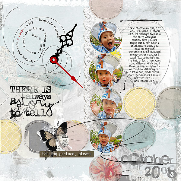
Take My Picture, Please by Audrey Tan | Supplies: Anna Aspnes: Painted Multi Foto Templates No6, ArtPlay Palette Story, Doily Edge Overlays No1, Jazzed Up Loop Da Loop No2, Loop Da Loop Clocks No1, ArtPlay Palette Awaken, Distressed Months No2, Multi Media FlutterBys No2, Story Word Art No1, Distressed Dates No1; Katie Pertiet: Cut Ups Photography; Font: Tandy Lee
arrange circles in rows and stagger the expected columns
Katie Scott says, “My son has ADHD and I want him to know that is one of the things I love about him – that he is nonstop action.”
“I think cutting photos into circles gets a bad rap – and that cutting photos into a circles can be a great way to give photos from different times a cohesive feel – like they all belong together despite the other differences (time, color, exposure etc) in the photos. Using circle cut photos is also an easy way to get a lot of photos onto a page – I got 20 photos which were originally 4×6 prints onto this 2 page scrapbook layout!”
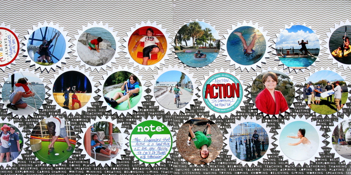
Nonstop Action by Katie Scott | Supplies: Carta Bella and Studio Calico patterned papers; Nestabilities circle and pinked circle dies; Jenni Bowlin letter stickers; Glitz Design stickers.
layer a grid of circle frames over a large photo and emphasize one opening
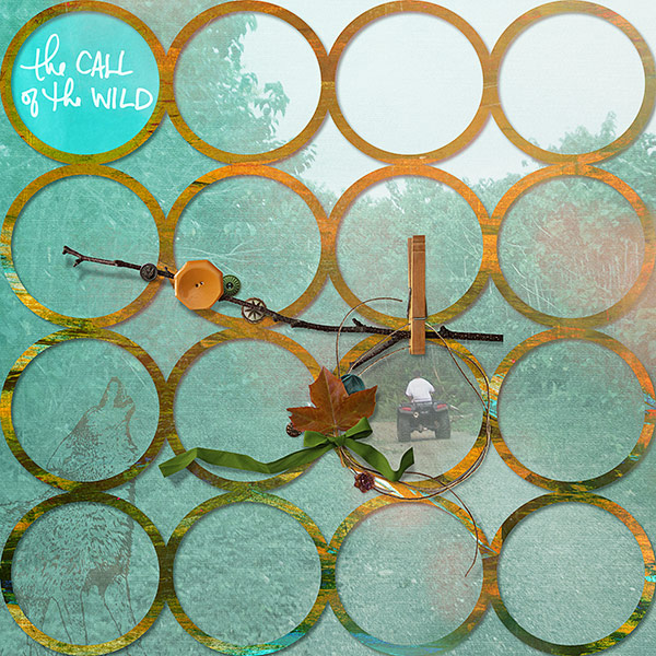
Deborah Wagner says, “I used a frame of circles to cover my entire page–which has a photo background. That photo background is covered with texture, gradients, and photo blends. I removed those blends and gradients from the circle framing my son on his 4 wheeler.”

