 Logo designs can be a source of scrapbooking ideas and inspiration. Today our team is inspired by (and rocking) the “X” or crossed design, and they show you how they go from logo to page design below.
about the X or crossed design
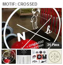 This logo design trend has been growing since the 1990s and features an X with letters or symbols in each quadrant. Read a fun and interesting analysis of the trend at Emblemetric where they cite the origin of this design with the 1980s punk scene when underage kids’ hands were marked with an X. Take a look at our Motif: Crossed Pinterest Board for more inspiration and a look at the many elements that have been used to create the cross from oars to umbrellas.
Heather Awsumb says, “This page is about the opportunity I had to take a flight in a small aircraft over the city where I live (Maseru, Lesotho) earlier this year.”
“I used two pieces of digital stitching and turned them until they made a large cross in the middle of the page. Taking inspiration from the designs on the Motif: Crossed Pinterest Board I went about filling each of the quadrants. I filled catty corner quadrants with frames to balance the layout, but tilted everything so that they lined up with the lines of the cross. This gave the whole layout a tilted look. The tilted look of my layout supports the story about flying, especially in a small aircraft that is not as steady as flying in a commercial jet.”
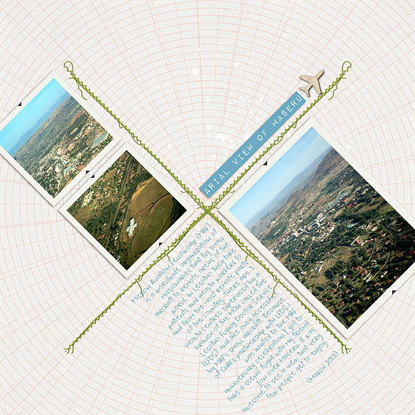
Arial View of Maseru by Heather Awsumb | Supplies: Bibliophile by Audrey Neal; This and That, Daily Bulletin by One Little Bird Designs; Vintage Charm Element Pack, Away We Go Element Pack by Katie Pertiet
Kiki Kougioumtzi says, “This layout is a short year-in-review from my point of view, focusing only on the year’s highlights. “
“I had a movie title (The Good, The Bad and The Ugly) stuck in my mind for a while, and I knew I wanted to make a layout playing with that title. I needed four compartments: three for my journaling (good,bad,ugly) and one for a photo. The crossed motif was the perfect fit. It has the four compartments I need and is an interesting twist, a move away from the usual blocked/square design. I hand-stitched the cross motif with embroidery floss.”
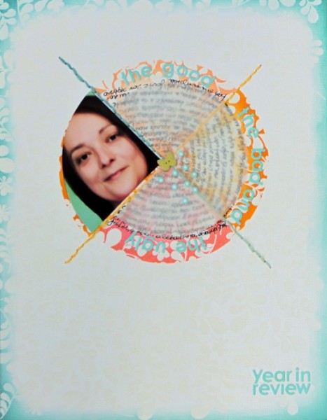
Year in review by Kiki Kougioumtzi | Supplies: Cardstock: Bazzill Basics; Ink: Ranger distress ink; Alphas: Basic Grey; Other: 7Gypsies brad, DMC embroidery thread.
Andrea says, “This page is about a wonderful day I spent with my daughter at a garden.”
“I used the crossed element to divide the page into 4 quadrants so that I could display some of my favorite photos from that day. The wrought iron motif connects to the idea of old fashioned garden gates.”
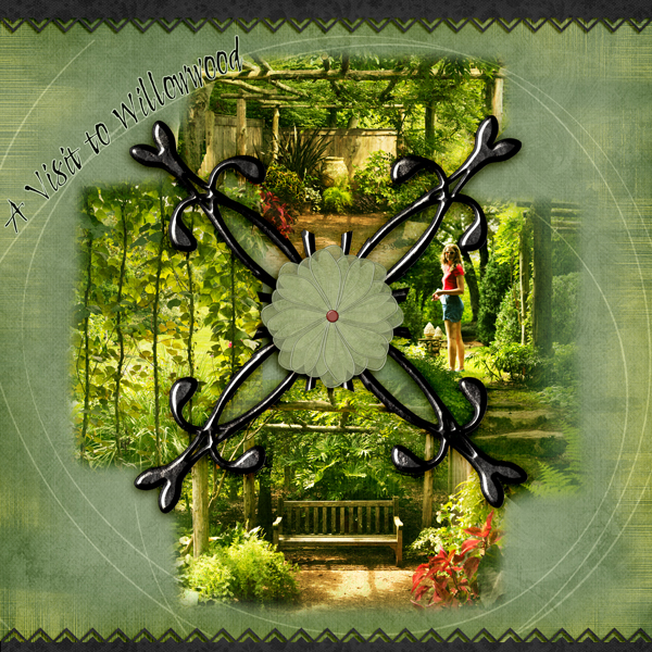
Willow Wood by Andrea | Supplies: Carina Gardner September morning paper; Anna Aspnes Loop de Loop; Katie Pertiet Color Inspired paper 071611; Shannon McCabe Deco trim 2; Oscraps Moonrise flower.
Susanne Brauer says, “This is a layout featuring photos of my two children over a span of eight years. Although they are each growing up and developing their own paths, they remain close.”
“I originally planned a page about their friendship because that is one meaning of crossed arrows, but then the Go Your Own Way sticker caught my eye and I decided to use the arrows for their directional meaning. It applied better to the span of time covered by the photos. In a way, both meanings are represented here. There are two sets of arrows pointing in different directions. The crossing of the elements represents that my children both start at a common nexus, our home and family, but then as time goes by, they will ultimately go forward in their own directions. I want them to remember that common starting point.”
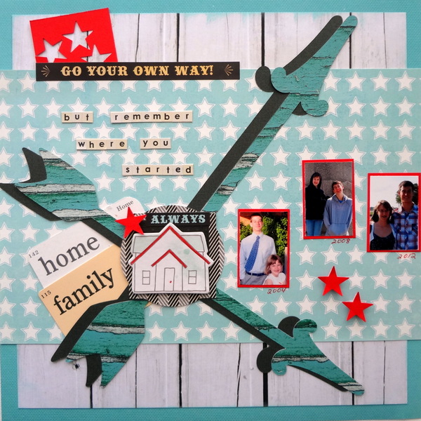
Go Your Own Way by Susanne Brauer | Supplies: Cardstock, We R Memory Keepers and Stampin Up, Patterned papers My Mind’s Eye, Stickers and alphabets Fancy Pants, Die-cut arrows – Cricut Arrows Cartridge, Chipboard American Crafts and flashcards Jenni Bowlin
Sue Althouse says, “This page is about several knitting projects I completed in 2013.”
“I cut knitting needle shapes out of kraft cardstock with my Silhouette and used them as the crossed element on my layout. Three of the quadrants house a knitting project and journaling, while the bottom quadrant contains my title. Border stitching frames the page, supporting the story along with the knitting needles and button embellishments.”
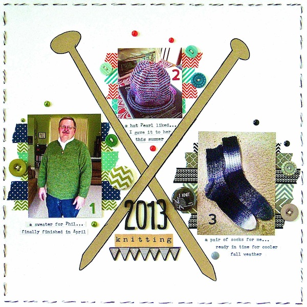
2013 Knitting by Sue Althouse | Supplies: Cardstock: Bazzill; Alphabets: American Crafts, October Afternoon; Number Stickers: Jillibean Soup; Buttons: October Afternoon; Floss: We R Memory Keepers; Washi Tape: Queen & Co., Bella Blvd., My Mind’s Eye, Freckled Fawn; MIni Pearls: Doodlebug, Freckled Fawn; Flair: A Flair for Buttons; Chipboard Banner: My Mind’s Eye; Tools: Silhouette Cameo, Remington Typewriter
Katie Scott says, “I wish I could rewind to this simple day of kayaking in 2007 when my dogs were still with us and my kids were small and still snugly.”
“I didn’t have oar embellishments so I printed an oar icon and used the icon to trace with a Fiskars cutting blade (the kind that fits onto your finger) onto wood grain paper. I really should have cut some kayak paddles, but I was thinking ‘row, row, row your boat,’ and I did have a row boat (and I hadn’t selected the photos for this layout when I cut the oars).”
“In addition to the idea of kayaking with paddles, I think the oars convey the idea of a simpler time in my life. P.S. My entire family ABSOLUTELY LOVES THIS LAYOUT more than any other layout I’ve made – probably ever. All three of them wanted to know how I made the oars and all three couldn’t believe that these photos were taken in 2007; sometimes the simple page is the most powerful – especially to those who don’t scrapbook.”
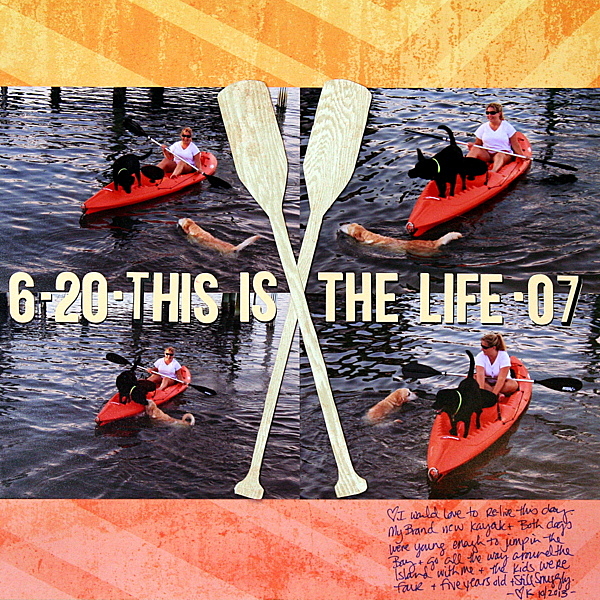
This is the Life by Katie Scott | Supplies: Crate Paper and Basic Grey patterned paper; Jenni Bowlin letter stickers. Fiskars Fingertip Detail Knife.
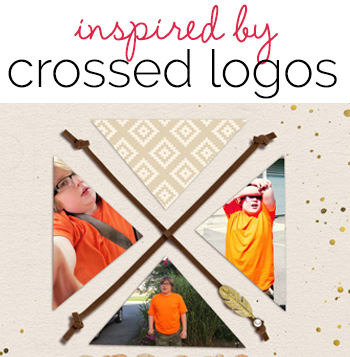
Carrie Arick says, “This page tells the story of my son’s orange shirts. He wears them so much they are in just about every photo of him for the past six months.”
“I used two knotted leather cords to create my crossed element. Because leather cord is dimensional in real life, I used the dodge and burn brush to create a little hump in the center of the top cord where it goes over the bottom cord. Since I’m creating a page about my son wearing his orange shirts all the time, the cross element helps the viewer understand that the photos are related, but not necessarily taken at the same time or for the same reason. I cropped the photos and paper in each quadrant into a triangle to reinforce their relationship and keep the crossed element uniform. The shirt is a really an overwhelming neon type orange, so I used a neutral piece of pattern paper to give your eye a place to rest in the top quadrant.”
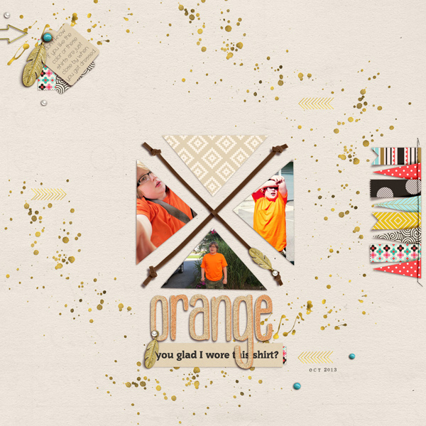
Orange by Carrie Arick | Supplies: Amber Clerrg: All Glitter & Sparkles Alpha; Gina Cabrera: Arizona Autumn; Fonts: Olgassys, Commons
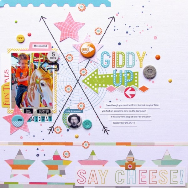
Ashley Horton says, “We recently attend the local county Fair, and our first stop on the rides was the Carousel. I wanted a center point for my crossed motif, so I stamped a circle grid in the background. I used a ruler to draw my lines and then stitched with embroidery floss over them.”
“The quadrants from the Crossed Motif provided me with an area for my photo and title, to be placed across from one another, and then I used embellishments in the top and bottom quadrants to complete my design.”

