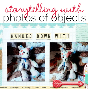
 While much storytelling is done with photos of people, the well-chosen and well-pictured object can be a springboard for your story and a great illustration of it.
Sian Fair says, “The object I’m scrapbooking today is a piece of clay pipe we found in our garden. Our house is built in the grounds of a big Victorian villa and we are guessing there was once a rubbish pit somewhere close to us: we regularly find pieces of broken crockery when we are digging. I bring it inside, clean it and display it on our hall table.”
“Because my photo has a simple, spare look I wanted to keep my page quite clean. I brought out the heart you can see imprinted on the pipe with a machine stitched heart and I used the colours of the crockery we have been finding: white and blue and brown glazes. I added gold accents to give a hint at the gold markings on the back of old plates – originally I had little gold glittered hearts, but I decided that distracted from my simple, honest theme and I covered them over so that just a little of the gold remains.”
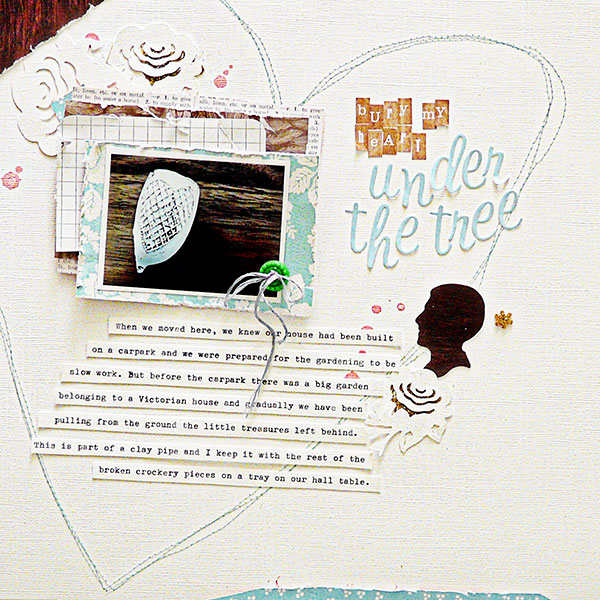
Bury My Heart Under the Tree by Sian Fair | Supplies: Patterned paper: October Afternoon, Teresa Collins, Studio Calico; Alphas: Kesi Art, Websters Pages; Embellishments: October Afternoon Sprinkler and button
Audrey Tan says, “This page is about my favorite mug. I love buying mugs from various places and countries I visit. However, if I do see a particular one that I like very much, it then becomes my favorite mug. As a result, I have a few favorite mugs, and this cupcake one is just one of them!”
“I kept the focus on the photo of the mug and kept the embellishments simple. My journaling was done on washi tape.”
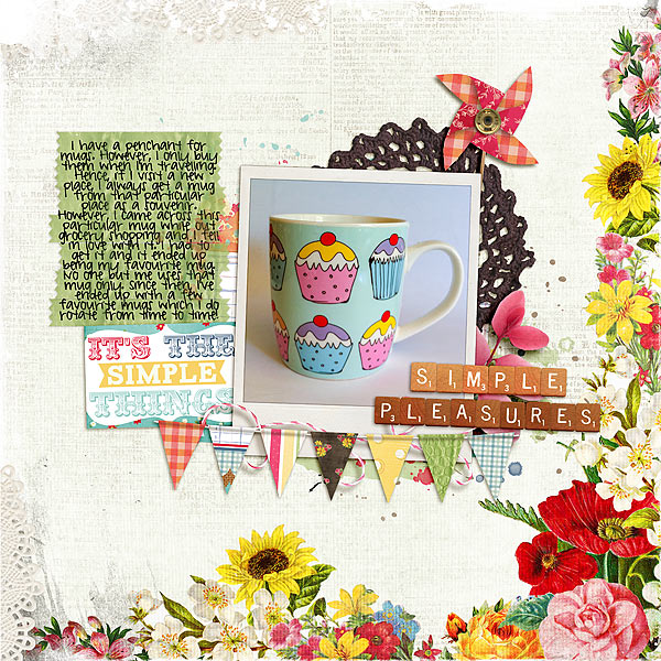
Simple Pleasures by Audrey Tan | Supplies: Julianna Kniepp Designs: Simple Pleasures, Hello Beautiful, Project 365/2012; Anna Aspnes: 12×12 Edge Overlays No5, Doily Edge Overlays No1; Font: Pea Kelly Jelly
Kristy T says, “This layout is about the Signature Bear that my mum made for me at the end of Year 12. My friends wrote messages for me on the bear and it always triggers happy memories when I take the time to read the words.”
“I photographed the bear near a window and intentionally overexposed the background to create lots of white space around the bear. This contrasts with the patterned papers layered around it and keeps the photo the main focal point of the page. The fabric on the ears and feet of the bear inspired the color palette of the page. I chose the patterned paper for the balloon embellishments which suited the theme of the end of school and all the possibilities that brings. As there is writing on the bear I decided to tuck the journaling into a pocket.”
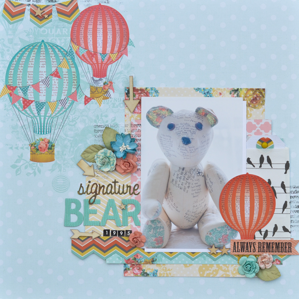
Signature Bear by Kristy T | Supplies: Patterned Paper: My Minds Eye; Stamp: Kaisercraft; Ink: Versafine; Markers: Copic Markers; Alphas: American Crafts, Websters pages, Kaisercraft; Paper Bag: Websters Pages; Flowers: Prima; Wood Veneer Shapes: Studio Calico, Brad: My Minds Eye.
Terry Billman says, “As I get older, I’m beginning to ‘see’ things a little differently. I’m finding it’s time to evaluate my priorities and change my lifestyle somewhat. The symbolism the photograph of my glasses represents is how I ‘see’ my life right now.”
“I duplicated my photo three times, graduating the size of my glasses to fill the frame. The word art surrounding the frame speaks of living life today and determining what the future holds. Both pieces of word art complement the thoughts in my journaling.”
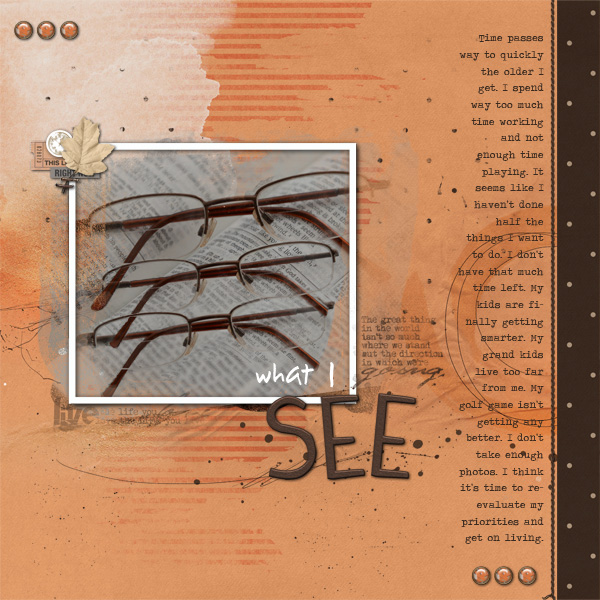
What I See created by Terry Billman| Anna Aspnes: Art Play Palette Tangier, Life Word Art 6, Art Play Palette Infatuated, Art Play Palette 3; Katie Pertiet: Arlesey; Patti Knox: Staple Its Clusters
Marcia Fortunato says, “Here, I’m scrapbooking chocolate chip cookies and milk and my family’s tradition of getting these each year that we go to the Minnesota State Fair. These are so delicious and fresh, and they’re something we really look forward to!”
“I kept the design fairly simple and linear and tried to keep the focus on the close-cropped photos.”
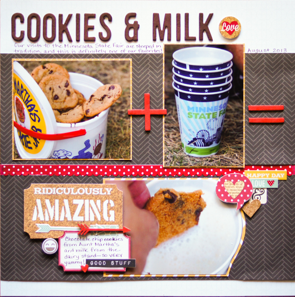
Cookies & Milk by Marcia Fortunato | Supplies: Patterned paper: Studio Calico, Simple Stories; Alphabets: American Crafts (Thickers), Basic Grey; Embellishments: Simple Stories, Little Yellow Bicycle, Studio Calico; Inks: Ranger (Distress Ink and Distress Paint), Hero Arts; Stamp: Studio Calico; Markers/Pens: Bic Marker, Marvy (LePen); Adhesive: American Crafts; 3D foam squares: Scrapbook Adhesives by 3L, Inkessentials.
Ronnie Crowley says, “When I think back to my childhood I would love to have pictures of some of the favorite foods I ate so I’m trying to scrapbook some of these things for my children. The story behind this box of cookies shows the character of my son and what a goofball he is. These cookies are his favorite and he’s very protective over them.”
“When I looked at the picture first I thought about going down a Fourth of July theme but when I wrote my journaling it wasn’t about Fourth of July but about the danger that would be involved if you ate these cookies. To support the idea of danger in my design, I chose the black background to allow the picture to pop off the page and to make it the focal point. The large title adds to this – any danger sign will be large and in-your-face to warn so I knew I needed a large title. The danger word art from Little Butterfly Wings was perfect for this especially with the addition of the yellow caution tape along the bottom of the page. I allowed the title to bleed onto the picture to draw the eye back to that focal point picture. Another thing I did (well I thought it was clever) was use the sell by date on the picture to date the layout. Originally I had cropped it out but then I was struggling as to where to put my date – just changing the crop on the picture allowed me to solve that problem.”
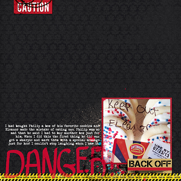
Danger! by Ronnie Crowley | Supplies: Little Butterfly Wings – Bad Mood; Ardent Sparrow – The Big Title Templates
Katie Scott says, “The item in the photo is my grandfather’s dog tags from WWII. As family historian, I inherited all the family heirlooms and old photos about ten years ago but have only just recently been able to go through all the boxes. I was surprised to find these dog tags – something that had once been so vital – in an old box. The dog tags of my grandfather combined with my recent family history research made me think that I should list out all of our relatives who fought in wars. I am sure I missed a few, but I like having all the names on one page. It’s OK with me that the dog tags are for only one person but the page is about more than one person.”
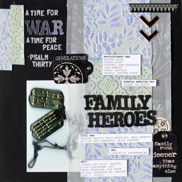
Family Heores by Katie Scott | Supplies: Vellum – Fiskars (circa 2002); Letter Stickers – American Crafts, Basic Grey; Stickers – Creative Imaginations; embossed paper – unknown manufacturer; Inks – Stampin Up: Watercolor Markers – Inkadinkado; Washi Tape – Recollections; Brads & Metal Photo Corners; Courier font.
Heather Awsumb says, “I took this picture of my desk at work during my (failed) attempt of doing ‘A Week in the Life.’ When I was looking back at my pictures from the week I realized that my desk says a lot about my personality and my life right now so it would make a great subject for an ‘all about me’ page.”
“I chose to make a layout with the photo as a strong focal point by making the photo big and bold. I used ‘office styled’ products like the torn paper border and the typewriter key patterned paper and even a typewriter font to emphasize the work theme.”
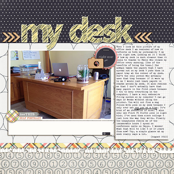
My Desk by Heather Awsumb | Supplies: Take Note by Robyn Meierotto; Edges & Headings by Jenni Bowlin Studio; Bibliophile by Audrey Neal; Forever Young by One Little Bird Designs; Cut Ups: Photography, Flagged Words No 3, Between the Lines Alpha, Striping Graphic No 2 by Katie Pertiet; #Selfie by The Lilypad; Stylin #90 The Essentials by Mommyish; CU Wood Veneer Toolkit by Chelle’s Creations
Susanne Brauer says, “I scrapbooked a special teddy bear. This one was made from quilts that had been used by a couple generations of my husband’s family. The quilts were so worn that my mother-in-law had the salvageable parts made into stuffed animals. She gave us a bear. I included three separate shots of the bear, highlighting a close-up with a double mat. I chose colors in my papers to complement the bear’s colors. One vintage style paper even included hand stitching marks – like on a quilt. The soft foam alphabet was a squeezable choice (like the bear) and I added several hearts to echo the heart-shaped toy the bear holds.”

Handed Down With Love by Susanne Brauer | Supplies: Patterned papers by My Minds Eye, Studio Calico, Websters Pages and Bazzill Basics. Photo mat by Scenic Route, die-cuts by American Crafts and October Afternoon, chipboard by Amy Tangerine, Alphabets from American Crafts and October Afternoon, Buttons by Jenni Bowlin

