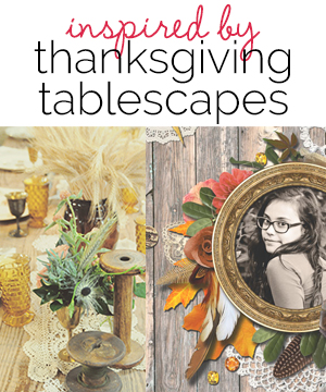
 Tablescapes offer scrapbooking ideas for color, materials, and arrangement of elements on the page — much like the arrangement of elements on the table. Our team took inspiration from Thanksgiving tablescapes, perfect for fall pages and holiday entertaining topics. If you’re looking for table inspiration for your own pages, check out our Thanksgiving Tablescapes Pinterest Board.
Anja de Dobbelaere says, “I was very much inspired by the wood, doilies, feathers, greenery, salmon flowers, and yellow glass in this inspiration piece. (Source: Southern Vintage Georgia). I went through my stash to find the same kinds of elements. The wooden background is from Paula Kesselring’s kit Autumn Sonata but I put a white wash on top of it to make it look like the wooden tabletop in the inspiration piece. To replace the yellow glasses on my layout I picked glass beads from Brandy Murry’s Autumn Jewel kit and spread them all around. Then, to match the picture’s matte look, I put a finishing curves adjustment layer on my final layout to give it that same matte look. I even made my layout in a rectangle format to match the inspiration piece.”

Wild & Free by Anja de Dobbelaere | Supplies: Paula Kesselring: Autumn Sonata, Virtue Of Wisdom, Wild Thing, Me And My Dad, Autumnal Days, Fall In Love (collab with Val C), Autumn Goodies; Gennifer Bursett: Made Of Awesome; Brandy Murry: Autumn Jewel, Outdoor Life, Mossy, Serendipity; Sussie M: Indian Autumn; Little Butterfly Wings+Jenn Barrette Collab: Let Your Dreams Fly; Mye De Leon: Sweet On September, Brave, In The Meadow
Ashley Horton says, “Autumn is my favorite season, and I love taking photos of all of the pretty fall colors, including pumpkins at the pumpkin patch. I used inspiration from a children’s Thanksgiving tablescape (Source: Frog Prince Paperie) to create my layout. I loved the neutral color created by the Kraft paper over the table and then all of the pops of fall color decorating it. I used a neutral background and incorporated the other colors from the inspiration. I also took inspiration from the banner in the background, and I used my Cameo to cut a Triangle background to layer behind my photo.”
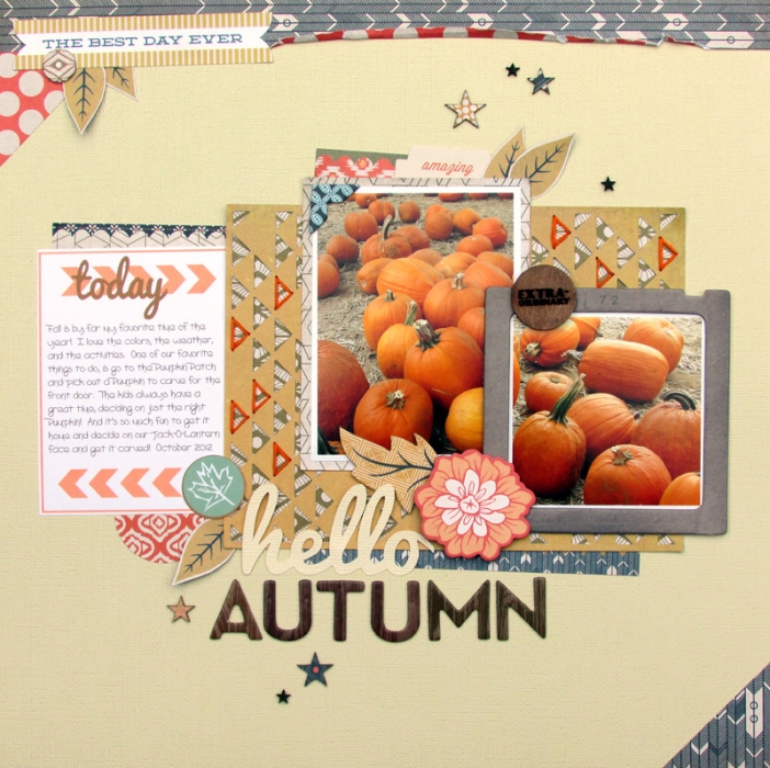
Hello Autumn by Ashley Horton | Supplies: Cardstock: American Crafts; Patterned Paper, Chipboard & Thickers: Basic Grey; Thickers: American Crafts; Font: Pacifico; Wood Veneers & Spray Mist; Studio Calico; Printables: ashleyhortondesigns.com
Susanne Brauer says, “I’ve scrapbooked a picture of my husband’s family gathered around our table the first time we hosted Thanksgiving at our home. What struck me about this inspiration tablescape (Source: Allison Sargent Events) was the casual combination of the wood with the linen and burlap combined with touches of silver in the leaves of the centerpiece and other elements. Because I don’t often scrap in monochromatic schemes, I tried to use the soft fun pastels that are so popular this fall. I turned my photos sepia and made my own table runner of burlap and patterned paper. I mimicked the silver chargers under the plates with a silver mat for my photo collage. The fact that it is glitter is a nod to the pretty glassware on the table. I think the use of pastels really gave my page a much more playful feel than the inspiration setting.”
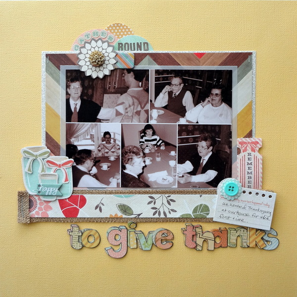
To Give Thanks by Susanne Brauer | Supplies: Patterned Paper Fancy Pants, Cardstock American Crafts, Glitter Paper and Vellum Stampin Up, Diecut Fancy Pants, Buttons and Chipboard My Mind’s Eye, Alphabets Fancy Pants and K & Company, Ribbon Stampin Up.
Stefanie Semple says, “I wanted to create a layout with this photo of the cat sleeping so happily and peacefully on my lap. She is sweet, warm, cosy and right at home. I was inspired by the various layers in an inspiration piece (Source: Stone Gable), so many circles, beautiful stemware that while transparent also has texture and details, different textures the mix of the traditional harvest color scheme with black and white. Starting from the bottom up, I loved the wood of the table being visible and matted the background (tablecloth-like patterned) with a sliver of the dark brown. The background paper has a similar shaped embossing to the edges of the tablecloth. I added layers of black and white in with the traditional harvest coloured pieces. The bunting and curls of the iron stand are echoed in the string and lace elements I added. The flowers and leaves I included are a not to the scalloped and leak shaped crockery. The overall feel of my layout is quite rustic with various blending modes being used in my layering to add details and to rough up papers etc the table setting is also rustic with their use of the textured leaves, gourds with their stems still attached and maize cobs. I still have three clusters in a visual triangle. Stitching and brushwork add details. I broke the borders to add a tension, and the elements that bleed off the left give the impression that my layout continues–like the tablescape.”
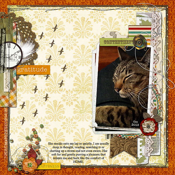
Contentment by Stefanie Semple | Supplies: Cilenia Curtis: artse play T6 (template); Scrapyrus Designs: Timeless (kit); Mye De Leon; When the heart sings (kit)
Brenda Becknell says, “At a local Fall festival, there was a cornbox (like a sandbox only with corn) set up in the kid’s play area. My grandson LOVED it. I was inspired by the neutral beiges and whites and the gold banner in my inspiration piece (Source: Centsational Girl). I tried to replicate that by layering cream cardstock over a brown backing, and then creamy white papers, with the top one shaped similar to the plate in inspiration photo, with the gold paper strip inbetween. The edges of the neutral papers were distressed and ink, to capture the look of the fringed edges on the table setting.”
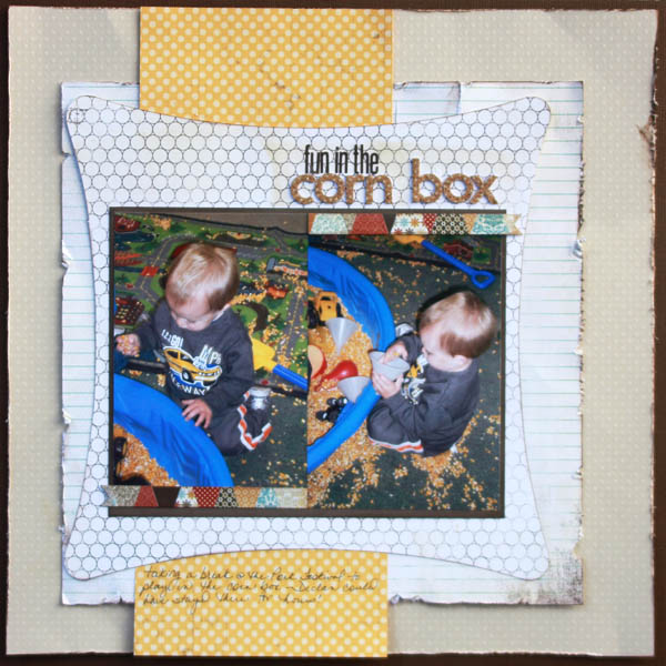
Fun in the Cornbox by Brenda Becknell | Supplies: Cardstock: Bazzill, BoBunny; Patterned paper: Basic Grey, Lily Bee; Ink: Quick Quotes chalk ink; Alphabet stickers: Lily Bee, Making Memories; Cricut Art Philosophy cartridge
Katie Scott says, “My sister-in-law does the big formal Thanksgiving Dinner with tons of extended family, so, for the past couple years, I’ve been making an informal, small dinner so that we have turkey left-overs and so I can use my many collections of my grandmothers’ dishes. I call my in-laws who live next door when the turkey is ready and have them come on over. My inspiration piece is the Stone Gable blog’s post “Stack ‘Em High.” (Source: Stone Gable) For my scrapbook page I took the color scheme, layering, and overall design by setting my page up like a Thanksgiving place setting.”


