 Storybook illustrations are a source of scrapbooking ideas for color, styling, motif, titlework and even subject. The layouts below are great examples of this.
Marie-Pierre Capistran says, “This is the story of my daughter who took the bus for the first time to go to Kindergarten.”
“My inspiration comes from the book: Il était une chanson by Christel Chatel–a book we read over and over again at bed time. I was inspired by this illustration because the drawings were simple and hand drawn and every time I’m reading the book I’m thinking that this is something I could draw myself. I was also very inspired by the colors and the deep greens of the grass and trees.”
“What I took from the illustration are the hand drawn houses and trees and the vivid colors. I translated that by drawing the bus stop and the path my daughter is using to go to school. I drew our house, the bus stop, the bus, the clubhouse and the playground: the things that she recognizes on her way. I used watercolor to get that vivid yet soft color. And I added alphas that look a little cartoonish. When I was done, I figured that my map feels more like a map from Winnie the Pooh so I guess I was also inspired by that, subconsciously.”
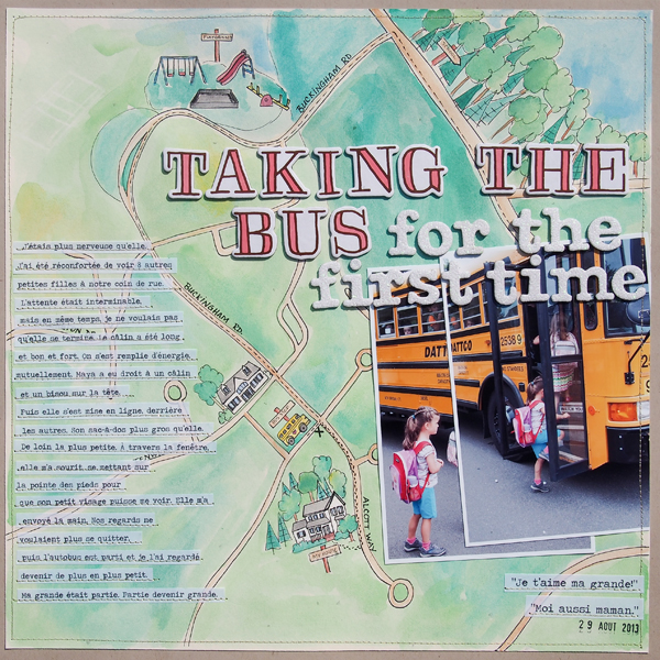
Taking the bus for the first time by Marie-Pierre Capistran | Supplies: Cardstock: Stampin’UP!, Letters: Thickers American Crafts; Others: Vellum, watercolor, gold thread, date stamp.
Kristy T says, “This layout is about some of the things we do with our children every night as part of their bedtime routine.”
“The inspiration piece for this layout was The Very Hungry Caterpillar by Eric Carle. I chose this book because it is a story that I was read as a little girl and that we have read to our children many times. Now the older two can read it themselves. I even bought a copy of the book before we had children because I loved it so much.”
“The illustrations in Eric Carle’s books are collaged from bright painted papers. He leaves obvious brush strokes to get a look like everything is hand cut. There is often a lot of white space on his pages, and the text is typed.”
“I created some of my own painted papers and hand-cut the stars for the night scene. The main alphas in the title are similar to the text in the book. I chose a very simple grid style layout with lots of white space. I kept the journaling simple with alphas on the photos. I wanted to keep everything within the grid because it reminds me of looking into a window showing some of our bed time activities.”
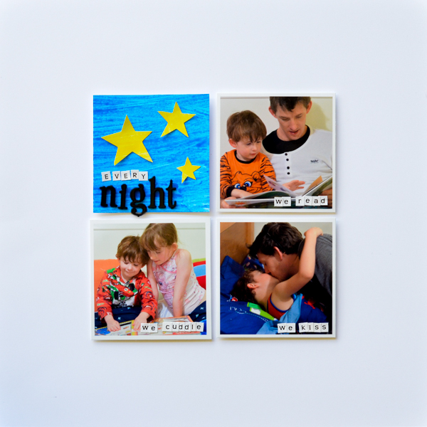
Every Night by Kristy T | Supplies: Cardstock: Artee; Paint: Leeho Finger Paint; Alphas: Tim Holtz Idea-ology, Papercraft.
Anja de Dobbelaere says, “The Snow Queen is a fairy tale from Hans Christian Andersen, it is one of my favorite fairy tales from when I was a child. I remember my mom had a vinyl record with that story on it, and it was so beautifully made. I listened to it over and over again.”
“When I got this assignment, I started thinking about my favorite fairy tales, and as soon as I had picked The Snow Queen I started looking for inspiration. There was very little to find, but just by accident I came across this illustration from Miss Clara, and I knew I was going for it.”
“I desaturated my picture, and recolored it manually. A lot of blending went into this layout, blending from papers, colors, brushes, overlays–until I got the desired result. All this time I kept the illustration of Miss Clara in my Photoshop document so I could go back to it over and over again. I picked some blues from the illustration to recolor my papers and elements. And I used a lot of light!”
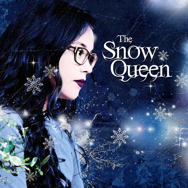
The Snow Queen by Anja de Dobbelaere | Supplies: Valorie Wibbens+Lauren Reid: Twinkle; Jen Maddocks: Jack Frost, O Christmas Tree, Let’s Ride, Owl Magic.
Michelle Houghton says, “Here are my daughters all ‘spooked’ up for Halloween. When I started this page I remembered a wonderful book, Lamont, The Lonely Monster with Lift-and-Look Surprises. , that I have had since childhood, it was a gift from my Grandmother when I was two years old. I have had it all this time and it truly has been well loved. The illustrations are wonderful and i wanted to bring the feel of them to my layout.”
“I created a doorway scene similar to one of the ones found in the book and then added water color to create a similar effect to the rock walls on the page as well. I added an embossed title and notes about my two Halloween girls with small additions of Washi tape and staples to finish off the layout.”
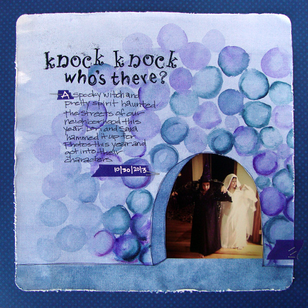
Knock Knock by Michelle Houghton | Supplies: paper; Bo Bunny and American Crafts, water color; Shin Han, ink; Sharpie and Tsukineko, embossing powder; Ranger, washi tape and staples, unknown
Audrey Tan says, “This page is about my son posing with two snakes and wearing a special hat.”
“While searching for an inspired story book illustration, I came across the Fifty Famous Fairy Tales illustration and was immediately drawn to the hat that the genie was wearing. It reminded me of the hat that my son was wearing when posing with the snakes and hence that was how this page came about. The genie appeared in a burst of smoke and I imitated that effect by using a starburst photomask on my page. I gave the page an artsy style as that was how the illustration appeared to be.”
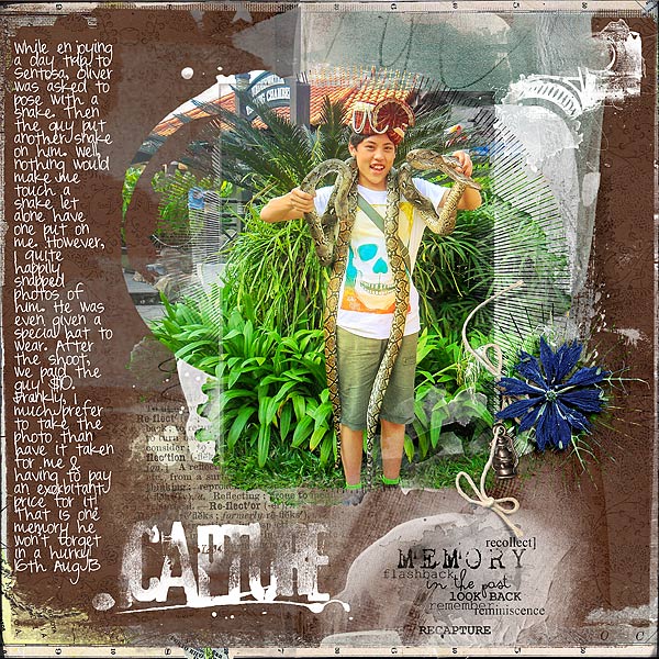
Capture by Audrey Tan | Supplies: Anna Aspnes: ArtPlay Palette Reflections, Find My Way Overlays No3, Mod Grunge Foto Blendz No3, Reflections Word Mix No1, Foto Word Art No3, Artsy Cameras No2, Warm Glows No3; Font: Pea Mily
Katie Scott says, “While doing family history research, I recently discovered that we are descended from people involved in the famous 1692 Salem Witch Trials. I was disappointed to learn that my 9th great grandparents were the accusers against the witches.”
“I did a search in Google for story book illustrations to get an idea and the Witches book jumped out at me and inspired this page because of the Salem Witch Trials subject matter and the sketchboard technique used by the illustrator which looks a lot like the trendy chalkboard style that is popular in scrapbooking right now. I took the chalkboard look, the symmetrical design – which looks a bit like a tombstone, and the color scheme of black and white with a bit of red.”
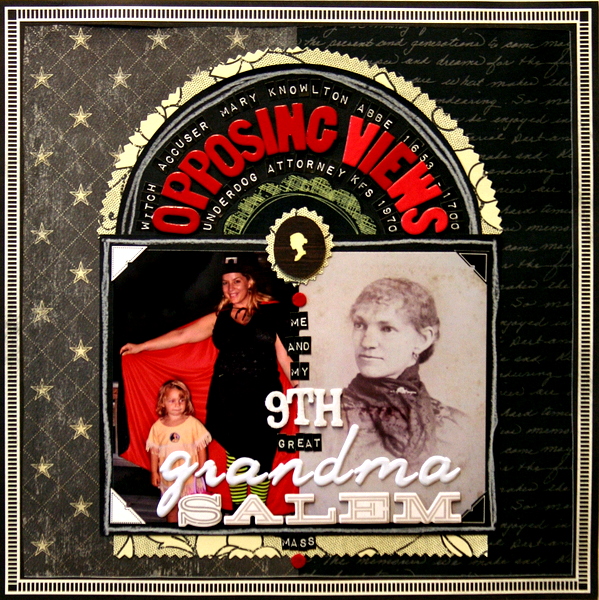
Opposing Views by Katie Scott | Supplies: DCWV, Crate Paper, Pebbles, and Authentique patterned papers; American Crafts Thickers; Tim Holtz letter stickers; white colored pencil; pinking shears.
Andrea says, “This page is about a wonderful memory of when my son was young and his favorite book was Chicka Chicka Boom Boom.”
“I was inspired by the book and also by a wonderful layout by Amy Kingsford. I used this photo because it was an important part of the story that I wanted to tell. Between both images I wanted to use the central palm tree with the letters falling out of the tree. I had fun coming up with my own version.”
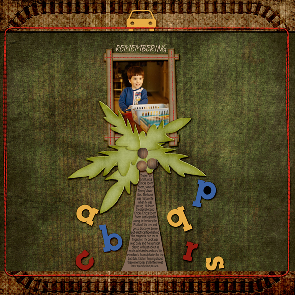
Remembering by Andrea | CC Wanted Slim Jim Paper; CKA Trains and Tracks paper; BH Paper BH Tree Mel Hains Collaborative Kit beach hut; AWP Happy Days Stitched Frames; Anna Aspnes Stitched by Anna Border.
Lise Mariann Alsli says, “The picture on this page was shot on Halloween last year. We tried to get our little witch to smile, but she refused because: ‘Scary witches never smile on pictures, mummy!'”
“My inspiration for this page is the Norwegian children’s book Karius and Bactus . The story about two little guys living in a little boy’s teeth and hacking holes in them. Every Norwegian kid knows this story.”
“I chose this book because I love the design on the front of the book. The watercolor-like stripes and the white circle really inspired me to use my neo-colors and try to mimic the style of the book. I didn’t use the same color scheme as the book cover because I wanted to tie the colors in with the picture and the Halloween theme. I also used some of the elements from the title, the big bold letters and the tiny letters in-between. I wanted to incorporate the silhouettes of the figures on the book inside the clean white circle, so I drew a witch and filled in the shape with black India ink. I then placed the witch inside the circle to mimic the book cover and also to use the circle as a scary moon.”

Scary, and Very Serious, Witch by Lise Mariann Alsli | Supplies: Papers and Cardstock: Bazzill card stock, Canson Aquarel Paper; Embellishment: Prima flowers, Petaloo leave, Prima pearl branch, Tim Holtz metal embellishment, Prima Pearls; Ink, Paint & Pens: Gran D´Ache Neocolors, Pebeo India Ink, Dew Drop ink pad, Tattered Angels Glimmer mists, Black pen; Alphabets: American Crafts (Thickers), Adornit mini alpha; Other: Shipping tag, selfmade witch.

