 Standout photos deserve a standout scrapbook layout treatment. Try these scrapbooking ideas for using oversized photos as the first foundational element on your page, layering journaling, titlework, embellishments, and even photos on top of your favorite enlargement.
let your photo be your canvas
Terry Billman says, “We don’t get to see our granddaughter Cami very often since 3800 miles and an ocean separates us. We visited the humpback whale sanctuary in Hawaii when we were last visiting. Cami jumped right in Craig’s arms to have her picture taken. The photo of the sanctuary was a perfect background to layer the close up shots of them. Since the left side of the background photo was mainly water, I layered the photos on the left so as to not interfere with the view of the sanctuary. I often use a large scenic photo for a background and layer close up/detail photos on the large photo. Generally, the background photos are pretty awesome and I don’t want to clutter the layout with many embellishments. I find it effective to ‘frame’ the layout by using a white or black stroke on the background photo.”
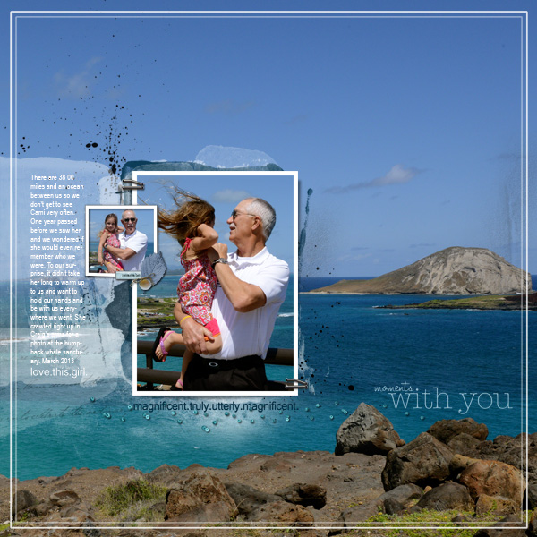
Moments with You created by Terry Billman| Anna Aspnes: Artsy Layered Template 114, Art Play Palette Sea Life, Art Play Palette Embrace Life, Art Play Palette Christmas Tree, Art Play Palette Seafoam; Katie Pertiet: Bead Scatterings, Fine Line Page Titles 2, Classic Curled Photo Frames 1, Holiday Word Strips, Beach House Memories Elements; Vicki Stegall: Magnificent Word Art; Patti Knox: Staple Its Clusters
combine a full-width (or full-height) photo with patterned papers for a blocked canvas
Rosann Santos-Elliott says, “Every year, I choose a location in NYC for our family photo shoot. From among the photos, I choose the best one or two for our Christmas card. This is in my top two for this year’s family photo. For me, the best part of the photo is our smiles. I layered papers below the photo and kept it simple and subtle.”
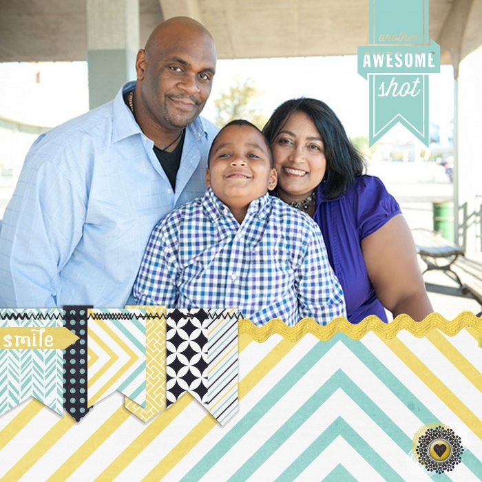
Another Awesome Shot by Rosann Santos-Elliott | Supplies: Penny Springman Designs: The Little Things; Cathy Zielski: Text Ribbons
use photo enlargements as the foundation (and home) for your other page elements
Katie Scott says, “My Native Floridian kids and I fell in love with the ski slopes of Durango,Colorado and we can’t wait to get back there. I used this photo as a large print because it is one of my favorites, and it is my current screen saver. I also selected it for this page because the photo had white space. I wanted to add embellishments to this photo but I didn’t want to cover it up entirely. I diecut circles so that I could create a column of embellishments with the photo background showing though. I also picked a blank white space in the photo to add journaling.”
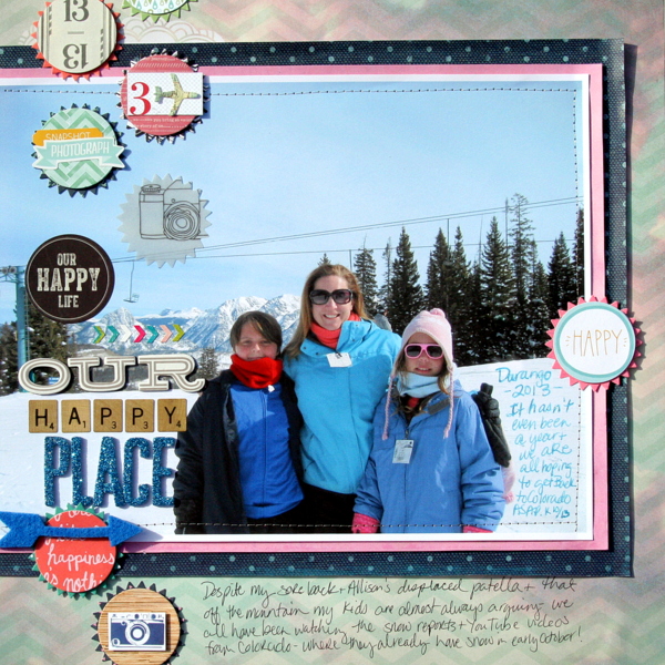
Our Happy Place by Katie Scott | Supplies: Crate Paper Maggie Holmes and American Crafts Dear Lizzy patterned papers, American Crafts Thickers; Spellbinders Nestabilities dies; My Mind’s Eye, Fancy Pants & Amercican Crafts stickers and embellishments.
Ashley Horton says, “With the hot Summer temps finally starting to mellow out, we like to get outside for a little play time each day. I printed a photo of our son holding his football on my home printer at 8″x10″. Because he was the main subject of the photo, I had a lot of surrounding space with the grass in the photo. This gave me multiple areas for adding embellishments, tags, and title to the ‘white’ space on the photo. One of the best tips for using large photos, is don’t overthink your design. Let your photo be the highlight of your page, add your title and a little embellishing, and you can create a great page in a short amount of time.”
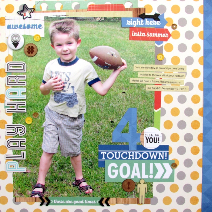
Play Hard by Ashley Horton | Supplies: Patterned Paper & Tags: Elle’s Studio; Wood Veneers, Sequins & Spray Mist: Studio Calico; Star Paper Clip: Two Peas in a Bucket; Flair Button: A Flair for Buttons, Thickers: American Crafts
Brenda Becknell says, “These photos are of my son during his ride-along experience in a NASCAR race car at Kentucky Speedway this year.”
“I enlarged the photo of the car at the start/finish line to 8.5″ x 11″ and used it as the background. I layered a small photo of my son in the racing uniform on top along with a stamped sentiment and a logo from the website. I printed facts on a transparency and adhered it under the small photo and over the top of gray space in the large photo. To add to the grungy feel of the page, I stamped black and grey streaks behind the large photo, and swiped paint around it and the cardstock edges.”
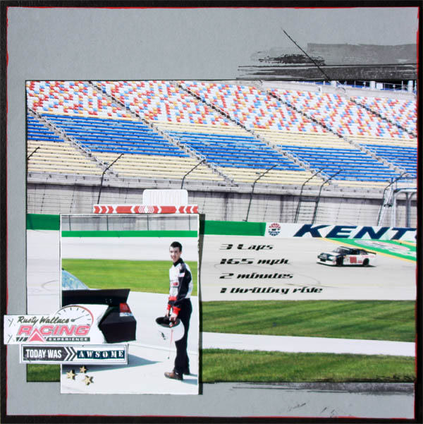
One Thrilling Ride by Brenda Becknell | Supplies: Cardstock: American Crafts; Stamps: Hero Arts and Mama Elephant; Ink: Hero Arts; Font: Sandoval Speed; Wood veneer stars: Studio Calico
go wide with a photo background spanning two pages
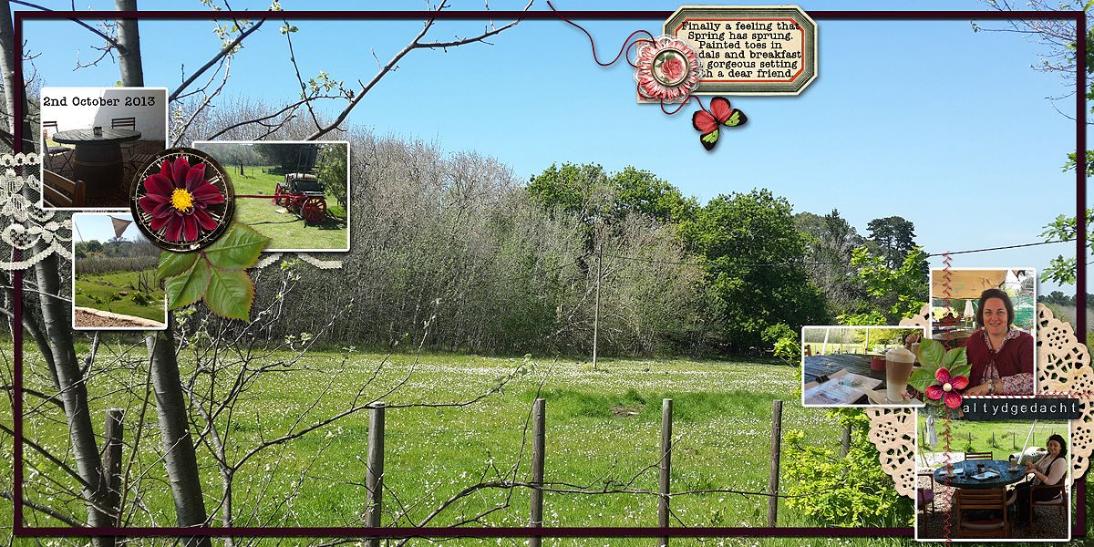
Stefanie Semple says, “The first day it really felt like Spring, a friend and I searched out a restaurant where we could sit outside and eat listening to the birds’ songs.”
“I filled two 12″ wide pages with my photo. This was part of the view we were looking at. The photo had a fence in the front, some ugly brown looking trees in the back ground and loads of blue sky which meant lots of space for layering other photos and elements. Had I used one of the detail photos, the object within the photo would have been over whelming. I created three clusters, two with photos and one with my journaling. To each cluster I added: 1) a foundation layer- the doilie, lace or postage stamp; 2) rectangles- either the photos or the journaler, and 3) dimensional or textural elements – the flowers, stitching and string. I added a frame around the outside to create the feeling of looking through a window.”
digitally merge two photos to make your photo background
Deborah Wagner says, “I blended two photos of my brother-in-law and nephews together to create the background photo. I layered my title and elements on the white space of the photo – the ocean and sand.”
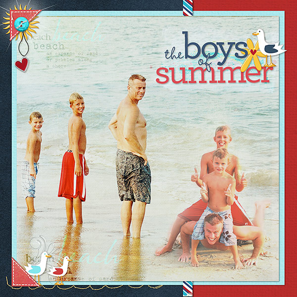
Boys of Summer by Deborah Wagner | Supplies: Katie Pertiet Anchors Away Kit, Bluebird Kit, Destination Seaside Paper Pack, Chandra Solids, Painted Pastels No.1, Surf Lagoon Kit, Stamped Stitches Summer, Star Glows No.1, Lens Flares, Defining Words No.4; Cathy Zielske Type Sets Summer; Lynn Grieveson Red Beach Kit.
mask or paint over your photo so text can stand out
Anja de Dobbelaere says, “This is a picture I took on Christmas day three years ago. It had snowed and the landscape looked amazing with that light, all the white… This is around the corner from where I live. I think this is an amazing picture and have been wanting to use it as a layout background, so here was my chance.”
“Looking at that picture I thought of the word ‘stillness,’ so I went looking for a ‘stillness’ quote and found this one from Deepak Chopra. I kept the whole page in white, cream, and brown hues to keep the wintery feel of the picture. I used a lot of brushes, paint and blending. Captivated Visions’ Blend Me Stash automatically blends a lot of the papers I used for the background. I then carefully chose brushes and stitchings and paint to fit.”
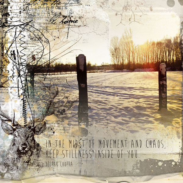
Stillness by Anja de Dobbelaere | Supplies: Captivated Visions: Mish Mash- Blend Me Stash 02, Creme Caramel-Elements & Ephemera, Creme Caramel-Mixed Media Papers, Creme Caramel Overlays, Yes You Can, Another Man’s Treasure ‘Stamps & Brushes’; Paula Kesselring: Season To Be Jolly; Rosey Posey: Finding Jenny; Tangie Baxter: You Are Divine, Lost & Found, Art Journal Caravan 2013 September Collection; Jen Maddocks: You Hold The Key
Andrea says, “The page is about the joy I have of seeing my two kids getting along so well and how many possibilities there are for the future. The photo I used as a background was a great scenic photo from our vacation to the Poconos.”
“I layered a photo on top of an area of the background that was not as interesting as the remaining parts of the photo. I blended the main photo it into the background using the Multiply Blending Mode. I then duplicated the image and used the Hard Light Blending Mode and added a mask just to highlight the important parts of the photo. Finally I added the watercolor filter to add texture to the same layer.”
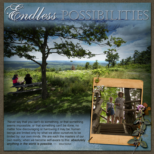
Endless Possibilities by Andrea | Anna Aspnes: Art Play Great Outdoors kit, Crazy life brush; Katie Pertiet: Color Inspiration paper, seasonal inspiration embellishment; Lynn Grieveson: Hint at it brush;
combine overlays with photo for a combo photo/patterned paper canvas
Amy Kingsford says, “The photo of my son here captures my youngest son’s personality well. It wasn’t the greatest quality of photo, though. In order to capture the energy and joy on his face I wanted to use the photo in a big way so I used a soft black and white treatment on my photo and placed it in my page’s background and then layered a piece of clear patterned vellum over top before bringing in a few other patterned layers and embellishments. The use of the oversized photo with a vellum overlay allowed me to create a fun yet soft blended look and let me mask the quality of the photo.”
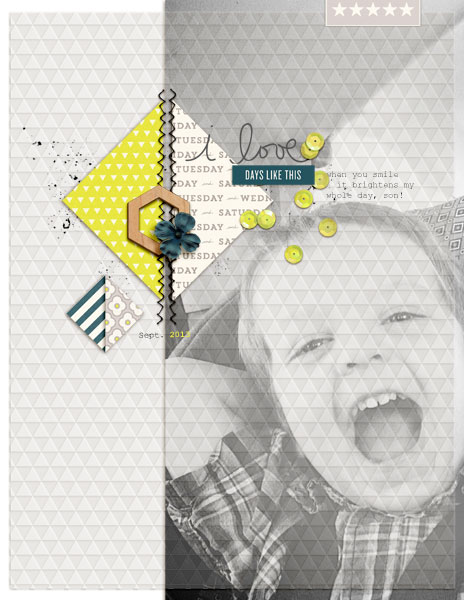
I Love Days Like These by Amy Kingsford | Supplies: One Little Bird: Per Diem; Amy Martin: Shaped Up: Triangles Vol. 2.
use a photo with generous white space for adding title and journaling
Paula Gilarde says, “My husband decided to take the family to the top of a mountain pass on a very, very foggy day – I wanted a permanent reminder of what a bad idea that was. There really is a spectacular view from that point, unfortunately we couldn’t see past the end of our noses!”
“I blended the photo into the background so that the charcoal covers most of the layout. This gave me a lot of space for my title and journaling and allowed me to use bright colors that contrasted against the dark background. I used yellow for my title (bright and optimistic) and pulled colors from my photo and used small portions to add interest and details. The red conveys drama, the tan is outdoorsy and the aqua is cool -it was chilly!)”
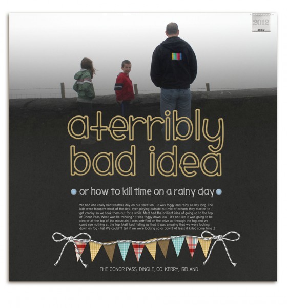
A Terribly Bad Idea by Paula Gilarde | Supplies: Naturally Krafty No 13 by Katie Pertiet, Rubber Alpha No 3 by Katie Pertiet, Readymade Banners For Dad by Studio DD, Loosely Labeled Dates No 4 by Katie Pertiet, Dated Journalers No 2 by Katie Pertiet, Brad Bonanza by Pattie Knox
layer little photos over your oversized photo canvas
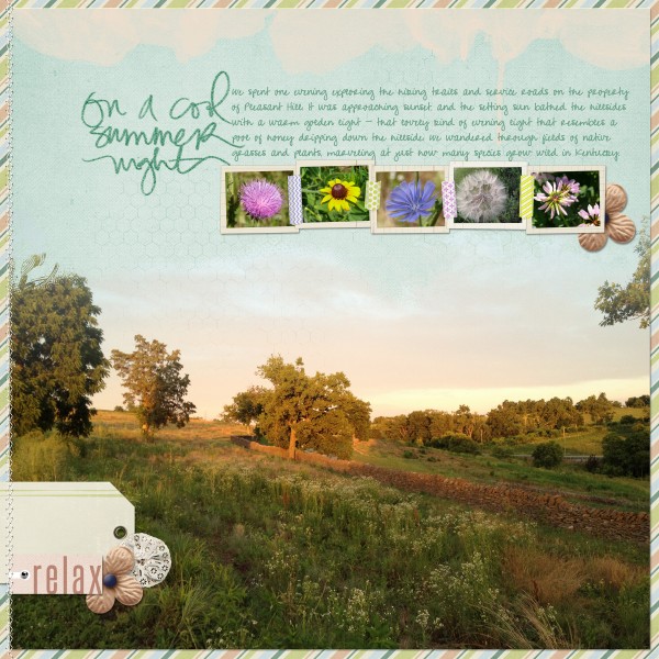
Audrey Neal says, “This is a page from a trip to Shaker Village. I love photography just for the sake of photography, and the natural world often makes a great subject to practice on. That’s really all these photos are, but as I get older, I also notice that I fall more and more in love with where I’m from and all the unique things Kentucky has to offer. This page is a little bit of all of those things rolled into one.”
“I am always really drawn to those incredible travel ads in magazines that feature a huge panoramic photo with great brushwork, topped by layered photo frames featuring details from the larger photo. It’s such a neat look, and I wanted to replicate it with this page. I started with a template that gave me the brushwork I needed for the large photo and combined that with a textured blue cardstock. I then added some taped frames and finished things up with a number of ‘go-to’ elements: handwriting, tags, stitching, and a ‘page frame’ with a bolder pattern. The result is a page that mixes the elements you’d normally see on one of my pages with the design inspiration I was originally drawn to.”
