 While storytelling is a noble pursuit, sometimes a scrapbooker just wants to have fun! Inspired by the work of Brazilian interior designer Ana Strumpf our team had fun this month. Take a look at the magazine covers she marked up with sharpies, and you’ll want to have fun, too.
Christy Strickler says, “I captured this photo of my son which has my husband and me reflected in his sunglasses.”
“I used a mix of permanent markers, pen and opaque markers. Some of the surfaces, like the letter stickers, were slick. For those surfaces, the permanent markers and pen worked the best. It helped to add the design in stages. Even though I was using permanent markers, I needed to allow a little drying time in between colors. I always chose to use the white gel pen last to add in details.”
“The opaque markers didn’t work well on the photos and I didn’t care for the matte finish of the permanent markers. To compensate, I printed a 2nd copy of the photo on cardstock. I then cut the image of my son from the photo paper, adhered a layer of chipboard on the back, and mounted his image over the one on the cardstock print. I was then able to slide vellum between the two layers and use the opaque markers to achieve a similar effect to that seen in the inspiration for the article. I did smudge the opaque pens a bit onto my background. I was able to use the white gel pen and permanent markers to match the background colors. I then colored over the smudges in a circular fashion. Then I came back and drew flowers around the circles to hide the covered up spots.”
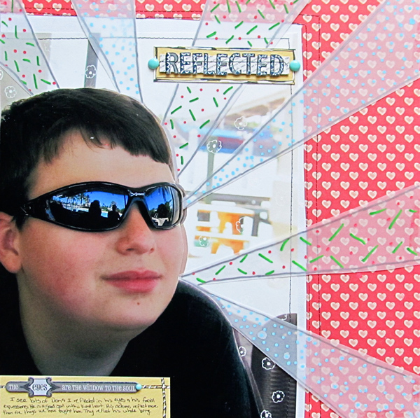
Reflected by Christy Strickler Supplies| Patterned Paper: Studio Calico; Letters: Jenni Bowlin; Markers/Pens: Martha Stewart, Sharpie, Bic Mark-it’s, Signo Uniball: Enamel Dots: My Mind’s Eye; Sticker: Studio 112
Katie Scott says, “This page is about a gold mine we visited during our summer trip to Georgia. I wouldn’t normally color all over my photos, but these photos were not the greatest since taken underground in a mine with very little light and they didn’t convey the excitement of our trip so the doodling added excitement to the photos. I also used the markers to color out the other tourists in the mine (lower left photo). “
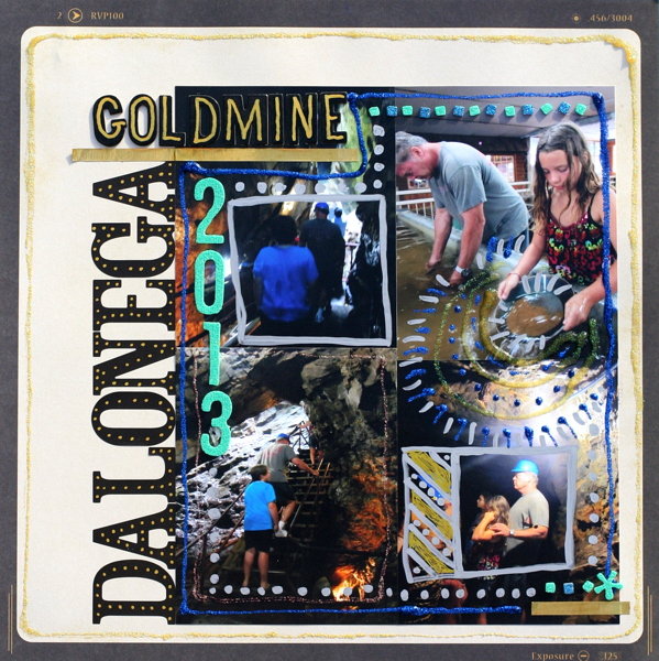
Dalonega Goldmine 2013 by Katie Scott | Supplies: Crate Paper patterned paper; American Crafts Letter Stickers and Thickers; Sharpie Markers; American Crafts glitter glue.
Ronnie Crowley says, “The original ‘standard’ scrapbook page I made was a blended digital page (gamer). I wanted to use this same page but have fun with it like the inspiration in the magazine pages.”
“As this is a digital page I was able to use lots of digital doodles that are available and that I have gathered but hardly used before. Doodles are not a go-to supply for me but for this fun layout I had fun using them. It will make a great title page for my son’s book. Some of the doodles I chose needed to be altered for my use. Take for example the headphones. I had to enlarge the headphones to fit my sons head. And the original doodle also included the music so I masked these out. Then I turned around and added the same doodle on another area of my layout and masked out the headphones just leaving the music. I could have done this using the erase tool but I choose to use masks as these are nondestructive and if I need to re-size or move things around I can do this easily.”
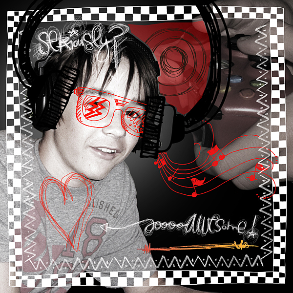
Gamer by Ronnie Crowley | Supplies: Albums to Remember: TeenBoy; CD Muckosy: Lookie Here, RockOn; Chelle’s Creations: Chalked Doodads; Captivated Visions: My Happy Place; Just Jaimee: Organic
Michelle Houghton says, “This is a gathering of my family, my parents and my in-laws over the holidays. The photo is wonderful in that it has us all together, but there was not a lot of personality to it.”
“Going a little crazy with a lot of markers seemed like a fun solution when Debbie presented us with the challenge. I used a mix of the markers I have on hand. Galaxy Markers by American Crafts worked well on the photos and were opaque so allowed me to ‘re-dress’ everyone in their royal attire. I had a great time using a mix of markers and small repetitive patterns to fill the entire space.
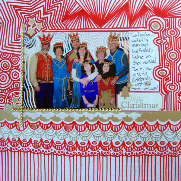
Merry Christmas by Michelle Houghton | Supplies: paper, bling, cardstock borders and stickers; SEI, markers; Sharpie, Zig Bic, Too Marker Products and American Crafts
Amy Kingsford says, “This page is about the broomstick races we had at my oldest son’s Halloween Party and that my youngest son totally dominated!”
“I used a combination of premade doodles, and handmade doodles on this page. Some of the handmade doodles I drew myself with my mouse and a small hard brush and others I created by tracing and/or stroking elements from my stash. Aside from the background doodles which were premade doodles and brushes, on my photo added the hat which I used an epoxy element as the base for and then selected and colored over top of it on a new layer before removing it from my page. And I freehanded the cape, and then colored it in, making sure to leave voids so that it had more of a doodled look. Finally I used another premade doodle that I layered over top of the actual broom in my photo, it was a pine branch doodle but I thought it made for a fun looking broom end.”
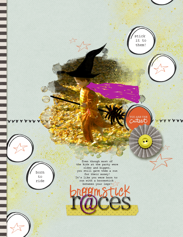
Broomstick Races by Amy Kingsford | Supplies: Paislee Press: Spellbound; Creashens: Wicked Alpha; Amy Martin: Crispy;
Kiki Kougioumtzi says, “Celebrating my daughter’s first double digits birthday with a special birthday cake.”
“I used wide tipped markers for quick coverage. I used kids markers because those were the ones I had at hand and the box had the ‘acid free, alcohol free’ mark, so I thought they won’t harm my photos. I also used for variation and definition a metallic marker on the photos and for the closest to my main gathering outline. For my market work I outlined my main gathering of photos and embellishments, repeating the silhouette with a rainbow of colors.”
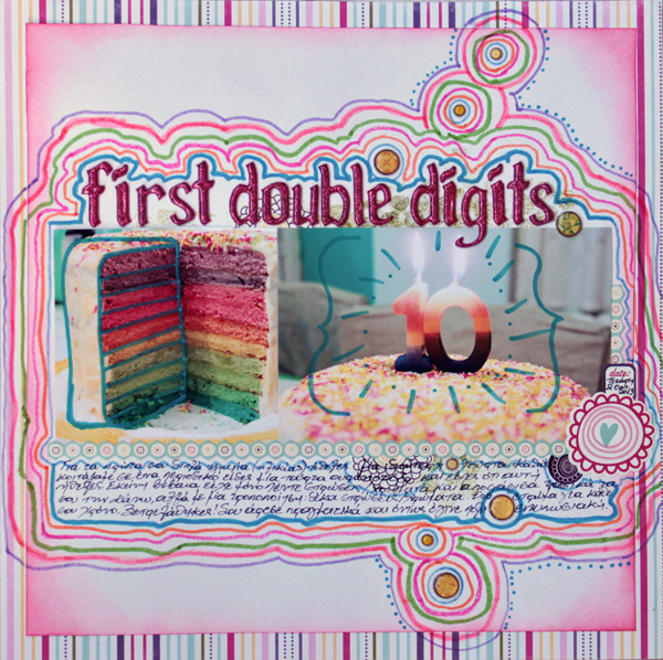
First double digits by Kiki Kougioumtzi | Supplies: Cardstock: Canson; Pattern paper, stickers: Echo Park; Alphas: America Crafts; Brads:Basic Grey; Markers:Crayola.
Carrie Arick says, “Here I’m telling the story of my cake-baking mishaps.”
“I used a round brush varying between 15 and 30 pixels (px). To ensure that I wouldn’t lose work if I made a mistake, I used a new layer for each element I doodled around or on. For instance, the doodles on each photo are each on their own layer. I wanted the doodling to feel and look very natural as it would if I was on the phone with a pen in my hand (because I am an analog doodler). Relying on my own hand instead of pre-made doodles was very scary at first, but I decided to just have fun with it. I let go of the idea of creating perfect lines, which ended up giving the page a more natural, hand-drawn feel.”
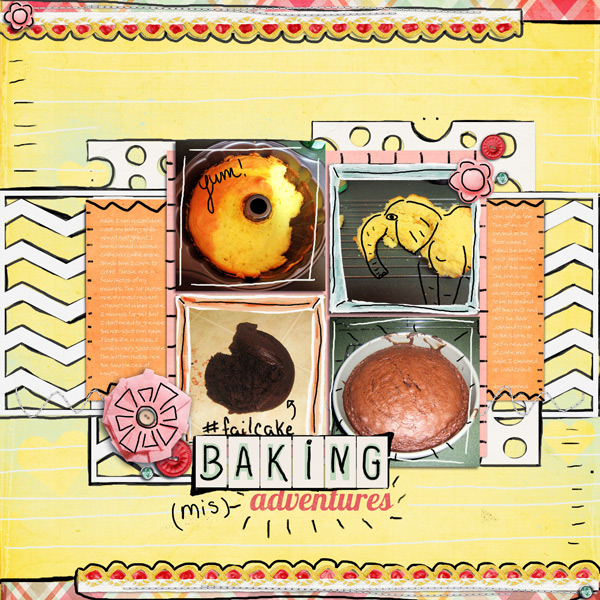
Baking Misadventures by Carrie Arick | Supplies: Michelline Martin: Someone to Love Paper Pack; Sara Gleason: Fig Tree; Allison Pennington: Playground Love Element Pack, Kaye Winiecki: Stax on Hearts; Valorie Wibbens: Sweet Tooth; Fonts: Lobster 1.4, MA Brownie tOO
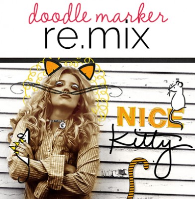
Deborah Wagner says, “I loved the inspiration pieces by Ana Strumf, and had a blast turning my niece, Alison, into an Ali cat.”
“I used digital supplies for most of the doodles. I tried making a few of them – the claws, eyes and tail – but didnt’ feel the look was as clean as the pre-made doodles. I think I would like to try a tablet and pen if I were going to do a lot of doodle work. This was great fun, and I cant wait to show my cat-loving niece the page I made for her.”
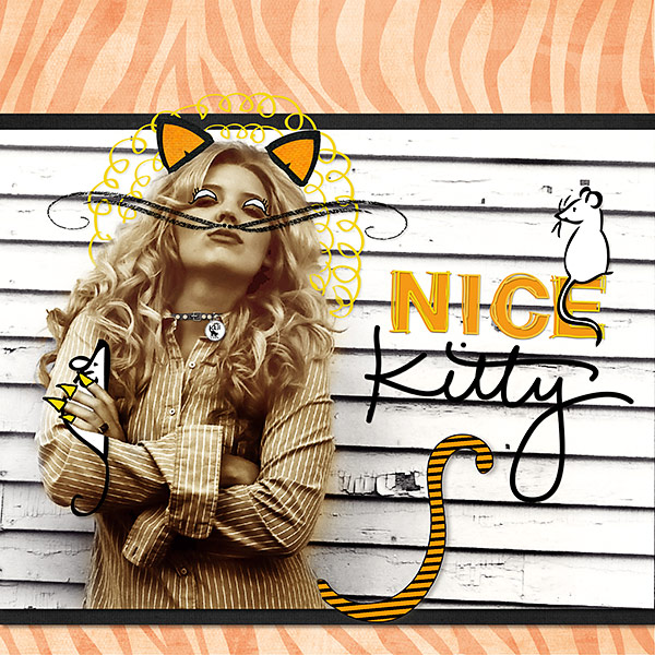
Nice Kitty by Deborah Wagner. Supplies: Katie Pertiet – Doodled Block Alpha, Chalkboard Ornaments Brushes & Stamps No.1, So Fine Element Pack, Which Witch Brushes, Color Inspiration tags 4-14 12; Ali Edwards – Cats & Dogs Hand Drawn Brushes; Mindy Terasawa Safari Zebra Prints; Lynn Grieveson Blackett Hall Paper Pack; Pattie Knox Gone to the Dogs, Gemstone Swirls; Cassie Jones Bending Shadows; Studio DD Doodle Critters No. 1; Jesse Edwards Doodles Flowers Brushes & Stamps

