 Storytelling on scrapbook pages is done with photos and words and color and image and styling — they all contribute to mood and meaning. Some stories can be told with one photo and others are best revealed with a series of photos — photos taken as an incident or moment proceeds.
scrapbook all the shots in a photobooth strip
Christy Strickler says, “While at Chuck E. Cheese, my husband tried to get a good picture of my son from a photo machine. I placed the worst take at the top and the best photo at the bottom. I used a wood veneer male icon to represent my husband standing off camera. While I wasn’t with them on this outing, the quote bubbles capture what I imagined my husband was saying as he worked to get my son’s cooperation for a good shot.”
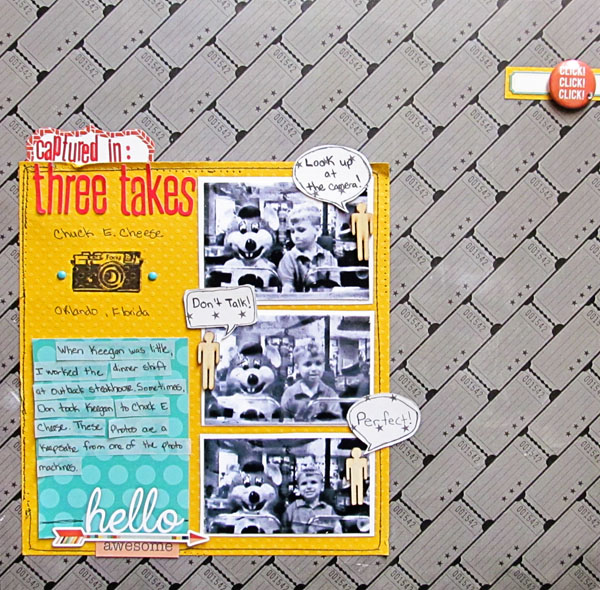
Captured in Three Takes by Christy Strickler |Supplies Cardstock: Bazzill; Patterned Paper: JBS Mercantile; Letters: Jillibean Soup, Lillybee Designs; Wood Veneer: Studio Calico: Stickers: Echo Park; Ink: Ranger: Stamp: Poulain; Brads: Basic Grey; Flair: Panda Eight Designs; Other: Vellum
show personality with a series from a moment in time
Andrea says, “I made this page to celebrate my daughter turning 18. I used the Scrapbook Coach On A Block class for layout, but I rotated it to work with my photos. Megan does not like it when I take photos of her, and series this shows her typical reaction. I save photo shoots with her for special occasions.”
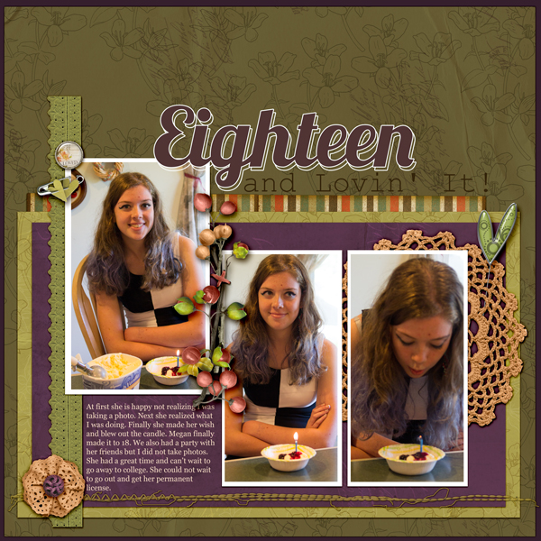
Eighteen by Andrea Hayes | Katie Pertiet, Sun Porch Kit, Oiselet Rouge Lace, Color Inspiration 41711; TMD Be who you are heart; Mel Hains, Everyday Life Ribbon.
get the before, during and after on the page
Marcia Fortunato says, “Our family has a seven-year tradition of visiting a theme park in Wisconsin Dells at the end of the summer, and this layout is about one of our favorite attractions. I placed a series of photos of my family waiting for the monster bucket of water to dump on them, and the final shots show them being drenched and then laughing. I used the burst mode on my camera to take the series of photos.”
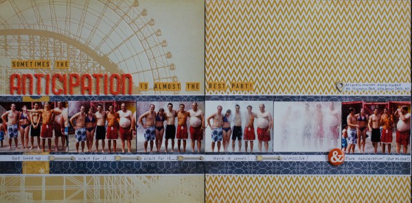
Anticipation… by Marcia Fortunato | Supplies: Patterned paper: Studio Calico, KI, Authentique; Cardstock: American Crafts; Alphabets: American Crafts (Thickers), October Afternoon; Embellishments: Studio Calico(wood veneer), Simple Stories (flair); Other: Sharpie pen, American Crafts adhesive.
Rosann Santos-Elliott says, “My son turned 6 in July and insisted on going out to a restaurant. These photos show how he begins to fall asleep as he is eating. I focused on the first and last photos which span about 1 minute. In the middle I place the progression of the sleepiness in a 4 photo grid. I thought that it was ironic that he was wearing an Incredible Hulk t-shirt, hence the title.”

Incredibly Tired by Rosann Santos-Elliott | Supplies:My Minds Eye: Boy Crazy-Geared Up; Simple Stories: Happy Day Fundamentals Card Stickers; 100 Days of Summer Expressions Cardstock Stickers, Fabulous
Debbie Hodge says, “This summer while visiting family, I often found my son and nieces playing this group challenge game — they’d cross over arms and take hands so that they were all tangled up. And then they’d work to get untangled without dropping hands. I wanted to show this process and the final untangled success.”
“I placed and cropped my photo series to convey this idea of movement toward — and final arrival at — a goal. I began with the first photo bleeding off the canvas at the left edge. The photos are cut to get progressively taller—but not in steps. Rather, they follow a steady line of widening — like a cone or funnel heading toward the wide opening. I finished the sequence with one larger rectangular photo—it has the shape we expect a photo to have unlike the photos leading up to it. I layered a golden burst behind this photo and a white burst (blended to emphasize the circle of untangled kids) on top it. Title and banners are also overlapping this photo, emphasizing it and giving it more importance, cementing its role as the desired destination.”
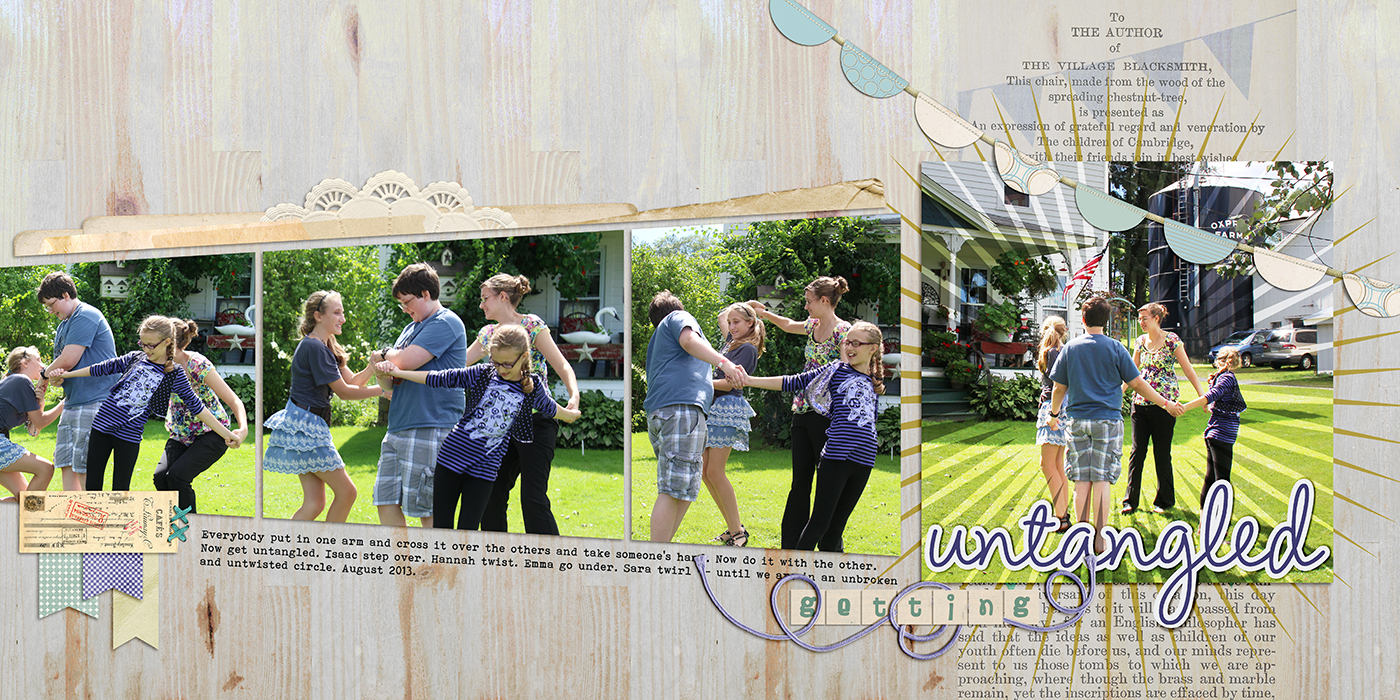
Getting Untangled by Debbie Hodge | Supplies: La di da by Allison Pennington; Late Summer by Lynn Grieveson; Still Life by One Little Bird; Eclectic Easter Alpha by Just Jaimee; Flossy Stitches, Vintage Christmas by Katie Pertiet; Jane by Ardent Sparrow; Brave by Mye de Leon; Amelie font
use a series symbolic of growth and time passing
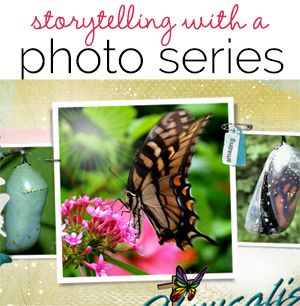
Terry Billman “The young adult version of the Christian ‘Walk To Emmaus’ program is called ‘Chrysalis.’ This layout depicts the process of a caterpillar changing to a chrysalis and finally emerging as a beautiful butterfly, and it symbolizes that Christ can transform us into new beings.”
“I placed the photos of the chrysalis and the monarch butterfly in a horizontal row across the page. To emphasize the final stage of the process, I placed the butterfly in a larger frame center stage of the series.”
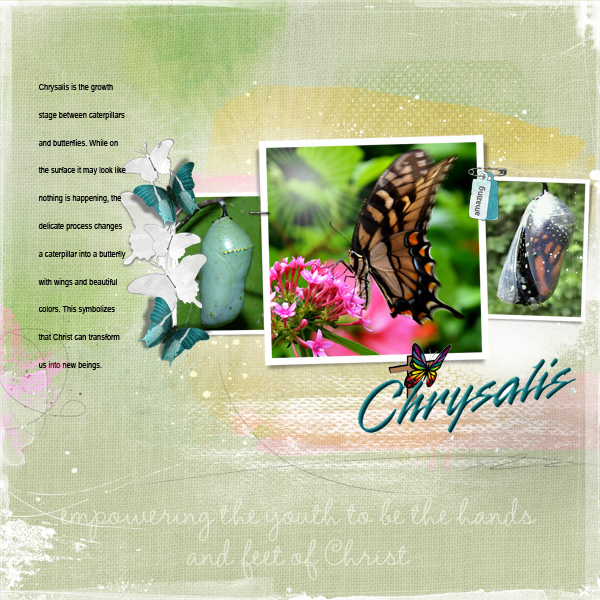
Chrysalis by Terry Billman | Supplies: Anna Aspnes: Art Play Palette Lush, Artsy Template Duo Pack 4, Art Play Palette Infatuated, Art Play Palette Christmas Tree, Foto Glows 4, TNT Flutterby Templates 3, Art Play Palette Genuine, 12 X 12 Artist Edge 6, Artist Edge Overlay 8; Katie Pertiet: Chandra Solids, I Look Butterflies, Artistry deAzul, Wire Rimmed Alpha Charms
step-by-step through an important moment
Ashley Horton says, “Our oldest daughter was saved over the Summer during Vacation Bible School and baptized. I scrapbooked photos of her baptism with a photo sequence across my page. I highlighted one of the photos with a chipboard frame. I clustered most of my embellishments and title near the photos. This design worked well for my photos, because it showed the sequence of events, frame by frame.”
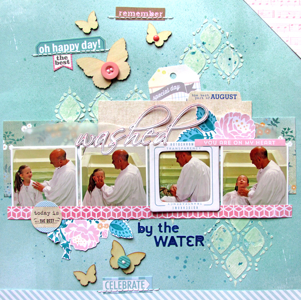
Washed by the Water by Ashley Horton | Supplies: Patterned Paper & Digital Files: Carta Bella; Tags: Elle’s Studio; Color Shine: Heidi Swapp; Wood Veneers & Spray Mist: Studio Calico; Patterned Paper & Phrase Stamp: American Crafts; Letter Stickers: Jilibean Soup; Buttons: October Afternoon; Modeling Paste: Liquitex; Vellum: Fynmark; Font: Scriptina; Photos take by: Lisa Hill
break down a landscape (or a really wide mural)
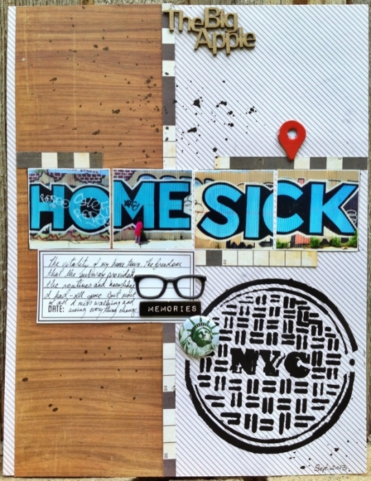
Michelle Hernandez says, “I took this series of photos in Williamsburg, Brooklyn the day before we moved to Utah. I couldn’t believe what I was seeing in this huge mural: it was so pertinent to my current mindset. I knew I wanted to scrapbook it, but photos of the entire wall weren’t very interesting because I had to move back quite a ways to get the whole thing. Instead, I shot close ups and lay them out a series. My daughter kept running around in front so I made sure to include a shot of her. One thing I will mention- it’s difficult to keep the color temperature consistent in each shot when it’s partially sunny. Clouds will drift in and change the quality of light, so it’s better to shoot in a cloudy day or print these type of photos at home after some color editing.”
get the process documented
Tara McKernin says, “This is a single page layout showing the process of trying to bake cookie with two little people that we happen to love very much. I kept it simple to keep the focus on the flow of the photos. My structure is left to right and continue onto the next line. I love how the outline frames the images keeping them contained.”
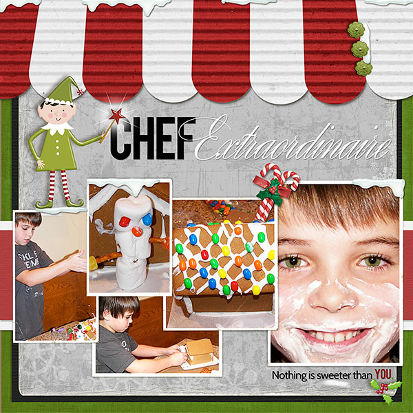
Deborah Wagner says, “This is a page of my son creating and then eating his masterpiece. This is a scraplift of Jana Morton’s Reading Café. I loved the café awnings she created in Photoshop, and thought they would work well with the theme of my page. I used a template to hold the photos, flipping it horizontally so the largest photo, holding my son with frosting on his face, would be the last in line.

