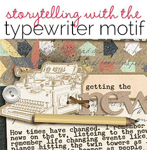
 Typewriters are a retro and enduring motif great for storytelling on scrapbook pages.
Typewriters are a tool for presenting the written word. They represent writing and (almost) a time gone by, a time when a machine with moving parts and ink was used to record stories and reports and official communications. Retro looks continue to be popular for home decor and branding and stationary products. See how we’ve used this nostaligic motif in a way that supports story on these scrapbook layouts.
Ronnie Crowley says, “This is a letter from me to my daughter as she starts her senior year at high school. I used the typewriter to hold my journaling so it looks like I actually typed it.”
“Kate Hadfield excels in her hand-drawn products so after I saw an inspiring image on Pinterest I knew that a typewriter from her would be perfect for what I wanted to do. The typewriter in Kate’s product didn’t have enough room for all the journaling I wanted to include on my page so I extended the paper coming out of the typewriter.”
Photoshop how-to for extending the paper:
- Select the top of the paper using rectangular marquee tool.
- Press CTRL + J to copy the selected area to its own layer.
- Use the Select tool to nudge the new layer up higher to make the paper longer.
- Copy and nudge that selection again and again until you have the paper to the size you need.
- Select all of these layers and merge them into one.
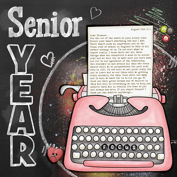
Senior Year by Ronnie Crowley | Supplies: Kate Hadfield: Hip Hip Hipster; Chelle’s Creations: Button alpha, Chalked Boards,Chalked Doodads, Chalked Frames, Chalked Out line Alpha, Chalked Serif Alpha; Genia Beana: A Whimsical Heart; Mommyish: Scarlet letter.
Susanne Brauer says, “Before I knew I was going to college, I took secretarial courses and learned to take shorthand dictation and type it up. I was quick at both skills, and have told that story here.”
“I used the typewriters as a major element in the page background, and I used two small typewriters as embellishments. Other ways I have tied into the typing theme: the rub-on typewritten letters across my banner and the circular letters used for part of the title. I chose Chunk Type font for my journaling. I downloaded the steno paper from Printable Paper, punched the edge, and put the shorthand on vellum so the lines still showed through. I finished with office supplies like clips and labels.”
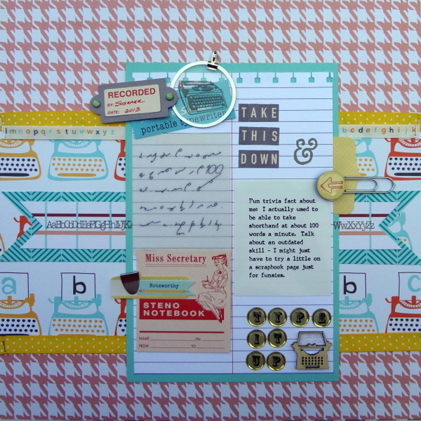
Take This Down by Susanne Brauer | Supplies: Lawn Fawn paper, October Afternoon paper, diecuts and alphabet, Making Memories alphabet, Studio Calico rub-ons and labels, American Crafts ribbon, Stampin Up cardstock, ribbon, punch and metal clips, Hobby Lobby paper clip
Stefanie Semple says, “Here, I reflected on the ways social media and cell phones have changed how we hear the news.”
“I used the typewriter as a foundational element in my title cluster, adding deep shadowing to it for a chipboard look. It ties into my old fashioned values and the old fashioned journaling font. The type-print patterned paper represents my inability to switch off the noise that overwhelms me at times. The clusters all contain inky brushwork or splatters, another nod to the older inky news methods.”
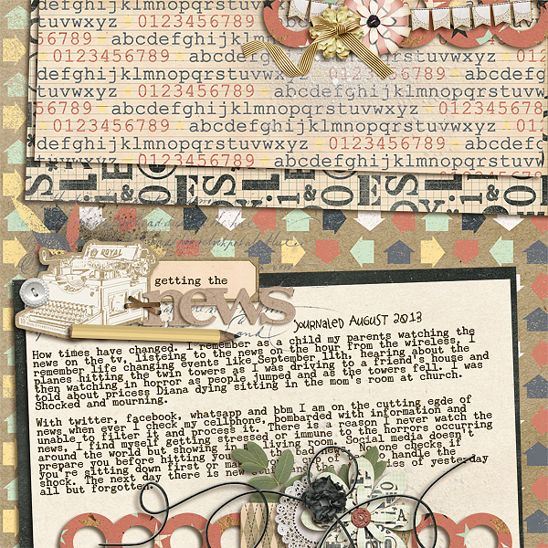
Getting the News by Stefanie Semple | Supplies: RiverRose Designs: Back in session (kit); Litabell’s Designs: Pretty little thing (kit); Cluster Queen Creations;Stacked and Clustered, the stacks volume 3 (template)
Brenda Becknell says, “When the 1940 census was released last year, it sparked my interest in genealogy, especially when I was able to find my parents and grandparents in the census records.”
“I used a copy of the 1940 census showing my mom, her brother, parents and grandparents as my background on this page, with a frame highlighting their names. An old photo of my mom at around her age in 1940 was printed in black and white and trimmed with deckle edge scissors. I added a typewriter motif that was fussy cut from patterned paper and a vintage typewriter sticker. To make it look like there was a document in the typewriter, I cut a small slit around the roller portion of the typewriter sticker and inserted a ledger print sticker. In keeping with the typewriter motif, I used a typewriter font rubon for the “1940” at the top of the page, and typewriter key alpha stickers for my mom’s initials under her photo.”
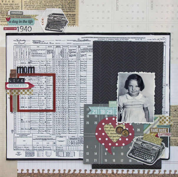
Mom in 1940 by Brenda Becknell | Supplies: Patterned paper: Simple Stories; Stickers: Simple Stories, Rebecca Sower; Rubons: Fancy Pants; Frame: Basic Grey; Wooden letters: Studio Calico; Other: gold washi tape, gold metallic dots
Heather Awsumb says, “This page is my response to a ‘Five Things’ challenge at Designer Digitals, documenting my five favorites in five different categories.”
“I thought the typewriter was a good motif for a layout about lists. I used a typewriter sticker as a focal point for the title and typewriter key alpha for the sub-titles to reinforce the motif. I used a typewriter sticker, typewriter patterned paper and an alpha shaped as typewriter keys. I used the ‘Cut Out Like Me’ shadow styles by One Little Bird Designs to create the look of the cutout circles.”
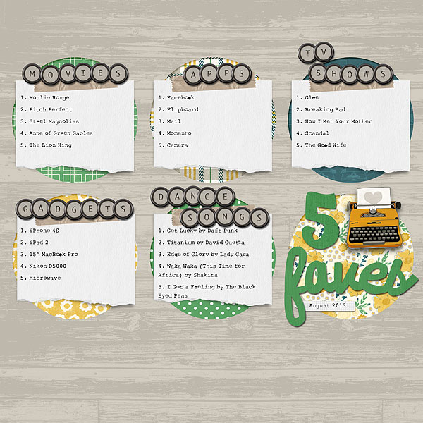
5 Faves by Heather Awsumb | Supplies: Up to Date by Jen Allyson and Gennifer Bursett; Curled Journal Spots No 6 by Katie Pertiet; Fancy Alpha by Jacque Larsen.
Amanda Robinson says, “This page tells the story of how, despite my love of writing, I struggle to write for my blog.”
“I used my vintage typewriter to tell my story and supported it with two typewriter embellishments. I wanted the story to be the focus of my page so used the typewriters to bring focus to the journaling rather then the photograph. I used a wooden typewriter embellishment from Prima, a dimensional sticker from Teresa Collins Designs, and my vintage typewriter.”

Be True by Amanda Robinson | Supplies: Cardstock – Bazzill Basics; Patterned Paper – My Mind’s Eye, Teresa Collins Designs; Wooden embellishment – Prima; Stickers – Teresa Collins Designs; Punch – Martha Stewart; Die-cut – Crate Paper; Other – Washi Tape, Vintage typewriter, Vintage book pages, sequins, paperclip.

