Frida Kahlo’s personal style, art, and attitude all provide scrapbooking ideas for design, motif, topics, and more.
Last November, Frida Kahlo’s entire clothing collection, which had been locked away for almost 50 years, went on display in the Frida Kahlo Museum in Mexico City with the exhibit Appearances Can Be Deceiving: The Dresses of Frida Kahlo. See exhibit image: Meseo Frida Kahlo and Vogue cover: Frida Kahlo on the cover of Vogue, October 2012
Her jewelry, shoes, colorful dresses, shirts and skirts are all on display. At the same time, Kahlo was featured on the cover of Vogue and several fashion magazines produced Kahlo-inspired editorials.
Kahlo has long been a source of inspiration for artists and journalers. This month, several of us at Get It Scrapped took the challenge to take inspiration from her style and her art for our scrapbook pages. Ideas on Pinterest for your own inspiration.
take inspiration from Frida’s attitude and spirituality
Michelle Hernandez says, “I’ll never forget when I first encountered Frida’s work in a classroom of a teacher I admired in high school. I thought the work grotesque and disturbing and said so. Annoyed, the teacher asked me to do more research and I did- falling in love with the painfully honest portrayals of her inner life.”
“I used one of my favorite Frida quotes here. It’s long so I’ll just say she’s reminding fellow artists that we are not alone in our wackyness. I included two Sacred Heart Milagros–metal charms used in some areas of Mexico to enable miraculous cures or solutions to a specific problem. The supplicant adds their metal charm to a wall designated for that purpose and prays for a cure to their leg injury or better health for their farm animal. I think the charms are gorgeous so I collect them and add them to pages every once in a while.”
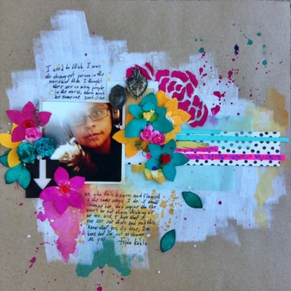
Untitled by Michelle Hernandez | Supplies: Cardstock: Aerican Crafts; Flowers: Prima; Chipboard: Scrap FXS; Mist: Dylusions Ink; Other: Charms, Gesso.
take inspiration from Kahlo’s personal style
Kiki Kougioumtzi says, “My daughter likes to wear lots of bracelets (with lots of charms on them) on her wrists and ankles and loves to have her nails colored. On this layout I talk about when (during school vacation) and why (allowing her the freedom to express and develop her personality) I let her do it.”
“For the page I took inspiration from Frida Kahlo: from her dress style (layers of clothes, bold colors, statement flowers, charms) and from the motifs in her surrealistic artwork (eye, cages, pins, flowers). I’ve spread all those elements around my page and made a shelf for my photos with charms hanging from it.”
“Finally, by using Kahlo’s symbolistic language, I made my title, replacing the word ‘heart’ with a heart embellishment.”
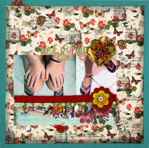
Her gypsy heart by Kiki Kougioumtzi | Supplies:Cardstock:Canson;Patterned papers:DCWV, Prima;Alphas:Basic Grey;Other Ranger Distress & Alcohol inks, Pink Paislee Arisan elements frames, various acrylic and metallic charms,pins,flowers.
Debbie Hodge says, “This page is about several things: an odd coat, my son’s wearing of it as an expression of himself, and love. He wore this Bulgarian Air Force coat last year way too much for my liking–but he has loved wearing it. When we set out to take a few possible senior photo shots, I told him to change and he came down with THE COAT. I wailed that he wasn’t wearing it, and Emily said she’d wear it. I love these shots of the two of them and of my youngest son jumping in to be a part of the hugging action.”
“Because Frida Kahlo has such a strong, independent sense of style, I wanted to incorporate inspiration from her style of dress with these photos (about a coat and about love and about these strong-minded and lovely teens). Looking through photos of Kahlo and her art I was drawn to the decorative headpieces and floral arrangements she wore. I liked their curve and the way they topped her body off so elegantly. I layered leaves with buttons, flowers, and decorative flair to make a curved cluster that felt celebratory and triumphant.”
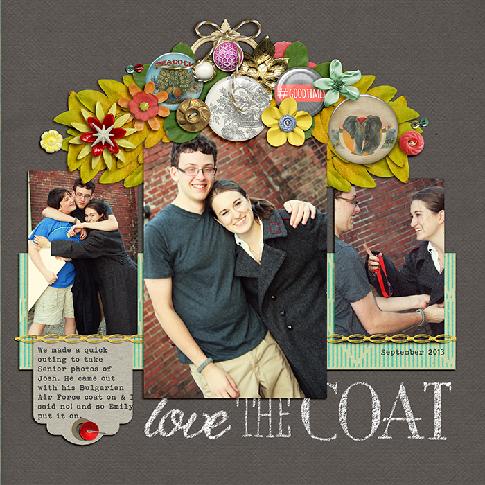
Love the Coat | Supplies: Aztek Summer by Sahlin Studio; Flair Boxes by Paula Kesselring; Chalkboard Alphas by Katie Pertiet; Dandelion Wishes by Mye de Leon; Remember, Happy Hipster by Amy Wolff; Read by Pixel Gypsy; Built for Two by Allison Pennington; Office Space by Gennifer Bursett; Anywhere Flair by Karla Dudley; Artplay Fall by Anna Aspnes; Stapled Sequins by Kim Jensen; Inspired by Frida Kahlo’; Bohemian Typewriter font
use the colors, patterns, and motifs of Kahlo
Sue Althouse says, “This page is about being in the right place at the right time to capture a great photo.”
“I was inspired by Frida Kahlo’s motifs and colors. Her use of bold florals, mosaic patterns, and the vibrant colors of Mexico are all incorporated into my layout.”
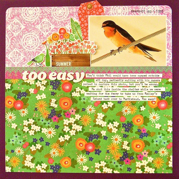
Too Easy by Sue Althouse | Supplies: Cardstock: Bazzill; Patterned Paper: Little Yellow Bicycle, Pebbles; Alphabets: American Crafts; Date Stamp: Amy Tangerine; Ink: Hero Arts; Stickers, Tags: Pebbles; Staples: Tim Holtz; Typewriter: Remington
Anja de Dobbelaere says, “I took this picture of my daughter one summer evening on a walk nearby our house. I thought it matched perfectly with the Frida Kahlo style I was going for because of the dramatic feel to the picture and the pink t-shirt my daughter was wearing.”
“To enhance the ‘dramatic’ mood, I used a Photoshop Hue/Saturation adjustment layer on the picture and chose the option ‘increase saturation more,’ then lowered the opacity to 80%.”
“I felt inspired by the exotic foliage and flowers that Frida Kahlo has used in her paintings so often (and the exotic bright colors). I went through all my scrapbook material to find vintage images from flowers and foliage. It seems I had quite a lot of them (see credits). I added three parrots as well, because Frida has often painted parrots in her self portraits.”

Untitled by Anja de Dobbelaere | Supplies: Pink Reptile Designs: Chatterbox; Viva Artistry: Pauls Island, Fairtytale-Virtuous, Fairytale-Love, L’Eté; Itkupilli: Funderful, Souvenirs d’Epoque, La Vie Bohème, Feminin; Paula Kesselring: Summer Garden, Butterfly Fly Away; Mye De Leon: La Bohème; The Graphics Fairy: two parrots on a branch (left)
use flowers like Frida might
Amanda Robinson says “I recently took a trip to a botanical garden and I created this page with one of the photos I took that day.”
“I took my inspiration, mostly, from Kahlo’s personal style. Something that sticks in my mind about her is how she wore bright clusters of pink flowers in her hair. I used a floral photo and surrounded it with flowers, keeping my background neutral to accentuate the colorful focal point.”

Splash by Amanda Robinson | Supplies: Alpha stickers – Fancy Pants Designs; Cardstock – Bazzill Basics; Flowers – Prima, Making Memories, Pink Paislee; Other – Buttons, Lace and ribbon scraps, acrylic paint.
Michelle Houghton says, “These photos are from our family trip to Hawaii and showcase the quiet beauty in the evenings. After looking at the inspiration board that Get it Scrapped gathered for Frida Kahlo, the stunning bands of flowers Kahlo were in her hair stuck me. Culturally I have taken the floral look out of context, but I felt the bright flower band suited the feel of the Hawaiian islands as well.

Aloha by Michelle Houghton | Supplies: cardstock; Bazzill Basics, ink and Gelatos; Faber Castell, letters; American Crafts, pearls and gems; Queen and Co., tissue unknown
add drama to the everyday
Amy Kingsford says, “This is picture of the sun setting over Salt Lake City that I snapped on our way back from a day trip with my family.”
“I’m a huge fan of Frida Kahlo, and I suppose the one thing that I am most drawn to is the drama she brings to everyday life. Though the images she paints start out as ordinary–flowers, fruits, people (including herself), she uses bold colors and exaggerated motifs to really bring the subjects of her paintings to life. And that is what I tried to accomplish here. I took this photo of the sun setting over our city’s oil refinery and exaggerated its colors on my page. I accented the photo with a scatter of beautiful flowers and butterflies–attempting to transform the somewhat ordinary setting into a scene that was almost surreal.
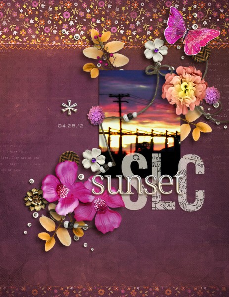
SLC Sunset by Amy Kingsford | Supplies: Vinnie Pearce: Lotus Sunset; Pixels and Company: Free Love and Homebody Collabs; Mye de Leon: The Good Stuff: This Week Alpha; Creashens: i love Alpha.
explore self-portraiture
Lise Mariann Alsli says, “This is a picture of me when I was 16 years old, taken the day after I met my future husband whom I have now been in love with for almost 17 years. You can see it by the grin on my face. I have this sweet secret!”
“Frida Kahlo is a great artist, and I love the way she pours her feelings onto the canvas. When I looked through some of her artwork online, I noticed that she often painted self portraits and used lots of flowers and feelings. So I started looking for a picture that I could use this way. And when I found the 16-year-old-me-in-love picture, I knew which piece of her artwork would inspire me most.”
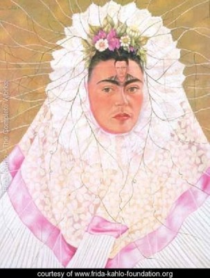
Diego on My Mind by Frida Kaho. Source: Frida Kahlo Foundation
“The painting “Diego on my mind” shows a woman in a circle of clothing surrounded by whites and pinks with flowers in her. The result of my inspiration is my own ‘self portrait’ surrounded by white and pink and flowers. And I know that I had my Tor Erik in my mind.”
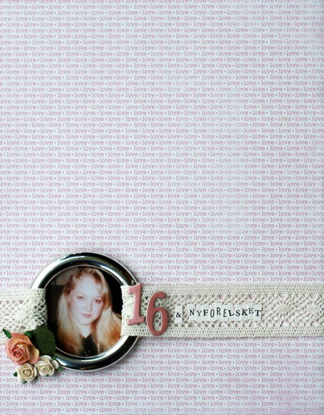
6 and in love by Lise Mariann Alsli | Supplies: Patterned paper: Unknown maker; Alphabets: Making memories, American Crafts; Embellishments: Metallic plastic ring from a curtain hanger, lace, Prima – roses and leaves.
take inspiration from Kahlo’s words and life
Rosann Santos-Elliott says, “I have been a long-time admirer of Frida Kahlo’s art and history. She always dreamed of having a child and she often used flowers and butterflies in her self portraits. On this layout, I used a photo from my maternity shoot that reminded me of Frida’s struggle and how fortunate I am to be able to have had a child.”
“I used a blue background to represent the Blue House, her house, which is now a museum. The use of butterflies was also inspired by Frida’s art. Her sick bed had a painting of butterflies on the canopy so that she could watch them when she was lying down during her recovery. They were a symbol of resurrection for her.”
“I was inspired by the fact that she pretty much invented the ‘selfie,’ except she didn’t use a camera. She used paint and canvas. She was very self aware and most of her art is of her. You can check out some of my inspiration on my blog. The journaling is a quote by Frida: ‘I used to think I was the strangest person in the world but then I thought there are so many people in the world, there must be someone just like me who feels bizarre and flawed in the same ways I do. I would imagine her and imagine that she must be out there thinking of me too. Well,I hope that if you are out there and read this and know that, yes, it’s true I’m here, and I’m just as strange as you.'”
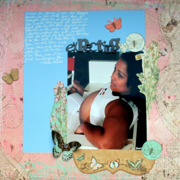
Expecting by Rosann Santos-Elliott | Supplies: Bo Bunny: Gabrielle Cut Outs; Prima Marketing Inc: Flights of Fancy Collection; American Crafts Thickers: Flakey
use symbolic images
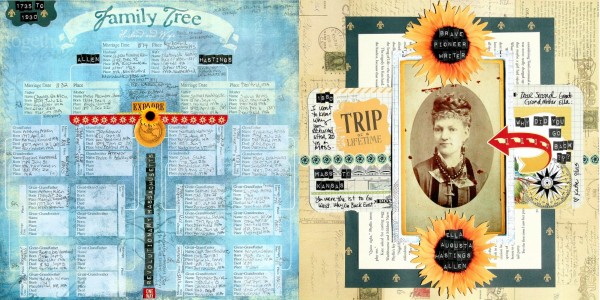
Katie Scott says, “I wonder about the choices of my second great-grandmother who traveled west but then returned to New England, which I recorded in this page. This great-grandmother was a journalist for a women’s magazine in 1880 at a time when I don’t think a lot of women worked as writers, so this also reminded me of Frida who was a female artist in a time when there weren’t a lot of women artists.”
Frida Kahlo also used images from her life in her artwork, and Katie used appropriately symbolic images on this page. She says, “I included large sunflower embellishments to represent my second great-grandmother’s trip to Kansas and the story she wrote about her daughter as a small girl titled ‘My Kansas Sunflower.’ I also incorporated images of exploration like a globe, compass and a ‘U turn’ arrow to signify Ella’s trip west and then back east.”

