 The Get It Scrapped Creative Team shares scrapbooking ideas and techniques for adding chalkboard looks to your projects here.
The look of an old fashioned blackboard with elaborately lettered words appeals both to the ongoing interest of consumers in nostaligic/retro packaging/design and the trend toward personalization (see monograms and gallery walls).
use tracing paper backed with chalk to transfer hand lettering
Michelle Houghton says, “This is probably my favorite recent photo of my girls, and it was taken right after the first day of school.”
“I decided I wanted to create my own chalkboard elements for this page so I used chalkboard paint and chalkboard tape to write my title, journaling, and the two small flags on the page. For the title and journaling I painted directly onto my Kraft cardstock and then used both chalk and a paint pen to get the chalky look with bright white lines. On the flags I used two different types of ink to achieve a similar look.”
Tip: “For my titlework, I used tracing paper to first draw my title, then covered the back of the paper with white chalk, lined it up on my layout right-side up and went over my lines with a regular pencil. The chalk transfers onto the page and I can ink right over the top. Also if you are working only in chalk you might consider using a spray fixative to keep the chalk from moving and getting on other elements. Hairspray like Aquanet works equally as well.”
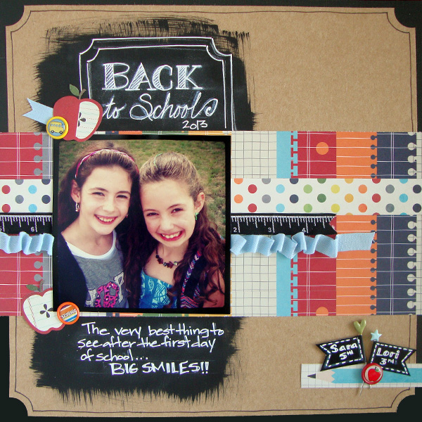
Back to School by Michelle Houghton | Supplies: cardstock; Kraft and Core’dinations, patterned paper and chalkboard tape; Fancy Pants, chalkboard paint; Americana, chalk; General’s, ink; Ranger and Sharpie, brads;Stemma, trims and stick pins; unknown
erase and rewrite chalk for authentic look
Marie-Pierre Capistran says, “On this page I talk about my experience as a French teacher. I had lots of stories to tell about some kids I taught and about the general experience as a teacher of children who come from countries where they can’t live anymore because it’s too dangerous to and the conditions are unbearable.”
“To give the feel of a classroom, I used black cardstock painted with black chalkboard paint. I then wrote on my paper with a white chalk. I wrote down things that I was writing during my classes like the date at the top and sentences with verbs and nouns, etc. I erased and rewrote different things a couple of times. I wanted my paper to have the feel of a real chalkboard in a classroom when class in over.”
“When I was done I assembled my pictures. I wanted a lot of pictures. I wanted to show my whole groups and also some special occasions and some of my favorite students – although I know we are not supposed to have favorite students, these are MY pages and I felt free to say the truth out loud! I wrote the day and date at the top left and started writing down my stories, drawing little arrows to show the students I was relating to in the stories. I also wrote, on the side of the pictures, little comments about the pictures, like the names of the students and what/where it was.”
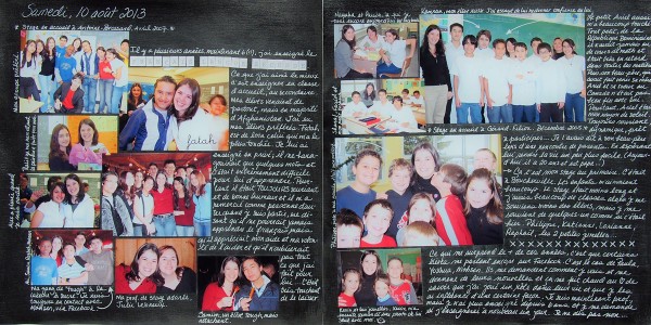
Teaching French as a second language by Marie-Pierre Capistran | Supplies: Carstock: Stampin’UP!, Letter stickers: Authentique; Rub-ons: Doodlebug, American Crafts; White pen: Sakura; Chalkboard paint: Martha Stewart; Others: chalk.
use bright colors with chalkboard elements
Katie Scott syas, “For me, the beginning of September is always a time of wiping the slate clean and making new resolutions and goals.”
“I used a chalkboard patterned paper from Glitz Design. I liked the way the chalkboard background looked like it was recently erased. It reminds me of back-to-school and was perfect for my thoughts on September being a time of reinvention. I really liked the way the bright colors of the embellishments looked against the chalkboard.
Tip: “Try bright colors with your chalkboard elements and products for high contrast.”
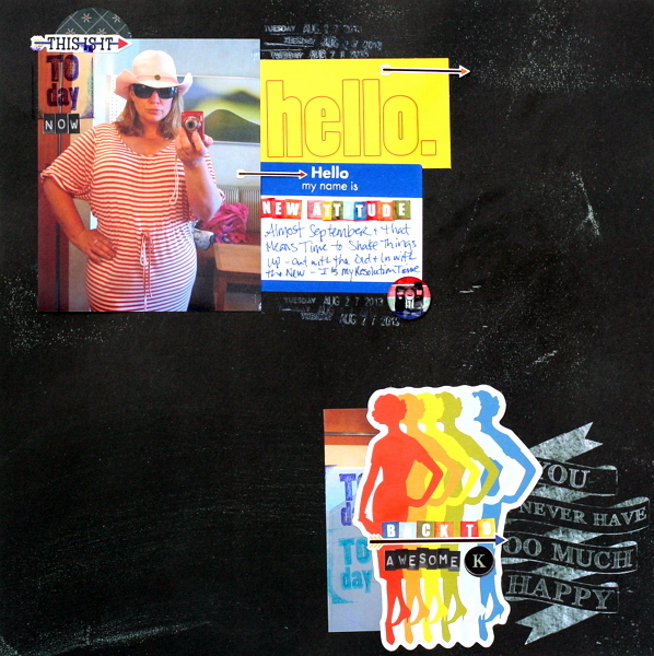
Back to Awesome by Katie Scott | Supplies: Glitz Design: patterned paper, letters, stickers and embellishments; American Crafts: date stamp.
use chalkboard-style fonts on digital pages
Tara McKernin says, “This layout is a simple start to my son’s school album. He has just started school so this is the beginning of many many more layouts to come.”
“I went with a chalkboard paper and some chalkboard styled fonts. I liked the idea of using that theme of product because it was a school based layout. Although now in the classrooms they use whiteboards not chalk. I still love that vintage school theme without being overly school based. I totally recommend playing around with the fonts you chose. There are so many great ones out there now, there are even brushes you can get that copy the beautiful chalk handwork we see now. It’s totally a fun concept so play.”
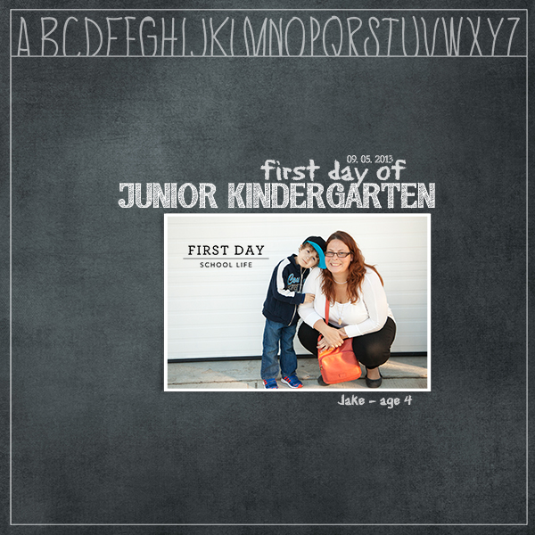
Jake’s First Day by Tara McKernin | Supplies: Chalk it up basic no.2 Katie Pertiet, Back to School Overlays from Ali Edwards, School Life No.1 from Cathy Zielske, font eraser dust, ariapenciroman and CK dots.
Terry Billman says, “My husband is an eighth grade history teacher and coach. This year, his eighth graders formed a team and walked in the Relay for Life in honor of Craig. Craig speaks freely with his students about his battle with cancer.”
“It seemed fitting, since Craig is a teacher, to use Katie’s Chalkboard paper behind the photograph. I downloaded a chalk font, Eraser, for the title of the page and placed it behind the journaling on the chalkboard paper. The chalkboard sentiments reflect the feelings of the kids.”
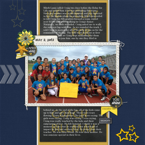
We Relay for Coach Billman created by Terry Billman| Maplebrook Studios: Just Linens 30, Just Linens 10, Just Linens 7, Stems of 3 Stars, Clear Thru Arrows No. 1; Katie Pertiet: Chalk it Up Basics No. 3, Stitched Up Frames 5, Chalkboard Dots No. 1; Anna Aspnes: Word Label Template 3, Taped Stripy 1; Gretchen Thomas: All Heart Brushes; E. Marta: You’re Amazing Flower
heat emboss with white powder
Kiki Kougioumtzi says, “This layout talks about the reasons I quit my university studies.”
“To incorporate the chalkboard trend was a perfect fit. To achieve the look I heat embossed the title with white embossing powder. When it dried completely I used white chalk ink over it.First I just went over the stamped words and then, using a wet babywipe, I took off the excess ink and spread it around the words a little to reproduce the white ‘wash’ left on a real chalkboard.”

Not meant to happen by Kiki Kougioumtzi|Supplies:Cardstock:DCWV;Stamps:American Crafts,Rico Design,Hampton Art;Ink:Tsukineko Versmark & VersaMagic;Other:Stampendous embossing powder,Echo Park pattern paper,Studio Calico printable labels,Fiskars paper punch.
add subtle white brushwork behind chalkboard fonts on digital pages
Carrie Arick says, “It’s pretty rare for my son to visit a doctor, let alone the emergency room, so when we had to take him last month, I brought my camera along in order to capture the experience.”
“My two favorite elements of the chalkboard trend are the cool and the high contrast of a dark background and light text. I knew that’s what I wanted on this page as it helps tell the story of pain and relief. I used a dark, lightly textured background then added my title and journaling in pure white. To help give the chalkboard feel, I created a new layer and added some brush work behind my text. I reduced the opacity of the brush layer until it was barely visible. I also ran the eraser tool at set 30% opacity, hardness and density, to reduce any hard lines on the title font. I repeated this with the splatter to keep the page harmonious. The quick tweaking creates a more authentic chalkboard texture on the page.”
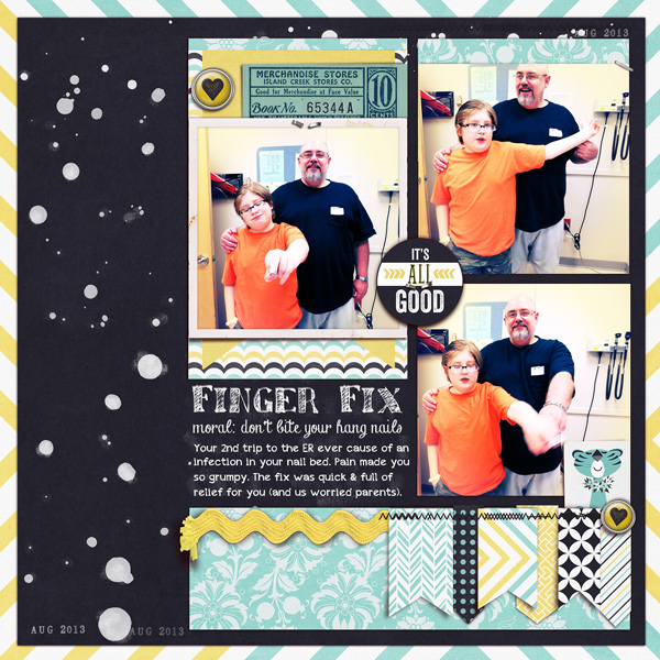
Finger Fix by Carrie Arick | Supplies: Penny Springmann The Little Things; Just Jaimee: Never Enough Splatter; Fonts: Sketchy, Chalk-Hand Lettering Shaded (demo), Appleberry
get the chalkboard look with black distress ink
Kristy T says, “This layout is about my son enjoying an ice cream while we were on holidays.”
“To create my chalkboard background I swiped Black Soot Distress Paint over some white card and left it to dry before writing part of my title in chalk. The chalk can be wiped away with a baby wipe if a mistake is made as but it is important not to brush the wipe across the unpainted card stock. I also added some chalk wash tape to be part of the ‘shelf’ for my photo to sit on.”
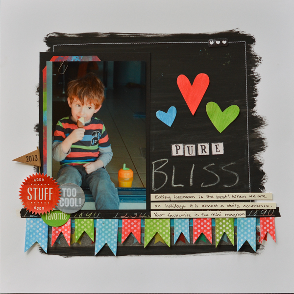
Pure Bliss by Kristy T | Supplies : Card: Artee; Distress Paint: Ranger; Template: Heidi Swapp; Flag: Maya Road; Ink: Archival; Stamp: Elle’s Studio; Alphas: Carolee Adorn-It; Chalk Tape: Unknown; Washi Tape: My Minds Eye; Stickers: Echo Park; Embellishments: Elle’s Studio; Chalk
die cut shapes from chalkboard-look paper
Ashley Horton says, “We are lucky enough to live close to the water, and it’s always such a beautiful and relaxing place to take in the scenery.”
“I used several print and cut files and part of a piece of patterned paper from the Glitz Design Uncharted Waters collection to add a chalkboard element to my layout. I didn’t want to use the chalkboard trend in a typical way, so I paired the wood grain and polka dot patterns to get a fun look. It’s always fun to think outside the box when you are using themed elements on your projects.”
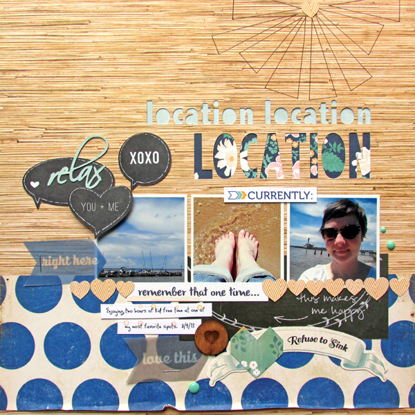
Location, Location, Location – by Ashley Horton | Supplies: Patterned Paper: Amy Tangerine, Crate Paper, Glitz Design & Carta Bella; Vellum & Tags: Elle’s Studio; Stamp & Mask: The Paper Bakery; Enamel Dots: My Minds Eye; Font: Scriptina; Print & Cut Files: Silhouette America; Wood Veneer: Studio Calico

