 Arranging and placing your scrapbook layout elements to create variations in density and cluster size is a way to create tension in some spots and release in others. (Check out more multi-cluster pages.) Do this with an eye toward using this variations to create emphasis and flow on the page. (Want to learn more about Tension in design? Check out the Masterful Scrapbook Design Tension class.)
Think about looking at a crowd — at the beach or the market or a party. There will be differently sized groupings. The members of some groups will be closer to one another than those in others. What’s more, the groupings themselves will be spread out from one another. You’ll know who is together and how close their relationships are by both proximities and distances.
See how our Creative Team designs groupings that use a rhythm of snuggling some pieces and separating others.
Amanda Robinson says, “I often find my cats snuggled together in identical poses and this page documents one of these occasions. I used several circular elements to echo this pose. By grouping my elements in three distinct areas I guide the eye from top left, through the focal point and out of the bottom right of the page. In each ‘snuggled’ group I have used similar items to ensure the page still feels unified despite the separated clusters.”
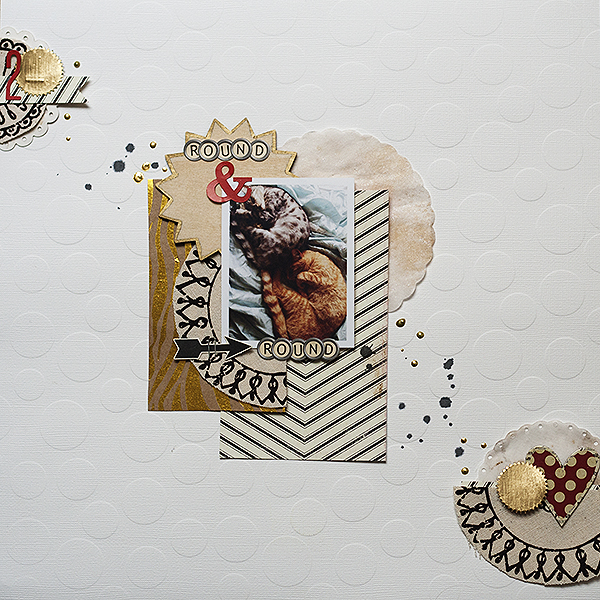
Round & Round by Amanda Robinson | Supplies: Patterned Paper – Crate Paper, SEI; Canvas – SEI; Cardstock – Bazzill Basics; Alpha stickers – October Afternoon, Echo Park Paper; Filter paper shapes – Fancy Pants Designs; Chipboard Heart – Ruby Rock-it; Other – Gold paint pen, acrylic paint.
Audrey Tan says, “This page is about my boys, being a brother to each other. I used hexagons in 3 distinct spots and in various quantities. This was further emphasized by the number of embellishments in each section.”

My Buddy And Me by Audrey Tan | Supplies:Traci Reed & Meghan Mullens: One Of The Guys, Slipins 9 Hexagons, Anna Aspnes: 10 Things 2 Heart, Font: Pea Charlee
Sian Fair says, “When we arrived at the Winter Palace museum, I busied myself getting my camera out of its bag, fiddling with the dials, and then I looked round and saw that my daughter had simply steadied herself on her Dad’s shoulder and started snapping. She has some beautiful pictures! I scrapbooked my photo with three clusters of varying sizes, with the biggest holding the key components of my page.”
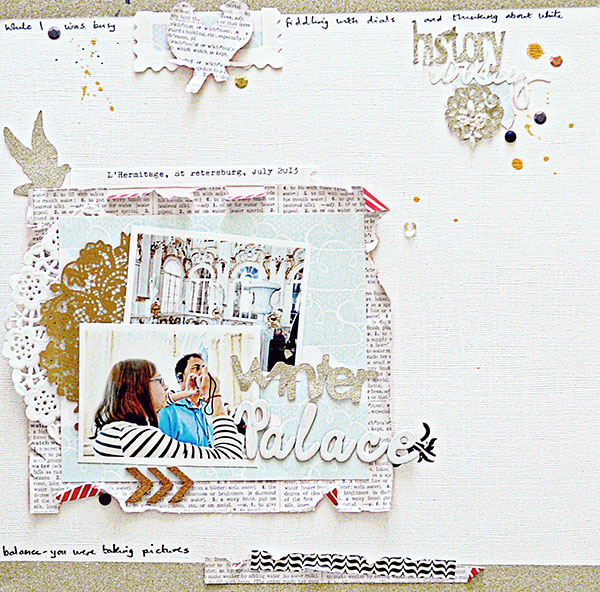
Winter Palace by Sian Fair | Supplies: Patterned Paper: American Crafts and Echo Park; Alphas: American Crafts; Embellishments: Pearls: Prima; Stickers: Jillibean Soup; Ink: October Afternoon; Doily Punch: Martha Stewart
Anja de Dobbelaere says, “The picture was taken during our trip to France last Summer, in the town of Figeac, where we were going for a torch walk with a guide through the medieval heart of the city. I love these sort of medieval streets and alleys! There is something so romantic about them.”
“Creating clustered groupings is something I often do on my pages, sometimes without even knowing it. It adds to the balance and tension on the page. The groups of elements were placed in a sort of triangle, and the smaller groups lead to the picture and the grouping there. By having ‘three’ areas of elements grouped together, the page also gets a ‘white’ space area.”
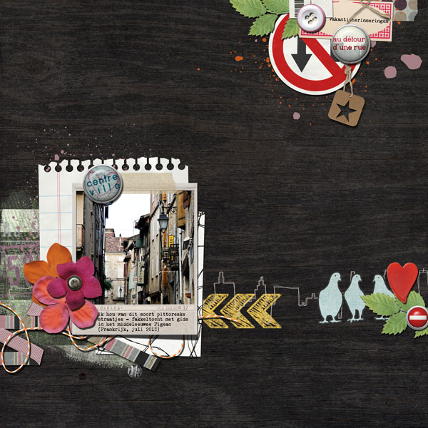
Centre Ville by Anja de Dobbelaere | Supplies: Pink Reptile Designs + Nini Goes Digi collab Downtown.
Brenda Becknell says, “I snapped these photos of my grandson with his messy blue face after he tried his first snow cone this summer.”
“My photos are grouped in the lower left corner of the page, along with some stickers, stickpins and twine, while more stickers and journaling block were grouped in the top right corner. The title on the journaling block, along with the “Memories” sticker combine to capture the feel of the page, so I didn’t add a separate title. To add dimension to the embellishment clusters, I attached some stickers with foam adhesive squares. I added faux stitching with a pen.”
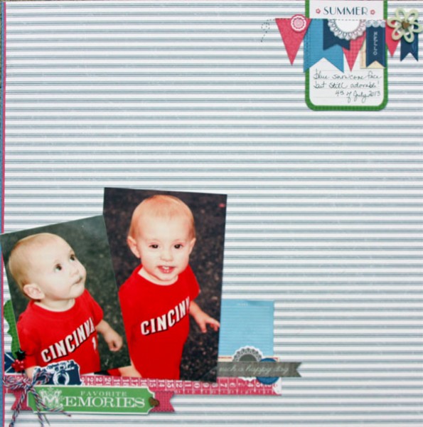
Summer Memories by Brenda Becknell | Supplies: Patterned paper: Little Yellow Bicycle; Stickers: Little Yellow Bicycle, My Mind’s Eye; Felt flower: Buttons Galore & More; Chipboard Hearts: Um Wow; Twine: Divine Twine; Stickpins: Little Yellow Bicycle
Deborah Wagner says, “These are photos of my two lovely nieces. I scrapbooked two separate groupings, one holding my photos and the other my title. The larger cluster holds the photos and adds weight and texture. The second cluster bleeds off the top of the page, holds the title, and is visually lighter. All of the elements within each cluster overlap or connect except for the balloon and the bird. In real life, they would be free-floating, too. It unites the 2 groupings while adding unexpected contrast.”
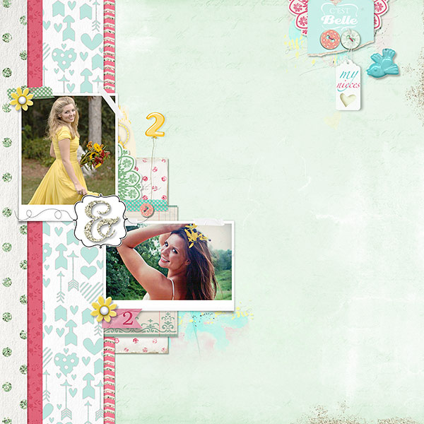
My Nieces by Deborah Wagner. Supplies: Katie Pertiet Photo Clusters No. 36, Winter Peony Kit, Color my Love Paper Pack, Crowning Affair Vibrant Kit, Color Study Clusters: Yellow, Collageable Notions No. 1, Summer Splendor Paper Pack, Lifelines Kit, Catana Kit, Assorted Patterned Tapes Dots, Little Plastic Flowers, Awarded Alpha No. 3, Birthday Balloons, Art Inspiration 3-9-13; Lynn Grieveson Worn Edges Mixed, Button Cards, Cassie Jones Bending Shadows
Katie Scott says, “The on-board cruise photos of our family were particularly cheesy and made us all laugh. I’ve snuggled the photos along with cruise-themed embellishments like cameras, anchors, themed rub-ons, and buttons (as in cute-as-a-button). The purpose of this page was to highlight these funny cruise photos in a light hearted way.”
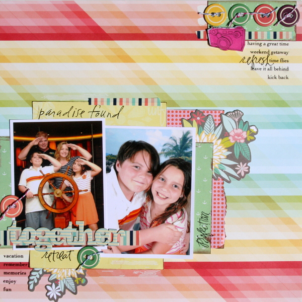
Cheesy Cruise Photos by Katie Scott | Supplies: Making Memories and Basic Grey rub-ons; Studio calico, Glitz, and American Crafts patterned papers; American Crafts embellishments; Cosmo Cricket chipboard embellishments; twine; ink.
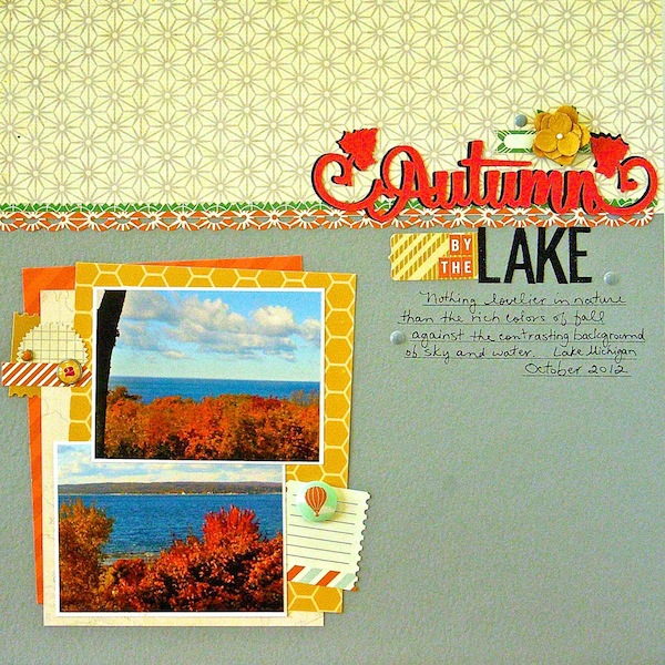
Sue Althouse says, “This page is about the breathtaking fall colors along the shores of Lake Michigan. The larger block of photos is snuggled in the lower left hand corner of the page. A slightly smaller grouping on the right contains the title and journaling. The two clusters are united by a visual triangle of embellishments.”

