 Any photo, title, or embellishment you add to a scrapbook layout is seen as a part of the whole page before it is seen as an individual piece.
Place the photo just a bit to the right and above center on your canvas and the eye will see it as “restless” and wanting to either return to center or move farther away. Perceptual forces (described wonderfully by Rudolf Arnheim) cause this.
Accordingly, the placement of your photo on a square canvas will trigger different visual forces than the placement of it on a square canvas. Some rectangles even have “golden” possibilities.

Image Source: Wikipedia
The ratio of 1 to 1.618 is referred to as the “golden ratio.” You can find this ratio occurring in nature, art and architecture. Ancient Greek and Egyptian artists and architects understood that elements incorporating this ratio are pleasing to the eye.
This illustration shows the “golden spiral.” It begins with a large landscape-oriented rectangle with a height-to-width ratio of 1 to 1.618. When a line is drawn to define a square within this rectangle, a new rectangle is also defined–a rectangle with the same “golden” proportions as the first (but this one has a portrait orientation). As each rectangle is divided into a smaller square and rectangle, successive division points lie on a logarithmic spiral as shown. This is the very spiral present in so many aspects of nature, including the shell of a nautilus.
Want to learn more?
- Check out TENSION at Masterful Scrapbook Design (we’re talking about both perceptual and narrative tension).
- Check out Scrapbook Coach IN A BLOCK (lesson #2 tackles the “golden ratio” and walks you through building a foundation with those golden measurements on a square canvas).
- Check out our creative team’s layouts working with a rectangle on a square below.
Carrie Arick says, “Since my birthday is coming up I decided to record the things I have loved this past year.”
“A rectangle-on-a-square design is a great way to keep the parts of a page organized and to control the flow in a comfortable way even when you’re using a bold or high contrast color palette. I placed the embellishment clusters, journaling, and title strategically in the compartments of a rectangle with golden ration proportions to lead the eye through the page. I let portions of the clusters hang off the rectangle to keep the page from being too static. I also used the scatter to suggest the logarithmic spiral of the
golden ratio. While there’s a lot of intense color on my page and lots of movement, it’s not overwhelming thanks to the order this “golden” design brings.
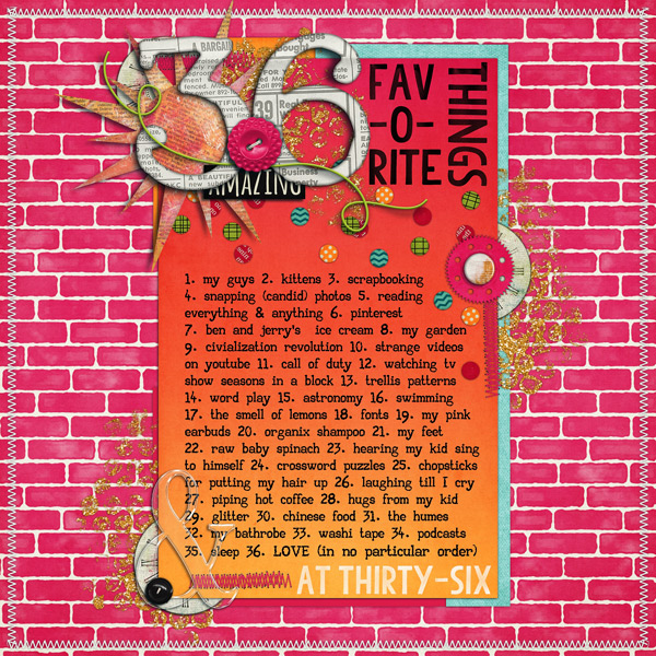
36 Fav-o-rite Things by Carrie Arick | Supplies: Libby Pritchett: Be Awesome; Tracy Martin: Wild & Free (stitched border); Fonts: Jelly, AA Typewriter
Celeste Smith says, “This page is about my boys’ enthusiasm for the beach.” When working with a rectangle on a square, Celeste suggests the following for making a well-designed and dynamic page.
- Break borders on the edges. In this case a few of my elements hang off the sides.
- Use multiple papers to create your rectangle.
- Add some edges at the top and bottom of your page to keep the eye from moving off the page.
- Use some paint or splatted on the top left and bottom right to create diagonal flow.
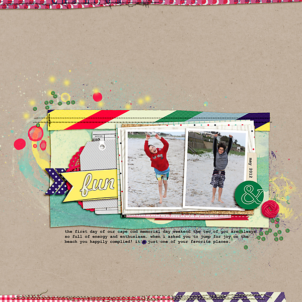
Fun by Celeste Smith | Supplies: Re Kniepp: Hey Summer papers and elements; Pink Reptile Designs: Chatterbox papers and elements; Paislee Press: His & Hers paper and elements; One Little Bird: CArson park papers and elements; Emily Merritt: Free journal cards; Allison Pennington: Built for Two papers and elements; Little Butterfly Wings: Lemonade Stand papers and elements; Val Wibbens: Sprinkles V15; Robyn Meierotto: Cut It Out Clipping Masks; Underwood Champion font.
Susanne Brauer says, “This page is about what protective parents we were when our son was little. The example of this is that we bundled him up for the cold weather, and we still do that now.”
“I kept the design principle of the golden ratio (learn about it in Scrapbook Coach) in mind here, but I did not measure the pieces, instead fitting them by eye. First I split the page into two sections, and then I tried to echo that proportion again with my photo block and my journal block. That left an obvious place for the title in the snow white space. I included photos of my son and a snowman waiting for the snow to fall with frames. One frame is a square and the other is a smaller rectangle–a repetition of the two shapes.
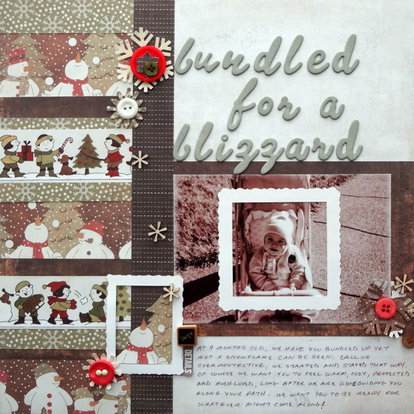
Bundled for a Blizzard by Susanne Brauer | Supplies: Paper Loft Slug Bug paper, American Crafts Thickers, Versamagic Chalk Ink, K & Company Frame Stickers, Stampin Up snowflake punches, Studio Calico wood veneer and buttons/brads from stash.
Katie Scott says, “My parents divorced when I was five years old, and my childhood was, thereafter, chaotic. I couldn’t wait to become an adult so I could make my own decisions. This page loosely follows the “golden ratio” but I’ve scrapbooked outside the lines all over the place. I think the breaking of the rules (or “rebel scrapbooking”) on this layout works because of the subject matter: I was ready to break free and be out on my own, and the elements on the page are similarly ready to break the rules.”

Ready To Be On My Own by Katoe Scott | Supplies: Kaiser Craft, Amy Tangerine, Bella Blvd., My Mind’s Eye, and Heidi Swapp patterned papers; October Afternoon journaling block; American Crafts letter stickers; inked edges, washi tape, sharpie pen.
Heather Awsumb says, “This page documents the things I want to remember about playing Ms. Pennywise in a production of “Urinetown: The Musical” that my community theatre group put on this year.
“I started with inspiration from Building Pages and used the principle of “gestalt” to build an imprecise rectangle of several combined photos. I did end up adding an explicit patterned paper rectangle below the photos. To lessen the effect of so many right angles, I added a circular journaling spot, circular stitching, and the slide reel.”

Playing Ms Pennywise by Heather Awsumb | Supplies: Scratchy Masks No 2, Astro Kit, Away We Go Element Pack, Almost There Element Pack, Label Strips Rainbow No 1 (recolored), Little Layette Kit, Messy Stitched Circles White No 1 by Katie Pertiet; Text Bytes No 26, Brad Bonanza by Patti Knox; Raspberry Sorbet Alpha by Kate Hadfield (recolored); Circle IT Basix No 1 by Anna Aspnes; CU Shimmerz 2 by Studio Flergs.
Sue Althouse says, “This page is about an outdoor concert we attended last Fourth of July.”
“I kept all of the major page elements within the confines of the rectangle and used misting to ground the rectangle to my layered square background. The white title pops against the dark background, while small doses of red bring energy to the page and move the eye around. Just like the singer’s performance, I wanted this layout to be simple, yet elegant.”
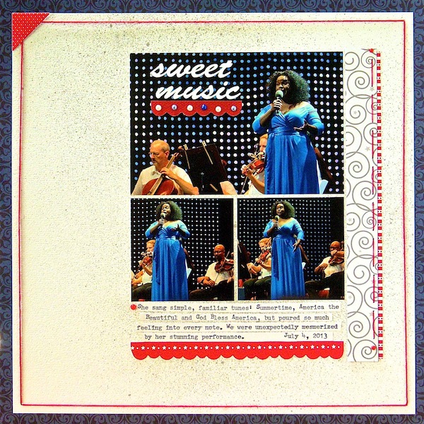
Sweet Music by Sue Althouse | Supplies: Cardstock: Bazzill, We R Memory Keepers; Patterned Paper, Stickers: Bella Blvd.; Border Punch: Fiskars; Alphabets: Silhouette (Brush Script), Remington Typewriter; Mists: Mr. Huey’s; Floss: We R Memory Keepers; Mini Pearls: Doodlebug
Marcia Fortunato says, “This page is about attending my 35-year high school class reunion last month. The only photos I had from the even were ones that friends posted on Facebook. Although the quality was not great, together they tell the story.”
“With so many photos, I decided that a grid design would work well, and I used 2″ x 2″ photos on a 7.5” white square. I based the sizes of my rectangle and the squares within the rectangle loosely on the “golden ratio” with a large square and increasingly smaller square-ish blocks all housed on the large rectangle. The main colors I used for the layout represented our school colors: blue and gold. Since there was a lot of red in the photos, I used that as my accent color. Brown embellishments and gold sparkle add sophistication to a primary-color based scheme.”
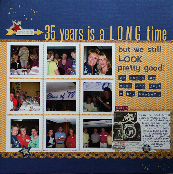
35 Years is a LONG Time by Marcia Fortunato | Supplies: Cardstock: Bazzill; Patterned paper: Basic Grey, American Crafts; Alphabets: Jillibean Soup, Authentique; Embellishments: Simple Stories; Pen: Sharpie pen; Adhesive: American Crafts, Darice; Other: Sizzix/Echo Park star die, Fiskars star punch; American Crafts date stamp.
Brenda Becknell says, “These photos are of my one-year-old grandson enjoying ‘surfing’ in the pool this summer. In keeping with the principle of the golden ratio, the patterned papers are 8″ wide (8×8 for the red and 8×2 for the yellow) against the 12×12″ background cardstock. A line of machine stitching 1/4″ outside the patterned papers helps emphasize the rectangle in a square. I let the photos and the word stickers hang slightly off the edge of the rectangle, to break borders and get a more casual feel to the page.”
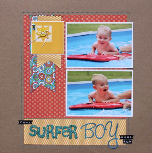
Surfer Boy by Brenda Becknell | Supplies: Cardstock: Hobby Lobby; Patterned Papers: Graphic 45; Alphabet stickers: American Crafts (Thickers) and Basic Grey; Sun and word stickers: Pebbles, Inc; Copic markers
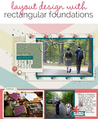
Debbie Hodge says, “These are some quick shots of ‘back to school’ for us. The boys rarely get out of the house with any time to spare, and this first morning was no different. They didn’t want me at the bus stop, and they didn’t have time to pose. So this is what I have: real life!”
“I blocked my square canvas into two parts: a narrow horizontal band at the bottom to hold supporting photos and journaling and a much larger rectangular block that I treat as a ‘canvas within a canvas.’ When I do this, I get to work with designing in a smaller rectangular area rather than in a larger square. This immediately limits my choices and makes getting the page made easier.”
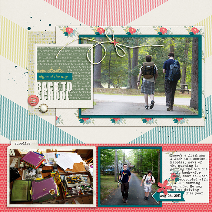
Back to School by Debbie Hodge | Supplies: This and That by One Little Bird; Filed Photo Frames by Katie Pertiet; Flossy Stitches by Katie Pertiet; Impact font
Debbie Hodge says, “Here is a second recent rectangle-on-a-square composition. As I mentioned with the previous page, placing a limit on my work area immediately reduces the number of decisions I have to make and allows me make a page more quickly. Again, once I’ve defined my rectangular foundation, it becomes my ‘canvas within a canvas.'”
“I chose a rectangular foundation for this page because of the photo content. I wanted to emphasize the vertical lines in the photo–the leaning silo behind my son’s upright body–in order to make a page that is about both the place and the play shown in the photo.”
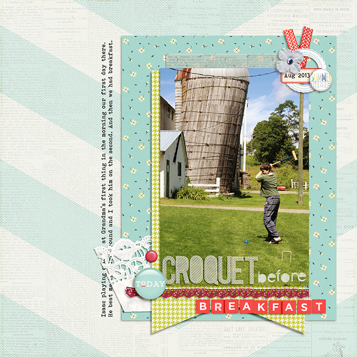
Croquet Before Breakfast by Debbie Hodge | Supplies: Daily Bulletin by One Little Bird; Little Miss Sunshine Alpha by Zoe Pearn; Coconut by Sara Gleason; Peachy Alpha by Karla Dudley; Also a Very Small Alpha by Allison Pennington; Puzzled by Mye de Leon; So Much Joy by Two More Days; Mellow Yellow by Karla Dudley; Snail Mail by Splendid Fiins; Bohemian Typewriter font
[current]

