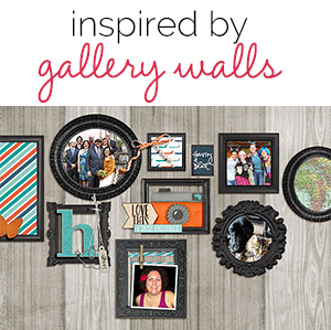
 A great source of scrapbooking ideas are the examples of well-designed “gallery walls” or “photo walls,” that abound on home decor blogs. These gallery walls are appealing examples of how to display a collection of framed images. We asked our creative team to take inspiration from both the design and content of gallery walls.
If you’re looking for gallery-wall design how-tos and ideas for your own projects, check out these pieces and see our scrapbook layouts that put the ideas to work.
- Tips for Installing a Gallery Wall – a Beautiful Mess
- A Gallery Wall for Every Personality – Houzz
- DIY How to Make the Perfect Gallery Wall – Refinery 29
- How to Create a Gallery Wall on a Budget – Apartment Therapy
- Get It Scrapped Gallery Wall Pinterest Board – Get It Scrapped on Pinterest
Michelle Houghton says, “I wanted to showcase a collection of pictures that represent what I love most in this life. The Hallmark concept of home is where the heart is gave me the idea to show the viewer what it might look like if you had a glimpse inside my home or, in this case, my heart in the form of a gallery wall.
“I created an artistic wall for my pictures to hang on and then selected photos from past and present of the people I care most about. In order to get photos spanning several decades working together on one layout, I scanned and printed all of them on matte photo paper in black and white.”

Home Is Where The Heart Is by Michelle Houghton | Supplies: cardstock; Kraft, spray mists; Adirondack, ink; Sharpie, gesso; Golden, embroidery floss; unknown
Celeste Smith says, “In order to decide what was going on my gallery wall, I made a short list and then went into my stash and my photos and searched for images on the web to fill in. I decided at the very end to add a short line of journaling just so my boys will know what each item represents–FYI: that striped paper from KI Memories is my favorite patterned paper ever. I have very little paper supply left, yet I still have 4 or 5 whole sheets of this! I went through my digital stash and selected lots and lots of dimensional frames, tagging them so that as I created my wall I could browse loads of framesm and choose just the right one.”
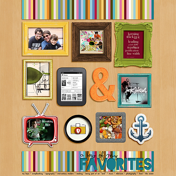
a few of my favorites by Celeste Smith | Supplies: One Little Bird: Stay Tuned; Missy Cato: Epoxy Styles; Mommyish: Life at Sea; Paislee Press: Weekender, Photobooth; Wishing on a Star: Clocks; Juliana Kniepp: Fly Away from Here; Lauren Grier: Easy for You to Say; KI Memories: Colorful; Karla Dudley: Take Note; Just Jaimee: Free Love; Kim Jensen: Grateful; Snips ‘n Snails: Eclectic; Tracy Martin: One Fine Day; Zoe Pearn: Life Helpers; Fonts: Blackout, Soymilk, Futura Thin
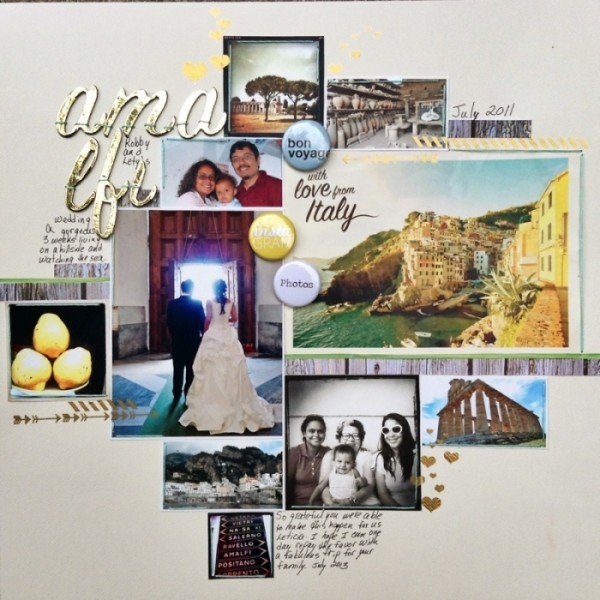
Michelle Hernandez says, “I have a lot of tiny leftover prints from a wedding/vacation project I made for my sister two years ago.The photos are too small to stand on their own but the gallery inspiration was a great theme to bring them all together on one page. Fussy-cutting 10 frames probably would have made more sense but just thinking about the exacting work involved made me tired so I decided to use blue thread to “frame” my gallery. I added a gold title at the last moment to unify the page along with some hearts and borders from Pink Paislee.”
Deborah Wagner says, “This is a page documenting my nephew’s eclectic taste in music. I made many pages for his graduation, but this is the only one he asked to have a printed just for him, and that made me a very happy Auntie!”
“I extracted my nephew from the original photo, and (using a tutorial by Cassie Jones called Gaining Perspective) I made it look as if he was leaning up against his gallery wall. I got most of my images from the web, using blending modes to hide the poor quality.
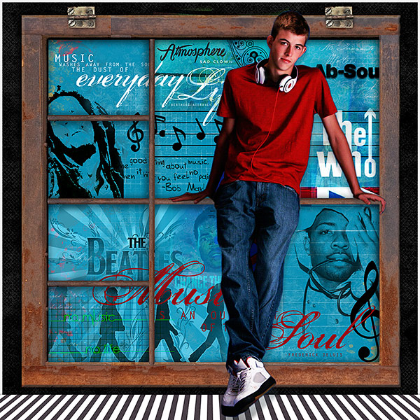
Music Love by Deborah Wagner. Supplies: Katie Pertiet Printers Trays No. 3, Musically Quoted, Grungy Ledger Grids No. 2, Hinge Pack, Graphic Pop Circles, Color Inspiration 10-29-11; Michelle Martin Bergen Dusk Paper Pack, Andrea Victoria Le Spook Paper Pack; Cassie Jones Gaining Perspective Mini-Lesson
Susanne Brauer says, “My ‘gallery-wall’ inspiration came from rows and rows of white china and stoneware in front of white walls on white shelves. I am personally fond of pretty porcelain china. I collect teapots, plates and other pottery, and this gave me the idea of do a page showing items I’ve collected and what it is they say about me. I think it’s that I like sweet pretty things because they represent a positive happy outlook.”
“I used washi tape to construct the frame–including the shelves and uprights. I used the boldest take around the edge and made the inner divisions more subtle. I set all my photos on the shelves with the exception of the picture of the wrought iron plate hanger that is tacked to one of the uprights with a brad. I use pastels instead of making this an all-white page because I am fond of patterns. A sprinkling sequins and pearls add a little sparkle and sweetness.”
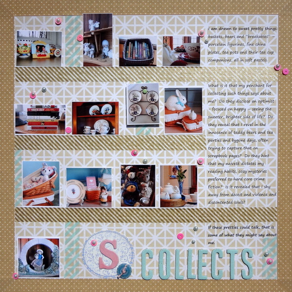
S Collects by Susanne Brauer | Supplies: Studio Calico Heyday paper, Bella Blvd and Tamoi (MT?) washi tape, Making Memories sequins, Queen and Co. pearls. Thickers Doll letters. Tag, button and chipboard initial from stash.
Stefanie Semple says, “My gallery wall is filled with the people and things that are most important to me: my family, home, pets, photography, scrapbooking, fresh flowers and orange tea in my favourite mug.”
“On an actual wall arrangement, I would convert the photos to black-and-white to unified them. This is a great collection of recent photos that represent me, though, and so I kept the color. I loved using frames all in different colors and roughed up along the edges, I added deep digital shadows to emphasize their dimension. I used the alignment and spacing tools in Photoshop to place the framed images. I added decorative borders at canvas top and bottom rather than embellishing the frames. The borders kepp the eye contained within the confines of the layout and adds more dimension, color and accents.

Untitled by Stefanie Semple | Supplies: Frames, borders and back ground paper (Captured with love, Country chic, Everlasting love and Vintage Dreams all from LDrag Designs)
Marie-Pierre Capistran says, “When I started gathering pieces for my ‘gallery wall,’ I was looking for pieces that spoke to me, and I was also looking for variety in texture and size. I selected pieces of things that I made myself and combined them with pictures of my family (now and then) and a postcard that I bought on a trip to Vienna years ago.”
“I included the postcard because I love it and because I wanted to have a bigger piece in my grouping. I printed my art pieces on different materials for different textures. I printed my watercolor painting on textured cardstock, my paper-cut silhouettes on photo paper to give them a glossy finish (since they are in a frame with a window), and my newspaper clipping on normal paper that I crinkled a bit. I added to that a quote printed on handmade paper. I added small words relating my love for art, and I tied everything together with gold. I made the gold frames with my Silhouette cutting white cardstock sprayed twice with gold spray mist. Finally I popped some of the pieces with foam dots.”

Enjoy the little things by Marie-Pierre Capistran | Supplies: Cardstock: Stampin’ UP!, a gold cardstock from my stash; Paper: japanese paper from my stash; Mist: Heidi Swapp Color Shine; Gold bullet points: Hero Art; Other: Silhouette Cameo, gold thread, foam dots.
Heather Awsumb says, “I went for a standard gallery wall look using one color of frames in a variety of sizes and shapes. I’ve tried to present an overview of my life at this point in time – my family, my friends, my pets, where I live and my interests. There are pictures of my family, friends and pets as well as a map of Africa. I saw monograms in many of the examples on the Get It Scrapped Gallery Wall Pinterest board an dincluded an alpha here to represent my first initial.”
“I used to use a woodgrain paper for a ‘realistic’ wall look. I played with the placement of the frames until I came up with an arrangement that I liked. I only started to fill the frames after I had the arrangement that I wanted. I went through my stash of supplies for inspiration. The phrase ‘Having a blast’ is a stamp, but I thought it represented how I feel about my life overall–and I thought it would look like a phrase someone would have framed on a real wall.”
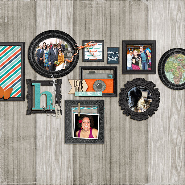
Gallery Wall by Heather Awsumb | Supplies: Frame Me No 4, Frame Me No 2, Almost There Kit, Cut Ups Photography, Little Layette Element Pack, Lil Bit Tags, Bunny Slope Blue Element Pack, Bakers Twine Sea by Katie Pertiet; Bare Tagboard Alpha by Patti Knox; Storyteller Kit by Scrap Orchard.
Marcia Fortunato says, “A sampling of photos from my phone camera reflects a lot about my everyday life and the things that are important to me. There are several recent photos of my family, as well as photos of the things I love to do and places to which I have recently travelled.”
“I started with photos and a corkboard-patterned paper. I used silver adhesive dots to mimic the look of thumb-tacks. To keep so many photos from looking chaotic, I grouped them loosely by subject and kept them lined up. I also used a fairly symmetrical arrangement. As well as grouping photos by subject, I also worked to balance colors and lines so that each part of the page had a pleasing flow. I filled in spaces with stamped phrases and embellishments and added a stamped map with dots showing the two places where I have lived.”
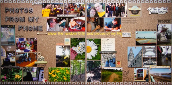
Photos From My Phone by Marcia Fortunato | Supplies: Papers: Studio Calico, Lily Bee, Echo Park, Bazzill Basics cardstock; Alphabets: American Crafts (Thickers), Basic Grey; Adhesive “tacks”: Mark Richards; Stamps: Hero Arts, Studio Calico, Technique Tuesday; Inks: Memento (Tsukineko), Hero Arts; Other embellishments: Fancy Pants, Studio Calico, Simple Stories, Basic Grey, Maya Road; Pen: Sharpie pen; Alphabet stamps: office supply; Adhesive: American Crafts
Christy Strickler says, “I made this page inspired by an article about how to shoot a portrait without a person. I chose items that represent me right now and placed them on my vintage faux fur coat for a textured background that represents my love of animals. The items include: a video game controller and scrapbooking supplies to represent my hobbies, cat toys to represent my pets, my tablet since I always carry it with me, a vintage camera to represent my love of taking photos of vintage items, and my glasses.”
“Some things were hard for me to represent with a physical object, so I used embellishments like the mother charm. When I created the layout, I used the ‘four steps’ to creating a gallery wall on Honest to Nod.“
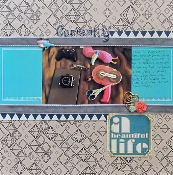
Currently: A Beautiful Life by Christy Strickler |Supplies Patterned Paper: Studio Calico;Letters: American Crafts; Ribbon: Prima; Jewels: Glitz Designs, Hero Arts; Bird, Flowers: Webster’s Pages;Journal Cards: Kelly Purkey; Metal Charm: Jenni Bowlin Junque Box
Ronnie Crowley says, “M ‘gallery “wall’ present (and represents) the things I love. I designed this digital page to look like a shelf with items on it and mounted in front of a wall. This allowed me to add one large picture to represent my family. It was then a matter of looking for dimensional items to add to my self. Luckily there are great digital scrapbooking designers making kits with photographed and extracted items that I could use.”
“Perspective and shadows were important to making layout and getting the effect of items on a shelf. I wanted the word ‘family’ to look like it was leaning against the wall at an angle, so, not only did I play with shadows, I also changed the perspective (>Edit >Transform >Perspective in Photoshop).”

Family by Ronnie Crowley | Supplies: Anna Aspnes : Art Play Palette Elegance & Art Play This Is Life; Jen Maddocks Designs: Regarding Trees; Maya De Groot: Brocante; New Life Dreams: Hello Baby Paper; Oscraps: Novel Collab; Chelle Creations: Wish U Merry; Juliana Kneipp: Wood Venner Words Family; Mye De Leon: A Christmas to Remember; Paula Kesselring: Black and White Only; Veronica Spriggs: A Spot of Tea and Urbanlight; Word Art World: Love Quote.
[current]

