
 With fashion imitating art, we’ve seen light airy shades of color in paintbrush strokes on the runway, on textiles for the home and on papergoods. The result is a soft and flowing effect that works well for creating mood and adding color to scrapbook page designs.
See scrapbooking ideas and techniques for adding this look to your pages and journals from our creative team.
Marie-Pierre Capistran says, “I made this page to record the feelings I have when I put my babies to bed. You know, when you’ve been running all day, and hurrying them here and there, and sometimes forgetting to pause and enjoy them, and when they finally sleep, the feeling of guilt gets to you sometimes? Well, that’s a page about just that.”
“Because I wanted the page to be soft, a watercolor background was a good choice. I had in my mind a dreamy sky so I went with an ombre look that changes from pale yellow to pale pink and darker pink. Before I painted, I embossed curvy lines and stars with clear embossing powder. When I painted over them, I already had a subtle motif on my background. I stitched the little gold stars with gold thread and added gold spray mist and droplets for just a bit of sparkle.”

When I watch you sleep by Marie-Pierre Capistran | Supplies: Cardstock: watercolor paper, Patterned paper: Stampin’ UP!, Dear Lizzy, Studio Calico Project Life; Enveloppe: Studio Calico’ Project Life kit; Vellum: American Craft Dear Lizzy; Stars: Studio Calico Project Life kit; Spray mist: Heidi Swapp Color Shine; Other: watercolor paint, date stamp, gold thread, Versamark ink, Versamark pen, embossing powder.
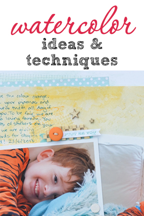
Kristy T says, “This layout showcases my son’s favorite things: the color orange and PJs. It also tells the story of the scratch-and-sniff sticker rewards we use to encourage him to stay in his bed at night.”
“To make the background, I applied texture paste through stencils and gyprocking tape to watercolor paper. I took color inspiration from the photos and randomly applied orange and blue water soluble oil pastels directly to the paper. I added water with a paint brush and then more color and then left it to dry. Watercolor paper tends to warp less than other card andstock. I adhered it to a card base so that my layout stayed flat.”

PJ Loving, Orange Loving, Little Boy by Kristy T Supplies List: Card: White card by Artee, Paper: Watercolour paper, Echo Park; Alphas: Prima, Simple Stories; Distress Marker: Ranger; Washi Tape: Teresa Collins; Gyprocking Tape; Wooden Icon: Prima; Wood Veneer Shapes: Studio Calico; Texture Paste: Jo Sonya; Assorted buttons; Scratch and Sniff Sticker.
Anja de Dobbelaere says, “I took this picture of my daughter at a castle park here in Belgium. I love the evening light bathing her.”
“This page design is all about blending and soft colors. I began by blending several papers and the photo for the page base. I a Photoshop action to make the picture soft and dreamy, and then I added more and more layers, including digital texture, overlay and splatter products.”

A Captured Moment by Anja de Dobbelaere | Supplies: Brandy Murry: Petals, Scrap Simple Paper, Background Blenders; Anna Aspnes: ArtPlay Palettes Life’s Little and Crazy Life; Jennifer Valencia: Pink Frost Photoshop Action; Celeste Knight: Watercolour Overlays, Watercolour Splatters.
Katie Scott says, “This was my son’s board-breaking best photo from his karate black belt test. I had my son tell me all the belt colors while I painted watercolor stripes; he enjoyed watching the colors mix together a bit.”
“This page will be the title page for a mini section of divided page protector sheets with lots of photos from the black belt test. I used watercolor paper which is harder to adhere to other papers than regular scrapbooking paper so I needed extra glue stick glue get it mounted.”

Black Belt 2013 by Katie Scott | Supplies: Watercolor paints, watercolor paper, letter stickers.
Brenda Becknell says, “I took this shot of my granddaughter jumping with excitement waiting to ride a roller coaster. I wanted a colorful page to match the expression on her face.”
“To make the background, I scribbled with watercolor pencils on white cardstock, starting with red, then pink, and orange at the bottom. I spritzed water over the papers and blended the colors with a foam brush. I used the same technique with yellow and pink watercolor pencils to make the banner. “
“The ‘Live Colorfully’ stamp was a perfect fit as a title, and the open spaces allowed the watercolor background to show through. I added stickles to the word ‘live’ and the hearts. I printed the photo three times: once in color, once in black and white, and once in black and white with the saturation level decreased to get a lighter print. I also used a grungy-edged digi mask on all the photos.”

Live Colorfully by Brenda Becknell | Supplies: Cardstock: Hobby Lobby; Stamps: Hero Arts; Glitter glue: Ranger; Twine: Doodlebug; Watercolor pencils: Inktense by Derwent; Gold trim: Mark Richards
Audrey Tan says, “This page is about my boys playing at the end-of-term concert. I made use of a watercolor photo mask so to blend out faces of other children. I added another watercolor mask behind a photo mask to highlight the image. Finally, I added a background color wash to the blank canvas.”

Make Music by Audrey Tan | Supplies: Anna Aspnes: ArtPlay Palette Concerto, ScriptTease Life Overlays No1, Rock Star Frames No1, Warm Glows No1, Watercolor Foto Blendz No1, Artsy Paint No4; Studiomix 49: Soulful Sinfornia; Jen Maddox Designs: Nature Jo
Ashley Horton says, “We love spending time outside in summer, and one of my children’s favorite activities is blowing bubbles.”
“I am a beginner with watercolor techniques, so I tied a simple technique. I diluted a small drop of Mister Huey’s Spray Mist in water and used a medium-sized soft-bristle brush to paint the color across my background paper. While the color was still damp, I stamped circle shapes with bottle camps and the mist as ink. Because the initial painted color was still damp, my stamped circles had a blended and soft look. For a final layer, I added mist drops by removing the nozzle from the mist bottle and dropping dots of color.”

Summer Memories by Ashley Horton | Supplies: Patterned Paper: Elle’s Studio & Simple Stories; Spray Mist& Wood Veneers: Studio Calico; Thickers & Phrase Stamp: American Crafts; Washi Tape: Love My Tapes; Stickers: Leeza Gibbons; Tags: Elle’s Studio; Ink: Stampin’ Up; Flair Button: Cocoa Daisy; Other: Stickers & Buttons
Carrie Arick says, “When my neighbor handed me a 4-week-old kitten, this is the conversation I had with my husband about what we were going to do with it. Because I used a big photo and busy paper, I used watercolor brushes rather than embellishments to add interest while supporting the soft, dreamy theme.”
“I used a light blue watercolor brush directly on the black and white photo. I changed the brush layer’s blend mode to screen, then reduced the opacity to get a slight blue wash over the photo. The brush directly on the photo reinforces the kitten snuggling. I also used the watercolor brushes to soften the background paper and to help my journaling stand out. Watercolors are a great way to add texture and color without overwhelming. If you want to overcome your fear of brushes, using watercolor brushes in neutral and light tones is great place to start.”

Happy Endings by Carrie Arick | Supplies: Studio Basic & Michelene Martin: Once Upon a Story; Just Jaimee: Watercolor Jamboree Brushes, Storyteller June Date Stamps; Heather Joyce: The Kala font
Kiki Kougioumtzi says, “During our vacation we heard of a place worth a visit. After a long walk in the sun we arrived at this breathtaking view.”
“I used two types of watercolors: liquid and dry. I made a trail with the watercolor to emphasize the focal point. I started by soaking the paper with water and adding watercolors. This way the colors are softer and become part of the paper. They enter the paper, staining it rather than sitting on top. When it dried, I made little splashes of watercolor with a thin paintbrush, like the drops from the waves crushing on the rocks. Finally, because the paper curved from so much water I adhered it onto cardstock with hot glue.”

Le grand bleu by Kiki Kougioumtzi|Supplies:Patterned paper:My Mind’s Eye,K & Company;Carstock:Bazzill Basics;Alphas:American Crafts;Watercolors:Reeves,Talens ecoline;Other:Maya Road office sheers,Basic Grey brads,Prima say it in crystals ribbon, acrylic beads.
Terry Billman says, “My granddaughter and I were at a Polynesian Luau in Waikiki, when I caught her staring at the ocean. As I looked into her eyes, I had to wonder what she was dreaming about.”
“Since I wanted to focus on Cami’s facial expression and not the background of the photo, I converted a copy of the photo with a watercolor filter for the base. I then layered an extraction of Cami from the original photo over the watercolor. I used brushes with varying opacities in yellow and green around the photo to soften the edges and give the layout a dreamy effect. To accentuate the word art, I used a watercolor brush under the word art.”

Your Dreams created by Terry Billman| Maplebrook Studios: Just Linens 23, Just Linens 20; Katie Pertiet: Watery Spots No. 6, Watery Spots No. 7, Letterbox Overlay No. 5, Type Inspiration 062913; Anna Aspnes: Art Play Palette 1, Hipster Plume FotoBlendz 5; Lynne Marie: Mellow
Andrea says, “This is a favorite sunset photo from the past winter scrapbooked with a watercolor technique for texture and interest.”
“I started with a textured watercolor paper. Next, I converted the photo with a watercolor filter and blended it into the background cardstock. Finally I used a mask and a watercolor brush to bring back part of the photo.”

Winter by Andrea | supplies: Anna Aspnes Golden Glory paper; Katie Pertiet Yesteryear Solids paper; Fonts Inked God and Brush Script.
[current]
