 Botanical and zoological prints have an old-fashioned look that fits well with many scrapbook layout subjects–and that just looks beautiful as you’ll see in the scrapbooking ideas here.
Illustrations made for scientific purposes — botanical and zoological — have a beauty that merges with decorative goals, and you can find wallpaper, upholstery, and clothing featuring them. The current trendy botanical looks have a retro styling that originated in the 1950s.
The challenge with these often large-scale and intricate patterns is to use them in a way that doesn’t overshadow the photos and story on the page. Our creative team shows you how they’ve matched these prints to topics and designed with them as a support their own photos and stories.
Anja de Dobbelaere says, “This picture was taken in 2010, July 31 at exactly 17.22 hrs. It was the last stop on our journey to the holiday home we rented in the Bourgogne region in France where we would spend a week. I love the light in this picture and that spot was so magical, so quiet.”
“This botanical/zoological print works perfectly with my picture, from the color of my daughter’s dress to the greenery behind her. As it is quite a busy print, I layered and blended it with a brown paper, and used an open book as the foundation for my photo. I layered the photo with tags, papers, stamps, and flowers.”
Anja did several things to give her photo a look and mood that goes with her background print. She says, “I blended the photo with one of Brandy Murry’s Shabby Photograph Masks for a worn look. I adjusted the colors of the photo to work with the patterned background. I applied a vintage filter, and, on top of that, I added a sepia photo layer that I set to ‘lighten’ with a lowered opacity.”
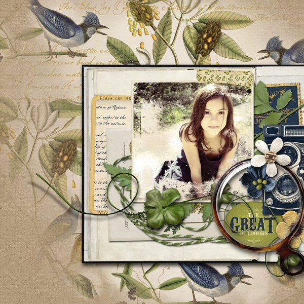
The Great Outdoors by Anja de Dobbelaere | Supplies: Brandy Murry: Outdoor Life Collection Biggie, Scrap Simple Paper Background Blenders, Shabby Photographs; Viva Artistry: Field Journal.
Sian Fair says, “Our museum has a big collection of stuffed animals, but there is only ever one I’m interested in seeing: the dodo, and this page records that.”
“When I started thinking about using a botanical print, I realised that it was a while since I had done some handcutting: this seemed like the perfect chance to make the most of the pattern on this older piece of patterned paper. I combined it with a much newer animal print, just seen in the background, to try to keep it looking fresh, even though I was aiming for a museum feel which I created with the muted colours and the journaling which looks like a label on a case. I could have tried to remove the shadows on my photo before I printed it, but I like how it reminds me I was peering into a dark cabinet, so I left it.”
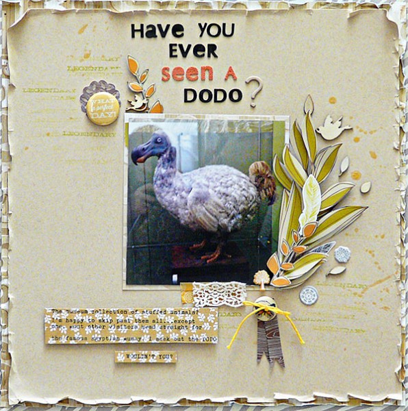
Have You Ever Seen a Dodo? by Sian Fair | Supplies: cardstock: American Crafts; Patterned Paper: Crate Paper, SEI, Kesi Art; Alphas: Prima; Flair and stamps from Citrus Twist; diecuts and wood veneers Studio Calico; washi tape and lace from stash
Ronnie Crowley says, “This page is about my Grandma’s love of her garden and especially her flowers. A vintage botanical print goes with the vintage photo adn the page theme.”
“I knew straight away that Katie Pertiet had a great selection of prints that would work. I used one of her botanical papers, but I really wanted more flowers and lots of different flowers, and so I added her blendables to the paper to create the final background paper. The paper was at this point was very busy but looked just like a garden with different flowers. The problem, though, was that my photos were disappearing into the background. I added a vintage paper stacks to provide a foundation for the largest photo. The vintage paper stacks coordinate well with the botanicals and the era of my photos.”
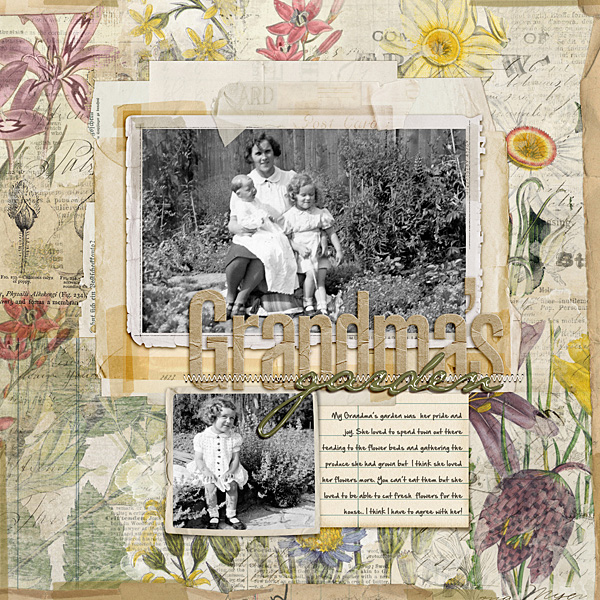
Grandma’s Garden by Ronnie Crowley | Katie Pertiet : BotanicGardens, Taped Together, Taped Together Overlays, Taped Together Stacks Vintage BlendablesNo17, Vintage BlendablesNo8, Vintage Photo FramesNo18; KarlaDudley : DigiEssentials-Stitch; Oscrap -: Novel collab; Juliana Kneipp : Truly Madly Deeply; Pink Reptile Designs : Growing Pains
Susanne Brauer says, “This page showcases a wonderful old photo of two young people: my parents. I wanted to celebrate how this photo captured their ease with each other – an ease that lasted 40 plus years. “
“I was inspired by SEI’s Field Notes collection, which includes a paper with a mixture of the gray engravings and realistic bird illustrations on perforated cards. The engravings spread across the page complement my vintage photo, and the birds tie into my title. The paper is so detailed, I kept other embellishing minimal.”
“All the narrow strips bordering the band of engravings came from that same single sheet of patterned paper. SEI added 4 different patterns around the perforated edges of the page. The three small die-cuts are also from SEI. Many of the buttons on this page are from my mom’s old sewing box: I try to include at least one on any page I scrap about her.”
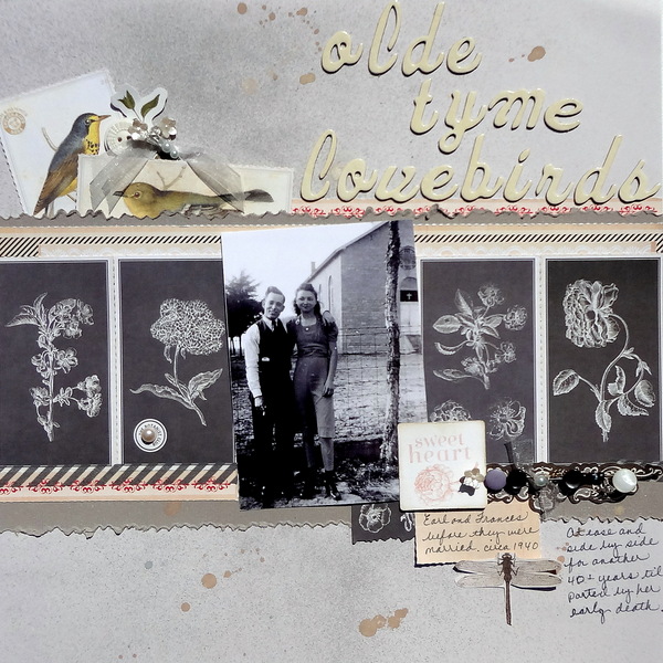
Olde Tyme Lovebirds by Susanne Brauer | Supplies: SEI Field Notes and Grandpa’s Attic papers, Bazzill Textured Cardstock, SEI Field Notes Sample Box, American Crafts Thickers Forest font, October Afternoon Art Box Mists, Making Memories Findings stickpins
Andrea scapbooked photos of ferns that she took in the spring here. She created her background with botanical-print digital brushes, her own blended photos, and worn digital papers. She layered dimensional dried flowers and ferns, buttons, tags and her photo to complete the page.

Fanciful Ferns by Andrea | Supplies: Naturally by Pink Reptile Designs; Brandy Murry BMU Mossy Paper; Fonts Inked God and Vladimir Script.
Christy Strickler says, “One summer we raised monarch butterflies, but, unfortunately, they did not fly away as expected.”
“I like to use botanical images to document my son’s science experiments. Since we were raising butterflies, the botanical butterfly prints were a perfect choice. Botanical prints have a serious and yet beautiful tone. I like to use them for layouts that on which I get introspective: this layout could have been about us raising the butterflies, but our butterflies did not successfully fly away which left my son pondering life and grieving. The larger print is from a sheet of Tim Holtz papers. I found additional botanical prints on-line, and I printed them in thumbnail size and used them as accents.”
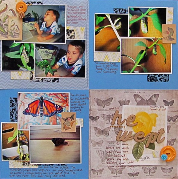
He Wept by Christy Strickler |Supplies Cardstock: Bazzill; Patterned Paper: Webster’s Pages, Tim Holtz, Heidi Swapp; Transparency, Flowers: Webster’s Pages; Buttons: Jenni Bowlin; Vellum: Studio Calico; Images: VintagePrintable.com
Audrey Tan says, “This page is about my son picking the cherries off our tree. When my eldest was born in 2000, my dad gave us an apple and a cherry tree to commemorate his birth. Since then, those two trees have been producing fruits. This particular year, the cherries were in abundance and my son had a field day picking them. I used a botanical paper to support the theme, and I aged the busy paper a little bit with digital paint.”
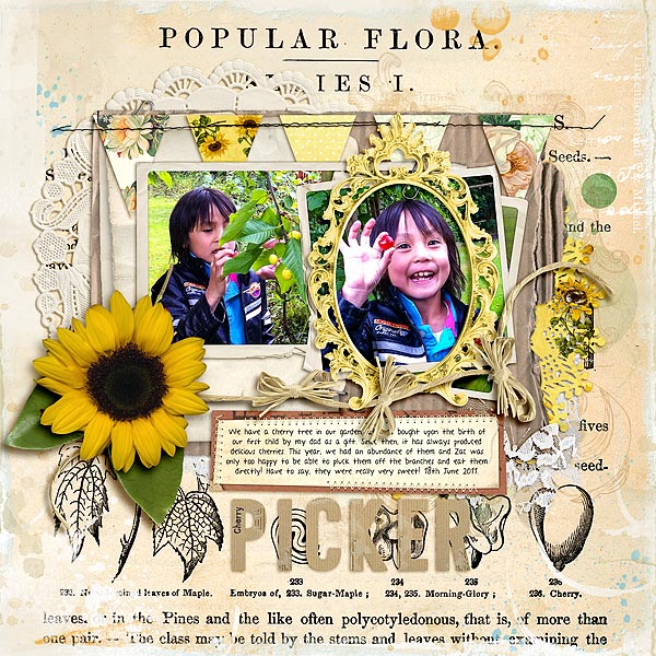
Cherry Picker by Audrey Tan | Supplies: Jenni Bowlin Studio: Magpie Collection; Julianna Kniepp: Beautiful Day, My Sunshine, Love Is All You Need, With All My Heart; Celeste Knight: Watercolor Overlays; Charity Collaboration: After The Storm @ Oscraps; Micheline Martin: TLP Collaboration Jump For Joy Alphabet; Katie Pertiet: Clipped Stacks No4, Carded Stacks No1, Ledger Paper Piece Journalers; Font: A Year Without Rain
Katie Scott says, ” I paired a recent photo of my son with the botanical/zoological motif to connect him to the idea that his family has been on the water for centuries. This page will go into one of my ancestry/ family history albums. I used prints of whales from a brochure I picked up at the New Bedford Whaling Museum. Instead of using a vintage-styled font for the title, I used Lisa Dickinson’s Modern Mercantile for Jenni Bowlin because I liked the contrast of old and new.”
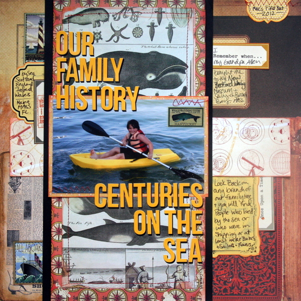
Centuries on the Sea by Katie Scott | Supplies: Kaiser Craft, Cosmo Cricket, and Making Memories patterned papers; Jenni Bowlin letter stickers, K&Company embellishments.
Amanda Robinson says, “Our garden was completely overgrown when we moved into our house this winter, and we’ve yet to get started on clearing it. Amongst the weeds and overgrown bushes we keep catching sight of beautiful flowers. Neither my husband or I are gardeners, so have no idea what plants they are.”
“This ‘plant-species-identity’ print worked perfectly to support the theme. As the paper was neutral in color I added a “wilderness” of colors behind the photo to liven up the page and to echo the bursts of color in our garden. I trimmed two sections from the paper. I wanted them to sit next to each other and covered the join with coordinating ribbons.”

Wilderness by Amanda Robinson | Supplies: Patterned Paper – Jenni Bowlin Studio; Die Cuts – Ormolu, Evalicious, Fancy Pants; Stickers – Basic Grey, Crate Paper; Other – Watercolour paints, ribbons, tag.
[current]

