 Take a scrapbooking idea from the ombre color trend. It has shown up on cakes, hair, fingernails, fashion, and stationary so why not on scrapbooking layouts?
See how the Get It Scrapped Creative Team has incorporated ombre treatments on paper and digital scrapbooking layouts, using both product and technique to get dreamy color-graduated looks.
Andrea says, “Giving this photo a sketched/stamped treatment along with an ombre gradient gave this photo a great look. After getting the desired look to the flat photo base, I embellished with dimensional flowers.”
My process for doing this in Photoshop CS or Elements is as follows:
- Duplicate the photo and hide the visibility of the lower copy for safe keeping.
- Convert the topmost copy to black and white by applying a “Hue/Saturation” adjustment layer and sliding the Saturation slider all the way to the left. Then merge that layer down.
- Next add a “Threshold” adjustment layer. As you move the slider you will see the grey disappear until you are left with only black and white. Stop when you get the desired effect. Again merge this layer down.
- Remove the white in the photo with the magic eraser tool: click on the white in the photo, >Select >Similar, and clear all selected areas.
- Finally add a “Gradient” adjustment layer, selecting the colors of your choice . Then clip this layer to your silhouette image and adjust the opacity of the gradient layer as necessary.
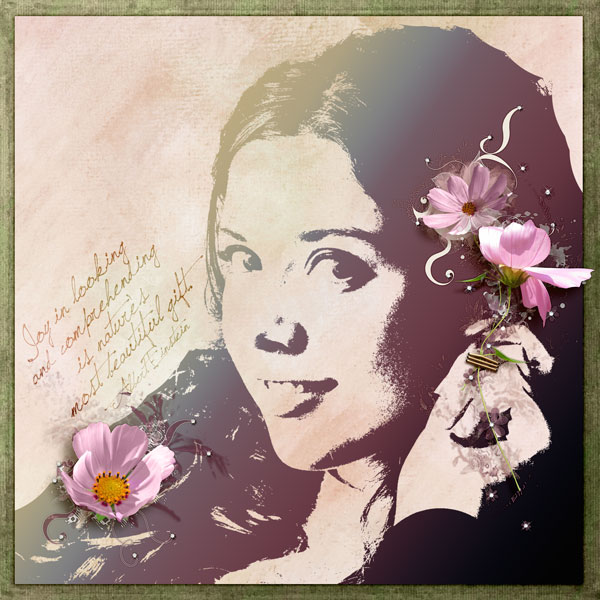
Joy by Andrea | Supplies: rdach muddy turf paper; Katie Pertiet Color Inspired 100811; Anna Aspnes Art Play Barren Sunrise quote; Pattie Knox fastenits staple cluster; Didio Designs Flower Shower.
Christy Strickler says, “I used a disposable camera to take a photo of my son waving hello underwater. I dragged white cardstock through pools of mist a few times to get an ombre effect. It’s a new technique I learned during the EntreArtistes Summer Camp class.I chose neon orange mist so that the turquoise in the photo would really pop.”
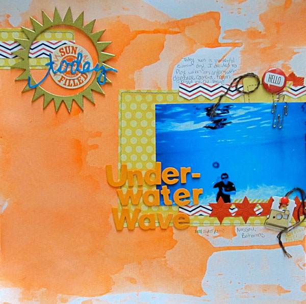
Underwater Wave by Christy Strickler |Supplies Cardstock: Colorbok; Patterned Paper: My Mind’s Eye, Jenni Bowlin; Letters: American Crafts; Flair: A Flair for Buttons; Paperclip: Pictome; Ephemera, German Foil: JBS Mercantile; Wood Veneer, Mist: Studio Calico; Enamel Dot: My Mind’s Eye; Embossing Powder: Ranger; Other: Washi Tape, bread tag, sticker, Glossy Accents, DMC floss, chipboard
Deborah Wagner says, “My youngest son, Dima, has the most beautiful green eyes, and every time I look into them I thank God for bringing him to us.”
I used a soft ombre effect with Photoshop and digital products to highlight my photo as follows:
- The first layer is a blue, sky-like paper. The 2nd layer is a darker green, wave- patterned paper. Blend the green paper with a layer mask so that only the bottom half was visible.
- Add a piece of folded paper above the green paper layer and set the blending mode to Darken.
- Duplicate the bottom sky-like paper and move it to sit over the folded paper layer in the Layers Palette. Set the blending mode of this duplicate layer to Multiply at 30% opacity.
- To accent the title and draw the eye to the Believe word art, drag in artsy paint and set the blending mode to Hard Light.
- Add a star glow, fill it with white, and set the blending mode to Overlay at 40% opacity.
- To finish, add a new layer directly under the photo, and use the Gradient tool to create a green-to-pink linear gradient. Set the gradient layer to Soft Light.
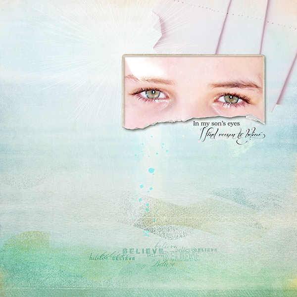
In My Sons Eyes by Deborah Wagner. Supplies: Katie Pertiet Painted Pastels No. 1, Worth Repeating No. 2, Ripped Vintage Photo Frames No. 2; Lynn Greiveson Summer Sunset Kit; Anna Aspnes Art Play Palette Obsession, Art Play Palette Seafoam
Amanda Robinson says, “This page showcases a photo taken at my 5th birthday party. The character ‘Strawberry Shortcake’ was the theme for the party so I included plenty of pink, but made sure it didn’t overpower. I used a metallic coral-pink paint to wash across my page, gradually adding white as I moved from bottom to top. The ombre effect helped me set the mood without overpowering the other girly elements I added to my page.”
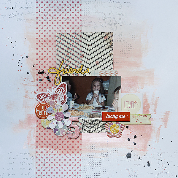
5 by Amanda Robinson | Supplies: Patterned paper – Crate Paper; Vellum – American Crafts; Die-cuts – Basic Grey, Pink Paislee; Stickers – American Crafts, Jillibean Soup; Mist – Studio Calico; Chipboard number – Pink Paislee; Cardstock – Bazzill Basics.
Kristy T says, “This layout is about my first cuddles with my youngest son who was born a bit early, thus spending a couple of days in the special-care nursery.”
“I created an ombre effect using a couple of blue, white and black distress paints on specialty stamping paper. I applied color directly to the paper and also mixed colors on my kraft sheet and applied them with a paint brush. I like using this paper as it gives me more time to mix my colors and it stands up to being fairly wet. To keep the focus on the ombre background, I created a textured white frame, printed my journalling on vellum, and used clear embellishments or embellishments in tones similar to my background colors.”
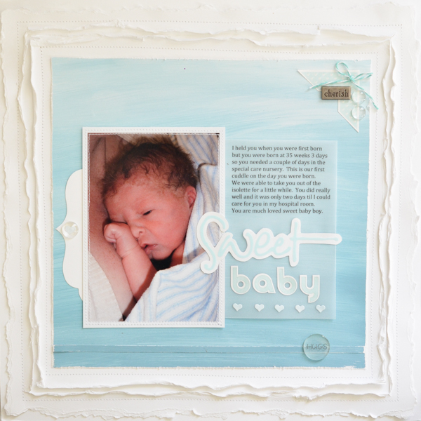
Sweet Baby by Kristy T | Supplies: Cardstock: Artee; Paper: Specialty Stamping Paper; Paint: Distress Paints by Tim Holtz (Picket Fence, Broken China, Stormy Sky, Weathered Wood, Black Soot); Twine: We R Memory Keepers; Alphas: Little Yellow Bicycle; Clear Beads: Prima; Dies: Sizzix/Tim Holtz, La La Land Crafts; Metal Word: Making Memories; Sticker: Little Yellow Bicycle; Vellum; Button: Unknown.
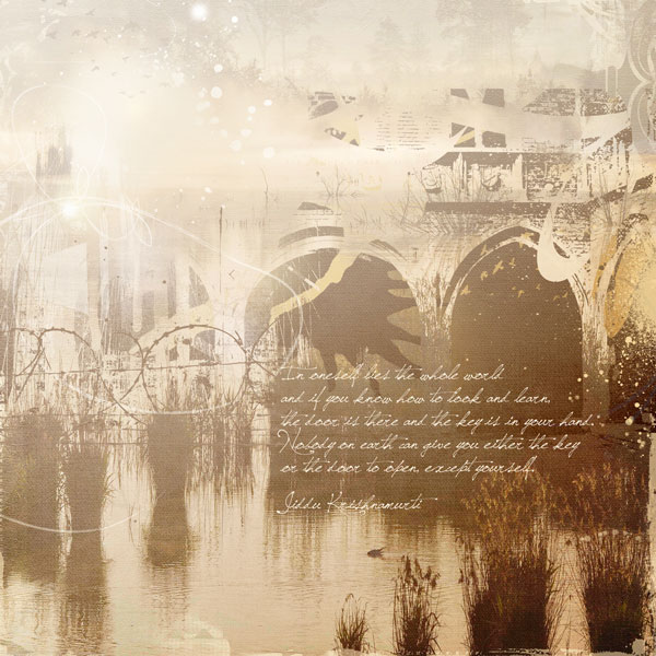
Anja de Dobbelaere says, “This picture of a well-known nature resort was taken by my cousin. I usually start a layout with a quote. I wanted to create a mood to go with the quote and I thought this picture was perfect to start with.”
“I used a digital ombre paper from Jen Maddocks ‘You Hold The Keys’ kit to get a misty effect and to let the left side slowly fade away. I actually used the ombre paper as a kind of photomask, and then I applied a brush to make it seem as if an old bridge were built over the water. Again, I used the same ombre paper to make it blend in perfectly with the original picture. I finished the whole piece with a few more brushes and lights.
Katie Scott says, “Eckerd College gave me a scholarship when I was 16 years old, and it changed the course of my life, I moved from Maine to Florida, and, 25 years later, I’m still here. These photos were taken at the most recent annual Family Eckerd Easter Egg Hunt. I used a Heidi Swapp heart template to create the background hearts, and I got out a variety of yellow-to-orange inks and copic markers and filled in the hearts to create an ombre heart background on the notebook-patterned paper.”
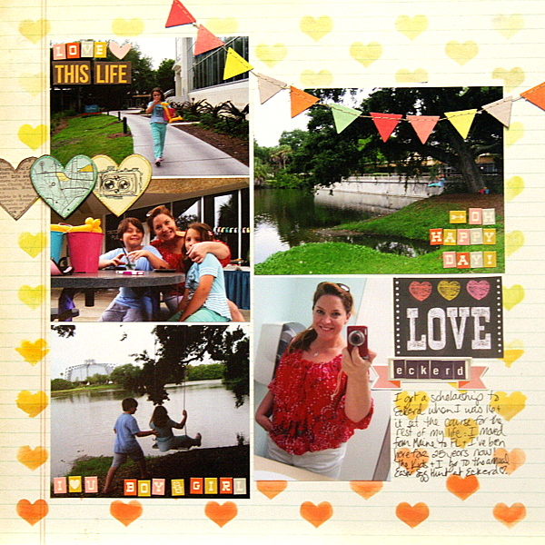
Love Ekherd | Supplies: Heidi Swapp template; Stazon, Stampin Up and Copic inks, American Crafts, DCWV, Cosmo Cricket embellishments and letters.
Lise Mariann Alsli says, “I love this picture of my beautiful, blue-eyed girl with all the colorful paint in her face. It makes me so happy to be her mum.”
“The title and theme of the page had to be that she makes our life so colorful. I used the pink from her face paint and the blue from her eyes and made the two colors “melt” together in this layout. In my stash I found this light blue and pink ribbon that screamed ombre effect. The ribbon became the middle of the melting point. I added pearl ribbons for texture, and the chipboard heart to emphasize the title.”
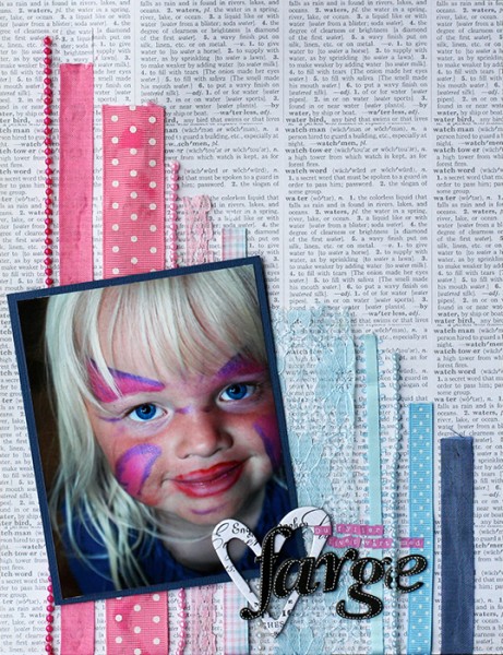
You color our lives by Lise Mariann Alsli | Supplies: Paper: Bazzill, Echo Park; Pearls: Kaiser Craft; Chipboard hearts: Pink Paislee; Alphabets: American Crafts thickers, Kaiser Craft tiny alpha stickers; Other: Various ribbons and lace, various pearl “ribbons.”
Sue Althouse says, “This page is about my sister eating a crayfish. I combined ombre and hand stitching in two ways on this layout. First, unique handmade photo corners frame and highlight my focal point photo. Second, a double border frames the entire layout, adding texture and interest. The result is a clean and simple layout using no patterned paper, yet still delivering a bold punch of color.”
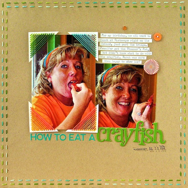
How to Eat Crayfish by Sue Althouse | Supplies: Cardstock: Bazzill; Alphabets: American Crafts, Jillibean Soup; Ink: Hero Arts , Buttons: October Afternoon, Floss: We Are Memory Keepers, Date Stamp: American Crafts, Flair: A Flair for Buttons, Twinkle Goosebumps: Queen & Co.
Michelle Hernandez says, “These portraits were lucky shots. My daughter was tired from running around all day and didn’t want to pose. She’s smiling because she’s running back and fourth trying to avoid a photo. Since she was in a doorway I just waited for her to get in the frame and got the perfect animated pixie smile.”
“I have arranged buttons in an ombre fashion diagonally down the page. They are a great solution for the paint- impaired scrapbooker who would like to add an ombre treatment to their page. Washi tape and embroidery thread are other easy ways to do this. The yellow leaves are from my backyard and I know they are totally random, but I love the color. Can I justify this by saying in a few days they will be a great ombre pattern of yellows and browns?”
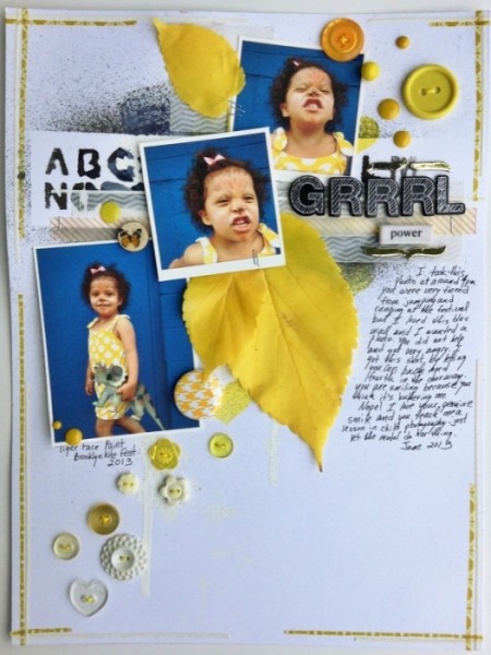
Grrrrl Power by Michelle Hernandez | Supplies: Misc. Buttons, Embroidery Thread, Washi Tape and Enamel Dots.
Tara McKernin says,”This layout is a reminder to myself to keep dreaming big. I graduated the color and size of my images to go with the message I wanted to convey. The goal of creating an ombre treatment was my inspiration to to use photos that started small and colourless and then proceed getting larger and more boldly colored.”
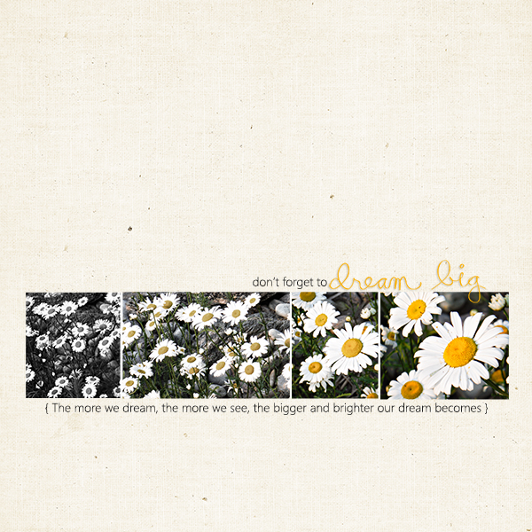
Dream Big by Tara McKernin | Supplies: Paint Swatch Template Sahlin Studio, Paper and Word art Paislee Press
Michelle Houghton says, “This page is another about our anual trips to Arizona in the fall. I always try to make my pages from our Arizona trips unique since it is an annual event and we repeat many of the same activities each year.”
“On this page I used Copic markers with the air brush system to create a sky and red rock background for my photos. I added a subtle ombre effect on both, backing the ink off as I got closer to the horizon on the sky and changing to a darker color as I got to lower layers on the Earth. The title is also colored with the same Copic color to match it perfectly to the background.”
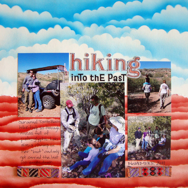
Hiking Into the Past by Michelle Houghton | Supplies: ink; Copic and Sharpie, sticker letters; Jenni Bowlin, cardstock, small sticker letters and trim unknown.
Amy Kingsford says, “This photo was taken on my son’s graduation day from preschool, and now, here we are a few months later, and he’s on his way to Kindergarten!”
“Here I added an ombre effect to the page background that was inspired by the gradient glare on an old pair of sunglasses. I used an ombre filter from my phone’s Pixlr Express app on the photo, and I placed the image inside the lenses of these digital glasses, flipping one of the images so they mirrored each other. Then I used an angled gradient to create my custom ombre background, sampling colors from the photo’s filter for an almost identical match.”
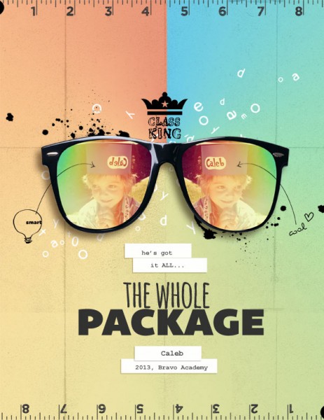
The Whole Package by Amy Kingsford | Supplies: Karla Dudley: Me Time, Letter Pressed: Schooled; Juliana Kniepp: I Like This; Fonts: Bemio, Amatic, Courier New.
[current]

