
 Type makes language visible, and is an important tool for telling scrapbook page stories. Read on for scrapbooking ideas to combine alphas, typefaces, word meaning, color, and size to create both a strong visual element and a story-telling tool.
1. Use sayings and quotes
Kim Watson says, “Sometimes we take ourselves far too seriously, and need something to jump start us out of our to-do lists and back into our happy space. These photos of my little guy acting like a loon in a pair of huge diving goggles makes me laugh out loud. He felt no inhibition or shyness parading around the sports store in them, announcing to anyone who would listen in a loud, nasal voice that he was Max ‘W’ and that he would like to tell them a fish joke.”
“To support the photos, I added a quote reminding me that laughter is indeed a great medicine (and a far side cheaper than a visit to the doctor).” See Kim’s Pinterest Board of Inspiring Words for more feature-worthy quotes. She used 9 different alphas in 5 different bold colors. They are united, though, by their common placement on oversized talk bubble filling up almost half of the canvas.
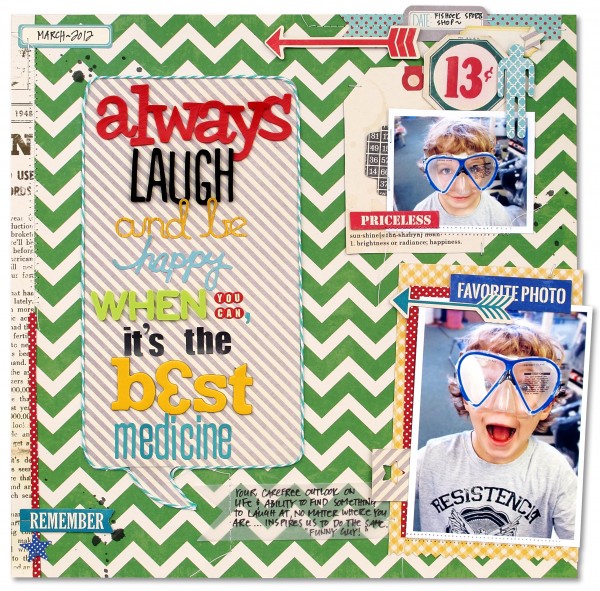
Always Laugh & Be Happy by Kim Watson- Supplies: Patterned paper, Die cuts accents, Stickers, Tags, Bakers Twine, Blue Alpha Stickers: Jillibean Soup; Alpha Stickers: American Crafts, Studio Calico, Fancy Pants Designs; Spray Ink: Maya Road; Pen: Zig; Adhesives: 3L, Tombow; Tools: Punch: EK Success; Mini Attacher: Tim Holtz;Trimmer, mat & Scissors: Fiskars; Xacto knife: Elmer’s; Printer & paper: HP; Other: Sewing machine, Vellum.
Stefanie Semple says, “Our boy Shadow sleeps in the most interesting positions. When it is hot, he sprawls out, often with a 180 degree twist, and when it’s cooler he is curled up and cozy. I think often of the quote regarding the heat of the day corresponding to the length of the cat.”
“I used a series of photos of Shadow taken at different times of day and in different seasons. The alphas I chose for ‘heat’ are lower case and more fuzzy looking, while the ‘length’ alphas are uppercase and the word is also longer. The measurement marks support the topic and add a shelf for the title.”

The heat of the day by Stefanie Semple | Supplies: Little Bit Shoppe Designs (template): Photo booth vol 2; River-Rose Designs: Cats and Dogs (kit); Clever Monkey Graphics : Soft chipboard alpha; Crossbone Cuts : My basics, rainbow shabby (card stock); Katie Pertiet : Mixed bag brushes and stamps vol 2.
2. Make a magazine cover treatment
Deborah Wagner says, “My nephew hated this photo, but I loved it. I thought it was model material, so I put him on the cover of GQ.”
“I used the gallon/quart/pint theory with my mixture of fonts. I used a gallon of the Serif font, Onyx; a quart of the Sans Serif font, Helvetica; and a pint of a handwritten font, Pea Bhea. I thought the handwritten font on the taped tab made the page seem more lifelike.”

Man of The Year by Deborah Wagner. Supplies: Katie Pertiet William Kit, Book of Memories No. 9B, Cardstock Tabs No. 2, Assorted Tapes No. 2; Andrea Victoria Le Spook Paper Pack; Photo by Dan Rother Photography.
3. Layer featured type over photos
Paula Gilarde, says, “My husband decided to take the family to the top of a mountain pass on a very, very foggy day. I wanted a permanent reminder of what a bad idea that was.” Paula layered her large yellow title over a photo background. It contrasts strongly with background. It’s centered placement anchors the rest of the centered elements on the page.

A Terribly Bad Idea by Paula Gilarde | Supplies: Naturally Krafty No 13 by Katie Pertiet, Rubber Alpha No 3 by Katie Pertiet, Readymade Banners For Dad by Studio DD, Loosely Labeled Dates No 4 by Katie Pertiet, Dated Journalers No 2 by Katie Pertiet, Brad Bonanza by Pattie Knox
Tara McKernin says, “These photos of my son are outtakes from a studio lighting practice session. I loved his expressions and wanted to showcase it. I kept my layout clean and simple and let the title be the focal point. The words are large and bold using the fun fonts Lobster and Impact. I kept my connector words simple and small using the font Avenir Book.”

Many Faces of You by Tara McKernin | Supplies: Paper, One Little Bird Suncatcher; Template, Cathy Zielske Life Basics; Fonts, Avenir Book, Lobster 1.4, IMPACT.
4. Let type do double-duty type as journaling and title
Amy Kingsford says, “Because I don’t use a lot of journaling on my pages, eye-catching and thoughtful titles are important. To make my titles stand out on the page, I use a variety of fonts and alphas. On ‘Boys Will Boys,’ I’ve used three different alphas in a variety of colors and textures to make the title the most visually interesting part of the page. The content of the title is important for providing context for the photos and helping tell their story.”

Boys Will Be Boys by Amy Kingsford | Supplies: Simple Scrapper: May 2011 Premium Membership Templates; Pink Trike Designs: Like a Fox Full Kit; Sahlin Studio: Softly Rimmed Plastic Alphas (re-colored), Typeset No. 2 Alpha; Mye De Leon: Veneer Alpha (re-colored).
Michelle Hernandez says, “I go to my local botanical garden at least four times a month in the spring. I love to see what’s growing and what changes from day to day.”
“I like mixing title fonts because they quickly add visual interest. This means I can use a simpler design and get pages made faster. The title for “Epic Times @ BBG” came together after I chose the wood veneer embellishments. I didn’t add extra journaling because the photos told the story–but the Basic Grey folder below “Headline” could easily hold a tag or journaling card.”

Epic Times at BBG with Abuela by Michelle Hernandez | Supplies: Papers: Basic Grey; Alphas: Heidi Swapp, Studio Calico, Crate Paper and American Crafts; Journal Card: Me and My Big Ideas.
5. Make a focal point with type
Ashley Horton says, “I made this layout to record my son’s favorites at 4 years old using a photo taken on his birthday. When mixing fonts or alphas, I like lots of contrast. Here, the larger Thickers are a dominant part of my title with the smaller, round letter stickers supporting.”

Four Favorites @ Four by Ashley Horton | Supplies: Patterned Paper & Tags: Elle’s Studio; Wood Veneers: Studio Calico & Freckled Fawn; Thickers: American Crafts; Mini Market Stickers: October Afternoon
6. Weave featured type with handwriting
Doris Sander says, “I used a photo, three title blocks, and five large pieces of ephemera to define my design.” The title here is a combination of handwriting mixed with the title blocks. The title blocks are large cardstock blocks with negative-cut words backed–which are each backed up by floral-print patterned paper. Doris layered the blocks vertically down the page. Their placement, along with the handwriting makes this an unusual and eye-catching way to tell a story.

Goals by Doris Sander | Supplies: patterned paper, pin, stickers – Basic Grey, stencil cards – Fancy Pants, chipboard stars – Pink Paisleee, kraft number, arrow – Maya Road, ephemera – vintage, brads – American Crafts, gold feather – German foil, ink – Jenni Bowlin for Ranger, tag – Avery
[current]
