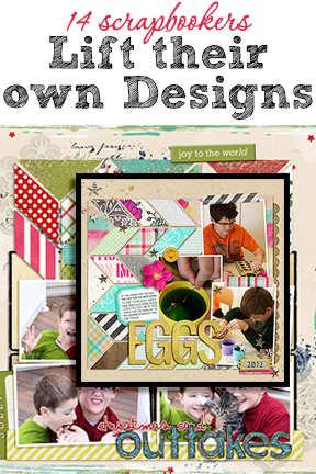
 Scrapbook design inspiration is closer than you think. Our creative team tells you how they go about lifting their own pages, and they share their advice for making your own scrapbook pages this way.
“The great thing about lifting yourself is that you have a guide for a solid design right in front of you,” says Carrie Arick. “With that, you can push yourself outside your comfort zone in a way that doesn’t feel too risky or overwhelming.”
Katie Scott adds that when you lift one of your own successful layouts, you KNOW you’ll be able to get the new page made.
advice for lifting yourself
Marcia Fortunato: The best tip I have for lifting yourself is to look through old layouts and use one (or more) of them as a starting point, then let it evolve until you’re happy with the final result.
Susanne Brauer: My best tip for lifting yourself is to go with one or two things about the original and then see where that takes you.
Celeste Smith: When I lift myself, I always try and shake it up a little: rotate or flip the layout, use a different color scheme, incorporate a few different elements, change up the number of photos, etc.
Sian Fair: My best tip for scraplifting is to play to your strengths! If you like to sew on pages, then why not repeat it? It won’t look like repetition, it will just look like you.
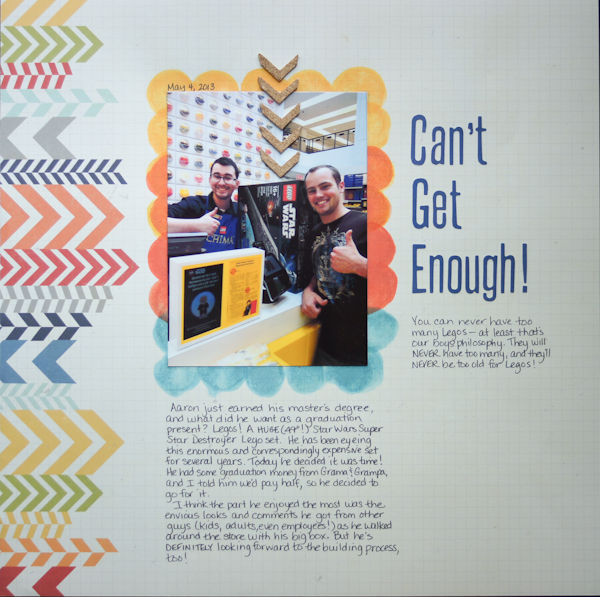
Marcia Fortunato says, “Then new layout here is about my oldest son’s recent proposal to his girlfriend. (My second son and his wife took the pictures, returning the favor from their engagement.) The layout I scraplifted is about the same son’s purchase of a LARGE Lego set as his reward to himself after finishing his master’s degree and how a guy can never have too many Legos!”
“One of the things that I liked about the original layout was the arrows and banners printed along the edge. I knew that I could replicate the look using strips of washi tape. I used brighter pinks and darker neutrals to help balance out the contrast between the bright colors in the photos and the muted background paper. I chose that background paper because, even though the couple is wearing bright colors, I wanted the layout to have a softer, more romantic feel. The arrangement of the washi tapes was somewhat random, but I did try to keep the brightest and darkest patterns pointing towards the photos and the lighter tapes at the top and bottom.”
“Since I had shorter journaling for this layout than in the original one, I replaced the bottom journaling with a strip of additional photos. I extended them all the way across but staggered them just a bit to give a more relaxed feel.”
“The best tip I have for lifting yourself is to look through old layouts and use one (or more) of them as a starting point, then let it evolve until you’re happy with the final result.”
“I don’t consciously scraplift myself very often. However, I do gain inspiration by looking through my scrapbooks; I’ll be reminded of a technique or design or embellishment that I’ve used in the past and be inspired to use it again. My scraplifts don’t generally look a lot like the original, but because I file my layouts in the order they are created, I wouldn’t care if they were identical since they most likely wouldn’t be near each other. Besides that, the fact that they would have different photos, stories, and products would lend enough variety that it wouldn’t bother me.”
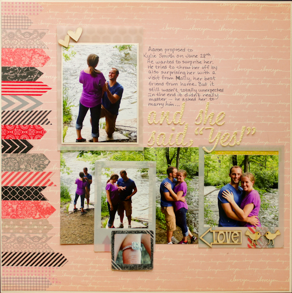
And she said, “Yes!” by Marcia Fortunato | Supplies: Papers: Studio Calico, American Crafts cardstock; Alphabet: American Crafts (Thickers); Washi tape: Teresa Collins, Hambly Studios, Studio Calico, My Mind’s Eye, Darice, Target, Lawn Fawn; Wood veneer: Studio Calico, Cocoa Daisy; Frames: Basic Grey, Studio Calico stamp; Inks: Ranger (Distress Ink), Tsukineko (Memento); 3D foam squares: 3M, Scrapbook Adhesives by 3L; Pen: American Crafts; Adhesive: American Crafts, Ranger (Glossy Accents).
Tara McKernin says, “Each layout is a two-page spread featuring a large image I love paired with a quote and simple elements. My advice is to just lift yourself – if you haven’t done it, try it. When you find a layout format you love use it. One of my favorite layout style is pairing a page with a full page photo. I could do every layout that way. Sometimes my layouts are the same, other times I switch elements or the orientation. They are never side by side, so I’m OK with them being similar.”
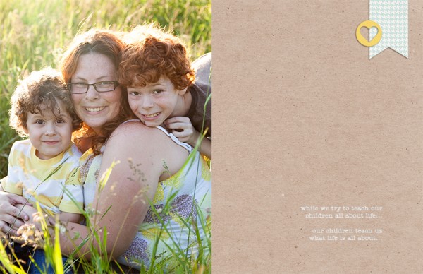
Teach by Tara McKernin | Supplies: Kraft cardstock from Karen Funk, Blue Patterned paper from One Little Bird, Font Amer Type
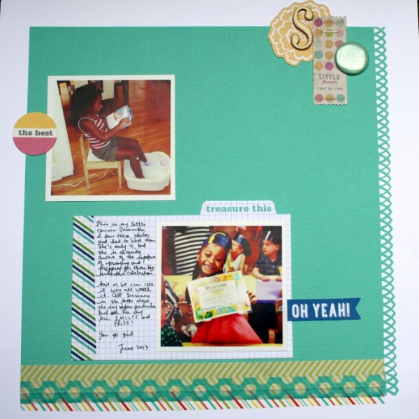
Rosann Santos-Elliott says, “The story of my original page is about my little cousin primping and prepping for her PreK moving up ceremony. The scraplift is of my son’s graduation.”
“I kept things very basic and switched only a few elements. I enjoy trying to make all of my layouts unique, but the best tip I have for lifting yourself is that it is OK to not always have a unique layout. Start with the same template. The photos and color palette will be enough to make it look different from the original. I didn’t think I lifted myself often, but because I have a certain set of styles, many of my layouts do end up being lifts of other layouts I have done.”
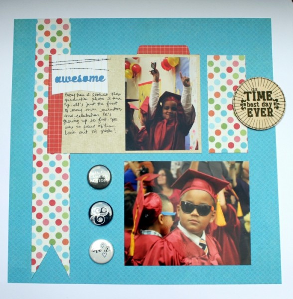
Best Day Ever by Rosann Santos-Elliott | Supplies: Elle’s Studio Saltwater Tabs, Carta Bella Alphabet ; Junction Dear Little Dots; My Mind’s Eye Indie Chic Citron Time Wood Label; Ormolu Flairs.
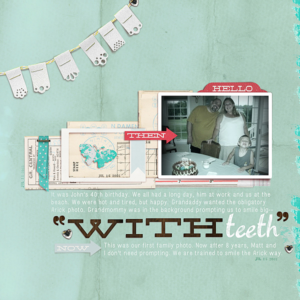
Carrie Arick says, “The story behind my original layout is really about my husband’s family photo protocol: Smiling so your teeth are shown! I created the second page to capture the essence of our spring walks. Now that warm weather has awakened the bugs and frogs have come out in full force, my two cats have really enjoyed our evening walks around our small yard.”
“The great thing about lifting yourself is that you have a guide for a solid design in front of you. With that, you can push yourself outside your comfort zone in a way that doesn’t feel too risky or overwhelming. If something doesn’t work, you can simply undo and try a different approach more closely related to the page you’re lifting. I don’t lift whole pages often, but I do lift techniques and strong design elements from my pages reguarly. Practice makes perfect! I’m never looking to create a page that’s a carbon copy of another, but I’m also not looking to create a page that doesn’t look like page I would create.”
“Here, as well in the page I lifted, I started with a not-so-great photo, and on both pages the photos inspired the story. I took the structure of all those paper blocks in the original page and used scatter (which is outside my comfort zone) and stitches to recreate that structure. Those elements also support the story because they are representative of things that flit about outside. Because the smaller elements are so busy, I grouped the title, photo and large butterfly on this page to create a strong focal point. While the second page doesn’t look much like the page I lifted, I don’t think I could have captured the controlled chaos or mood of our walks without the original page.”

Prowl With Me by Carrie Arick | Supplies: Sara Gleason: Coconut Tree; CD Muckosky: Inkpot Alpha; Vicki Stegall: Butterfly Kisses Alpha
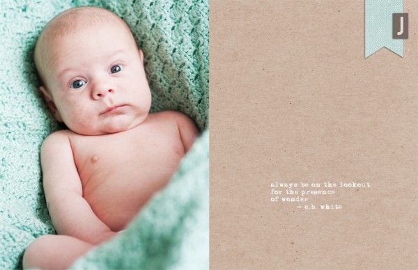
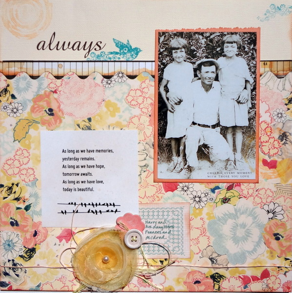
Susanne Brauer says, “The layout I chose to lift has a photo of my grandfather posed with two of his daughters. The new page is about his wife, my grandmother, and my journaling has ties back to him. They will both be included in my album of nostalgia pictures. Often I don’t know the details of the old photos, but I can use them to tell stories that I do know about those pictured.”
“My best tip for lifting yourself is to go with one or two things about the original and then see where that takes you. Here I repeated the word ‘always’ and the bird motif in the title. It was really serendipity that both those could be found on the patterned paper I used as my base. The second item I lifted was to do a pretty cluster. While the sketch of the page is similar the orientation has been rotated and placement of elements tweaked.”
“I don’t usually scraplift my own pages. However, I find myself doing so when I have story about my daughter that parallels a story about my son who is older. Then I will go back and review his page to get ideas for hers – I like the continuity and bond it provides between their albums, just as these two pages now have continuity between my grandfather and grandmother. “
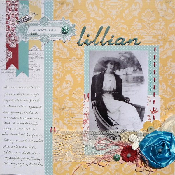
Always You, Lillian by Susanne Brauer | Supplies: Carta Bella So Noted and Lilly Bee Buttercup patterned paper, Making Memories Findings (bits and bobs), American Crafts Natural Thickers, Stampin Up pigment ink, embroidery thread, flowers and lace ribbon from stash
Celeste Smith says, “The first page showcases funny photos I took during the Christmas Card photo shoot. The boys love to horse around between serious takes and we tend to get better smiles! The second page is about dyeing Easter eggs last year and my lamenting that I didn’t get better photos since this year they decided they didn’t want to do it.”
“When I lift myself, I always try and shake it up a little: rotate or flip the layout, use a different color scheme, incorporate a few different elements, change up the number of photos, etc.”
“I lift myself quite a bit. Most times I reuse elements. The chevron shapes on this page have made their way onto a number of pages I’ve created, for instance. I have a stack of papers that I often put behind a photo to give it some dimension. I do try to make things a little different, but in digital scrapbooking it’s great to start with an older page and recreate it. It’s like having an instant template at your disposal!”
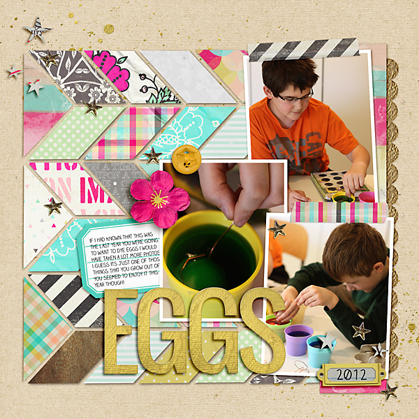
Eggs by Celeste Smith | Supplies: Jennifer Barrette & Allison Pennington: Once Upon Imagination; Audrey Neal: Neutral Basics.
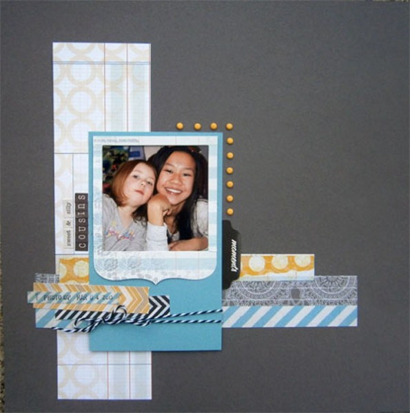
Brenda Becknell says, “At one year old, my grandson often gets more food on his face than in his tummy, so he sometimes goes straight from the dinner table to the bathtub. In this lift of my original layout about my granddaughter and her admiration for her older cousins, I scaled down the vertical strip and matted the photos on two squares of patterned paper instead of using a photo frame. I also substituted blue “skittles” for the brads, and a journaling card for the paper strips on the original.”
“My strategy for lifting previous layouts is to keep the basic structure and some of the elements, but to change the composition slightly. I might substitute two smaller vertical photos for one larger horizontal one or rotate the whole page, and I usually try to change up the color scheme. I treat the original layout more like a sketch, so it’s more of a starting point.”
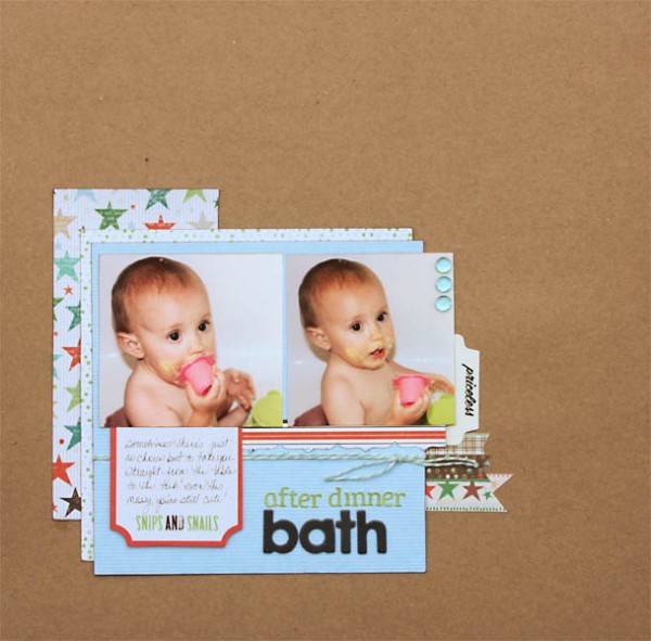
After Dinner Bath by Brenda Becknell | Supplies: Cardstock: Hobby Lobby; Patterned paper & journaling card: Little Yellow Bicycle; Alphabet stickers: Lily Bee; Chipboard letters: American Crafts
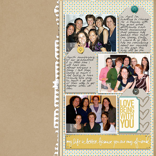
Heather Awsumb says, “The new page here documents one of my favorite parts of a trip to see my sister in Germany in 2010: drinking Gluhwein while visiting all the Christmas Markets. I wanted to include the cool technique this guy had for serving the drink.
“I like to look for pages that have a basic design–like this first blocked layout. Even without changing anything around, you can get different looks by using different papers and kits. I don’t scraplift myself as much as I should especially considering that I scraplift others all the time.”
“I created the original page as an assignment for the Guided Study Critique Workshop, and liked the overall layout of it so decided to do a pretty straightforward lift. I like that the original layout had 3 pictures from across time but the new layout has 3 pictures all in a sequence to tell the story. I don’t care if it looks similar to the original: 1) because I don’t scrapbook chronologically so these two pages will end up nowhere near each other in albums, and 2) I don’t think that anyone looking at my pages in the future will care even if they were next to each other.”
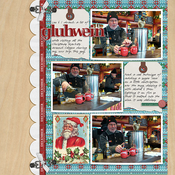
Gluhwein by Heather Awsumb | Supplies: Katie Pertiet: Woodside Jangle Kit, Almost There Solids, Postage Strip Months, Classic Curled Photo Frames No 1, Basic Tags No 1, Tied Fasteners No 4, Cut Ups: Christmas, Linen Buttons: Winter Woods; Patti Knox: DIY Sticker Alpha; Lynn Grieveson: Ripped and Stitched DIY No 2; Lori Whitelock: Masking Borders 2.
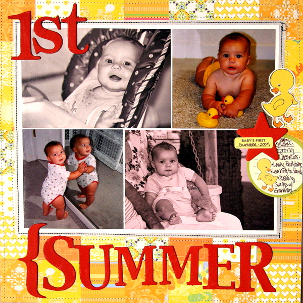
Katie Scott says, “My original layout features photos from my daughter’s first summer. On the scraplifted page, I’ve recorded her love of crafting fashions out of random things – like craft packing paper.”
“I love to lift myself because I know that I can accomplish the page. I also like to lift successful pages. The page I’m lifting here is one of my most re-pinned pages on Pinterest – so I know that it worked.”
“I thought the quilted patterned worked well with the Project Runway theme of this page. On the original page, I thought the quilted pattern resembled a baby’s blanket. Also, I didn’t stick with the same number of photos but I did stick with a block of several photos in one rectangular unit.”
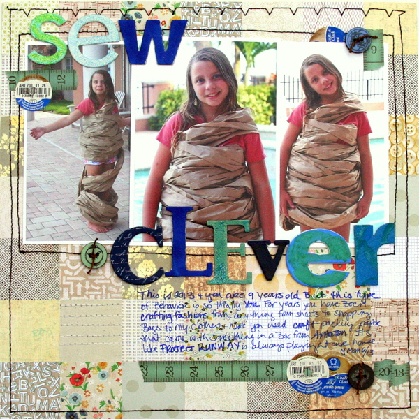
Sew Clever by Katie Scott | Supplies: American Crafts, Crate Paper, Basic Grey patterned paper; Recollections buttons and washi tape; random chipboard letters; machine stitching; square punch.
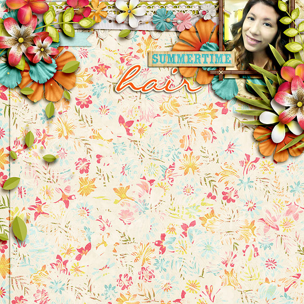
Alexis Aragona says, “My original layout records a fun hairstyle I tried for the first time last year: curls/waves with no heat. I’d also gotten my hair bleached, so I wanted to show off the color. My lift has no relation to it: I rave about a current TV drama I’m watching.”
“I’ve unintentionally scraplifted myself twice, haha. I usually lift for composition, so it means I must’ve really loved a page’s composition to do it again! My best tip would be to look closely at your gallery and find what layouts catch your eye just by their thumbnails. For me, it’s usually because of color or composition. If I’m consciously lifting myself, I change it up a little if I can. In this case, I went with two photos and added journaling.”
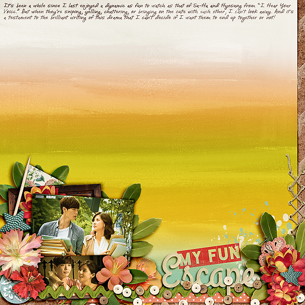
My Fun Escape by Alexis Aragona | Supplies: Photos: SBS Entertainment; Kristin Cronin-Barrow: Down by the Bay; Fonts: DJB I Love Me Some Brook, Blackout
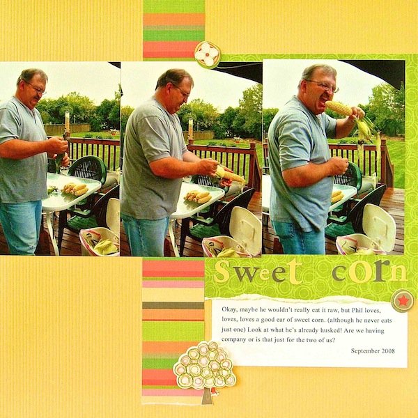
Sue Althouse says, “The original page is about my husband’s love of sweet corn on the cob. The second page is about our annual visit to Greenfield Village’s Civil War Remembrance.”
“When scraplifting myself, I like to find an older layout and create an updated version of the design for my new page. This is a quick and easy way to complete a layout–much like using a sketch. I don’t try to re-invent the wheel. It’s fine with me if the two pages look similar, although they usually don’t!”
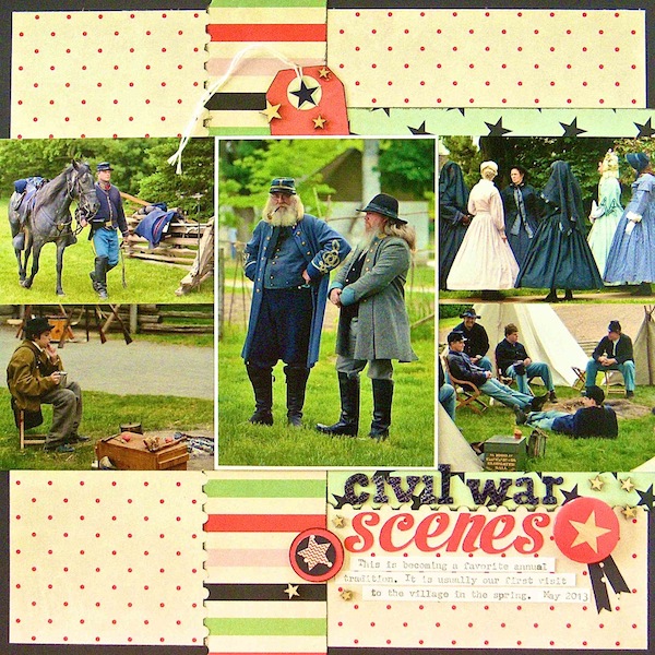
Civil War Scenes by Sue Althouse | Supplies: Patterned Paper, Stickers, Tags, Flair: Fancy Pants; Punches: EK Success, Fiskars; Alphabets: American Crafts, Silhouette; Ink: Jenni Bowlin
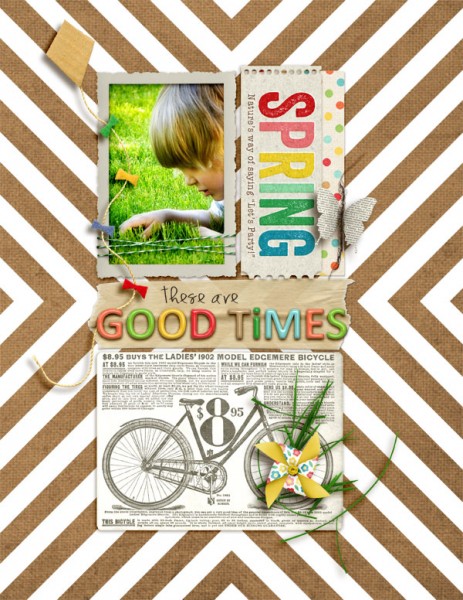
Amy Kingsford says “My original page celebrates the things I love most about spring, and my scraplift records my son’s 5th Birthday celebration.”
“In the latest issue of Masterful Scrapbook Design I shared these two pages as a an example of how I approach blocked canvases. Both of these pages use a blocked inner canvas with the same configuration–a large block on bottom, a slender rectangle in the center and two smaller blocks on top. I often use my largest block to house the element(s) that reveal the most about my story–it could be photo, title, journaling or even embellishments. The slender piece is perfect for titles or embellishments and the two medium sized blocks work great for journaling and photos. Because I let my memories dictate what goes where with this type of configuration I rarely worry about a lifted page looking too much like the original.”
“I scraplift myself fairly often, though it might not be conscious at the time. I’ve definitely developed certain approaches and design crutches over time and personally I don’t think these have to be a bad thing if you don’t want them to be.”
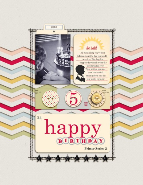
Happy Birthday 5 by Amy Kingsford | Supplies: Jenni Bowlin Studio Digitals: Playful Embellishment Kit, Magpie Collection, Journaling Basics, Vintage Bling, Chevron Stencil Cut File; Anna Aspnes: ArtPlay Palette Inflorescence (button); Creashens: Bare Necessities Cardstocks; Karen Funk: Simple Stitches.
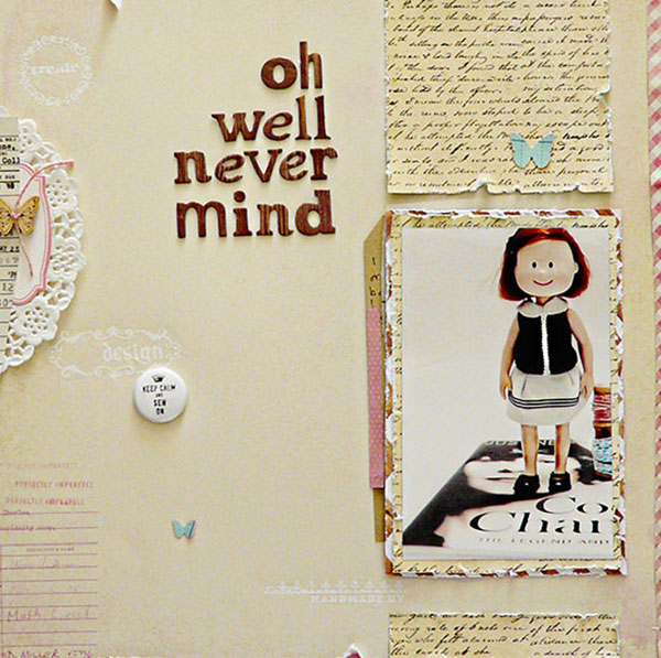
Sian Fair says, “On the original page here, I poke a bit of fun at myself with, recording that, as I sat sewing dolls clothes, I thought about the more useful things I could be doing. My scraplifted page tells the story of a gift I gave to my brother in the form of a doll that was made to look like him.”
“My best tip for scraplifting is to play to your strengths! If you like to sew on pages, then why not repeat it? It won’t look like repetition, it will just look like you.”
“I think scraplifting yourself is a great idea! If you have enjoyed making a page once, why not make it again? You don’t have to put them beside each other in an album, and even if you do, chances are no one will even notice. I challenged myself here, not only to scraplift the design, but also to make a page about a similar subject, just to see if I could achieve a different look. This one definitely looks like a page about my brother. But if it had turned out looking more like the first one, I wouldn’t have minded. Scraplifting is often as much about enjoying the process as the end result.
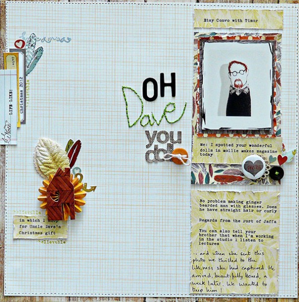
Oh Dave You Doll by Sian Fair | Supplies; Patterned Paper by Crate Paper and Studio Calico; Alphas by American Crafts and Sassafras; stickers: Studio Calico, American Crafts and Pretty Little Studio; tags: Elle’s Studio
[current]

