Check out a round-up of scrapbook pages with portraits of our favorite guys.
Deborah Wagner says, “These are cute photos of my nephew goofing around, and I scrapbooked them with an Andy-Warhol-inspired photo treatment.” Deborah repeated the colors from the photo treatment in her titlework and embellishments.
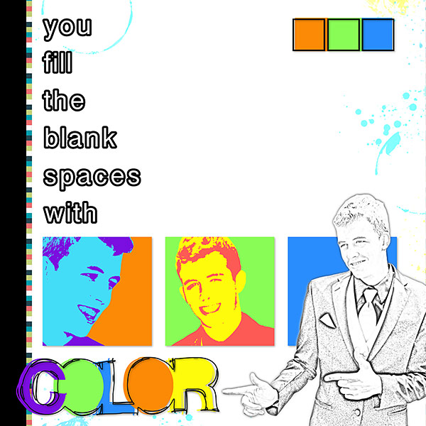
Fill The Blank Spaces by Deborah Wagner. Supplies: Katie Pertiet Surf Lagoon Paper Pack, Touches of Paint Paper Pack, Doodled Block Alpha
Amy Kingsford says, “These were two photos that my nephew asked me to take of him and they really do capture his personality perfectly–cool and collected with a touch of adventure! I brought these photos together on this page in a way that created a “picture-in-picture” type of feel and combined them with contemporary colors and patterns. When photographing guys, I find that its best to just go with the flow and aim to capture them in situations in which they feel most natural and comfortable–then we are both happy with the results!
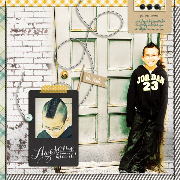
So Very Awesome by Amy Kingsford | Supplies: Made of Awesome by Gennifer Bursett and Stitched Kriss Kross No. 1 by Anna Aspnes.
Leah Farquharson says, “This is a layout to things I’m thankful for in my husband. The design is inspired by retro packaging design. The single color, simple shapes, centered placement composition, and vintage print paper are all hallmarks of retro designs.”

YOU ARE by Leah Farquharson | Red, white and black cardstock: bazzill. Patterned paper, vintage buttons: Jenni Bowlin Studios. Stamps, Page Gems: Studio Calico. Pigment Ink: American Crafts. Fonts: marketing script, BEBAS.
Adryane Driscoll turned her son’s portrait into a digital stencil. She said, I took a photo of my son against a light colored wall, turned it to black and white then increased the contrast so that the blacks were very black and the whites very white. Then I used the “cut out” filter in photoshop. I adjusted the various settings until the “cuts” were where I wanted them. Two of the images are blended directly on the background while the other two have a white border that allowed me to add a drop shadow to give the page a little dimension. Since stencils are usually painted, I tried to achieve that look by blending various papers and brushes over the stenciled images. I also used a stencil font (“Stencil” from dafont.com) to create the “Y” and the “U.” I think stenciling is like fussy cutting. The simpler the shape the nicer the cut. If I do this again with a photo of a person I would try it with a straight on shot so that the eyes and mouth are larger when I use the cut out filter.”
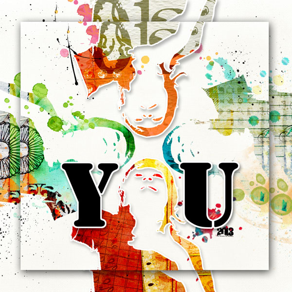
you by Adryane Driscoll: Credits: Anna Aspnes I ArtPlay Palette Metro Graffiti, ArtPlay Palette Pumpkin Patch, 2013 WordArt No.1, ArtsyKardz Vitality, ArtsyKardz Viaggio, ArtsyKardz Bask, ArtsyKardz Salty Living, ArtsyKardz Storm, ArtPlay Palette Social Network, and Light Textured Neutrals No.2; Holliewood Studios I Art Box No.2 and Art Journaling No.2; and J Kneipp I Far From Here
Debbie Hodge says, “I scrapbooked these photos of my still dressed up after attending a play with colors and motifs that have a dressy tone. The series of circles are arranged like scallops of a theatre curtain, and gold brads tack them down.”
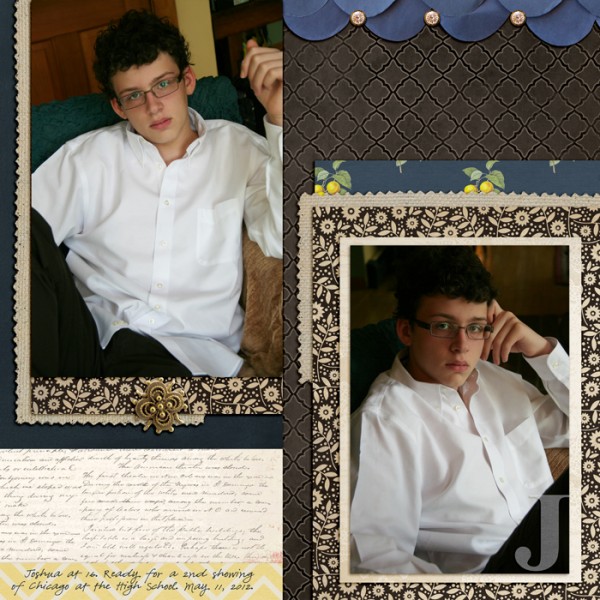
J by Debbie Hodge | Supplies: Findings by Jenn Allyson; Petals by Sara Gleason; Alpha Set 5, Burlap Scraps, ArtPlay Snow Fun by Anna Aspnes; Chasing Fireflies by Paislee Press; Bollywood Dreams by ViVa Artistry
Deborah Wagner says, “My nephew hated this photo, but I loved it. I thought this is model material, so I did just that – Put him on the cover of GQ. I used the gallon/quart/pint theory with my mixture of fonts. I used a gallon of the Serif font, Onyx; a quart of the Sans Serif font, Helvetica; and a pint of a handwritten font, Pea Bhea. I thought the handwritten font on the taped tab made the page seem more lifelike.”
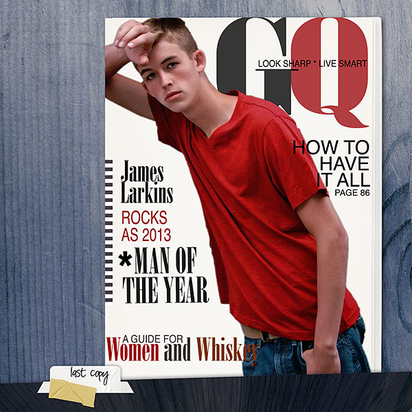
Man of The Year by Deborah Wagner. Supplies: Katie Pertiet William Kit, Book of Memories No. 9B, Cardstock Tabs No. 2, Assorted Tapes No. 2; Andrea Victoria Le Spook Paper Pack; Photo by Dan Rother Photography.
Sue Althouse says, “This page is about snatching my husband’s camera to get a few pictures of him. I wanted the page to be more about my husband and less about the fall setting, so I used a black and white close-up as the focal point and neutral colors for my title and journaling. The supporting pictures and embellishment clusters form a visual triangle and add pops of color to a mostly neutral layout.”
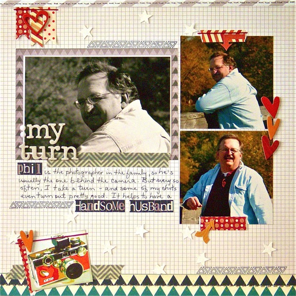
My Turn by Sue Althouse | Supplies: Cardstock: Bazzill; Patterned Paper: Studio Calico; Alphabets: American Crafts, Studio Calico; Inks: Hero Arts, Jenni Bowlin; Stickers, Stamps, Chipboard Shapes, Gems: Studio Calico; Floss: We Are Memory Keepers; Star Punch: Fiskars
Amy Kingsford says, “I absolutely loved these photos I took of my husband and couldn’t wait to get them on a page. I decided to use their “cool factor” to help me scrapbook a funny little tidbit that our family will enjoy looking back on in years to come—the fact that both of my boys called my husband “Jake” instead of “Dad” up until about a year ago. I think this one line of text: “So cool that his kids call him Jake,” really says it all!
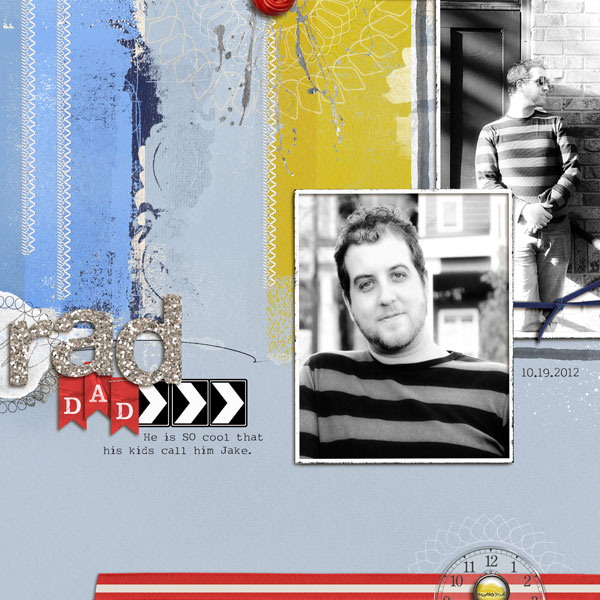
Rad Dad by Amy Kingsford | Supplies: Anna Aspnes: ArtPlay Palette Twizzle, ArtPlay Palette Bike Like, Stitched Straight Lines White No. 3, Gold Paint No. 1 (altered), Silver Glitter Alpha; Pattie Knox: ClockWorks No. 1; Katie Perteit: Awarded Alpha No. 2
Deborah Wagner says, “This is a photo of my nephew going to prom. I thought the bright floral and striped patterns were the perfect fit for this photo. The background floral pattern coordinates with his pink vest and makes the page pop; while the black and white stripes maintain the masculine feel.”
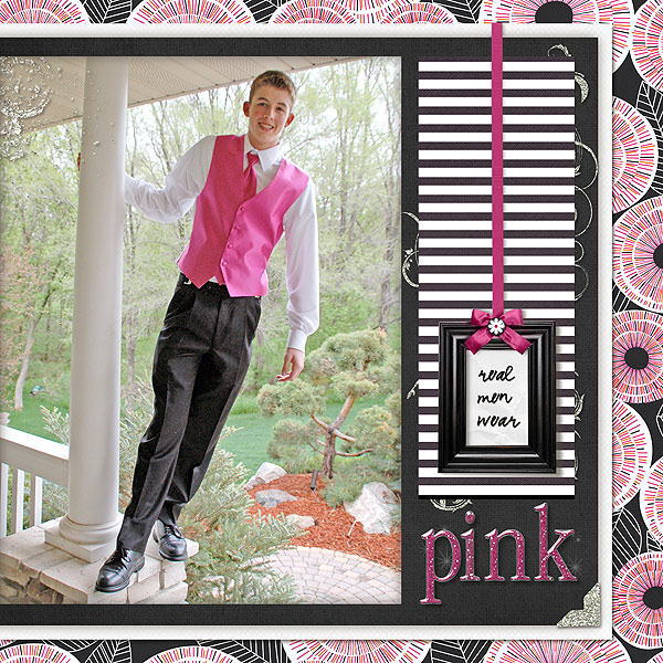
Real Men Wear Pink by Deborah Wagner. Supplies – Designer Digitals: Andrea Victoria – Floral Pop Paper, Le Spook Paper; Katie Pertiet – Star Glows No. 1, Classic Cardstock Festive Brights, Colorful Edgers No. 2, Metal Rimmed Glitter Alpha, Photo Corners Colors No. 2, Ad Inspiration Frames 11-14-10; Pattie Knox – Brad Bonanza 3; Lynn Grieveson – Blackett Hall Paper
Betsy Sammarco says, “I had a nice photo of my son on high school graduation night and I wanted to create a page using it. I used one of my favorite journaling techniques where I simply write down thoughts that may be spinning around in my head. I don’t pay attention to grammar when I journal this way. The journaling strip is coming out of a vintage ‘Egg Saver’ envelope which in a way has its own symbolism by holding the thoughts I’ve written about my child.”
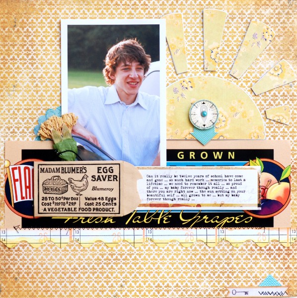
Grown by Betsy Sammarco | Patterned Paper by My Mind’s Eye and Sassafrass Lass, Embellishments by My Mind’s Eye and Sassafrass Lass, Vintage fruit label and Egg Saver envelope, font Mom’s Typewriter
[current]

