
 by Debbie Hodge
Have you seen the recent fashions inspired by the Art Deco style? What about the recently released movie version of The Great Gatsby? The Art Deco style emerged in the 20s and embraced new technologies and materials, incorporating symmetry rather than asymmetry and the rectilinear rather than the curvilinear. The Get It Scrapped creative team has found inspiration for line, shape, type, colors and materials from the Art Deco style for their scrapbook pages.
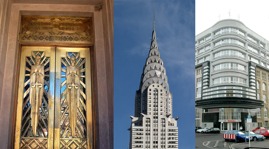
Art Deco Architecture: Cochise County Courthouse, Bisbee, Arizonia; Chrysler Building, NYC; Rudolf Mosse Publishing House, Berlin. Source Wikipedia.
Marcia Fortunato says, “This layout documents an afternoon of shopping at the Cleveland West Side Market with my oldest son.
I felt that the symmetrical design typical of the Art Deco period would work well with the symmetry of my focal photo showing the ceiling of the market.”
“I built on the inspiration, incorporating many small detail photos of some of the things we saw at the market, maintaining the symmetry in my design. I also included details in my layout that were art deco-inspired — graphic flared designs, metal (in this case silver) bordered in black, and colors typical of the period. For my title I used shiny silver art deco-type letters. Then to make the flair design I free-hand drew the pieces using black marker on silver cardstock and cut them out keeping the black outlines. To keep the design symmetrical I cut the pieces out for one side, then traced the mirror image of each piece for the other side. My design was particularly inspired by this art deco image.”

West Side Market by Marcia Fortunato | Supplies: Cardstock: Bazzill Basics, American Crafts, The Paper Company; Alphas: American Crafts, Fancy Pants; Embellishments: Simple Stories, Fancy Pants; Other: Markers: Sharpie; Adhesive: American Crafts
Carrie Arick says, “This page is about my in-laws loving their new Android phones. I am inspired by the palette and the shapes used during the Art Deco period because they meld the exotic (a lot of exploration was taking place, especially in Egypt) and the everyday (the modernization of the Western culture) in a way that is lush and dramatic without being fussy.”
“While looking for Art Deco inspiration, I came across a great window done in an iconic Art Deco shape, so I traced it to use on my page, clipping a simple leaf pattern paper to it. I used it horizontally to help ground my photo in a way that is unexpected, which I also think makes look modern. I created my title with an Art Deco font (Market Deco) and paired it a very modern serif journaling font.”

Droid by Carrie Arick | Supplies: Just Jaimee: Organic
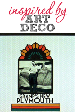
Sue Althouse says, “This page is about my grandfather buying a brand new car for $665.00 back in 1936. Choosing a photo that dates back to the Art Deco period sets the tone for this page. I cut an art deco arch frame with my Silhouette to highlight the picture. Rich colors, bold geometric shapes, and a Market Deco font complete the look in a clean and simple style.”

Gramp’s New Plymouth by Sue Althouse | Supplies:
Cardstock: Bazzill, Core-dinations, Patterned Paper: Webster’s Pages, Alphabets: Silhouette (Market Deco), Die Cut Frame: Silhouette (Art Deco Arch)
Lise Mariann Alsli says, “This is a picture from when my husband (who is 6´7″) was actually smaller than his big sister. So cute! To me the Art Deco period was all about clean, symmetric shapes, gold, yellows, browns and feathers. So I immediately knew that I wanted to use these elements in my page.”
“I searched the internet a bit and found a beautiful stair-like shape. I knew I had to use it. After I had made the shape, the rest of the page came together really quickly. The plaques from Tim Holtz were in pewter color so I made it look like old gold with paint and I stole some golden nails from my husbands tool case to ‘fasten’ them to the page. When it was time to find a picture I loved the idea of using this picture of my husband and his sister from the 70s–because that is truly the brown period, isn’t it?”

1977 by Lise Mariann Alsli | Supplies: Paper; Bazzill cardstock, Bazzill craft, Elle´s studio – Day to day, My Minds Eye – So Sophie, Webster´s pages – Your life. Embellishments: Tim Holtz – Word sticks, Studio 490 – Art parts metal gears, Jenni Bowlin – Rub on feathers, Nails from my husbands tool case. Paints; Acrylic paints, Color Box – Cats eye chalk, Black pen. Alphabet; American Crafts Thickers Daiquiri.
Tara McKernin says, “This is a simple and fun layout showing my favorite image from my son’s big season opener day at baseball, more about us than baseball. This one is for me.”
“I find Art Deco to be bold, graphic, linear, and just funky with lots of layers of patterns and designs. I took my cue from this kit: it’s colors are retro and scream Art Deco to me. I used lines mixed with patterns in a layered approached. This is totally outside of my typical style and I love the result.”

Season Opener by Tara McKernin | Supplies: Template, Sahlin Studio June blog template; Kit, Sahlin Studio Melon Sorbet
Katie Scott says, “When my kids were babies, I used to take them to the JC Penney Portrait Studio every Wednesday after work to take photos of them in silly costumes including this baby flapper costume (that I just recently passed on to another little girl in our spring cleaning and house clutter purge!)”
“The costume my daughter is wearing made me think of the 1920s flappers. When I researched “Art Deco” online, I read that the style was graphic, streamlined, flashy and used stylistic fonts. I tried to keep most of the elements on this page graphic and straight, but added in the flashy bling in a diagonal line to highlight the fun nature of this photo and our silly picture-taking tradition. I also happened to find a title block from My Mind’s Eye (their 2003 collection!) that seemed very Art Deco. I wanted to keep the layout fresh and light looking since the architecture of that time was kind of light feeling. I didn’t use a particular pin or image for inspiration, but I did look at the Get It Scrapped Art Deco Pin board for general inspiration.”

Baby Girl by Katie Scott | Supplies: Echo Park, American Crafts patterned papers. My Minds Eye embellishments
Susanne Brauer says, “The story here is that my daughter is sweet – although seventeen and not sixteen. It is a lasting quality – embedded in her soul.”
“After looking at many examples of the Art Deco style, I was struck by the mix of straight lines, often on the diagonal along with curved shapes (but not circles) and a very centered orientation to design. I choose not to make everything strictly symmetrical but loosely matching instead. This is a school portrait, and while the colors and patterns aren’t reminiscent of the Art Deco style, the crispness of the paper lines and the simple bold font are. I dug out my old Creative Memories cutting system for the oval shapes.”

Sweet 17 by Susanne Brauer | Supplies – Papers – Basic Grey Paper Cottage and Soliel paper lines, October Afternoon Woodland Park, Peebles Sunny Side paper, Basic Grey PB&J chipboard including alpha, Websters Pages Florettes and Prima Say It In Pearls.
Amy Kingsford says, “The story here is about my high school (which happens to be a great example of art deco architecture) and my new appreciation for its beauty and its sense of history.”
“As an homage to the architectural style of my school, I chose several Art Deco inspired patterned papers to fill my pieced background. All of these prints incorporate a strong use of line and shape. The bold retro colors are also reflective of the Art Deco movement. Finally I chose a few glitzy elements to embellish with as well as this stylish circular frame to help channel the viewer’s eye into the page.”

Alma Mater by Amy Kingsford | Supplies: Pixels and Company Collab: Homebodyand Free Love; Deena Rutter: Hotel California Papers; Robyn Meierotto: In Stitches-Basic Neutrals; Simple Scrapper: Premium Membership Template & Story Starter.
Doris Sander says, “While perusing the Get It Scrapped Art Deco Pinterest board, I noticed three outstanding characteristics of the style: geometric shapes, symmetry, and lots of gold. For me, the gold was the most inspiring and the best fit with my style.”
“I created a page in all golds and yellows and am delighted with the results. For the background, I misted Heidi Swapp Gold Lame over the Prima trim and then hand stitched the trim to the page. For the tag, I adhered some yellow vintage trim down and then inked the exposed places with Wild Honey Tim Holtz Distress Stain. The chipboard sunburst was first inked and then misted in the same two colors. I finally added some yellow washi tape and gold foil leaves and bugs to complete the look.”

Gold by Doris Sander | Supplies : cardstock – Bazzill, trim – Prima, bag, washi tape – Jillibean Soup, tag – Avery, gold leaves – Martha Stewart, mist – Heidi Swapp, ink – Tim Holtz, alphabet – American Crafts, trim – vintage, other – German foil
[current]
