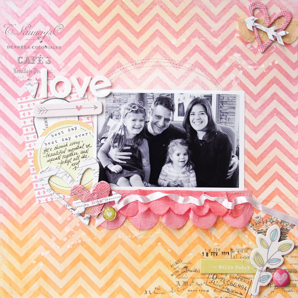
It is the soft and dreamy quality of watercolors and pastel colors that appeal to Marie-Pierre Capistran.
Marie-Pierre’s cool thing right now is using watercolors to create a soft and dreamy look in her pages.
Marie-Pierre became interested in watercolors long before she took up memory keeping, so incorporating this skill in her scrapbook pages felt natural.
Marie-Pierre says, “I’ve always been interested in watercolor. The soft and dreamy look of it appeals to me. Before I started scrapbooking, I took watercolor classes. The only thing I didn’t really enjoy was the drawing. When I started scrapbooking I was happy to see that I could incorporate the art that I loved into my layouts without worrying about being good at drawing, because I could easily use watercolors with stamps or as a background. I often study the layouts of awesome scrapbookers like Wilna Furstenberg, Lisa Truesdell and Anna-Maria Wolniak and try to find what I like about them in order to translate that into my own style.”
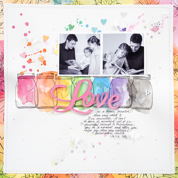
“On this page that showcases the relationship between my husband and our daughters, you might think that I filled in my little jars with watercolor paint, but I’ve actually done the opposite. I started with the paint and once it was dry, I stamped over the various color spots with my jar stamp. Before adhering my photo, I made some watercolor splatters with the same colors I used for the jars. Then I mixed in some small hearts that I punched from patterned paper with a watercolor look. For the mat around my page I used the same watercolor patterned paper that I punch my hearts from.”

Love by Marie-Pierre Capistran | Supplies: Cardstock: SU!; Pattern paper: Amy Tangerine; Stamps: Dear Lizzy; Paper punch: SU!; Other: vellum paper, date stamp, sewing machine, Silhouette; Inspiration: Art Class with Wilna Furstenberg.
Watercolors work well with a variety of colors and textures.
Though Marie-Pierre is partial to using pastel color schemes and soft layers in her pages, she tells us that watercolors work well with a variety colors and textures.
“What I like with watercolors is that they not only work with pastel colors but also with vibrant and happy colors. In fact, because it is so soft, it is fun to pair watercolors with more vibrant colors that will pop next to it. I also like that watercolors can can be combined with other techniques and products like embossing, sewing, chipboard accents, ink pen, etc. “
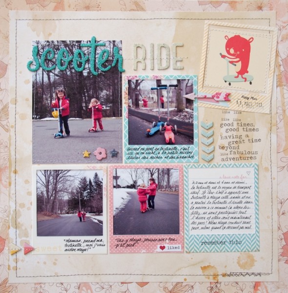
“On ‘Scooter Ride,’ I used patterned paper with a watercolor-like finish in soft neutral colors along with pastel Polaroid frames in turquoise, yellow and pink. The pictures are fairly dark with the street and trees showing and create contrast. Then, to that very soft-looking page, I added lots of texture with chipboard elements, stitching and glitters on the letters. I also used arrows all over the page to guide the eye through the different pictures and elements.”

Scooter ride by Marie-Pierre Capistran | Supplies: Patterned paper: DCWV; Letter stickers: American Crafts Thickers; Chipboard elements: American Crafts Dear Lizzy; Rub-ons: Heidi Swapp; Like sticker: Heidi Swapp; Others: date stamp, patterned paper from stash, polaroid frames found on internet, stitching.
Watercolor is an inexpensive and forgiving technique.
According to Marie-Pierre all you need to get started with this technique is watercolor paper and and an inexpensive watercolor paint set. She also suggests that you hold onto any backgrounds or watercolor paintings that didn’t work out for use on future layouts.
“When working with watercolor I try to use watercolor paper because it’s durable and easier to work with. I buy cheap watercolor paint from the craft store. If you’re interested in using watercolor with stamps, I’d look for stamps that have a big enough empty space to color in and I recommend black Memento ink to avoid bleeding, though I’m usually careful not to paint over where I’ve stamped.”
“Another thing I like about watercolors is that mistakes are welcomed! That’s very important to me since I don’t always achieve the look that I was striving for. ”
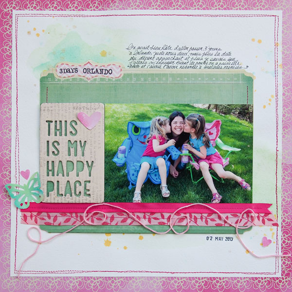
“The background for this happy page I made with watercolor. Originally it was meant to be for another layout but it didn’t work out, so I held on to it and used it here. I matted the watercolor background with this watercolor-like patterned paper and it was suddenly perfect! I added some gold mist from Heidi Swapp (the gold is perfect to add some shimmer to watercolor) and dressed the mini file folder up with ribbons and a butterfly that was also colored with watercolors.”

Marie-Pierre Capistran
Marie is a French-Canadian who has lived 12 years in Switzerland before moving to Connecticut. Although she’s a french teacher, she’s currently home with her two little girls ages 3 and 5.
Marie is an artist at heart and has been crafting for years. She enjoyed working with many different types of crafts including watercolor, paper cutting and calligraphy before she fell in love with memory keeping, which is now her biggest passion alongside photography and writing. This is Marie’s second year on the Get It Scrapped Creative Team.


