The cityscape motif is appearing on scrapbook pages lately. It seems we’re dreaming of urban life.
Over at Trendhunter.com the trendiness of the cityscape motif for fashion and home decor was noted with the following thoughts: “For centuries, art depicting landscapes offered comfort and inspiration to people, hinting at a yearning for tranquil life outside the city. The recent popularity of cityscape art, however, suggests that as more people move to urban cores, or dream of doing so, the city has become an idealistic destination.“
See scrapbooking ideas for topics and designs that use the trendy cityscape motif on pages below — and more ideas on the Get It Scrapped Cityscape Pinterest board.
Christy Strickler says, “These are photos of us in the airport lobby and on the plane during takeoff on a trip to Fort Lauderdale.”
“The title, FLL, is the airport code. I found a die cut cityscape of Fort Lauderdale in the Silhouette store. (They have die cuts for many different cities.) I wanted to convey the different views from takeoff to being in the air, and used paper showing city buildings at ground level, paper with an aerial view map of a city and paper with clouds.”
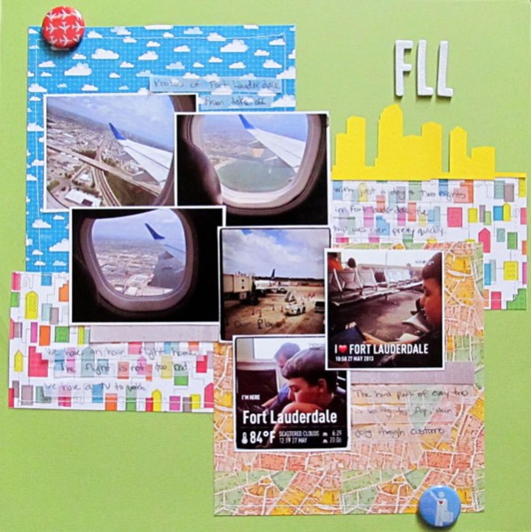
FLL by Christy Strickler |Supplies Cardstock: Bazzill; Patterned Paper: Studio Calico, American Crafts, Webster’s Pages; Letters: American Crafts; Flair: A Flair for Buttons;Die Cut: Silhouette; Other: vellum
Carrie Arick says, “Last year, I took my first solo vacation in over 11 years, and this was the first photo I snapped once I arrived at my destination. When I picked this photo, I knew I wanted a cityscape in a band spanning my page to make a foundation for my photo.”
“I found a great cityscape element from Enkaye Designs in my stash and loved the overall shape, but the color and size weren’t quite right. I decided to clip a piece of patterned paper to the element then duplicated it. Part of each element comes out from behind my photo, then bleeds off the canvas, which allows me get the band I wanted without any fuss. I added white strokes around the cityscape elements, which I placed on a new layer, to give a chalked outline effect and to help add extra dimension. It’s easy to do this using the magic wand to select your element. Then from the selection menu choose modify, expand. Create a new raster layer, use the flood fill bucket to fill your selection on the new layer, deselect, then drag the layer under your element and play with the opacity until you’ve got some of the underlying paper texture peeking through.”
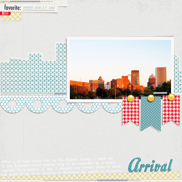
Arrival by Carrie Arick | Supplies: Enkaye Designs: Comic; Sara Gleason: Sequoia Tree; My de Leon: Wide Washi Wub; Kristin Aagard: Just Add Water Elements (stitches).
Sian Fair says, “I am finally making a start on some pages about Belfast. I wanted to recreate the mixed up, jumbled feel of the differently aged buildings in our city, with an emphasis on the red brick which is everywhere.”
“I used washi tape strips to indicate the tower blocks and I cut silhouetted buildings with my Slice cutting machine: they are actually taken from an “International Travel” Design Card and if you look closely you might spot that I have disguised the shapes of some famous European buildings with careful cutting! But the impression of the shape of the buildings we have here is still there. The ship gives a nod to the famous Belfast shipyard: it’s Titanic Town.”
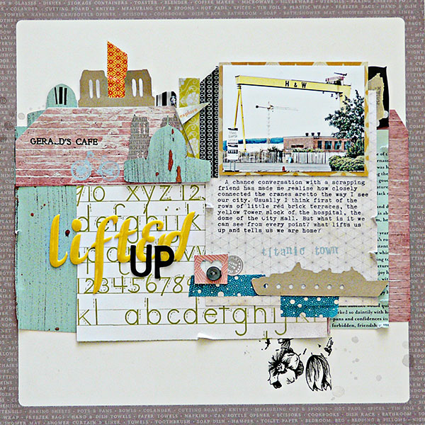
Lifted Up by Sian Fair/ Supplies: Patterned Paper: American Crafts Dear Lizzy, Crate Paper Maggie Holmes, October Afternoon; Alphas: American Crafts Dear Lizzy; rub on by Jenni Bowlin; washi tape and button from stash
Marcia Fortunato says, “My oldest son recently completed his master’s degree and is starting a new job. I wanted to document this milestone in his life.”
I made my background paper with a cityscape that fits with the work he will do as a structural engineer. I added a bridge because bridges fascinate him. I created the background by cutting a rectangle from the edge of an envelope (this made it double thickness so a little sturdier) and then using the negative space as a template. I used Distress Ink on a blending tool and dragged it from just above the edge of the template down onto the paper to create the buildings. I moved it around the page to create additional buildings and used the same technique for the bridge at the bottom of the page. I added hand-drawn windows to some of the buildings.”
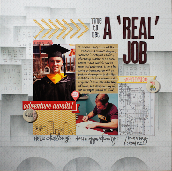
A Real Job by Marcia Fortunato | Supplies: Patterned paper: Studio Calico, Basic Grey, American Crafts; cardstock: American Crafts; Alphabets: American Crafts (Thickers), Studio Calico; Embellishments: flair- Studio Calico, word stickers- Simple Stories, October Afternoon, and Jillibean Soup, rub-on- American Crafts; Stamps – Technique Tuesday, Hero Arts/Studio Calico; Inks – Hero Arts, Tsukineko Co. (Versa Color), Ranger (Distress Ink); Pens – American Crafts, Marvy (LePen), Sharpie; Adhesive – American Crafts, Scrapbook Adhesives by 3L, Darice
Alexis Aragona says, “As someone who’s lived in a city her whole life, I wanted to highlight what I loved about it. Instead of a photo, I used a digital brush of a cityscape, stamped and blended into my background paper. Essentially I went photoless for this page, because the brush was enough to highlight the subject of my journaling. The rest of the page took an artsy turn with brushes and doodles. I went vertical with my journaling to reflect the height of the buildings.”
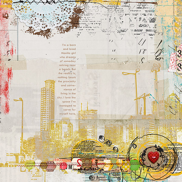
A City Girl by Alexis Aragona | Supplies: Katie Pertiet: Taped Together No2; Captivated Visions: Sunshine in my Soul; Studio Basic: Addiction: Brushes and Stuff #2; Photoshopfreebrushes.com: Funky Cityscapes; Font: Rough Typewriter
Audrey Tan says, “I created an artsy background and added city brushes that represent the city I live in. I went for a photoless page and journaled about being a city girl.”
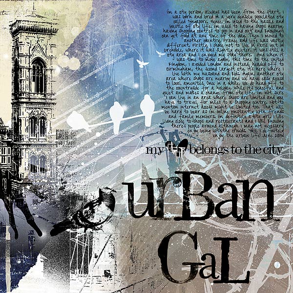
Urban Gal by Audrey Tan | Supplies: Jen Maddocks Designs: Urban2
Katie Pertiet: Messy Stamped Alpha
Font: Pea Cindy
Lise Mariann Alsli says, “I come from a tiny, little island with only about 50 inhabitants so when I had to move away to get my education at 16, it was a huge transition. I was terrified of all the city things like buses and strangers (which, of course, was almost everyone). After living in cities for almost 17 years now, I consider myself a true city girl.”
“I really like doing a transfer technique in which I print a picture on regular copy paper and glue it face down on the cardstock using gel medium. When the medium is dry, I rip off as much as I can before I spray the whole thing with water and rub off the rest of the white paper on top of the print. The result is a shabby, cool background picture which looks like it emerges from the cardstock. Love it. This technique can be used to make all kinds of cool backgrounds using pictures not only as pictures, but a decorative element as well.”
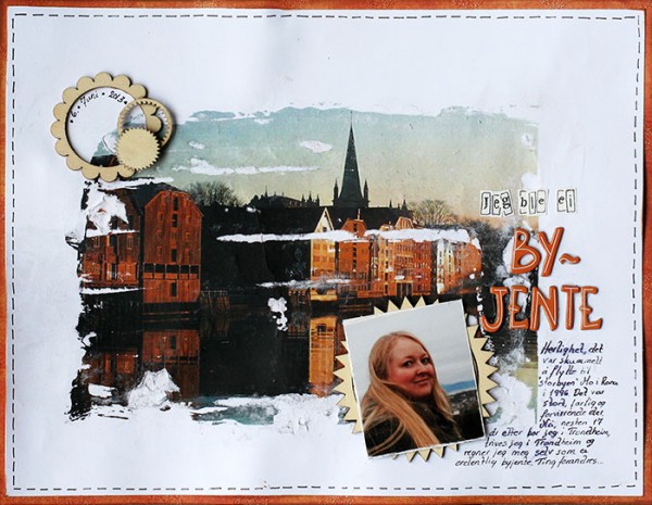
Jeg ble en byjente (I Became a City Girl) by Lise Mariann Alsli | Supplies: Paper; Bazzill cardstock, Printed picture on regular copy paper, DCWV patterned paper. Embellishments; Studio Calico wood veneer. Alphabet; American Crafts Thickers Bones. Medium; Liquitex matte gel medium. Black pen.
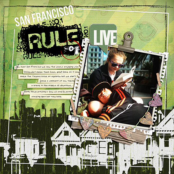
Ronnie Crowley says, “The whole time my kids were in San Francisco they pointed out people who seemed strange, living like they’d never seen before, and I wanted to record how the people of San Francisco live.”
“I took inspiration from this card on the Get It Scrapped Cityscape Pinterest Board, especially the way ‘New York’ was rendered in the box. For a city feeling, I converted a photo of San Francisco into an element that looks a rub-on. How-to for converting city photo to rub-on: I used the sketch filters in Photoshop with my original photo until I found one I liked. The resulting image was black and white with strong lines. To reduce the amount of white, I selected and deleted the sky to leave the skyline. To get a less-than-perfect look to the image, I used an action from Mommyish Designs called ‘Peeled Paint.’ It took a while, but it was fun playing with Photoshop until I got the look I wanted.”
Michelle Hernandez says, “I use cityscapes a lot in my scrapping. I really wanted to stay simple and bright with this page since many of my other pages tend to be experimental or graffiti inspired. I used an older Sassafras Lass paper collection, a cute hello button from A Flair For Buttons, and a current favorite tool: the Amy Tangerine embroidery stencil.”
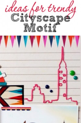
“I thought the stencil was a little generic so I added the Empire State Building by using an old NYC themed chipboard as a stencil for the design.
I found that it’s best to choose smaller designs when embroidering on paper as you get a lot of popped stitches in fine details. I usually also divide my embroidery floss in two so I get a thinner line. I did lot of repairing on the back of the page with washi tape to keep the stitches in place after they popped out.”
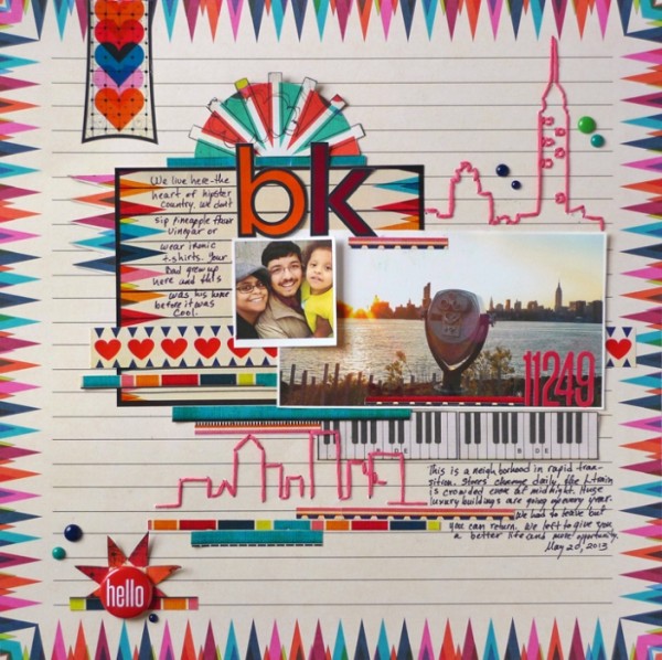
BK by Michelle Hernandez | Supplies: Sassafras Lass (paper); A Flair For Buttons (hello button); Amy Tangerine (embroidery stencil).
[current]

