by Debbie Hodge
There are times when a story is best told with a combination of old and new photos. See how the Get It Scrapped Creative Team has made scrapbook pages with both old and new photos on the same page.
Doris Sander says, “This layout documents a couple weeks right after we moved into our new house when we were using coolers and waiting on a new refrigerator. I happened to ask my dad about getting ice when he was a kid. I knew they didn’t have a refrigerator back then, but I imagined they probably got ice once a week at least. I was so shocked when he said they got ice maybe once a year! Wow how times have changed!”
“I used photos taken right after we moved into our new home along with a little photo strip of my father as a child. I didn’t really have a clear story to share of these random photos of my dad, so I was delighted to find a way to incorporate them into a story of my own. They play a great supporting role in this refrigerated tale.”
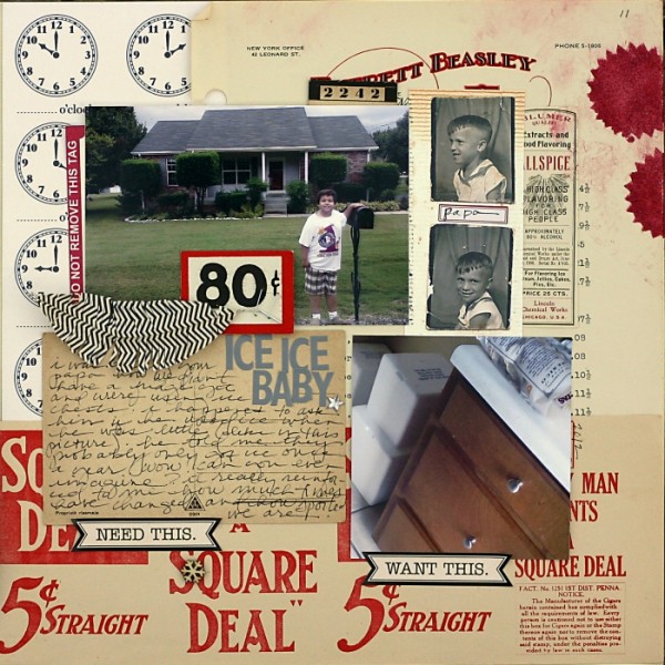
Ice Ice Baby by Doris Sander | Supplies: patterned paper, feathers, stickers – Jenni Bowlin Studio, stencil – JBS Mercantile Exclusive, ink – Jenni Bowlin for Ranger, wood veneer snowflake – Studio Calico, postcard, price tag, letterhead, ad, spice label – vintage
Andrea says, “I wanted to show the conflicting feelings I have about my daughter going away to college. I converted the younger photo of her to sepia tone and left the newer prom photo in color to reinforce that they are from two different times. I used a masking technique to bring back some of the color in her eyes in the older photo to show their similarities. This was a fun layout even though it is bittersweet.”

Dreamt and Dreaming by Andrea | Katie Pertiet Catana kit; Anna Aspnes Stitched by Anna White 12inchVertical; Fonts Lavandaria, Times New Roman
Katie Scott says, “This is a compare-and-contrast page to show how my daughter and I were similar and different at the same age. It is also a reminder to both of us that I really once was her age, and it’s facilitated some girl talk between us. I used my photo from third grade 1978 and my daughter’s third grade photo from this past school year. I used patterned paper with a report card motif to mat both photos for unity, but kept the top and bottom backgrounds different because they are from two different times.”
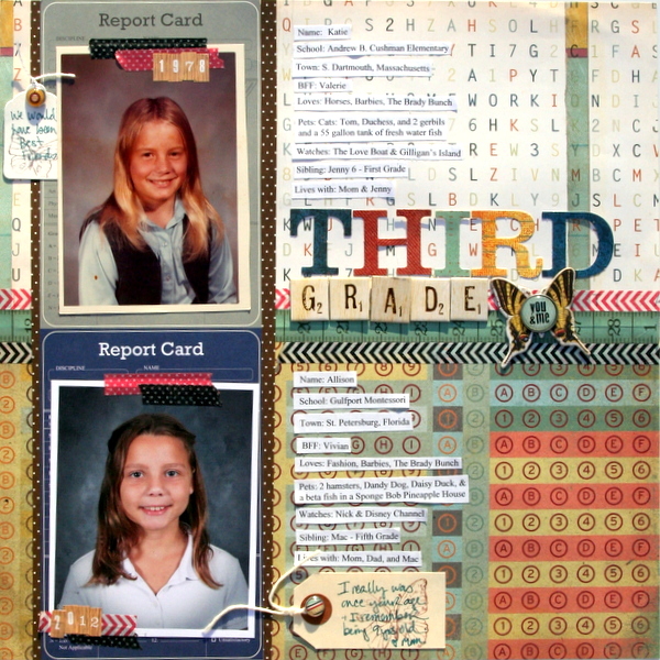
Third Grade by Katie Scott | Supplies: Bella Blvd., Making Memories, KI Memories and Autumn Leaves patterned papers; Basic Grey, Studio Calico, and American Crafts letters and embellishments, Bella Blvd washi tapes.
Heather Awsumb says, “I used a journaling prompt from ‘365 Ideas for Blog Posts, Scrapbook Pages, & Art Journal Entries’ by Kam Altar to document how I am different from my teenaged self, but as I started to write I realized that I’m a lot more like myself from almost 20 years ago than I am different. I didn’t feel I had to present the two photos next to each other since I was using them to represent the two phases of my life and not making direct comparisons.”
“My design is based on Lesson 1 of the Scrapbook Coach – 2×2. For my recent photo I picked a favorite that was taken with my sister in April. My older photo is pretty poor quality (a picture of a computer print out of a scan of the original) so I did some touching up using Rad Lab but it didn’t help much. It’s the only photo I have from that period of my life, though, so I thought it was worth using despite the poor quality.”
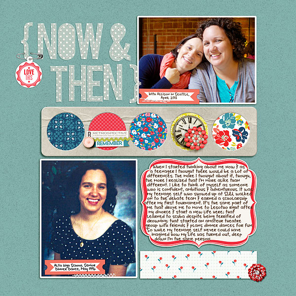
Now & Then by Heather Awsumb | Supplies: Katie Pertiet: Away We Go Solids, Blank Safety Tags, Sentiment Spots No 4, So Fine Element Pack, Dragon Trainer Element Pack, Label Strips: Rainbow No 1, Coin Holder Frames; Adrienne Looman for Websters Pages: Citrus Squeeze Paper Pack, Citrus Squeeze Digital Jewels; Britt-ish Designs: Tack It Down; One Little Bird Designs: Retrospective Kit; Zoe Pearn: Little Miss Sunshine Alpha Add-On; Vinnie Pearce: 100 Miles Element Pack.
Sue Althouse says, “This page is about our daughter in-law adapting to our sports-loving son’s ways during football season. Even though these pictures were taken over ten years apart, the similar colors in both made them easy to scrap together. I placed the larger focal point photo in a “sweet spot” on the page according to the rule of thirds, then lined up the smaller photo so our son’s eyes form a horizontal line across both photos to tie them together.”
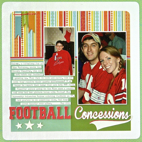
Football Concessions by Sue Althouse | Supplies: Cardstock: Bazzill; Patterned Paper, Chipboard: Little Yellow Bicycle; Star Punches: Fiskars; Alphabets: Silhouette; Floss: We Are Memory Keepers
Alexis Aragona says, “I knew I wanted to go totally artsy-crazy on this page, because my childhood photo (I was about 8 or 9 years old) wasn’t a very good scan. I blended two background papers and went nuts with blend modes on the clipping masks. The way I blended my “now” photo was a happy accident with a patterned paper–I liked how it looked like my face was radiating something. I figured it would be a nice image of me being ‘in transition’ of sorts, since my journaling (deliberately semi-hidden for its content) talks about it.”
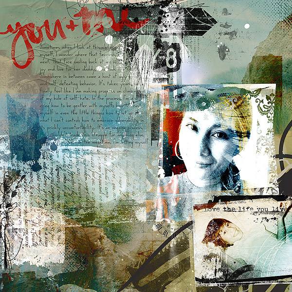
You & Me by Alexis Aragona | Supplies: Jen Maddocks Designs: Travel Papers, Travel Light, Travel Brushes; Anna Aspnes: Life WordArt No 5, Layered PhotoBlendz No 7, FotoTransfers No 1, Tissue Textures No 2; Valorie Wibbens: Scribblers; CD Muckosky: Paint Stroke Chatter Sentiments; Font: CK Ladder
Michelle Houghton says, “This page is about how life repeats itself. I found this old photo of my father and me after my girls had built and flown rockets with him. I had to make a page putting them both events together. I separated the photos purposefully to make a point of the past and present but linked them together with the title to highlight the similarity.”
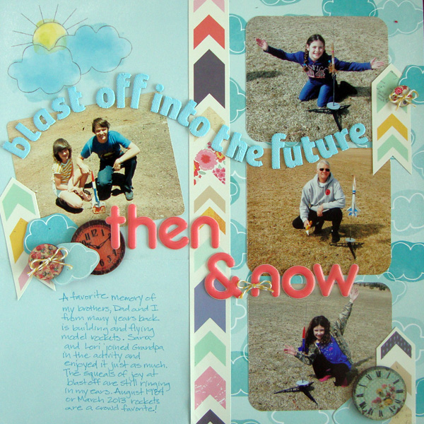
Blasting Off into the Future, Then and Now by Michelle Houghton | Supplies: patterned paper and letters; American Crafts, ink; Copic and Ranger, wood clocks and lg. button; Prima, sm. button; Crate Paper, Twine; Queen and Co.
Stefanie Semple says, “So often I get all bent out of shape by the nitty gritty of everyday life, things the children say, things they neglect to do. The days seem so long and yet the years fly by and soon the two oldest could be leaving the nest and I know that I will miss them then too.”
“I paired two family photos, taken more than ten years apart, putting them next to each other, as if on a timeline . I made them both black and white to remove distracting background elements and colors. I suppose I am highlighting the changes that ten years have made, the growth in the children, more than anything else.”
The kraft background allows the primary colored elements to pop. The heart, doily and word art are red and form a strong visual triangle around the photos; the giraffe and measuring tape are nods to their growth; the sunrise paper block is a reminder that the sun will come out again tomorrow and that everything will work out. The butterflies are a subtle reminder that what the caterpillar thinks of as the end of his life – is merely another beginning. Stitching, photo anchors, staples and buttons all add visual attachments. The string bow on the giraffe adds an important dimensional element.”
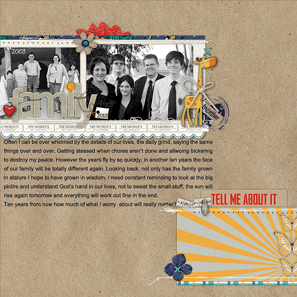
Ten years by Stefanie Semple| Supplies: Studio Double D: Layer Works no 53( template); Stolen Moments and Litabell’s Designs: Strength in Hope (kit); Stolen Moments and Erica Zane : Tell me about it (kit)
Susanne Brauer says, “The objective of this page was to share the memories brought back by looking at handprints in cement at our house. It’s something I pass by all the time, of course, but I finally have it recorded on a page with a recent photo of the handprints and older photos of my son and our house being built.”
“I purposely picked organic colors and designs like the wood print, the sand cardstock and the antique brads because this is an outside story. I couldn’t find a little boy piece of chipboard so I went a with little owl next to the house instead. I turned the older photos to black and white to get rid of funny colors that would not mix together well, and then added back in a focal point black-and-white effect in the brown and green parts of the photo.”
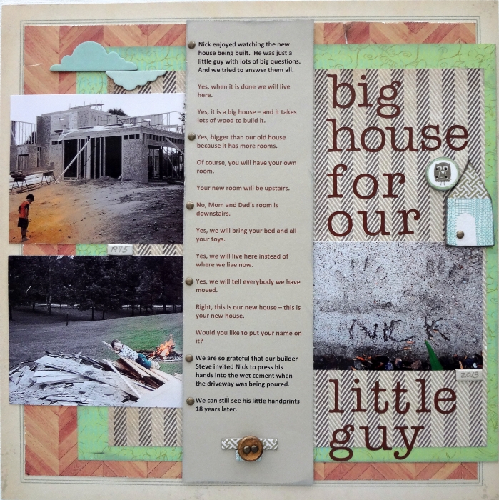
Big House for Our Little Guy by Susanne Brauer | Supplies – Papers – Basic Grey Little Black Dress & Euphoria, My Mind’s Eye Nostalgia, Echo Park, Everyday Eclectic, Card Stock and Brads – Stampin Up, Alphabet – Scenic Route, Chipboard – Basic Grey PB&J
[current]

