
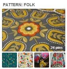
See a gallery of folk art print patterns on the Get It Scrapped Pinterest boards.
by Debbie Hodge
“Folk” art is the art of the people — and the motifs and colors will vary with those peoples (and cultures) in which they arose.
Folk art is defined by Dictionary.com as being marked with attributes of “highly decorative design, bright bold colors, flattened perspective, strong forms in simple arrangements, and immediacy of meaning.”
A simply cut wood block or stencil was a common folk medium for making prints. On these layouts, our Creative Team was inspired by folk print patterns, often with simplified and repeating shapes and bright bold colors.
Adriana Puckett says, “My daughter very patiently picked all of the blueberries out of her pancake one morning, which cracked me up and made me resolve to document her strong berry-free preference.”
“The folk print that I used for this layout is a repeated coral flourish, which I echoed by die-cutting the same pattern in white. I love how the sophistication of the pattern is contrasted by the whimsical theme of the layout.”

Berry Picker by Adriana Puckett | Supplies: Cardstock: Basic Grey; Patterned paper: American Crafts and Studio Calico; Letters: American Crafts Thickers and Basic Grey (small letters); Brad: Stampin’ Up; Die-cut machine and design: Silhouette Cameo
Barb Brookbank says, “This layout is about the two things that my granddaughter loves: books, and pretty, flowery dresses.”
“I was inspired by the bold flower patterns in folk art designs. I noticed that a many of these patterns had dark backgrounds, which I hardly ever use in my scrapping. Here, the dark navy fit well.”

So Teagan by Barb Brookbank | Supplies: Template: Freebie 82910 by Katie Pertiet, papers: KPertiet_AdInspiration112110-4, stitches: Grow Your Own Way by Dunia Designs, flower: Just Another Day by Jennifer Labre, Font: DJB Miss Flora Mae Bell, TXT Abrasive
Brenda Becknell says, “I love this old photo of my daughter taken on a walk through the woods. The bare feet, messy hair and big smile reflect her personality well.”
“I love the folk art style that’s found in felt penny runners and used felt and stitching on my page to get a similar effect. The photo is mounted on sage green trimmed with a pinking blade. I added a running stitch around the edge of the mat and placed it and the patterned papers at angles on the lower right of the page. I hand-cut felt leaves (using Cricut cuts as patterns) and stitched veins. The patterned paper behind the title is also trimmed with a pinking blade. The title and leaves were attached with foam squares for dimension, and a jute bow was added to complete the embellishment cluster. To add a little color in the top left, I added a stitched line with banner stickers and then sponged ink through a strip of drywall mesh tape.”

One Fall Day by Brenda Becknell | Supplies: Cardstock: Hobby Lobby; Patterned papers and stickers: Lily Bee Design; Ink: Quick Quotes Java chalk ink
Vicki Walters says, “I used birds and hearts and made little repeating patterns with bold color on the solid paper and clipped them to hearts for a folk art look.”

Little Birds by Vicki Walters | Supplies: Anna Aspnes at Oscraps-ArtPlay Palette Ablaze and Crumpled Neutrals no 1 Paperie; CD McCusky at the Lilypad-Sweet Tweets; Font: Ellianarelle’s Path
Sue Althouse says, “This page is about walking into a charming room in a little winepress cottage and instantly feeling right at home.”
“My product choices were inspired by traditional folk patterns. The green and cream paper strip has a folk art motif and helps anchor the smaller photo. The folk art heart embellishments were cut with my Silhouette and layered with raised adhesive to flow across the page on the diagonal. Small details like the twine hand-stitched border and turquoise crochet heart help the layout look as cozy and inviting as the room in the photo.”

All I Want is a Room Somewhere by Sue Althouse | Supplies: Cardstock: Bazzill; Patterned Paper. Brads/Buttons. Twine, Chipboard Banner: My Mind’s Eye; Punches: Fiskars; Alphabets: American Crafts; Ink: Tim Holtz; Die Cut: Silhouette (folk art heart); Crochet Heart: Bella Blvd.
Stefanie Semple says, “I made this page as a reminder that even though I don’t live in a picture-perfect home, my home is lived in and a comfortable place to be.”
“I love folk art for its colors and patterns. Oftentimes touches of red are prevalent and heart and house motifs are used symbolically. Some folk prints are quite chaotic in their design while others are structured and symmetrical. Most of them feature things close to home and heart.
“I am struggling to juggle my need for a tidy home with the knowledge that my children are growing up and will be leaving the nest soon and then I will be sitting all alone in a quiet tidy house and probably still not loving it, and I arranged my photos in a chaotic, layered way.”
“Folk art patterns cover the majority of the page background. The journaling card is sweet and with its swirls and hearts. I added a tilted home embellishment to re-enforce the idea that home is crazy and feels a little out of control, yet is grounded and surrounded by love and respect. My journaling is in the centre of the layout and also my attitude is central to the climate within the home.”

Not quite picture perfect by Stefanie Semple : Little Bit Shoppe Designs ; So lucky template : Jennifer Labre Designs from ScrapMatters ; Home Sweet Home (kit).
Kiki Kougioumtzi says, “At Easter one of our traditions is to dye red eggs. Since my daughter has grown enough to be able to do it, she enjoys helping me. Because the layout is about tradition, I chose a patterned paper with folk art inspired designs (especially the birds) but with a more modern color combination. For the finishing touch I added bits of hand stitching.”

Easter eggs by Kiki Kougioumtzi | Supplies:Patterned paper,stickers:Echo Park;Alphas:American Crafts;Other:embroidery thread.
Audrey Tan says, “This page is about wishing to be somewhere else and I’ve got got a photo of the sea, taken at dawn, slowly drawing the eye into the unknown. It comes with a quote too. I was inspired by folk patterns and used them as a background for my page. As flowers seem to be prevalent in folk patterns, I tried to create a similar effect.”

Imagine The Unknown by Audrey Tan | Supplies: Pink Reptile Designs & Lynne Marie: Boho Bliss; Font: Bloody Impact
Leah Farquharson says, “We visited Navy Pier last summer, and I have to say, the live music, breeze off of Lake Michigan, and ambient lights swept me away. I’m looking forward to returning!”
“I found that a lot of the folk patterns highlighted on Pinterest included flowers and stitching. I worked to incorporate those two elements here. I ended up keeping it clean and simple, because adding anything else just didn’t feel right.”

Navy Pier by Leah Farquharson | Supplies: cardstock: bazzill, file folder, patterned paper, chipboard @, diecut: Basic Grey. buttons: autumn leaves. Burlap letters: American Crafts. Paint: Jenni Bowlin for Ranger. Journaling spot: Chic Tags. Ink: Studio Calico
Katie Scott says, “Goats–and these photos from my daughter’s field trip–trigger random memories from my childhood.”
“I was inspired by a folk art goat motif quilt with triangles for this page. I outlined a goat and cut it from the “patchwork” cover of 6′ x 6″ pad of patterned paper (Basic Grey Serendipity).

Goats by Katie Scott | Supplies: Pebbles & Basic Grey (Paper); American Crafts Thickers.
Debbie Hodge says, “My son and I attempted to teach a gang of 13-year-old girls how to crochet one afternoon. A couple of them were interested and got the hang of it, but we discovered it was a lot tougher to teach then we’d expected. The tea and brownies were good, though!”
“Inspired by crewel work stitching samplers of folk art, I found a use for a set of digital stitches I’ve had in my stash for a while but never used: Homespun Stitches by Kitschy Digitals. They seemed ‘folksy’ to me, and the yarn echoed in the yarn in the photos. I layered the swirly stitches beneath my photo cluster and let them define the colors I embellished with. I added heart and house motifs which are frequently seen in folk art. Other elements I chose for their simple shapes, including the arrow and funky red button.”
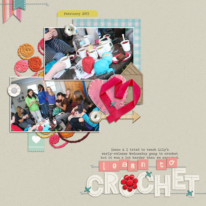
Homespun Stitches by Kitschy Digitals; Bare Necessities by Creashens; Scrappy Alpha by Zoe Pearn; Eclectic Easter Alpha by Just Jaimie; Foxy by Gina Miller (hearts); Click (vellum label, heart), WrapStar (ribbon) by One Little Bird; Flossy Stitches by Katie Pertiet; County Fair (button) by Dani Mogstead; Stitched by Anna Blue, Artplay Strawberry (button), Artplay Thankful (button) by Anna Aspnes; Snail Mail by Valerie Wibbens (button); Wood Veneer Arrows by Sahlin Studio; Hometown by Lauren Ried; Bohemian Typewriter font
[current]
