
With their announcement of emerald green as the 2013 color of the year, Pantone said, ““Lively. Radiant. Lush… A color of elegance and beauty that enhances our sense of well-being, balance and harmony.”
How did it come about that the color so abundantly found in nature is association with elegance?

See emerald green inspiration on the Get It Scrapped pinterest boards.
While green is all around in nature, finding a dye in a beautiful green isn’t easy. A bright emerald green was first developed in 1778–by a Swedish chemist–and it contained arsenic. Green became a popular color for wallpaper. George Washington took time from his busy life to plan to green room for Mount Vernon. Many many people became sick as a result of green rooms. Napoleon probably died of poisoning from the arsenic in emerald green — since when he was imprisoned on the island Elba, he spent much of his time in a green wallpapered room.
Take a look at pages that work emerald green’s connections to outdoor and harmonious themes or dressed up beauty and elegance.
Use emerald green for out-of-doors themes
Marie-Pierre Capistran says, “When I met my husband in Vancouver 15 years ago, we planned a short road trip to Victoria Island with 2 friends but our old car broke down the first day and we ended up camping next to the garage where the car was repaired. We ended the road trip right there and went back to Vancouver the next day by bus.”
“I wanted to scrapbook this camping photo with lots of green to support the outdoor theme. I used Heidi Swapp color magic paper and mint green color shine spray (which is really emerald), a grass green sheet of vellum and blue-green cardstock and patterned papers. I added a punch of orange for contrast and fun and wood veneer paperclips, again, to support the theme.”

Camping in Victoria by Marie-Pierre Capistran | Supplies: Pattern paper: Heidi Swapp, Crate Paper, Amy Tangerine; Velum: Amy Tangerine; Stickers: Amy Tangerine; Rub-ons: Crate Paper; Letter stickers: Basic Grey/Studio Calico; Wood veneer paperclips: Studio Calico Project Life Kit; Flair: Studio Calico Project Life Kit; Stamp: Amy Tangerine; Journaling cards: Becky Higgins, Studio Calico Project Life kit; Spray: Heidi Swapp; Other: sewing machine, Silhouette.
Michelle Houghton says, “My daughters built rafts out of sticks and yarn last summer, and it was fun to see them sailing them down the river. I used emerald green to match the amazing greenery that surrounded the river. It barely shows up in the photos, except in reflections on the water. I wanted to mimic the rippling effect of it across my page. ” Michelle used colors that are all a part of the event including the river, the wood boats, and the surrounding trees. Emerald green hexagons cross the page like stepping stones across the river. There are gems in clear and blue, navy blue cardstock and silver letters and doodling.

Floating Down the River by Michelle Houghton | Supplies: cardstock: American Crafts; patterned paper: My Mind’s Eye; wood veneers: Studio Calico; paint: Liquitex; lettering: American Crafts and Pioneer; gems: Darice; ink: Sakura, Copic and Sharpie
Deborah Wagner says, “I loved the contrast between fall colors and emerald green. I thought my photo and embellishments popped with the addition of the emerald green papers.”

Colors of Fall by Deborah Wagner. Supplies: Katie Pertiet Defined Discs Fall, Halloween Memories Kit, Metal Rimmed Tags No. 1, Photo Clusters No. 16, Spooktakular Kit, Mixed Media Branches No.1, Grassy Edgers Brushes, Carte Post Kit, Pine Creek Kit, Cut Ups Fall, Color Inspiration 8-14-11, Ad Inspiration Alpha 8-4-12, Ad Inspiration 8-21-12; Mindy Terasawa Flower Stickers; Pattie Knox: Fasten Its 2; Cassie Jones Bending Shadows
Adryane Driscoll says, “I got the idea for this page from a project my daughter’s class is doing on recycling. I mixed emerald green with yellow/gold because it fit with my secondary idea of bringing ‘a little light to the world.'”
“To achieve the emerald green color, I checked the Internet for the hex code for emerald green. The code is 5B9C64. Then, I recolored the leaves (which were originally maroon and gold). I replaced just the maroon color, as opposed to colorizing the entire leaf, so that the leaves retained their gold. The sticker letters are psd files that have a layer for clipping paper or adding color. Using the paint bucket tool, I colored each of the letters with emerald green.”

Go Green by Adryane Driscoll: Credits: Anna Aspnes I HipsterPlumes, WarmGlows No.3, ArtPlay Palette Sun Fun, MultiMedia Leaves No.2, Tribute PageSet, ArtPlay Scientist BrushSet, ArtPlay Palette Science, and ArtPlay Palette No.5; Pattie Knox I DIY Sticker Alpha; Katie Pertiet I Basic Black; and Captivated Visions I I Became Somebody Else
Tara McKernin says, “I started an instagram project to make a photobook of my gardening this year, and this layout is a bit about that process. Emerald green was an obvious choice based on my topic but, it’s also rich and earthy, and I like how it grounds the layout. The colors that have gone with the emerald are neutrals found in nature and drawn straight from my images: creams, yellows, blues and even lilac.”

How My Garden Grows by Tara McKernin | Supplies: Template, Simple Scrapper – may edition; Kit, Sahlin Studio – Down the Lane
Amanda Jones says, “This is a simple page documenting a local landmark which holds special memories for me. Because the photo reminds me of walks we took as a family during my childhood, I used emerald green to represent nature and calm. Although I have peaceful memories of this landmark it is, after all, a working lighthouse. To capture the essence of its purpose, I used the green burst (as it is the opposite colour to red) to hint at the contrast of the lights in the night sky.”

Road Trip by Amanda Jones | Supplies: Cardstock – Bazzill Basics; Stencil – The Crafter’s Workshop; Mist – Maya Road; Stickers – Studio Calicot; Ephemera – Vintage; Other – glassine bag, manila tag.
Use emerald green for elegance with posed shots and portraits
Christy Strickler says, “These photos are of me with my mother on my wedding day. Emerald Green and white were the colors of my wedding. I chose to use it as an accent for my layout. I mixed it with cream, pearlized white paper and browns. The German foil and hearts had a metallic sheen which was offset by the tan and cream. I didn’t want to overpower the layout with a lot of shiny green elements.”

Wedding Day: with my Mom by Christy Strickler |Supplies: Patterned Paper: Jenni Bowlin, Cartabella; German Foil: JBS Mercantile; Chipboard: Maya Road; Wood Veneer: Studio Calico; Die Cut: Jenni Bowlin for Silhouette; Mist: Pink Paislee; Embossing Powder: Ranger; Stamp: Jenni Bowlin; Doily: Martha Stewart
Katie Scott says, “My daughter loves to put together fashionable outfits and only then does she enjoy getting her photo taken; she also thinks that I could be more fashionable. Emerald Green is a good choice for these photos because her outfit is varying shades of green. I have mixed aqua blue with emerald green.”

Cute in Green by Katie Scott | Supplies: American Crafts papers; American Crafts and Crate Paper embellishments. Heidi Swapp banner.
Audrey Tan says “This page is about my boys taken by the school’s photographer. Every year, they have their portraits taken and I never fail to buy theirs. As their school uniform matches the colour theme, I thought it would be the perfect photo to use. My other color chosen is of a grayish tone, just to add a little contrast to the color.”

Picture Perfect by Audrey Tan | Supplies: Angie Young: Color Play 4; Katie Pertiet: Cut Ups Photography; Word Art World: 100 Of My Favourites Vol3; Font: Baby Boston
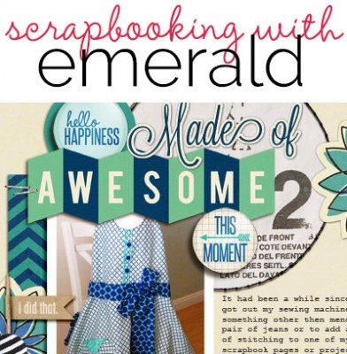
Amy Kingsford says, “This page is about an apron I recently sewed and, more importantly, it’s about the joy I feel from making something with my hands. I mixed emerald green with navy blue and light neutrals. I love how well the green popped against the darker navy. I added a few sewing pattern cutouts to my background, stitching, and scattered buttons to establish a strong sense of theme.”

Made of Awesome by Amy Kingsford | Supplies: Scotty Girl Designs and Wild Blueberry Ink: Life is Good Collab; Pixels & Company: Homebody Collab; Gennifer Bursett: Made of Awesome; Karen Funk: Simple Stitches; Sahlin Studio: Precocious Papers, Button It Up: Fresh; One Little Bird: Flight Plan No. 22
[current]
