Surface treatments that add a golden finish are trendy in home decor, and gold is showing up in fashion, too. Gardener Susan Cohan says, “Opulence isn’t a dirty word. After years of frugal garden and DIY design options ie. the pallet craze and other recycled madness, many (including me) are ready for a sense of luxury.” Check out the current gold spotting we’ve done on our scrapbooking inspiration Pinterest boards.
And then see the techniques and color schemes our Creative Team has used to get gold on their pages.
Katie Scott says, “During a Colorado road trip we happened upon a real hot spring in the snow!”
“Because the ground around hot springs was golden yellow and gold amidst lots and lots of white snow, I used glittered gold letters and papers. I also used glitter glue to make the cut out embellishments (camera and tag) to go from plain paper to glittered accents.”
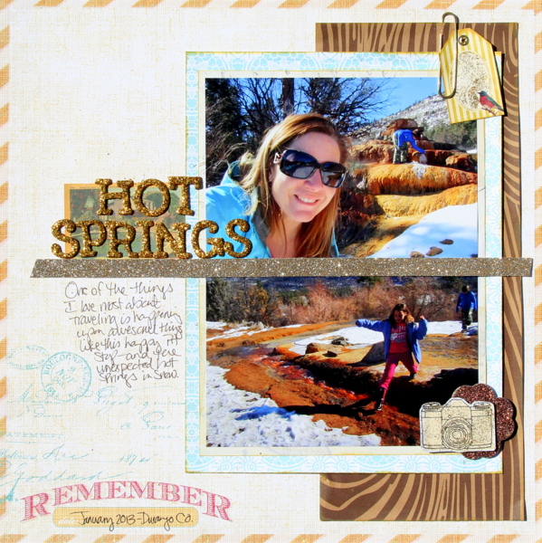
Hot Springs by Katie Scott | Supplies: Heidi Swapp and Bella Blvd. paper; American Crafts (Amy Tan and Maggie Holmes) embellishments and letters;
Marie-Pierre Capistran, says, “On April 5th it has been 15 years that my husband and I are dating. I had been thinking about what I could scrap about using gold. When the 5th arrived, I pictured a big 15 in my head–all shiny and gold–and I knew what to do.”
“Way back, I took art classes, and one was about using gold leaf. I I covered a customized Silhouette-cut title with gold leaf. It worked great but I wouldn’t necessarily do it again. I think you could achieve almost the same look with cheap gold foil. To finish off the title, I Silhouette-cut “we chose each other” (in French) and used the negative this time.”
“I added green and blue hues and a pop of orange to my gold titlework. I love this color combo. I brought a little more shine with some mustard color shine spray from Heidi Swapp which looks like orange when it’s sprayed on blue. Because the gold on orange wasn’t popping enough I added black rub-ons under the title.”
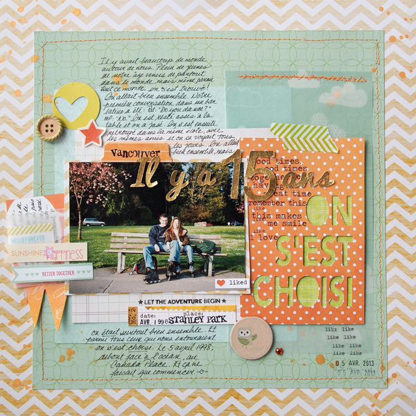
15 years ago by Marie-Pierre Capistran | Supplies: Patterned paper: AC Dear Lizzy, Magenta, My Minds Eye; Velum paper: AC Dear Lizzy; Banner: Heidi Swapp; Spray mist: Heidi Swapp; Button: AC Dear Lizzy; Rub-Ons: Heidi Swapp; Washi Tape: Bella Blvd; liked sticker: Heidi Swapp; small glassine envelope : Studio Calico; Small tag: Elle’s Studio; Stamps: Studio Calico, Stampin’UP!, Purple onion, date stamp, Heart punch: Stampin’UP!; Other: Silhouette, sewing machine.
Deborah Wagner says, “This photo is of my daughter and a friend at spring formal.”
“I converted the photo to black and white and changed the Blending Mode to Overlay in Photoshop. I duplicated the photo layer and applied a glitter style to the entire photo; setting the blending mode to Soft light and the opacity to 38%. Using a layer mask and a soft brush, I erased the glitter from everything but the girls’ dresses. My daughter’s dress was originally pink so I added another layer on top of the glitter layer, and used a soft pink brush set on Color blending mode at an opacity of 60%. To finish, I added a glitter style to the starburst brush and the word art.”
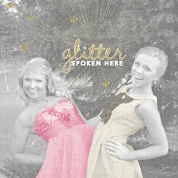
Glitter Spoken Here by Deborah Wagner. Supplies: Katie Pertiet – Chandra Solids, Scatterings No. 1, Cathy Zielske – Girlie 2 Word Art; Anna Aspnes – Art Play Palette Sea foam
Michelle Houghton says, “My daughter made a rocket with her Grandfather over spring break.” She named it ‘Shooting Star,’ and painted it bright gold.”
“I used three different products to carry over the bright gold of her rocket. A metallic gold paint is on the chipboard lettering and splattered across the background. I used a gold paint pen for the border and journaling, and then there is gold foil over the pink word ‘shooting.’ I used a glue pen across the letters and then added the gold by laying it face down and rubbing across the back of the sheet.”
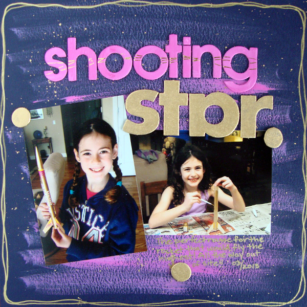
Shooting Star by Michelle Houghton | Supplies: cardstock; Bazzill Basics, paint; Liquitex, paint pen; Zig, gold foil; Martha Stewart, chipboard; unknown
Stefanie Semple says, “We are celebrating our 25th wedding anniversary shortly, and in honor of this occasion, hubby had a new ring made for me. It is gorgeous and ‘over-the-top’ when compared to my original wedding set. I made this layout showcasing this personal story and my gratitude and appreciation of him. I have an album celebrating us and this layout will be the cover page.”
“I used a heritage-style patterned paper with clocks to cue the subject of time. The title, ‘Bling,’ is what I said when I first saw my new ring. I loved the gold shiny alpha for over-the-top drama and flair. The stars and sparkly bits echo the sparkles of the diamonds and their reflections. I added mauve flowers to to create my visual triangle. It’s fitting because the colors for the vow renewal ceremony are white, green, purple and mauve. The bow on the sub- title is a nod to the idea of tying the knot and celebrating anniversaries. The gold heart showcases our love standing the test of time, with gold being a precious metal. This layout is an exuberant declaration of appreciation and thankfulness.”
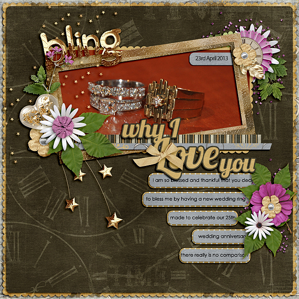
Bling by Stefanie Semple | Supplies: LDrag Designs: Auld Lang Syne (kit), Eternal love letters (kit); Jady Day Studio: Why I love you (template).
Kiki Kougioumtzi says, “This is a photo of my daughter playing in a summer sunset, pretending to holding the sun.I used a warm color palette, and gold complements it well. It also enhances the focal point photo. I applied leafing medium with a stencil (which I washed immediately), waited the suggested time, and then added the gold leafing. To embellish a little more I added gold sequins.”
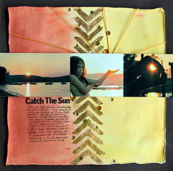
Catch the sun by Kiki Kougioumtzi | Supplies:Cardstock:Bazzill Basics,Canson;Gold leafing & medium:Efco;Acrylic paint:Ranger Studio;Alphas:Basic Grey;Stencil:The Crafter’s Workshop;Other:Tattered Angels glimmer mist,thread,sequins.
Terry Billman says, “Embracing life and living each day as if it were his last has been Craig’s desire since receiving the news that his cancer returned and is incurable. This photo was taken on a recent trip to Hawaii when we took a stroll on the beach at Waikiki. He reminded me of living each day to its fullest.”
“I love the texture of the pearlescent paper and the way it gives the layout dimension. I used the hard light blending mode on the photo to give the surf and water a glittery effect. Using the color blending mode on the warm glows added a dramatic sunset effect behind the photo. The subtle gold paint splatters were placed from left to right to guide the eye through the photo to the journaling.
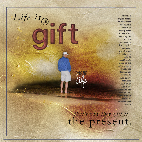
Embrace Life created by Terry Billman | Supplies: Anna Aspnes: Pearlescent Paperie 1, Warm Glows 4, Art Play Embrace Life, Gold Paint, Gold Alpha Number Set, Life Word Art No. 3
Ashley Horton says, “I aimed for a nautical feel on this page since it was at the beach and my daughter’s shirt is navy. My nautical color scheme here is navy, red, white, and gold.”
“I have been saving (hoarding) gold polka dot vellum paper from Crate Paper that I knew was perfect for this color scheme and subject. I wanted a touch of gold in my title, but I didn’t have any gold letters or alphas, so I misted AC Thickers with Gold Color Shine from Heidi Swapp. It created the exact effect I was looking for. I finished off my page, with flecks of the Gold Color Shine on the background and scattered gold sequins.”
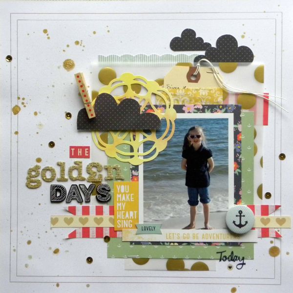
The Golden Days by Ashley Horton | Supplies: Patterned Paper, Rub Ons, Clothespin: Dear Lizzy; Bits: Amy Tangerine; Gold Vellum Paper: Crate Paper; Flair Button & Mini Bag: Fancy Pants; Thickers: American Crafts; Mini Market Stickers: October Afternoon; Color Shine: Heidi Swapp; Other: Shipping Tag & Sequins
Amy Kingsford says, “This is special page about my son. There is a side of himself that he shares only with those that make him feel most comfortable. My title for this subject is ‘Golden Boy,’ and that inspired my incorporation of gold.
“I used gold painted leaf transfers and golden glows and sparkles alongside everyday photos. The gold paint and glows capture the light in the photos and take them from the ordinary to the special. I paired the gold with the dark navy for a masculine look but also to increase the intensity of the gold on my page.”
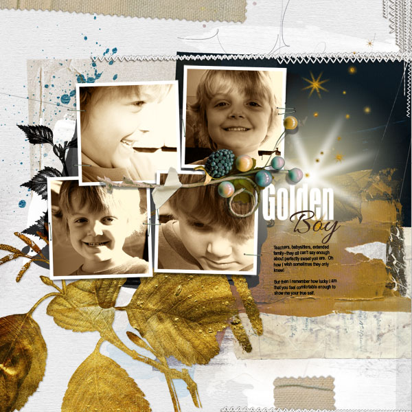
Golden Boy by Amy Kingsford | Supplies: Anna Aspnes Designs: Art Play Palette Heraldry, Artsy Layered Template No. 71, Gold Leaves No. 3, Warm Glows No. 4, Burlap Scraps No. 1, Kriss Kross Stitched Overlays No. 1.
Christy Strickler says, “I love how my cat looks at me when I pet him, and this photo captures that look.”
“My color palette was inspired by a vintage image. I stamped and embossed with gold embossing powder. I also embossed several wood shapes and added gold washi tape. The gold is light but adds a rich feel to the layout. It gives weight to the emotions I want conveyed.”
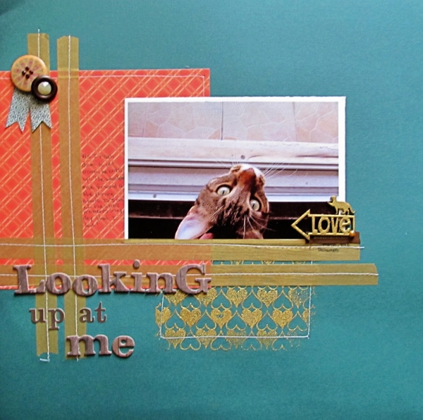
Looking Up at Me by Christy Strickler | Supplies: Cardstock: Colorbok; Patterned Paper: My Mind’s Eye, Studio Calico; Alphas: Jillibean Soup, Webster’s Pages; Stamp: Hero Arts; Embossing Powder: Ranger; Wood Veneer: Studio Calico, Lawn Fawn; Cloth Tag: Basic Grey; Buttons: Jillibean Soup, Basic Grey; Jewel Studio Calico; Other: Tape, jewels
Leah Farquharson says, “I recently ordered a bunch of jewelry making supplies– because I need more hobbies!”
“I used a number of different elements here for a monochromatic gold scheme that fits with the subject of jewelry I used gold-embossed vellum to mat my photo, journaling and title, and there are lots of gold accents and embellishments. The design and color scheme on this definitely pushed me outside of usual range, but I love the page, and think it works without being gaudy.”
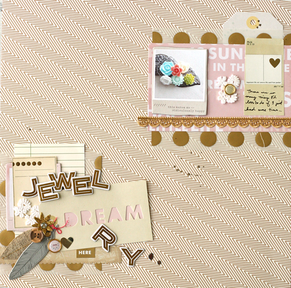
Jewelry by Leah Farquharson | Supplies: patterned paper, tags, stickers, brads, feathers, chipboard, vellum, flower: American Crafts. Chipboard letters, border sticker: Crate Paper. Lace pieces and foiled lace diecut: JBS Mercantile Antiquarian kit.
[current]

