Sue’s cool thing right now is using bold colors and patterns on her scrapbook pages.
Sue says, “I’ve always been drawn to colorful objects and bold patterns. I like to dress in bright, happy colors and add colorful accents to my home decor.”
“When I started scrapbooking, I discovered online classes where I could learn about the color wheel and color theory. I find this a fascinating subject. Some of my favorite layouts in online galleries and blogs are those that have pops of color, lots of pattern, and an easily perceivable sense of organization.”
“One Fine Fall Day is about all the local activities available to us in the fall. It is built on a central band of bold patterned paper and contained by two narrow border strips on each side. A loose grid is layered on top, using different size orientations so the design is not too rigid. I like to work in compartments of color that are controlled and organized, but I also like to break the borders to add interest and unpredictability.”

One Fine Fall Day b y Sue Althouse | Supplies: Cardstock: Bazzill; Patterned Paper, Alphabets, Stickers: Simple Stories; Postage Border Punch: Fiskars; Stamps: Stampin’ Up!; Inks: Creative Memories, Hero Arts; Mist: Mr. Huey’s; Buttons: American Crafts, October Afternoon; Floss: We R Memory Keepers; Other: Remington Quiet-Riter Typewriter
Using bold colors and patterns is a great way to bring your pages to life.
Sue says, “After learning more about the meaning, mood, and emotion that color can convey and even evoke, I knew that needed to be an important part of expressing myself creatively.”
“I feel very satisfied when I can bring my stories to life with color and pattern. The more I scrap, the more I realize I am happier with layouts that embrace color and pattern in a controlled manner. I like to be basically positive and optimistic and want that to translate into my scrapbook albums.”
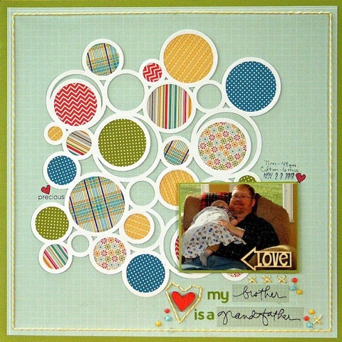
“This page is about my brother and his new grandson. Another technique for getting an abundance of color and pattern on a layout is to use punches and die cutting tools. This Silhouette circle die cut serves three purposes. First, it brings energy to the page. Second, it symbolizes the circle of life. Finally, it contains the patterns and colors in a crisp, clean and organized fashion. This page satisfies my love of color and my need for order!”

My Brother is a Grandfather by Sue Althouse | Supplies: Cardstock: Bazzill; Patterned Paper: Pebbles; Alphabets: Jillibean Soup; Stamps: Technique Tuesday, Studio Calico, Amy Tangerine; Ink: Hero Arts; Marker: Marvy Le Plume; Heart Stitching Template: Amy Tangerine; Twine: Doodlebug; Circle Die Cut: Silhouette; Wood Veneer: Studio Calico; Enamel Dots: My Mind’s Eye
Look to your photos for color and pattern inspiration.
Sue says, “My main source of inspiration is my photos. Rarely will I try to match the colors in the pictures. Instead, they become the start of my color palette. If I want an energetic page, I’ll go with a complementary color scheme. If I want something calmer, I’ll choose analogous colors. If my photos are full of warm colors, I will deliberately choose cool colors to create contrast, and vice versa. I like to add a small dose of an ‘unexpected’ color for a little tension.”
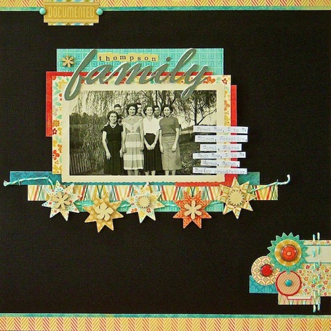
“This page is about my grandfather and his six siblings. One of my favorite ways to make patterned paper and embellishments pop is to place them on a background of black card stock. I think this is especially effective when the photo is black and white. The combination on this layout is a pleasing mixture of vintage charm and vivid color.”

Thompson Family by Sue Althouse | Supplies: Cardstock: Bazzill; Patterned Paper, Brads, Twine: My Mind’s Eye; Alphabets: Silhouette, Cosmo Cricket; Quilt Star Punch & Chipboard: Jenni Bowlin; Wood Veneer: Studio Calico; Stapler: Tim Holtz
What’s your “cool thing?” Is it a way of laying out your page, products, storytelling approaches or something else?
Sue Althouse
Blog | Pinterest | Twitter | Facebook
Sue lives in southeastern Michigan with her husband of 30+ years and two spoiled cats. She also has one grown son who is married. Sue has spent her days teaching piano lessons for over 20 years and loves working from home.
Sue started scrapbooking in 1999 after she took a trip to Israel and Egypt and came home with a plethora of pictures and memories. She knew she wanted to do something more than slap pictures in an album. After attending her first Creative Memories party –as they say, the rest is history! When Sue’s not teaching piano or scrapping, you might find her reading, knitting, watching NCIS, or rooting for her beloved Ohio State Buckeyes or Detroit Tigers – sometimes even doing several of these at once!


