
by Debbie Hodge
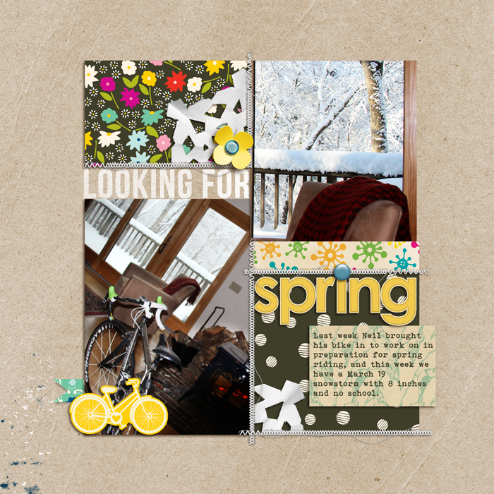
Looking for Spring by Debbie Hodge | Supplies: at end of this post. Click to see larger.
so much that a bike can represent
When I think about bikes, I think of the challenges and opportunities they present — and how those vary depending upon who you are. Riding a bike is a skill to be conquered as a child, an opportunity for early freedom for the pre-teen, and a way to get around traffic jams for the courier. It can be a way to fly your “green” flag and a way to exercise.
Debbie’s husband longs for the first day he can get on his bike each spring, and she’s scrapbooked that enthusiasm with a photo of the bike inside while he tunes in up — next to a window showing record March snows. A fun yellow bike sticker accompanies snowflakes and flowers for embellishments.
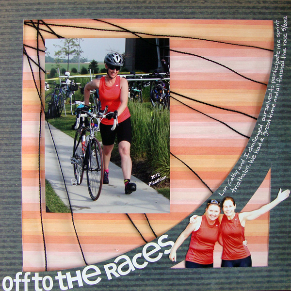
Off to the Races by Michelle Houghton | Supplies at end of this post. Click to see larger.
the shape of a bike
Visually the bike offers interest–with circular wheels, straight spokes, and slices of pie when the two meet. Images of bikes that scrapbookers can use vary in styling from vintage to doodled. See how our Creative Team scrapbooked bike riding on these pages.
Michelle Houghton says, “Last spring two friends and I challenged ourselves to participate in a sprint tri-athalon, this layout commemorates the day. I wanted to stick with colors from the photos since we had purposefully matched our tops. I also wanted to keep with the feel of the athletic event, so I found papers that complemented the bright orange and black of our clothing and decided to create the look of a bike wheel as the framework for the photos.”
before the bike: the trike
Tara McKernin says, “I wanted to capture the story, thoughts, and feelings around Jake riding his tricycle from last summer. I like to keep my layouts with large photos clean and simple, with the focus on the photos and the words. I kept the colors simple and the background neutral, taking my sing accent color–green–from the grass in the photo.”

This is real life | Tara McKernin | Supplies: Template, Cathy Zielske; Paper, Karen Funk
getting a bike is a big deal
Sue Althouse says, “This page is about getting new bicycles for my 7th birthday and again on my 50th birthday.”
“The dominant color in my photos is green, so I chose red, the complementary color, to bring energy and contrast to the layout. Small doses of blue add harmony and point out my blue bicycles. For interest and dimension, I used a variety of products: twine, chipboard, stickers, Thickers, flair, mini pearls and wood veneer. I challenged myself to use 3 different materials for the title. The twine, Silhouette die cut and Thickers are a fun and eye-catching combination!”

Cardstock: Bazzill; Patterned Paper, Stickers, Buttons, Chipboard: Basic Grey; Border Punch, Star Punch: Fiskars; Alphabets: American Crafts, Amy Tangerine; Die Cut, Decorative Tab: Silhouette; Twine: Doodlebug; Bicycle Flair: A Flair for Buttons; Wood Stars: Studio Calico; Mini Pearls: Doodlebug
Terry Billman says, “This layout is about my husband assembling our granddaughters first Radio Flyer tricycle. The only thing she wanted to do was gather acorns and put them on the back of the tricycle. She didn’t want to ride the tricycle! I selected a neutral background and highlighted the page with different shades of pink to coordinate with her top. I blended photos of the Cami and the tricycle in the background and framed closely cropped photos of Craig assembling the tricycle.”

Radio Flyer created by Terry Billman| Anna Aspnes: Artsy Layered Template No. 72, Art Play Palette Enamored, 12 X 12 Distressed Edge Overlay, 12 x 12 Artist Edges 6, Stitched by Anna Red No. 1; Katie Pertiet: Loosely Labeled Dates No. 3
learning to ride a bike is an even bigger deal
Audrey Tan says, “This page is about my youngest learning how to ride a two-wheeled bike. He was certainly wobbling a lot initially and I managed to capture those initial moments of learning. Hubby was quite patient with him and he eventually mastered his balance.”
Audrey used themed bike elements and worked with black-and-white blended pieces for an urban-road look.

Progress by Audrey Tan | Supplies: Anna Aspnes: ArtPlay Palette En Route, EnRoute Sampler, EnRoute No1, Foto Inspired Frames No1; Gina Miller: Stitched Alpha; Font: Rat Infested Mailbox
Kiki Kougioumtzi says, “My daughter went with the scouts to a road safety park, where she got her bicycle driving diploma.”
“I took colors from my photos (blue, bits of yellow, orange, grey and pink). I don’t usually use themed products. The exception in this layout is the bicycle rub-on, which is part of a visual triangle. I used patterned papers with organic designs (leaves and circles) to represent movement. Those prints are arranged in a orderly way, though (e.g., the leaves are in a row) to support the idea of ‘lesson.’ The alphas are rendered in a childlike font.”

Enjoy the ride by Kiki Kougioumtzi|Supplies:Patterned paper:Becky Higgins,Provo Craft;Cardstock:American Crafts;Rub-ons:American Crafts,Cosmo Cricket;Stickers:Basic Grey;Chipboard:My Mind’s Eye.
and then it’s time to enjoy the ride
Adryane Driscoll says, “This is a photo of my son taken almost 6 years ago. Even though it’s not a great photo, I knew 6 years ago that it was a special capture because of the combination of images. The topic of bikes combined with my son’s recent birthday finally gave me the direction I needed to scrap it. I converted the photo to black and white to reduce the impact of the distracting background.”
“Then, I went with a black, white, and yellow color scheme which I like for more graphic, dynamic pages. I knew I wanted to focus on the bike and the sign in the photo so I went through my products and pulled out all kinds of arrows and bikes. I moved things around and eliminated everything that I didn’t like or didn’t work. Because there was a lot of journaling, I broke it up and positioned it in visual triangle around the photo. Using some of the tips from Debbie’s class Tension, Story,Focus and Flow, I played with the spacing between the lines of journaling and the spacing between the actual letters until I found something that I thought was comfortable for the eye.”

enjoy the ride by Adryane Driscoll: Credits: Anna Aspnes I Road Rider Page Set, EnRoute No.1 BrushSet, ArtPlay Palette Metro Graffiti, and ArtPlay Palette Social Network; O’Scraps Seven Birthday Collab
Marie-Pierre Capistran says, “My daughters are 2 and 4 at the moment, and what they like most is to ride their scooters.”
“On this page I used a large focal point photo to show the scooter riding and smaller photos in in Polaroid frames (free printables) to record the places we go when riding bikes. I don’t usually used themed elements but an image of a red guy riding a scooter added fun and fit into one of those Polaroid frames. Heidi Swapp rub-ons with words related to adventure and love add texture and interest to the page. Lastly, I included chevrons, triangles and arrows to guide the eye through the page and add movement.”

Scooter ride by Marie-Pierre Capistran | Supplies: Patterned paper: DCWV; Letter stickers: American Crafts Thickers; Chipboard elements: American Crafts Dear Lizzy; Rub-ons: Heidi Swapp; Like sticker: Heidi Swapp; Others: date stamp, patterned paper from stash, polaroid frames found on internet, stitching.
Debbie Hodge says, “My husband rides his bike several times a week from early spring to late fall. He rides so much we take it for granted. Realizing this, I parked myself on the front steps and waited until he came home after work on a late fall evening. I used map print paper to represent the idea of him traveling many miles and a two-tone diagonal print for energy and motion.”
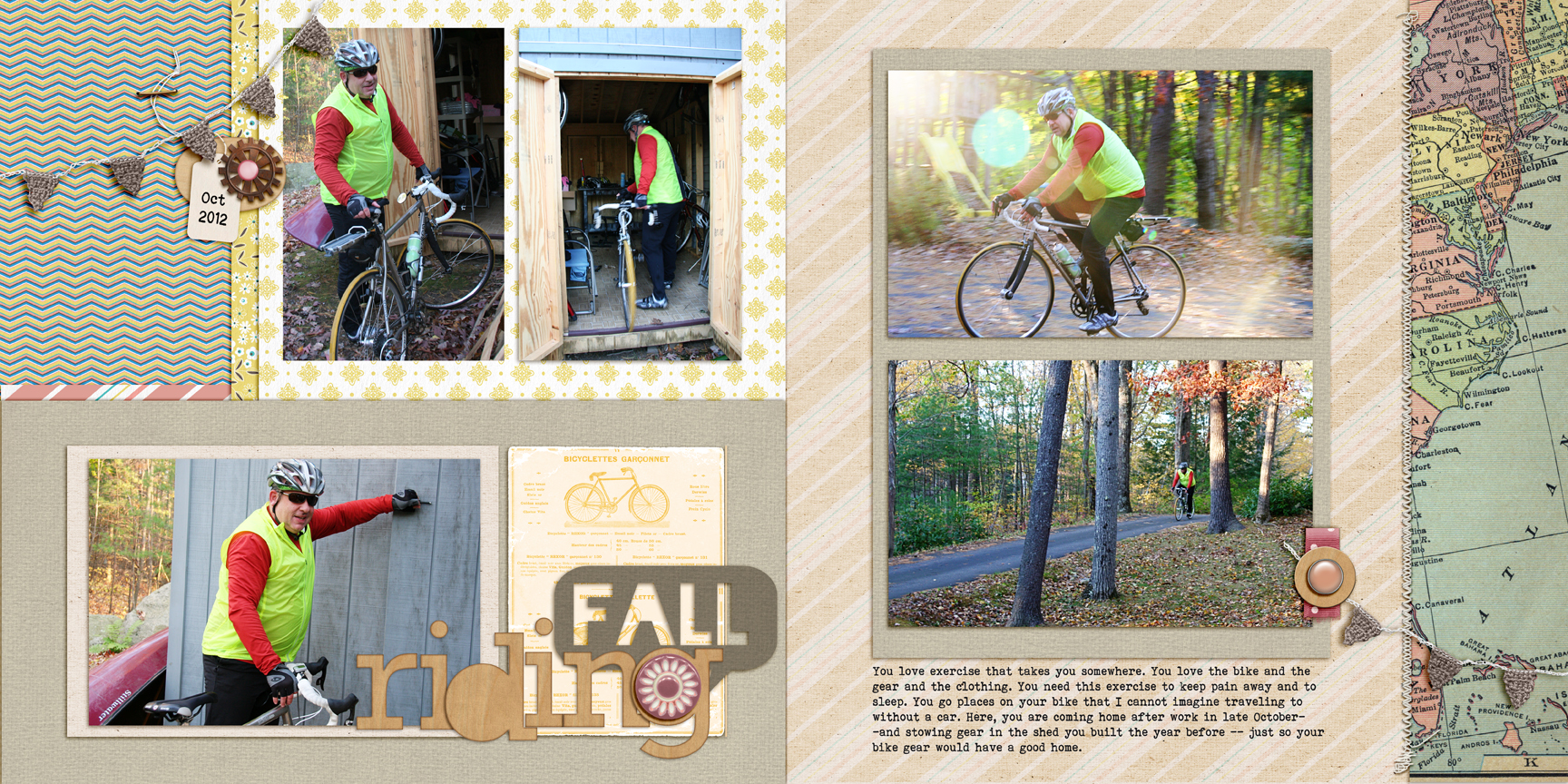
Hey There, Traveler Maps, Woodland Jangle Elements, Winter Peony Elements, Naturally Krafty 12 by Katie Pertiet; Pedal Pusher by One Little Bird; Folded Ribbon Bits, Staple Its, Brad Bonanza by Pattie Knox; Blackout font
Additional supply lists
Looking For Spring by Debbie Hodge | Supplies: Patterned Paper: Soho Garden by American Crafts, Sketchbook by Amy Tangerine; Cardstock: Sequoia by Sara Gleason; Journaler: 5th and Folic by Dear Lizzy; Handcut Snowflakes by Valerie Wibbens; Stitching, Banner template by Anna Aspnes; Bike: Amy Tangerine; Flower, Alpha: Spring Day and Sunshine Alpha by Sahlin Studio; Bebas Neue, Bohemian Typewriter fonts.
Off to the Races by Michelle Houghton | Supplies: patterned paper; SEI, sticker letters; Doodlebug Designs, Inc., ink; Sharpie, wire string; unknown
[current]
