by Debbie Hodge
In the 1999 movie Office Space, Chotchkie’s restaurant manager Stan explained to Jennifer Aniston’s character that, really, 15 pieces of flair on her uniform was the bare minimum.
[twocol_one]
He said, “People come to Chotchkie’s for the attitude. The flair is about fun.”
So how are you expressing your attitude lately? Advances in digital and print technologies, the advent of personal button makers, the current trend toward “gamifying” workplaces and education, and the ability to display your achievements (and attitude) online have made flair buttons newly trendy.
Check out 7 ways to use “flair” on your scrapbook pages from our Creative Team and teachers–and leave us a comment telling us if you’re adding flair to your pages and if you have favorite products and approaches.
[/twocol_one]
[twocol_one_last]
[/twocol_one_last]
[hr]
1. Put flair in the middle of elements, alphas, and arrangements
Christy Strickler says, “We visited a friend’s farm to meet her new chickens. The rooster on this flair button made it perfect for the layout. I used it as a center for a die cut flower. I spelled the word ” cluck” several times with tiny type alphas and spread the words around the flair button to create a handmade flower embellishment.”
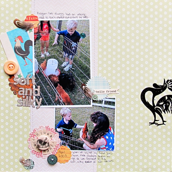
Soft and Silky by Christy Strickler Supplies| Patterned Paper, Flair, Flashcard: Jenni Bowlin; Alphas: My Little Shoebox, Sassafrass; Die Cuts: October Afternoon; Stamp: Basic Grey; Embossing Powder: Ranger; Other: buttons, feathers
Ashley Horton says, “We love to visit the fair every year, and this was the first time that all three kids were just the right height to ride the kiddie rides.”
“The Midway collection from October Afternoon, is perfect for fair photos and the collection also includes fun tin pins (flair buttons) that coordinate with the line. The images were perfect for my story and I used several, placing one in the center of a wheel of circles.”
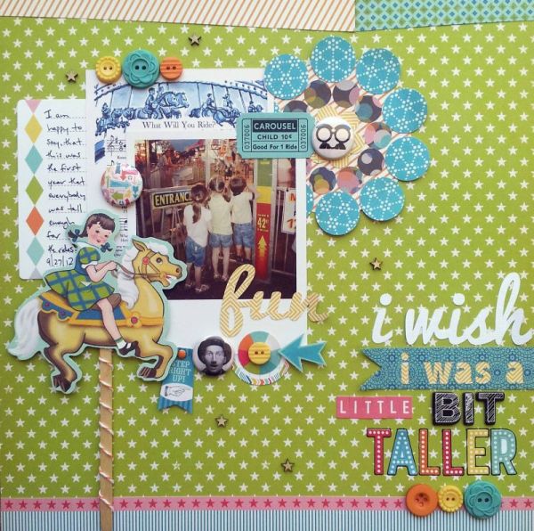
I Wish I Was a Little Bit Taller by Ashley Horton | Supplies: Patterned Paper, Buttons, Tin Pins, Designer Brads, Alpha Stickers, Miscellany, Mini Market Stickers & Journal Cards: October Afternoon; Wood Veneers: Studio Calico; Baker’s Twine: The Twinery; Thickers: American Crafts; Font: Pacifico
Deborah Wagner says, “I was inspired to do make page for my nephew after taking Jana Morton’s All Star Graphics Class. I used one embellishment, a flair, to ground my title and emphasize the basketball motif.
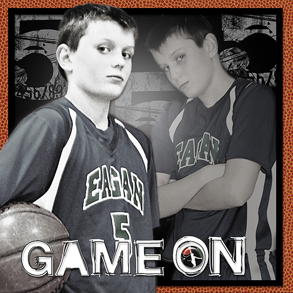
Game On by Deborah Wagner. Supplies: Katie Pertiet – Doodle Block Alpha, Counting Trash Alpha; Art Warehouse – Basketball Papers; Anna Aspnes – Art Play Basketball
2. Frame your photos with a visual triangle with flair
Amanda Jones says, “It doesn’t matter what day is is – my son is always slightly crazy!”
“I used three pieces of “days of the week” flair to complement the three circles I cut from the background of my page and to support my theme. They serve also as sub-titles for my layout. I placed each piece of flair to both the photo and one of the circles.”
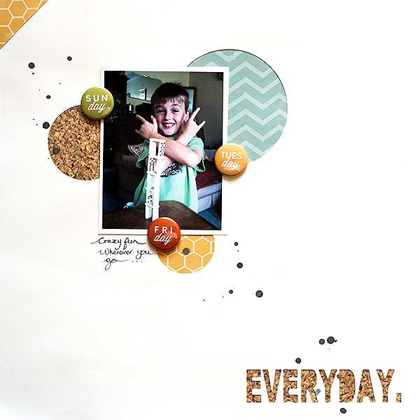
Everyday by Amanda Jones | Supplies: Cardstock – Bazzill Basics; Patterned paper – Simple Stories; Flair – Ormolu; Ink spray – Tattered Angels.
Adriana Puckett says, “We got cable service when we moved into our new house three months ago for the first time in twelve years, and this layout explores our favorite shows and how it is going with this major paradigm shift in our household.”
“I love using flair as a colorful and dimensional way to reinforce a layout’s theme, and the 3 in this tv-themed digital kit were perfect for this story. I placed them in a visual triangle.”
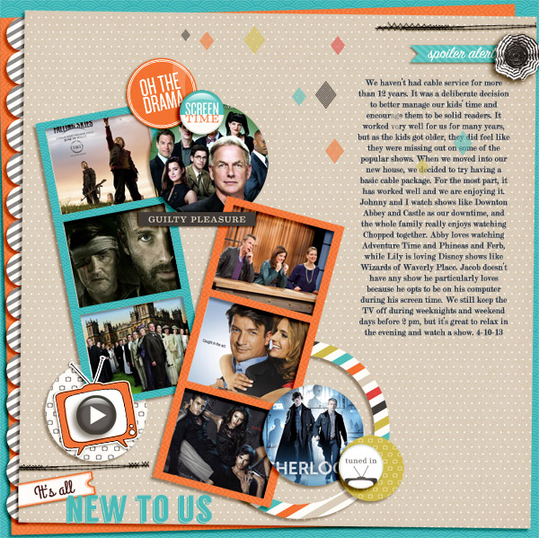
It’s All New to Us by Adriana Puckett | Supplies: Patterned paper and embellishments: Stay Tuned by One Little Bird Designs; Template: Ratatouille collection by Jeanye Labaya Designs; Title fonts: Langdon and Grand Hotel (script); journaling font: Modern No. 20
3. Add a line of flair
Leah Farquharson says, “Our oldest son recently had a quiz team competition and his team took 3rd place. We’re super proud of him.”
“I used several pieces of flair here, some related to the topic, others not. I placed them to border the photo and journaling spots to draw the eye to those main components of the page.”
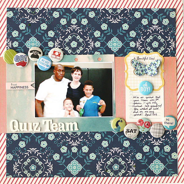
Quiz Team by Leah Farquharson | Supplies: patterned paper, journaling spots, chipboard, ink: October Afternoon. Flair: Panda Eight (etsy shop), Ormolu, October Afternoon, American Crafts, Studio Calico. Foam letters: American Crafts.
4. Recreate or mimic an element from your photo with flair
Katie Scott says, “Our family got to mark zip-lining off our bucket list on our spring break cruise to Jamaica.”
“One of the pieces of flair I had said ‘Try New Things,’ and the others looked tropical and travel-related so they were great for this subject. I placed them over the circles on the patterned paper and then used them as anchors for the baker’s twine which goes horizontally across the page and supports the theme of zip lining.”
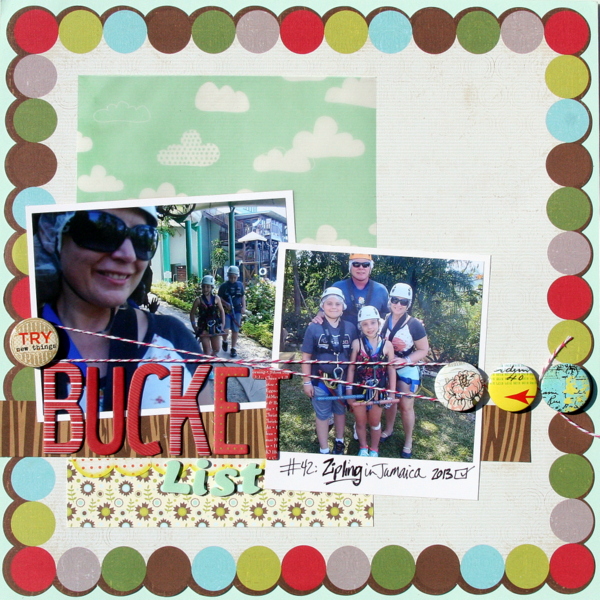
Bucket List by Katie Scott | Supplies: Amercian Crafts Dear Lizzy, JilliBean Soup, Bella Blvd. and Crate Paper patterned papers; Heidi Grace, American Crafts and Basic Grey embellishments and letters.
Audrey Tan says, “I used flair here to represent the bubbles coming out from the photo.”
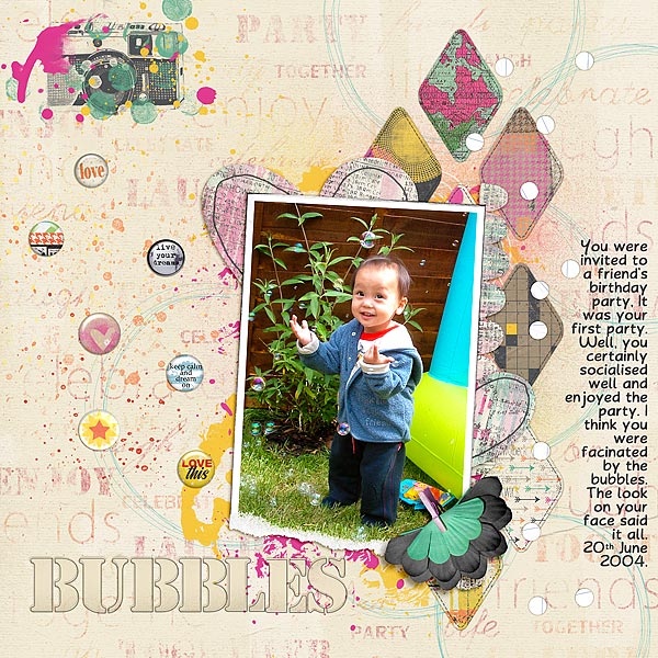
Bubbles by Audrey Tan | Supplies: Anna Aspnes: Torn Foto Frames No2; Pink Reptile Designs: For You Mom; Traci Reed: Little Joys; Traci Reed & Erica Zane: Silly Goose; Traci Reed & Jenn Barrette: Get Connected, Get It Together; Val C. Designs & BeeDesign: Self Confidence; Val C. Designs: Celebrate, Expressions Of The Soul; Traci Reed & Studio Basic: Lost In Reverie; Studio 68: Reflections; Oscraps Collaboration: Seven; Font: You All Everybody
5. Add flair to embellishment clusters and stacks
Sue Althouse says, “This layout is about our favorite place to eat lunch when we’re at the beach. I chose flair with bright, happy colors that I associate with summer and vacations at the ocean. I used two of them as centers, stacked on stamped, hand-cut shapes. The third is part of a grouping of smaller shapes in a corner of the page where there was not room for the larger size. The placement of these embellishments forms a visual triangle that guides the eye through the layout.”
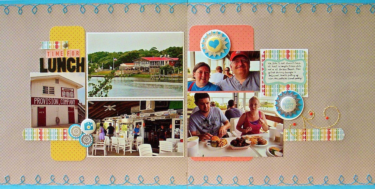
Time For Lunch by Sue Althouse | Supplies: Cardstock: Bazzill; Patterned Paper, Stickers: Studio Calico; Alphabets: American Crafts, October Afternoon; Stamps, Brads: My Mind’s Eye; Inks: Hero Arts; Floss: We Are Memory Keepers; Flair: A Flair for Buttons; Stitch Template: Amy Tangerine; Cloud Punch: Fiskars; Design: based on a sketch by Allison Davis
Debbie Hodge says, “My son’s jazz band played at a local ‘quackfest’ fund raiser and I used flair with colorful and energetic motifs to support the tone of the page. I stacked a ‘burst’ flair on top of a tie and topped it with an enamel dot to make a stacked element that grounds the journaler to the page. Two more pieces of flair are a part of the largest embellishment cluster on the page at bottom right.”
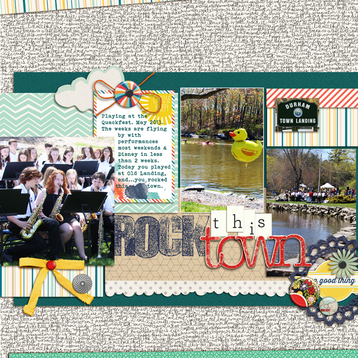
Rock the Town by Debbie Hodge | Supplies: Jade by Lili Niclass for Becky Higgins; More or Less by Rebecca Wagler, Celeste Knight, Gennifer Bursett, Pixels & Co; Flair Family Edition by Little Butterfly Wings; Fling by Creashens; Classic Cardstock Snow, Chipboard Alpha Red by Katie Pertiet; Woodland Wonder by Jenn Barrette, Textured Stamped Alpha by Just Jaimee; Brad Bonanza by Pattie Knox; Border Punches by Splendid Fiins; Bohemian Typewriter font
6. Add shine to your page with flair
In the Oomph & Polish issue of Masterful Scrapbook Design, Lisa Dickinson shared a lesson on the four things every page should have and shine was one of those things.
Debbie Hodge scrapbooked photos of her son photographing cats barefoot on a snowy day. Photography-themed flair works well to support the story, and it also adds a repetition of the shine and circular shape in the alphas spelling out ‘cats.’ The placement of the flair and of the shiny circular alphas create a downward diagonal flow taking the eye from top left down through the photo to bottom right. (Debbie’s note: “I lifted the idea of layering dotted vellum from Doris Sander!”)
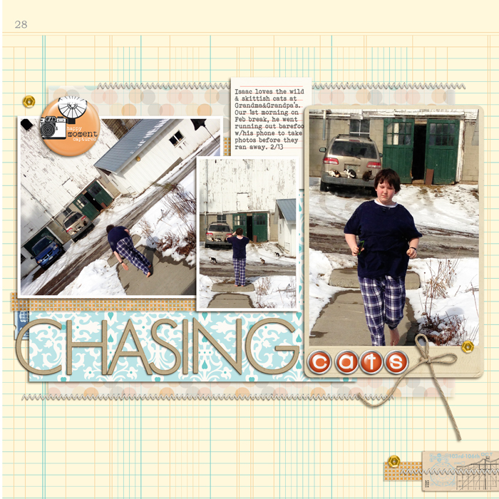
Chasing Cats by Debbie Hodge | Supplies: Clementine by Lili Niclass for Becky Higgins; Stitched by Anna Cream by Anna Aspnes; Washi Tape by Karla Dudley; Itsy Bitsy Alphas by Amy Wolff; Family Edition Flair by Little Butterfly Wings; Down the Lane by Sahlin Studio; Bohemian Typewriter font.
7. Tell your story with flair
Amy Kingsford says, “This page features a fun Instagram photo of my two boys showing off their different sense of style. I used several pieces of flair from the ‘Geeked Flair Pack’ by Karla Dudley. Their messages reflected my theme, and I love the depth they add to my digital page. I re-sized some of them to add variety.”

Cool Cute & Geek Chic by Amy Kingsford | Supplies: Karla Dudley: Geeked Collection; Creashens: Griddy Frames, D’Inks No. 1, Hello Kit; Robyn Meierotto: In Stitches: Basic Neutrals; Crystal Livesay and Sara Gleason: iNSD Grab Bag Templates
Doris Sander says, “When adding to my flair collection, I am drawn to those with clever wording and iconic symbols. My most recent purchase was a package of Basic Grey’s ‘Hey, Boy!’ flair. I actually tried to talk myself out of it at first, because I only wanted it for the one that read, ‘I (heart) Science.’ I wasn’t sure if I’d use the other seven in the pack as my son is a definite science and nature geek, but is not the typical rough and tumble boy.”
“I started on this page about our recent Cub Scout trip to the Space Center in Huntsville, Alabama with the idea of using that ‘I (heart) Science’ flair, and was pleasantly surprised when I ended up using three more of the pack on the page! It turned out that ‘Sweet Ride’ and ‘Shazam!’ are perfect for a page about rockets, and a Coke display will always get a ‘Thumbs Up’ from me. This page has taught me to keep my mind open to all the thematic possibilities that my flair collection has to offer.”

Nasa by Doris Sander | Supplies: cardstock – Bazzill, patterned paper, flair – Basic Grey, Thickers – American Crafts, washi tape – Pebbles, Inc., tag – Avery, pen – Sharpie, other – staples
[current]

