 by Debbie Hodge
As photographers and memory-keepers have discovered the ease and enjoyment of “Project Life” Scrapbooking, products designed to fit into 3″ x 4″ pockets have proliferated. The grid-based configurations of Project Life pages make for easy arrangement of many page elements and they aren’t JUST for Project Life pages. They’re great for all kinds of subjects.
See scrapbook pages and ideas from the Get It Scrapped Creative Team that are inspired by Project Life products and layout designs.
Tara McKernin says, ” This is a two page spread of our 2010 trip to the Toronto Zoo.”
“I love the project life products and concepts for story telling and memory keeping. They are versatile and work with any topic you want to scrapbook. Plus there are so many options for making it your own. I really loved Tiffany Tillman’s’s window templates. They utilize the window/pocket concept of project life. I liked using a slightly varied template from the basic project life template to showcase our zoo photos. I kept it clean and straightforward–just how I like it!”
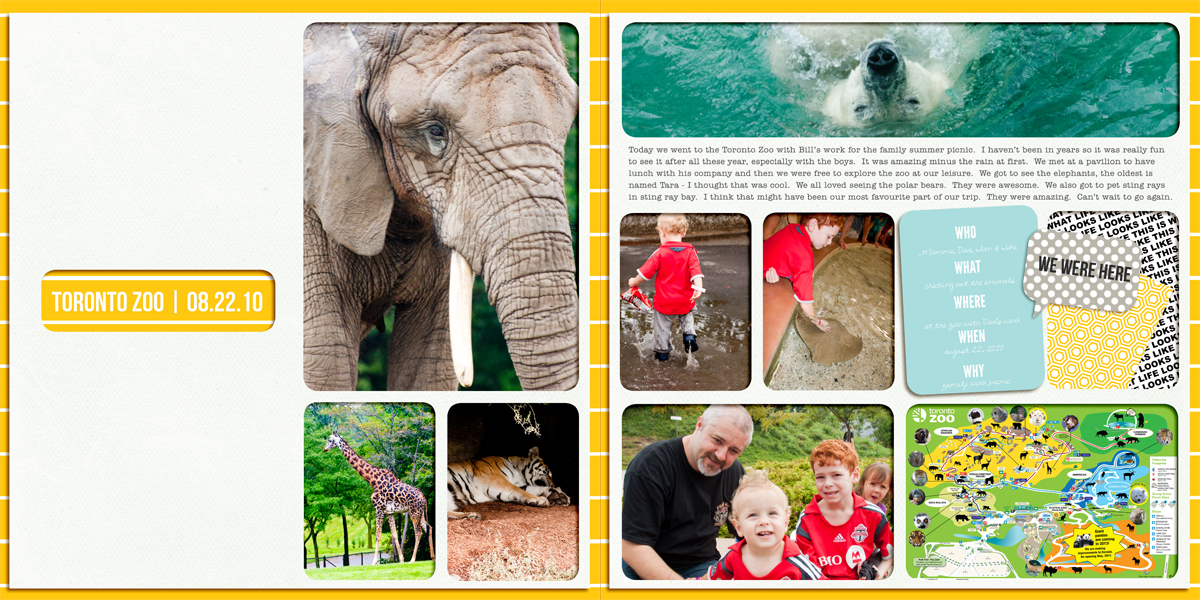
Toronto Zoo by Tara McKernin | Supplies: Simple Tiffany Studios (templates): Window System Collection and Covers; Becky Higgins (kit): Seafoam digital edition.
Christy Strickler says, “My son got to ride in the Engineer’s car of the Walt Disney World Monorail and these are photos from that day. I used project life cards in place of patterned paper. I used a loosely based grid design to house the cards and the photos.”
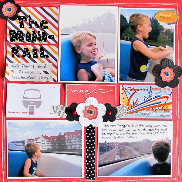
The Monorail by Christy Strickler Supplies| Cardstock: Bazzill; Hybrid Project Life Cards: Britt-ish Designs and Sahlin Studio’s Project Mouse; Flowers: Boxer Scrapbooks; Tape: K and Company; Jewels: Prima, Queen and Company; Other: Electrical Tape
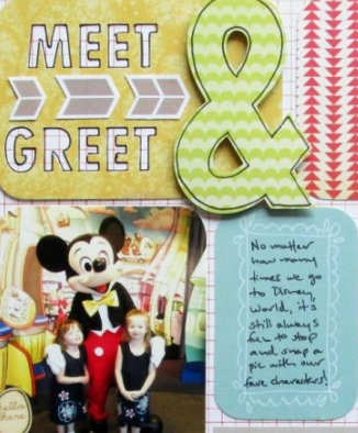
Ashley Horton says, “No matter how many times we visit Disney World, we still always stop for photos with the characters.”
“The Project Life composition worked great for this layout. I was able to include 3 photos on an 8.5×11 page format and still have plenty of room for embellishing and multiple patterned papers. This format would work well for those who like to journal a lot on their pages. Just add your photos and use tags or paper beside them and add your story for each photo.”
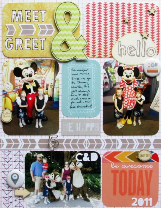
Meet & Greet by Ashley Horton | Supplies: Patterned Paper, Wood Veneer, Paper Clip & Mask: Studio Calico; Washi Tape; Glitz Design; Flair Buttons: The Paper Bakery; Letter Stickers: Jillbean Soup; Font: Abadi MT Condensed Extra Bold
Adryane Driscoll says, “These are photos taken by my uncle in 1943 while he was stationed at the US Airbase in Maxton, North Carolina. Fortunately, he was good about writing the names of the people in the photos on the backs of the photos.”
“I started this page with one of the basic project life compositions of six 4″ x 3″ blocks. I decided to take the center blocks and turn them into a single space for my title. The journaling block was also inspired by the project life composition which tends to have lots of information (sometimes detailed, sometimes just short snippets) about the photos on the page.”
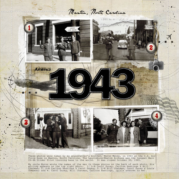
America 1943 by Adryane Driscoll: Credits: Anna Aspnes I FotoInspired Templates Pack 2B, ArtPlay Palette Traveler, Vellum Sheets No.1, 12 x 12 Stitched by Anna Overlays, WarpingFrames No.1, ArtsyKardz Traveler, ArtPlay Palette Wicked (solid paper clipped to alpha), 52 Weeks NumberSet No.1, ArtPlay Palette No.8, ArtPlay Palette RedWhiteBlue, and Complete Stitched Alpha No.1; the plane was a free image from the Internet.
Katie Scott says, “I keep a box of journaling cards and notebooks and question books by my bed. At bedtime, I interview members of my family using the question books and the journaling cards. I write on the cards so when I go to make the scrapbook page, the journaling is already done.”
“On this page, I used journaling cards from October Afternoon (they have slightly different dimensions than those from Project Life). I cut the photos to 2.5″ wide so they would fit in the middle and line up with the cards. Since the cards were taller than they were wide, I added some patterned paper strips on the left side of the page.”
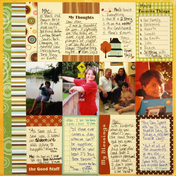
Mac at 10 by Katie Scott | Supplies: October Afternoon journaling cards; patterned paper from KI Memories.
Brenda Becknell says, “It took a few tries, but I finally got a picture of my grandson showing off his smile with two new teeth.”
“I was inspired by the grid layout often seen on Project Life pages. The dotted pattern paper pieces are actually all from one sheet of paper that was divided into different colored 3″ x 4” rectangles; I just cut them apart and chose the colors I wanted for this page. The top and bottom rows have vertical rectangles, while the middle row has two horizontal rectangles with a square photo in the center. In keeping with the casual style of a lot of Project Life pages, I didn’t use a title or journaling, but used some phrase stickers to set the tone of the page. I also used some partial circle punches in an “off the edge” style that helps offset the hard edges of the grid design.”
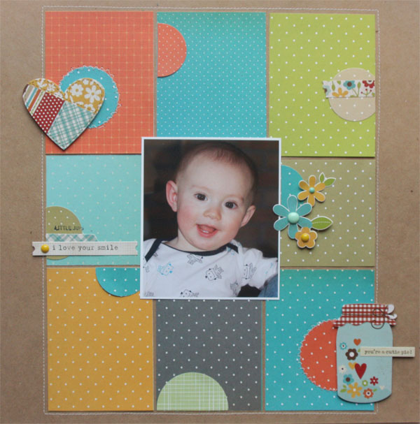
I Love Your Smile by Brenda Becknell | Supplies: Patterned paper: Studio Calico; Cardstock: Hobby Lobby; Stickers: Simple Stories & Pink Paislee; Circle punches: EK Success: Enamel dots: My Mind’s Eye
Stefanie Semple says, “My son was participating in his school inter-house tennis doubles match in these photos. I took numerous photos and love getting as many as possible onto the page.”
“I like the stitched plastic pocket feel of Project Life designs and used it here, adding dark blue stitching and a few flowers and metal fasteners to add a touch of realism and to cross the lines of the ‘pockets.'”
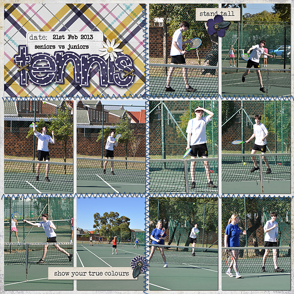
Tennis by Stefanie Semple | Supplies: Chelles Creations: Stitch me up (stitches), In the pocket {freebie} (layered template); Litabells Designs: Where I stand (kit)
Adriana Puckett says, “This layout showcases photos from my daughter’s Girl Scout weekend at camp (we had a blast but very little sleep!). “
“I started out very strictly following a blocked Project Life design, but eventually I started blurring the margins and overlapping edges. I treated each block as a mini canvas, which was really fun. On four of the spaces I popped up the embellishments to add to the depth and texture. While, this started out as a challenge taking me out of my comfort zone, I ended up really liking both the structure and the opportunities to to break that structure.”
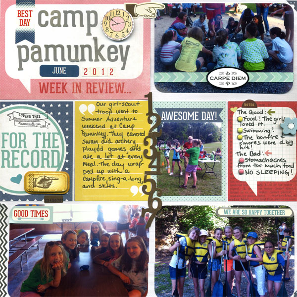
Camp Pamunkey by Adriana Puckett | Supplies: Patterned paper for cards and title block, also title letters and some stickers : Echo Park Photo Freedom; Stamp: Studio Calico; Stickers and Chipboard embellishments: K & Co, My Mind’s Eye, Pink Paislee; Brads: Basic Grey.
Debbie Hodge used a Project Life inspired digital template by Anna Aspnes to scrapbook photos of her sons playing board games with friends on a winter day off from school.
Debbie says, “Like Adriana, I really loved starting with an underlying structure and then doing unexpected things with it. I found that the 2 by 3 grid of 4″ x 3″ rectangles made a great foundation. I made changes like adding in a square photo, blocking with patterned papers within one of the 6 main blocks, and layering a dimensional frame over another. For a patterned paper lover, this composition provides lots of opportunity to play and use many prints.”
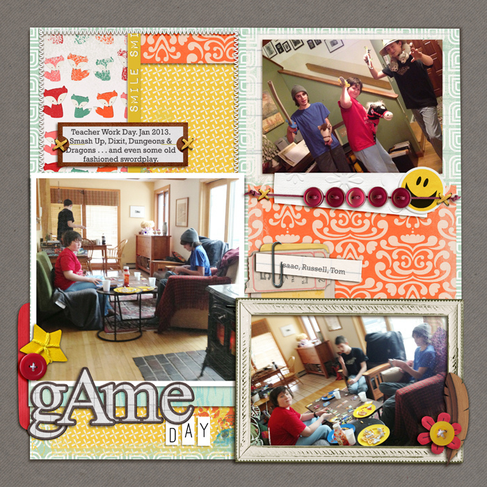
Game Day by Debbie Hodge | Supplies: Foxy by Gina Miller (papers & embellishments); Jane by Ardent Sparrow (ticket); Rules of the Road Alpha, You Make Me Happy by Mye De Leon; Flossy Stitches Yellow by Katie Pertiet; Ordinary Special by Kaye Winiecki; Woody Feathers by Lynne-Marie; Amore Mio Envelopes by Paula Kessselring; Alpha Bits, Krafty Essentials by Karla Dudley; Foto Inspired Template Pack 2B by Anna Aspnes; Fastenating by Scotty Girl; Chin Up by Allison Pennington; Bohemian Typewriter font
Amy Kingsford says, “This page features a collection of quotes that resonate with me and act as a daily reminder for living my life.”
“I wanted to use the Project Life-style journaling cards in a fun way here. I have so many that come with my digital kits, but I was rarely using them because I’m not a linear scrapper. I set myself a challenge to find a way to include them in my more freestyle designs. The easiest way to do this was to treat them as if they were photos. I came away with this photoless yet meaningful page.”
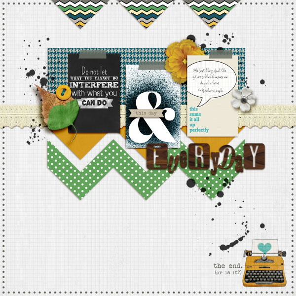
This Day & Everyday by Amy Kingsford | Supplies: Gennifer Bursett: Up to Date (with Jen Allyson), Toolbox Mists Vol. 7, Quotable Journal Cards; Creashens: Dippers; Mye de Leon: Veneer Alpha 2; Karen Funk: Sprayed Notecards; Crystal Livesay:Chalkboard Quotes Vol. 1, Hold Onto Happy Templates .
[current]

