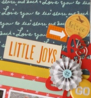
 When you set up a visual situation with tension, the viewer feels like something isn’t quite right, that something might happen they don’t want to miss. And so they dive into your piece and stay!
One way to add tension to scrapbook pages is to “break canvas edges.” Doing this is unexpected, but it also takes advantage of the mind to complete known shapes or images even when part of that image is missing.
So: if you bleed a known image or shape off the canvas edge, the mind fill in the missing part. There’s more, though: the mind perceives that your image takes up space off the canvas. Thus, in the viewer’s mind, your page becomes bigger than it actually is.
See how our team has gone to the edge on their pages.
Amanda Jones says, “This is a simple page to note some of the nicknames I have for my cat. I layered three clusters of elements going off the edge of the page, including the focal cluster with my photo. I used the clusters to guide the eye through my layout, and added ink splatters to tie the clusters together.”

Love My Jim by Amanda Jones | Supplies: Kit –Patterned paper, die-cuts – Teresa Collins Designs; Alpha stickers – Jenni Bowlin Studio; Pinwheel – Crate Paper; Flair – American Crafts; Die-cut – Crate Paper; Other – Ink spray, washi tape, doily.
Ashley Horton says, “I really wanted a cute photo of all three kids together for Valentine’s Day this year and actually managed to accomplish it. It’s definitely not an easy task!! I used ‘Off the Edge’ clusters to create a visual triangle that guides the eye around the page. This offered plenty of space for clustering elements on my layout while still showcasing the photo and mix of patterned papers. Adding these clusters is also a fun way to mix and layer lots of little bits like doilies, buttons, twine, washi tape, and flair buttons.
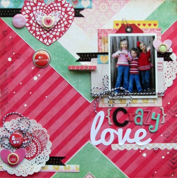
Crazy Love by Ashley Horton | Supplies – Patterned Paper: Crate Paper; Flair Buttons: Ormolu; Clothespin: Amy Tangerine; Buttons & Thickers: American Crafts: Washi Tape: Prima Marketing; Baker’s Twine: The Twinery; Stamps: Teresa Collins. Ink: Stampin’ Up; Doilies: Hobby Lobby; Font: Pacifico
Adryane Driscoll says, “This is a photo of my nephew. I layered label templates and ‘clipped’ (digitally) ribbon and paper to them to create the flags going off the edges of the page. The two clusters mirror each other (except for their shadows). This allowed me to use a lot of bold color without overwhelming the photo.”
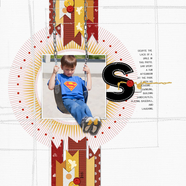
S by Adryane Driscoll: Credits: Anna Aspnes I ArtPlay Solids Gather, Word Label Templates No.3, CircleIts Basix, Stitched Alpha Complete No.1, ArtPlay Palette Twizzle (button), ArtPlay Palette Crazy Life (button), and KrissKross Stitched Overlays No.1; Katie Pertiet I Little Forest Friends Twills, Spots of Love No.3, and Basic Twills.
Marie-Pierre Capistran says, “This page is about when I met my husband. I placed hearts and speech bubbles off the edges of both sides and at the top of my layout.”
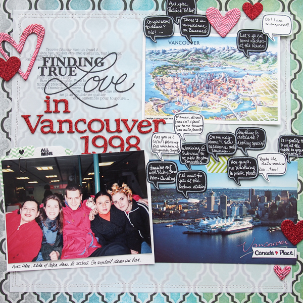
Finding True Love by Marie-Pierre Capistran | Supplies: Pattern Paper: Heidi Swapp; Mist spray: Heidi Swapp; Chipboard pieces: Heidi Swapp, Recollections; Cardstock: Stampin’UP!, Bazzill; Stamp: Denami Design, October Afternoon; Letter Stickers: American Crafts; Washi tape: Bella Blvd.; Mini Paper Clip: Tim Holz; Others: Vellum paper, silver thread, white gel pen.
Tara McKernin says, “This is a simple layout of my two boys for Valentine’s Day. I began with a digital template that had tons of paper layers, which I switched out for bits of washi tape that I could layer and cluster off the edge of the page. I also used flair buttons and glitter hearts to embellish the page allowing some to also go off the edge.”
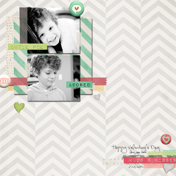
Love you both by Tara McKernin | Supplies: Just Jamee, Mommyish, Edeline Marta (kit): February Pea Soup Eye Candy; three17 Designs (template): Valentine
Brenda Becknell says, “This is the only known photo of my great-grandparents on my paternal grandmother’s side. It was photographed in a frame so there is glare in the center, but I really wanted to scrap it for my heritage album. I used two off-the-edge groupings, one on each side of the photo, to create a diagonal design line. I cut stickers and journaling cards in half, and added patterned paper pieces, ink, and buttons from my grandmother’s button box. (My grandmother is the little baby sitting on her father’s lap in the photo.)”
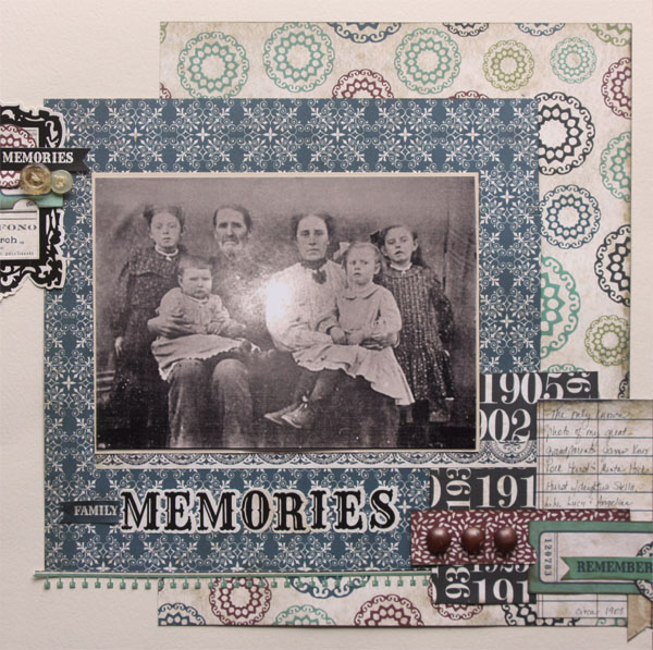
Family Memories by Brenda Becknell | Cardstock: Bazzill; Patterned paper, stickers and alphabet stickers: Echo Park “Times & Seasons” line.; Chalk Ink: Quick Quotes “Java”
Leah Farquharson says, “Our boys participate in a certified PE program for homeschoolers each week, and these photos are from their annual track and field day. I wanted to give a sense of motion to this page, and by pushing the clusters of elements to the far right and left on the page, I felt like it created a sense of coming and going. It was the perfect way to accentuate the photos that I had from this super fun day!”
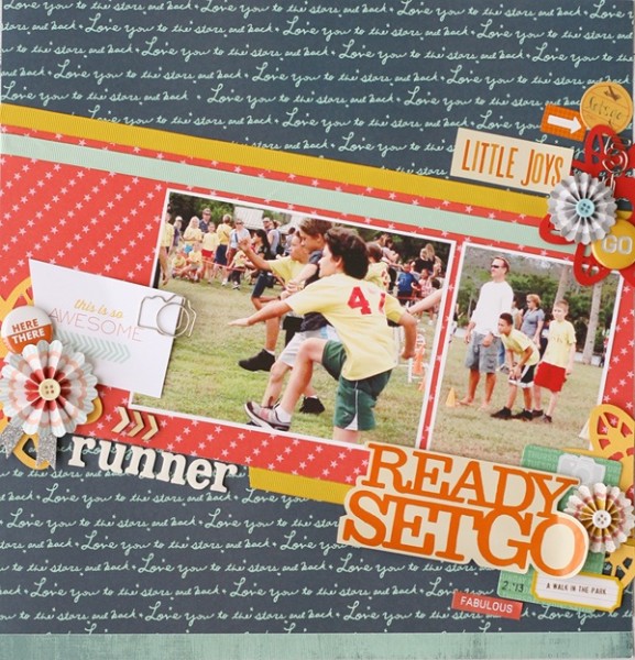
Runner by Leah Farquharson | Supplies: patterned paper, accordion flowers, stickers, ribbon, silhouette doily shape, cardstock, journal cards, foam letters: American Crafts. Wooden veneer arrows, flair: Studio Calico. Camera paper clip: Prima Marketing.
Vicki Walters says, “The focal point of this page is a photo of the harbor and Bible verse. To me the ocean is very spiritual, and I tend to pair verses with my photos. The elements off the edge are a sand dollar, seahorse, fishing rod, buttons on one side and clocks and buttons on the other. They are off the edge as they are accents and not meant to detract from the main focal point.”
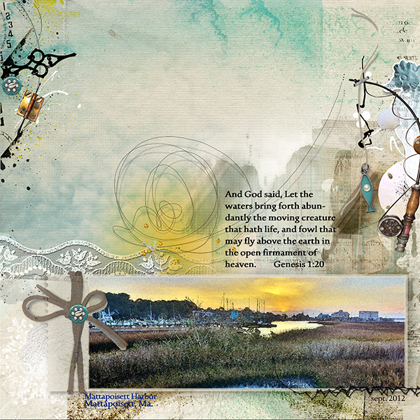
Layout by Vicki Walters | Supplies: Font Urdu Typesetting; Anna Aspnes at Oscraps-CrochetedSnow no 2, ArtPlay Palette Salty Living, ArtPlay Palette Wander, ArtPlay Palette Sun Fun, ArtsyClocks no 2,JazzedUp LoopDaLoop no 2, MultiMedia SeaLife no 1, UrbanStitchez No 1,andScriptTease Summer no 1 Brushset.
Kiki Kougioumitzi says, “The first bloom of the spring is from our almond tree. I wanted the feeling of spring and emerging for my layout and that’s why I placed everything off the edge. Patterned paper scraps, tiny flowers and gems, stenciled branches (with modeling paste) and even the photo, all are entering from the edges of the page.
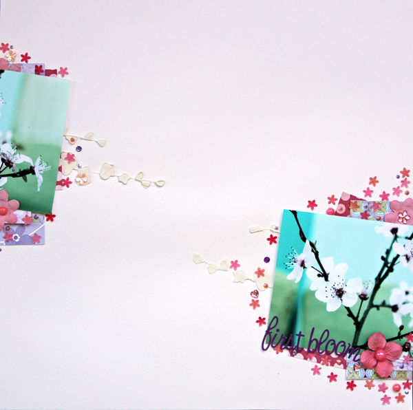
f First bloom by Kiki Kougioumtzi|Supplies:Patterned paper:Rouge de Garance,Basic Grey,Echo Park,DCWV; Cardstock:Canson;Flowers,Stencil:Prima;Other:gems,Liquitex modeling paste,Ranger liquid pearls,tiny flowers.
Deborah Wagner says, “This is a photo of my niece and nephew 18 years ago when they first met. My layers (including the photo) go off the edge on the right and left side of the page.”
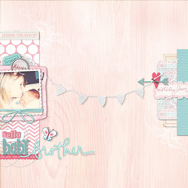
Hello Baby Brother by Deborah Wagner. Supplies from Designer Digitals: Studio Double D – Layer Works No. 215; Katie Pertiet – Sweet Rose Bay Collection, Artistry d’Amour Kit, Hey There Kit, Blitzen Kit, Whimsy Wings Kit, Elfin Magic Kit, Frosted Winter Kit, Twisted Stitches No. 2, Looking for Love Kit; Lynn Grieveson – Sugar & Spice Kit, Word Strips No. 11; Ali Edwards – Family Words, Siblings Brushes & Stamps; Cassie Jones – Bending Shadows
Barb Brookbank says, “Here’s my sensitive little grandson – enduring a photo shoot and unwillingly being the centre of attention! I added the little camera to support the fact that this was a photo shoot. I like that he is looking over at the paper strips which seem to be cheering him on!”
“I love to run little bits of papers and elements off the edges of my layouts. I really like how they seem to be peeking into the page without overwhelming. In this example – they direct the eye toward the photo from both the right side and the left side. The other thing I did here that I don’t usually do is angle the top paper – this resulted in all the edges of the paper running off the edge a tiny bit – showing the striped paper beneath which keeps the eye inside the page – like a frame.”
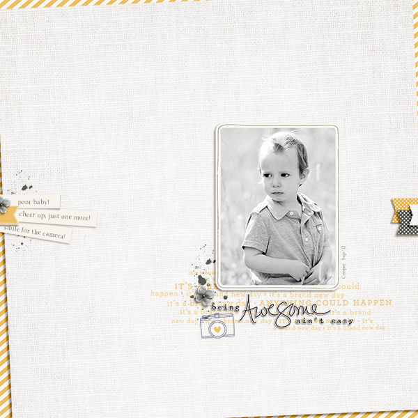
Being Awesome Isn’t Easy by Barb Brookbank | Supplies: One Little Bird: Meadowlark Collection and Word Art; Dunia Designs: Camera; Paislee Press: Is It Friday Yet; Font: Californian FB; (Photo by Tere).
Debbie Hodge says, “This photo is from a sweet 16 hoe-down-themed birthday party. I balanced my cluster of layered papers and photo with two ‘shelf’ clusters, both going off the right edge of the canvas. The shelf at top right extends about one third of the way across the page while the cluster at bottom right extends about two thirds of the width. They are each made with strips of paper and stitching topped, and they are each embellished with circular elements.”
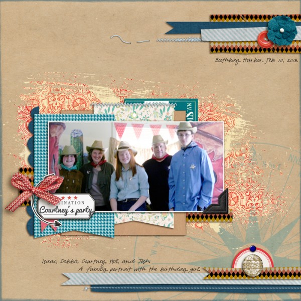
Going Places by One Little Bird and Rebecca Wagler/Ardent Sparrow; Boho Transfers by Lynne-Marie; Distressed Edge Overlays No 9, Stitched by Anna Baby Blue by Anna Aspnes; The Way We Weren’t, Rough Cut Strips by Allison Pennington; More + Less by Paislee Press; Cut.It.Out Clipping Masks by Robyn Meierotto; Fig Tree by Sara Gleason; 365Life by Karla Dudley; Brad Bonanza by Pattie Knox; Banners by Amy Martin; Pacifico and Pea Olson fonts
[current]

