 by Debbie Hodge
This is an update of an article we ran summer 2012. Since then many new scrapbooking products with feathers have been released so we’re revisiting the topic with more feathery pages.
They are in hair extensions and earrings, in arrangements in vases and bridal bouquets, and on high fashion gowns and wedding headdresses. American Idol judge Steven Tyler appeared wearing a particular rooster feather that’s long and flexible–a trend that started in Colorado where fly fishing is popular.
Feathers are associated with a number of things depending upon the type of feather. Practically, their shape and size are great for adding variety to a cluster or framing an element on one side.
Take a look at these ideas for incorporating the feather motif into your scrapbook pages.
Use feathers for story | Use feathers for theme and mood | Connect a “feathery” play on words with page subject | Use feathers for emphasis | Use feathers as page accent | Use creative techniques with feathers
Use feathers for story
Amber Ries says, “This is a fun page of a summer outing to the playground where my daughter discovered a bird feather and tried to pet the neighbor cat, who was watching her play. I used the feather because I wanted a motif that would tie in with the photos (my daughter playing with a feather she found on the playground).”
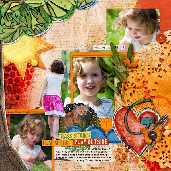
Hello Beautiful by Amber Ries | Supplies: Michelle Godin: Sunshine & Grass stains papers | Sunshine & Grass Stains | Sloppy Stencils 2; Jenn Barrette: Naturally Organic Elements ; Anna Aspnes: Journal Transfers 2
On “Nature Nerd,” Amy Kingsford used feathers for a nature-themed page. She placed the cluster next to the center photo to draw attention to it. Amy says, “The feather adds to the nature theme of my page and lightens up a heavy cluster while pointing the eye toward titlework and journaling above.”
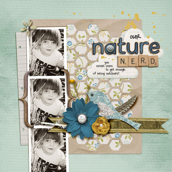
Nature Nerd by Amy Kingsford | Supplies : Template from Simple Scrapper’s Premium Collection, Blue Skies Ahead by Jenn Barrette, Love and Grace Alpha by Kate Hadfield, Brackets No. 1,Adventure Art Play Palette, Sun Fun Art Play Palette, Forget Me Not Art Play Palette by Anna Aspnes.
Use feathers for theme and mood
Doris Sander says, This layout is centered around a couple gorgeous photos from our most recent cub scout hike. I’ve always loved to use leaves on my pages and I think I’ve fallen easily into the feather trend because of it. Feathers just have a similar structure and are a carefree part of nature as well.”
“The irony in the tiny vellum bird beneath the large feather bouquet is not lost on me. It was unintentional as at the time I just felt I needed a hint of color in the title area. Looking back though I’m so impressed by how well the size contrast fits with the title. While the photos I used are beautiful, they don’t have a strong focal point. I placed the feather bouquet in the middle of them to pull the eye in without detracting too much from the message I was trying to get across.”
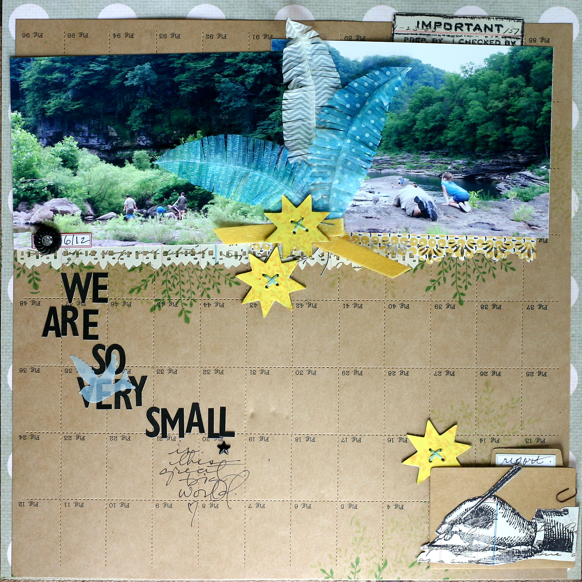
We Are So Very Small by Doris Sander | Supplies: patterned paper, perforated paper, alphabet stickers, chipboard elements, feathers, rhinestone brad, clear stamps, file folder, label sticker – Jenni Bowlin Studio, punches – Jenni Bowlin for Fiskars, ink, mist – Jenni Bowlin for Ranger, paper clip – Tim Holtz, ribbon – vintage, other – embroidery floss, vellum
Debbie Hodge says, “This page began with an inspiration piece: a photograph of vintage stationary in a blocked arrangement by Vicki Dvorak, and I was lifting not only the composition but the look of the inspiration piece. The stamped feather evoked the old-fashioned tone I was after and it took the place, shapewise of a stemmed flower in the original piece”
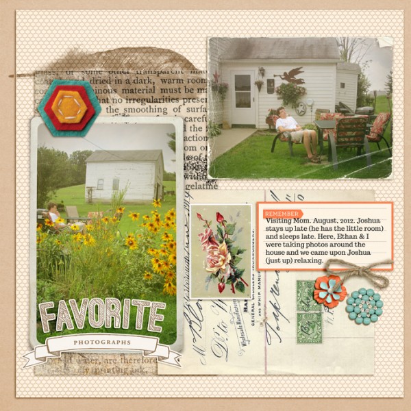
Favorite Photographs by Debbie Hodge | Supplies: Pedal Pushers by One Little Bird; In Motion by Ashalee Wall; Artsy Feathers No 1 by Anna Aspnes; Summer Camp, Key to My Heart by Sahlin Studio; Headliners by Paislee Press; Vintage Photo Frames No 16 by Katie Pertiet; Worn Photos 2 by Lynn Grieveson; Ephemera by Mye De Leon; Stax On Hexagon by Kaye Winieki; Trocchi font; Totally Rad Labs photo editing; Inspiration photo by Simply Hue on Flickr http://www.flickr.com/photos/36280025@N06/5347872192/
Tiffany Tillman says, “Feathers are light and delicate, and they pair well with baby pages, which are often light and delicate too. Feathers and babies create a perfect, thematic balance.The title of the page is ‘A Little Birdy Told Me’ and what would a bird be without feathers?”
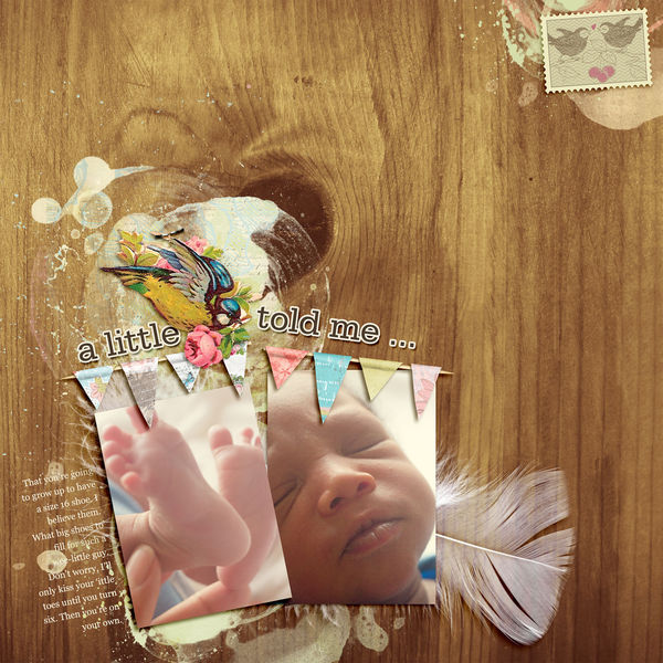
A Little Birdie by Tiffany Tillman | Supplies: Digital Kit: A Little Birdy by Juliana Kneipp; Page Template: Stuffy no. 2 by Simply Tiffany Studios; Fonts: Serifa (title), Georgia (journaling).
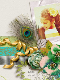
Amy Kingsford used a large peacock feather on her page “L is For” to add to its feminine feel and to accent this beautiful photo of her niece Amy says, “Feathers can be such a fun way to add soft texture and vibrant pops of color to your pages. I think the trick to using feathers on a digital page is creating that perfect drop shadow-distant yet soft.”
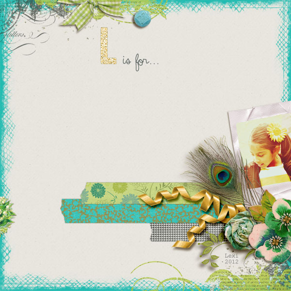
L is for… by Amy Kingsford | Supplies: Deena Rutter: Enchanted Papers (March Co. Stash); The Ardent Sparrow: Taylor Borders (March Co. Stash); Robyn Meierotto: Lucky Elements (March Co. Stash); Mye de Leon: La Boheme; Pixels & Company Collab: In Good Company Alpha; Creashens: Bare Necessities: Neutral Cardstock and Torn Bits No. 4
Connect a “feathery” play on words with page subject
Doris Sander said, “I thought the quote “birds of a feather flock together” made an appropriate title and theme for this layout featuring my son and his two little friends at several Cub Scout events this year.”
“I used several feathers that we picked up on walks at the lake to embellish the layout. I originally thought to tape the feathers to the page with several colors of washi tape which is all the rage right now. It soon became apparent that the washi tape wasn’t strong enough to hold down the feathers, so I then machine stitched over them to hold them down.”
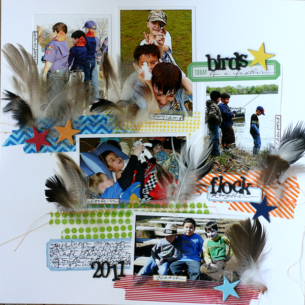
Birds of a Feather | Supplies: washi tape – Target, Queen and Company, My Mind’s Eye, plastic alphabet – Tim Holtz, labels – Jillibean Soup, Fontwerks, 7 Gypsies, chipboard stars – Jenni Bowlin Studio, paint – Jenni Bowlin for Ranger, other – feathers
Debbie Hodge scrapbooked a photo of her son with a friend — both of them wearing the very same and usual winter coat — as a way to talk about their friendship and how much they have in common. “Birds of a Feather” is the begining of the common phrase that ends “flock together” which is fitting to the topic. She used feather masks with a digital misting brush to create a foundation for her focal point photo. Repetitions of the feather and of birds are in the title and the bird swooping in from top left.
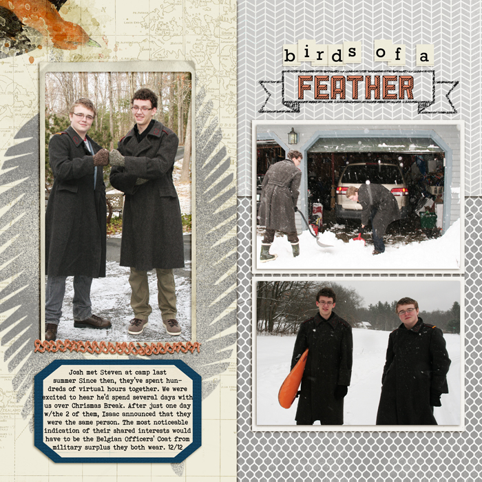
Birds of a Feather by Debbie Hodge | Supplies: Teak Papers, Teak Embellishments by Sara Gleason; January by Lynn Grieveson; Primitive Feathers by Jenni Bowlin Mercantile; Birdwatcher Blendables, Chalkboard Banners, Vintage Frames no 21 by Katie Pertiet; Embroider Me by Pink Reptile Designs; Sullivan, Rockwell, Bohemian Typewriter fonts
Use feathers for emphasis
Jennifer Matott says, “I love to use feathers in my artwork. This black feather was the focal point of this work and I wanted it to be prominent. I stitched it onto the canvas piece with embroidery floss.”
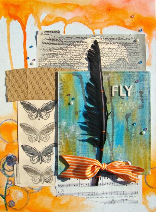
Fly by Jennifer Matott | Supplies: Canvas, Letters, & Bling: Prima; Stamps: The Rubber Cafe; Ribbon: May Arts; File folder & tag: Staples; Art Supplies: Faber-Castell DMC Gelatos, PITT Big Brush Artist Pens, Watercolors; Other Supplies: crayons, Coffee sleeve and feather.
Leah Farquharson tucked a few long white feathers behind her photo in this page about a recent home decor purchase. They mix beautifully with all of the other textures present in her page and also echo the line created by the vertical strokes of paint on her background.
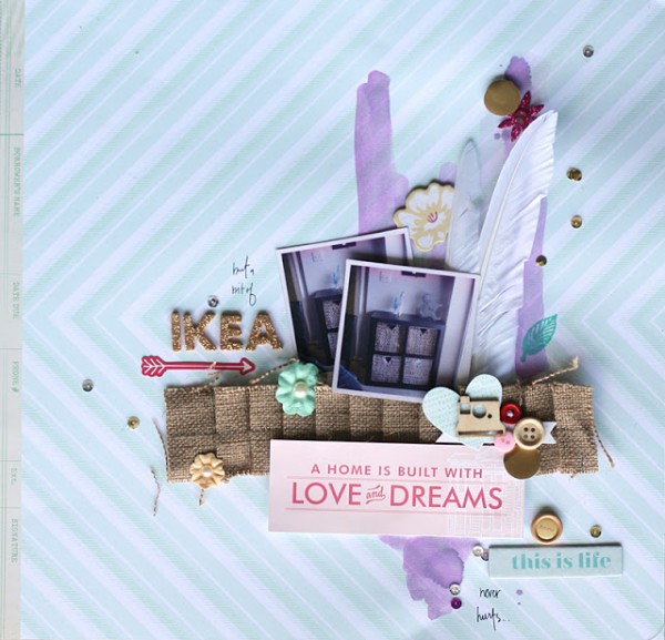
A Little Bit of IKEA by Leah Farquharson | Supplies: patterned paper, burlap element, wooden buttons, chipboard elements, stickers, flowers, stamp, ink, gold vellum paper, gold foam letters: American Crafts; wood veneer camera: Studio Calico; watercolor, sequins, feathers: craft supply store.
Use feathers as page accent
Debbie Hodge use a single small cardstock alpha to accent a page showing her brother with his dog on a summer evening. It’s a great addition to a cluster.
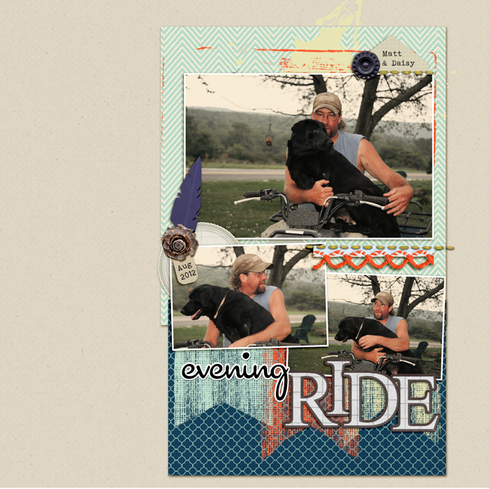
Evening Ride by Debbie Hodge | Supplies: Interview Papers by One Little Bird; Glitter Thread Stitches by Lynn Grieveson; In the Meadow, Rules of the Road Alpha by Mye de Leon; Sprinkles 11 by Valerie Wibbens; DYY Banners, Pretty Pieces by Lynne Marie; Bare Necessities Cardstock by Creashens; Cocktail Script, Bohemian Typewriter fonts
Audrey Tan embellished her focal point photo on “Meet Up” with a cluster of feathers tied and topped with a silk flower.
The subject of the page is a real-life meetup of online friends on Jubilee day in London. Audrey says, “The few of us that met up came from various countries–Australia, Singapore, Netherlands and United Kingdom–and we couldn’t have chosen a better day. Hence, I wanted my page to reflect the special moment.”
“I used feathers in three colours–white, blue and red–to represent the colours of the British flag. They were great embellishments for a page was made to reflect the Jubilee moment and the excitement of meeting up with online friends.”
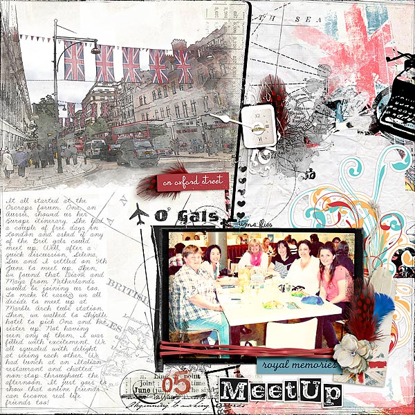
O’Gals by Audrey Tan | Supplies: Anna Aspnes: ArtPlay Palette GlobeTrotter, ArtPlay Palette Concerto, Distressed Dates No1, Month Word Transfers No1, Travel Europe No1, Globe Trotter No1, Loop Da Loop Travel No1, Warm Glows No1, Distressed Frames No4, Artsy Clocks No4, 12×12 Edge Overlays No5; Katie Pertiet: Double Decker; Tangie Baxter: Flora Finery; Pink Reptile Designs: Noted; Fonts: LD Shelly Script, VTKS News Label & LD Letterpress Inverted.
Use creative techniques with feathers
Leah Farquharson says, “Our garden is started to show baby veggies! Yay! It’s been such an exciting process – new to our kids, but not to me. I always love watching things grow.”
On “Fruits of Our Labor,” Leah used a diecut of tattered leaves, and then turned the leaves into feathers. Leah says, “I feel like the “feathers” give this page a light, sweet feel that totally makes me think of summer!”
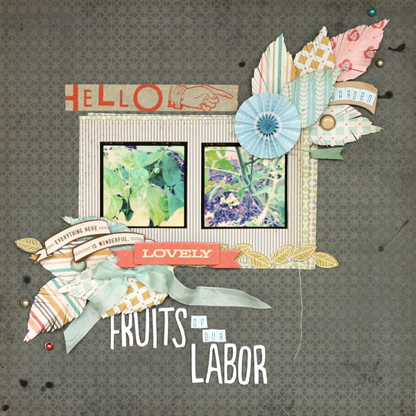
Fruits of Our Labor by Leah Farquharson | Supplies: patterned paper, brads, 3D sticker: My Mind’s Eye. accordion flower, fabric accents, letter stickers, foam letters: American Crafts. Tape: Cosmo Cricket. Ink: Ranger. Seam Binding: Hug Snug. Diecut: Tim Holtz Tattered Leaves for Sizzix. paper clip: Studio Calico. Sewing machine: Singer. Photos edited in Instagram.
Michelle Houghton used feathers on a beach page, “appropriate,” says Michelle, “since we spent the day collecting seashells and chasing seagulls.”
Michelle drew the feathers on kraft cardstock with a white Sharpie paint pen and black Sharpie. She says, “I added lots of little pearls for texture. It will be hard to read but the journalling is scratched into the photos with a stylus. It reads: Is there anything better then running on the beach chasing seagulls and collecting seashells and sand dollars? With their buckets full of treasures the day is perfect.”
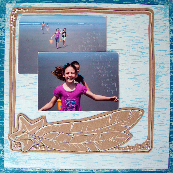
Feathers, Seagulls and Seashells by Michelle Houghton | Supplies:
Cardstock – Kraft, Patterned paper – Little yellow Bicycle (Christmas papers), Pearls – Mark Richards, Pens – Sharpie
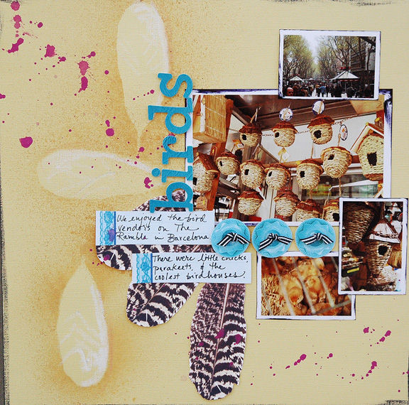
Dina Wakley used digital feathers from Kitschy Digitals (printed and cut out) first as masks on her misted background and then as eye catching accents on her page about visitng the bird vendors in Barcelona. Not only does this motif suit her page topic perfectly but these feathers add visual pop to the page.
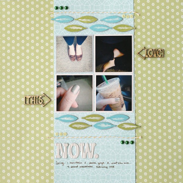
Leah Farquharson has created these fun borders for her page Love This Now with miniature chipboard feathers that she has hand painted for a one-of-a-kind look.
Ashley Calder has layered an aqua piece of cardstock with many sizes and styles of feathers cut from it over a patterned paper background. Ashley says, “This cardstock was the first thing I cut with my new Silhouette Cameo, and I loved the way it looked–even though I had originally intended on using the feathers I cut out, I used this piece instead.”
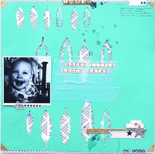
Happy Little Lunch Eater by Ashley Calder | Supplies: Typing Lesson patterned paper; backdrops1 triangle cut file; JBS Mercantile January 2013 Papercrafting Kit feather cuts; mini chalkboard alpha stickers, red; mini chipboard pieces, tiny tab; mini chipboard pieces, stars; tiny circle cardstock alpha sticker, reverse navy; Hear Ye, Hear Ye banner stickers, candy stripe; blue label stickers; apothecary stickers, navy.
[ontrend]

