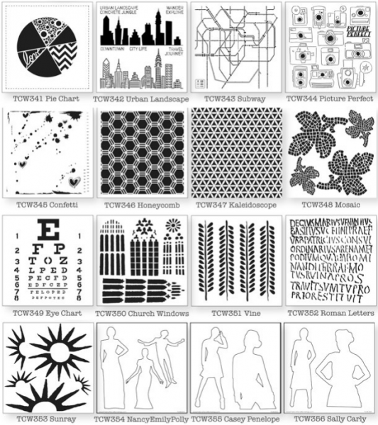
The Crafters Workshop has stencils from designers Dina Wakley, Julie Fei Fan Balzer, and Ronda Palazari that let you get a hit of their style on your pages.
With stencils and paint you can add new layers to to your scrapbook page. These tools let you add texture and dimension, color, motif and touchable interest.
Top designers are creating stencils that let you get a bit of their style on your pages and die-cut machines have made it easier to make your own stencils.
Check out our ideas for stencil work on both paper and digital scrapbook pages.
Stencil work on paper pages | The look of stencil work on digital pages
Stencil work on paper scrapbook pages
Doris Sander stenciled a block of numbers in four colors and topped it off with stickles and stitching for a hand crafted look.
Doris says, “I love using paint with stencils on my scrapbook pages for the lovely handmade effect they create. On this page, I was recording some of my thoughts from the days following the Sandy Creek tragedy. The painted numbers on my page add the feel of an elementary school classroom as well as conveying the idea of time passing. Using paint also let me control my color usage, so I was able to rotate four different colors in my design. Once the paint was dry, I went back and added a touch of Stickles for a bit of sparkle.”
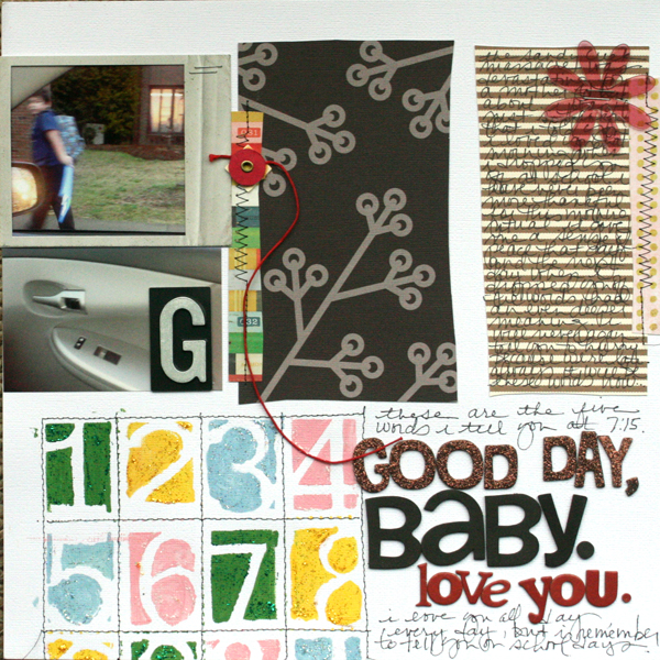
Good Day Baby by Doris | Supplies: patterned paper – Crate Paper, Canvas Corp, KI Memories, Basic Grey, Stencil – Crafter’s Workshop, paints – Jenni Bowlin for Ranger, glitters – Stickles, alphabets – American Crafts, acrylic flower – Heidi Swapp, other – mailbox letter, folder attacher
Kiki Kougioumtzi made her own stencils with mylar and a craft knife. After painting she detailed with a marker.
Kiki says, “A sudden spring rain is always fun and makes you wanna sing and dance in the rain, at least for my daughter!I used a cloud and drops stencil I made my own from mylar (I traced the designs and cut them with craft knife). I used acrylic paints with paintbrush. When the designs dried, I placed the stencil to the same position again and moved it slightly. Then traced the designs with a fine tip marker. I did that to give the stenciled image more definition and interest.”
Tip: use thick acrylic paints and very little water for a crisp image, otherwise the paint will run under the stencil and ruin the end result.
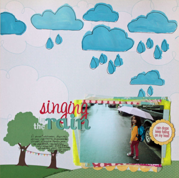
Singing in the rain by Kiki Kougioumtzi|Supplies:Patterned paper,Alphas:American Crafts; Acrylic paint:Ranger Studio;Alphas:Webster’s Pages,Basic Grey;Stickers:Echo Park;Other:paper scraps,mylar,tissue paper.
Christy Strickler layered repetitions of hexagons via embossing, print (the packaging from a toy) and stencils with modeling paste. The stencil work goes right over the photos grounding and the foundation to the canvas.
Christy says, “In the photo, my cats are playing with my son’s Hexbug Nano toy. I knew I wanted to incorporate the toy’s packaging. For a high-contrast background, I wrapped cardstock scraps with blue painter’s tape which I then embossed with a hexagon pattern.” Stenciled hexagons in white modeling paste add even more texture and ground the photos and foundation to the canvas.
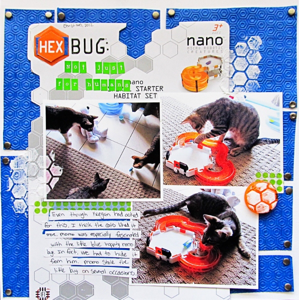
Hexbug: Not Just for Humans by Christy Strickler | Supplies: Cardstock: Colorbok;Alphas: My Little Shoebox; Embossing Folder: Lifestyle Crafts; Modeling Paste: Liquitex; Snaps: Making Memories; Other: washi tape, painter’s tape, toy packaging,Glossy Accents,bicycle reflector
Amanda Jones worked on a sheet of canvas rather than cardstock so she could be generous with her paint.
Amanda says, “I wanted to document my new routine – settling down to study in the morning with a cup of tea. I used stencils from JBS Mercantile along with acrylic paints, applying the pink dots and the grey starburst designs with acrylic paint over the stencil with a sponge. I then added a thick layer of paint through the alphabet stencil with a palette knife to give it more texture. I created the whole page on a sheet of canvas so that I could be generous with my paint and not worry about the paper holding up.”
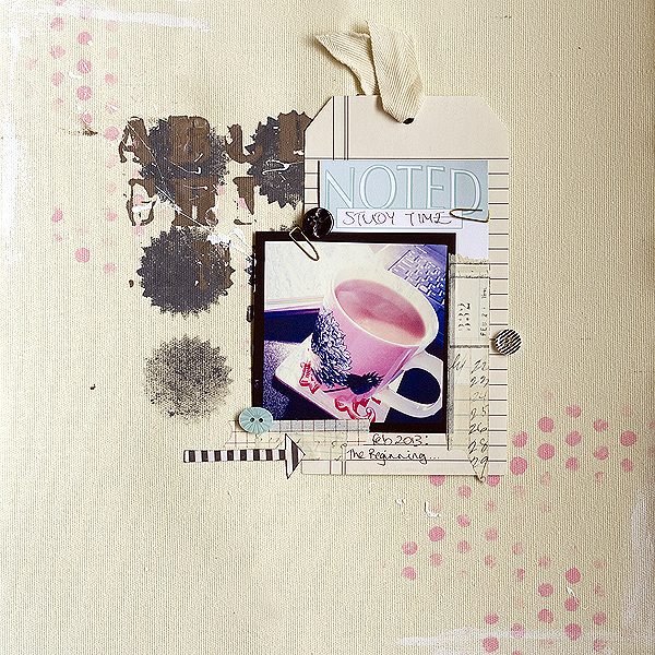
Study Time by Amanda Jones | Supplies: Supplies:
Canvas paper, large tag, buttons – Teresa Collins Designs; Stencils, journaling tag, – Jenni Bowlin Studio; Other – Acrylic paint, paper clips, twill ribbon.
Katie Scott used the frame from punch-out chipboard embellishments to make her stencils.
Katie says, “This page records how I had to do early voting and a few weeks after the election, I got a letter saying that my vote didn’t count. I have been loving all of the arrows in scrapbooking but I don’t have any of the new arrow-themed products. I found an old embellishment punch out page by Scenic Route and used the negative space of an arrow to create the arrows on this page. Instead of paint, I applied ink pads to the handmade stencil to make the arrows.”
“After I made the arrows, they didn’t seem sharp enough so I outlined them with a Sharpie so that their shape was better defined. I also used a punch out alphabet sheet to form my letters which I traced directly onto the photo of my voting letter. I outlined the letters with a fine tipped sharpie and colored them in with Copic markers.”
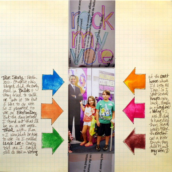
Rock My Vote by Katie Scott | Supplies: Scenic Route paper and embellishment sheet used as a stencil; sharpies, Copic markers, ink pads.
Brenda Becknell stenciled small motifs onto patterned paper to make her banners. She worked with white and tone-on-tone colors.
Brenda says, “My 6-month old son loved this teddy bear that his uncle bought him for Christmas, although he was torn between eating the bear and hugging it! I used acrylic paint and stencils on scraps of patterned paper to make the banner flags on this page. I used white paint on one flag, but then used paint that was the same color as the patterned paper on the others. I used plain acrylic paint and a small foam brush to apply the paint to the stencil. After some trial and error, I found that using a little bit of paint, but making sure it went all across the width of the foam brush, gave the effect that I liked the best. You can see on some of the red banners that I used a little bit more paint, so there is more texture to those.”
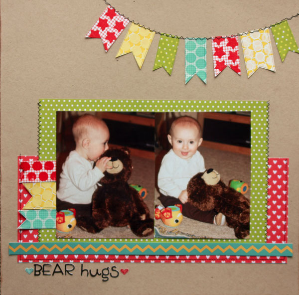
Bear Hugs by Brenda Becknell | Supplies: Cardstock: Bazzill; Patterned Paper: Pebbles; Alphabet stickers: Doodlebug Designs; Heart stickers: Jillibean Soup; Black marker: Copic; acrylic paint, foam brush, machine stitching
Leah Farquharson made a cream and blue stenciled foundation to mimic waves and sand for her beach photos.
Leah says, “The beach is always one of our favorite places to spend time in the warmer months (which for us is most of the year)! I used paint daubers from Jenni Bowlin’s Ranger line along with the “bubbles” stencil from Studio Calico. I used the stencil work to create the foundation for my layout. It anchors both my photo and embellishments. I blended the cream and blue paints over the stencil, to mimicked the sand and waves on the beach.”
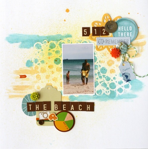
The Beach by Leah Farquharson | Supplies: stickers, chipboard, letters, tags: American Crafts. Stencil, inks, flair: Studio Calico. Flowers: Prima Marketing. Paints: Jenni Bowlin for Ranger. Twine: The Twinery.
Adriana Puckett cut her own stencil from cardstock with her Silhouette Cameo.
Adriana says, “When we visit Florida, we have a tradition of stopping by the Visitor’s Center as soon as we cross the state line to taste the orange juice. This year my daughter decided to try grapefruit juice instead and made a wonderfully disgusted face that I was lucky enough to catch. I made a stencil from a Silhouette circle die cut that I cut from cardstock. Then I positioned it on my background paper and brushed some acrylic paint from the kids’ stash over it. I like how it turned out, except that it did warp my background paper.”
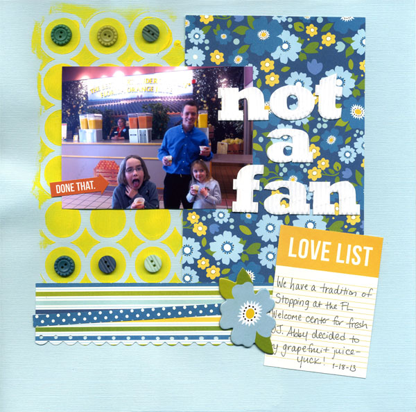
Not a Fan by Adriana Puckett | Supplies: Cardstock: Bazzill basics; Patterned paper and embellishments: Pebbles in my pocket; Title: Corrugated cardboard letters by Jillibean soup; Sticker: Simply Stories
Rosann-Santos-Elliot used a makeup sponge brush for dabbing through her stencil in a range of colors.
Rosann says, “The story is about who I am right now and taking an opportunity to get in front of the camera and highlight my own personal story. This was certainly a challenge since paint is not in my normal work flow, but it was fun to get messy. I used a makeup sponge brush to have better control over the dabbing and to range the shade of the colors.”
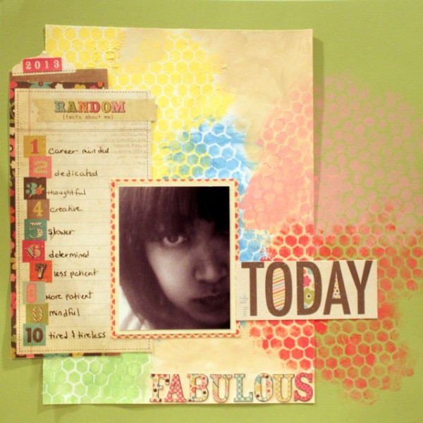
Today by Rosann Santos-Elliot | Supplies: Paper and Embellishments: Simple Stories Fabulos Line; Acrylic Paints: Studio by Claudine Hellmuth; Stencils: Crafter’s Workshop Chicken Wire.
The look of stencil work on digital scrapbook pages
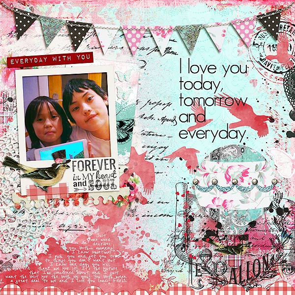
Audrey Tan used a bird shape as a mask, applying digital brushwork to the area it filled.
Audrey says, “This page is about my love for my boys. I layered bird stencil on the page and used a digital brush to paint it onto the paper. The bird imagery is used here to depict the the transient nature of their being. Like my boys, they won’t remain children for long and as much as I would like to ‘cage’ them, I have to give them their freedom to explore, play and discover life for themselves!”
Adryane Driscoll made her own digital stencil from a photo of her son and discovered that the simpler the shape is, the nicer the cut.
Adryane says, “The first thing that came to mind when I read “stencil” was alphabets. After a quick Internet search I was able to broaden my focus. There are so many really cool sites on stenciling! You can stencil almost anything … floors, walls, furniture, even cars. For this page, I decided to make my own stencil.”
“I took a photo of my son (against a light colored wall), turned it to black and white then increased the contrast so that the blacks were very black and the whites very white. Then I used the “cut out” filter in photoshop. I adjusted the various settings until the “cuts” were where I wanted them. Two of the images are blended directly on the background while the other two have a white border that allowed me to add a drop shadow to give the page a little dimension. Since stencils are usually painted, I tried to achieve that look by blending various papers and brushes over the stenciled images. I also used a stencil font (“Stencil” from dafont.com) to create the ‘Y’ and the ‘U.'”
“I think stenciling is like fussy cutting. The simpler the shape the nicer the cut. If I do this again with a photo of a person I would try it with a straight on shot so that the eyes and mouth are larger when I use the cut out filter.”
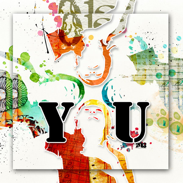
you by Adryane Driscoll: Credits: Anna Aspnes I ArtPlay Palette Metro Graffiti, ArtPlay Palette Pumpkin Patch, 2013 WordArt No.1, ArtsyKardz Vitality, ArtsyKardz Viaggio, ArtsyKardz Bask, ArtsyKardz Salty Living, ArtsyKardz Storm, ArtPlay Palette Social Network, and Light Textured Neutrals No.2; Holliewood Studios I Art Box No.2 and Art Journaling No.2; and J Kneipp I Far From Here
Vicki Walters used ready-made wordart with her on stencil-look type for “puppy love.”
Vicki ways, “My son gave this flower arangement to his girlfriend for their anniversary and I thought it was adorable with the flowers made to look like puppies. The stenciled “love” and “believe” are ready-made digital wordart. To make the “puppy love” stencil I typed the words on a separate layer, rasterized the type, enlarged it and then I used the magic wand to select all of the black, copied it and pasted it onto a new layer in my layout. Using a rectangular selection around the letters and a medium brush, I painted all around the letters. Then I re-selected the black letters and deleted them. To make it look more worn I changed the layer properties to dissolve and used a soft brush set at 50% opacity and flow and erased lightly to make it look more worn.”
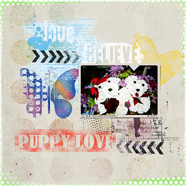
Puppy Love by Vicki Walters | Supplies: Stamped Hearts brushes by Amber Clegg Designs at the_Lily Pad, Certified Organic Brushes (butterfly) by Nancie Rowe Janitz at Jessica Sprague, PersonalizedFrames no 2 and 12×12 Polka Dot Edges no 1, Love Word Mix no 1 and Love WordTransfers no 1 by Anna Aspnes at Oscraps, and Take A Chance (background paper, mist circles overlay and arrows) by Studio 68 at Oscraps. Font AR Julian.
Deborah Wagner used an outline font to get the look of an outlined stencil.
Deborah says, “This is a scraplift of ‘Jack’ by Mugsbigsis at Designer Digitals. I used an outline font to get the look of stencil outlines. To get the text behind my sons, I extracted them from the photo. I placed the text between the background of the photo and the extractions.”
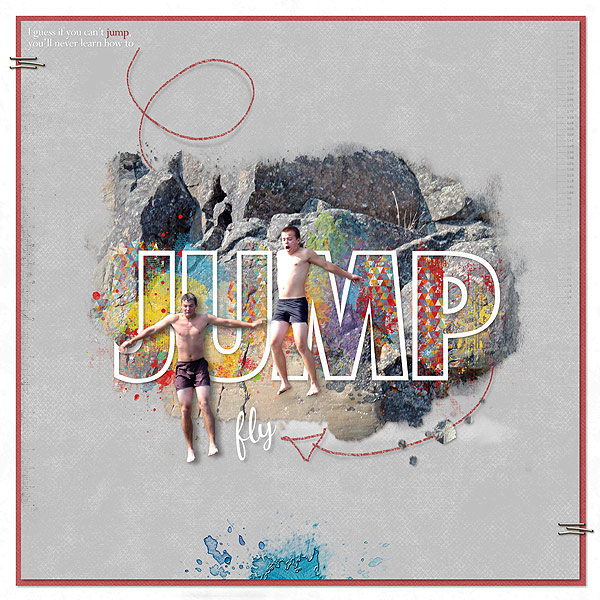
Jump by Deborah Wagner. Supplies: Designer Digitals – Katie Pertiet: Pencil Line Twists Arrows, Charted Brushes No.1, Colorful Watery Spots No.2, Watery Photo Masks No.2, Color My Love Paint; Pattie Knox: In the Swim Kit, Staple Its Clusters; Michelle Martin: Bergen Paper Pack; FunctionCondTwoOutExtraBold font
Barb Brookbank began with polka-dot pattered paper, erasing some dots and grunging up the paper to get the look of stenciled dots.
Barb says, “We’ve holidayed in Maui quite a few times, and it’s quite dreamy. I set up a mini photo shoot of my husband and I on the beach – using a tripod – we didn’t get too many stares! I erased and grunged up the polka dots on digital patterned paper to get the look of a stencil. I used brushes to paint the splatters that echo water splashes.”

