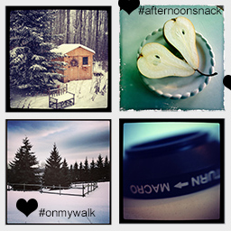
Squares are familiar and stable shapes. Their right angles and equal sides suggest order, equality, and even conformity. So how do you leverage the stability of squares and steer clear of boring? Our team and teachers show you ideas for how they like to use square photos on their scrapbook pages.
Squares are great for grid designs
Amanda Jones says “I created this page to show the drastic change in view from my living room window following a three hour downpour of snow. When I work with more than one square photograph I almost always end up with a grid-style page design. I like the fact that I can mix photos with similar sized pieces of patterned paper to create a block. It’s a nice way to work with pictures that don’t require one strong focal image.”
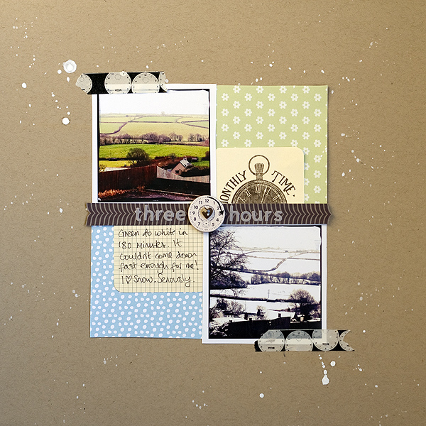
Three Hours by Amanda Jones | Supplies: Patterned papers – Jenni Bowlin Studio, Studio Calico; Mini deck cards, chipboard clock, –Jenni Bowlin Studio; Alpha stickers – Jilibean Soup; Washi Tape – Teresa Collins Designs; Gem – Prima; Mister Huey spray – Studio Calico; Cardstock – Bazzill Basics
Ashley Horton often works with square photos on her scrapbook pages. She says, “With the popularity of Instagram and other photo apps, square photos are easy to upload and print from your home computer or through photo printing services. One of the big advantages to designing with square photos, is that many of us are designing on a square canvas. This makes setting up a grid design easy. Here I’ve paired square photos with square patterned paper pieces.”
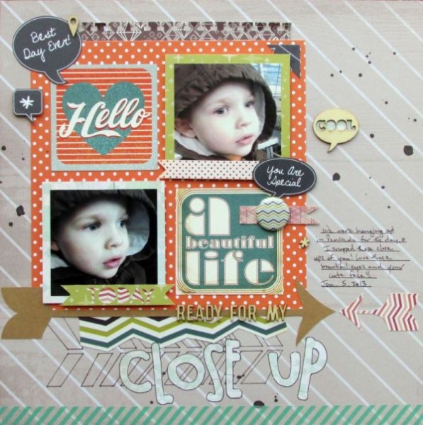
Close-up by Amanda Jones | Supplies: Patterned Paper, Wood Veneers & Spray Mist: Studio Calico; Chevron Mask: The Crafter’s Workshop; Tin Pin: October Afternoon; Washi Tape: Love My Tapes; Punch: EK Success; Font: CK Chloe; Pen: Zig Memory System
Lisa Dickinson arranged six small square photos in a “haphazard” grid, with most of the photos tilted and jiggle just a bit off the grid. The resulting design conveys both the repetitiveness of her daily coffee “addiction” and the jittery feeling that too much caffeine can trigger.
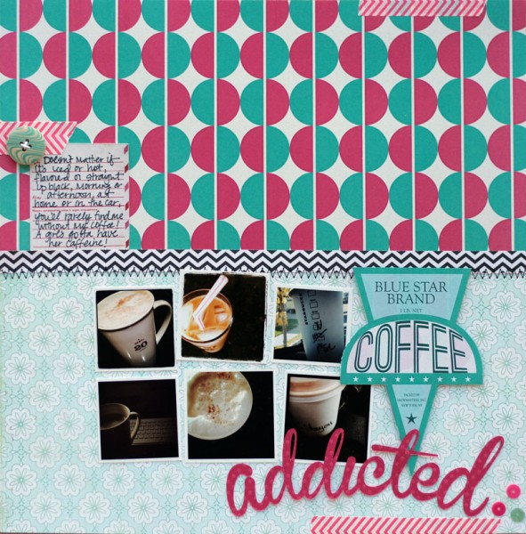
Addicted by Lisa Dickinson | Supplies: kit (JBS Mercantile); cardstock (Bazzill Basics); patterned paper (JBS Mercantile, Crate Paper); washi tape, button (Bella Boulevard); sequins (Pebbles); die cut machine (Silhouette Cameo); font (Branboll); pen (Creative Memories), machine stitching, twine
Square photos are great for a series showing activity
Celeste Smith scrapbooked a series of photos of her new kitten playing in the leaves in a column of three photos. They balance well and convey a sense of the kitten’s play better than just one photo would.
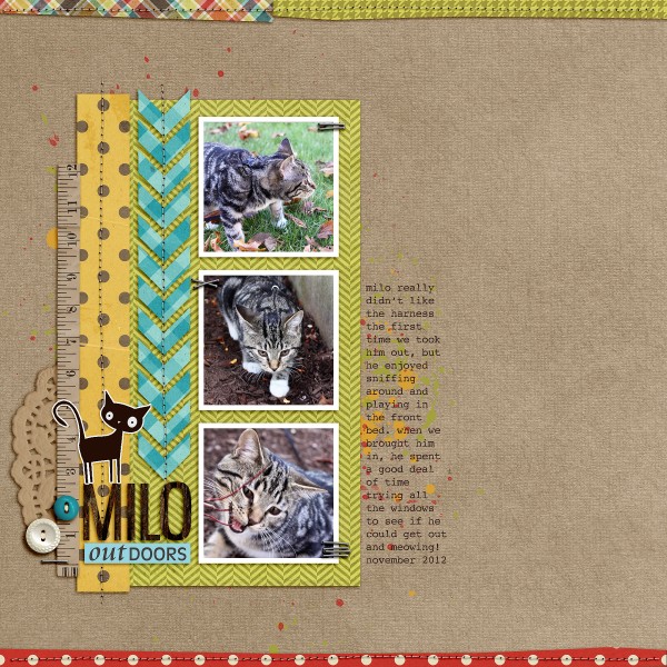
MILO outdoors by Celeste Smith | Cut It Out Layered and Stitched Clipping Masks by Robyn Meierotto at Pixels & Co.; Everyday Autumn kit by Jennifer Barrette & Kristin Cronin-Barrow at Sweet Shoppe Designs; Summer Camp kit by Sahlin Studio at The Lilypad; Smell My Feet kit by Valorie Brown at One Story Down; The Office by Splendid Fiins at Jessica Sprague; Typewriter Scribbled font.
Debbie Hodge has arranged her square photos in a grid, but they are several shots taken within a couple of minutes, shots that show the play of her son and friends at the beach. Debbie says, “Using small square photos lets me get more on the page along with title and journaling and get a sense of an activity.”
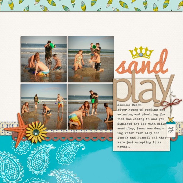
Sand Play by Debbie Hodge | Supplies: Patterned Paper: On Trend by Crate Paper, Soho Square by American Crafts, Sketchbook by Amy Tangerine; Cardstock: La Belle Vie by One Little Bird; Starfish, Flower: Seas the Day by Ju Kneipp and Jenn Barrette; Crown: JBS Vintage Whimsical; Gem, Brad, Tie, Stitch, Scallop Mask: Reminisce by Leora Sanford, Cold Springs Elements, Flossy Stitches, Scallop Strip Masks by Katie Pertiet, Brad Bonanza by Pattie Knox; Enjoy Life Alpha by Cluster Queen; Pacifico, Bohemian Typewriter, Pea XOXO fonts
The square crop is great for detail shots
Terry Billman says, “My granddaughter and I love having popcorn snacks at football and basketball games. I particularly like working with square photos when I zoom in and crop photos as close ups. The square shape seems to work well allowing me to fill the frame, highlighting the details of a photo.”
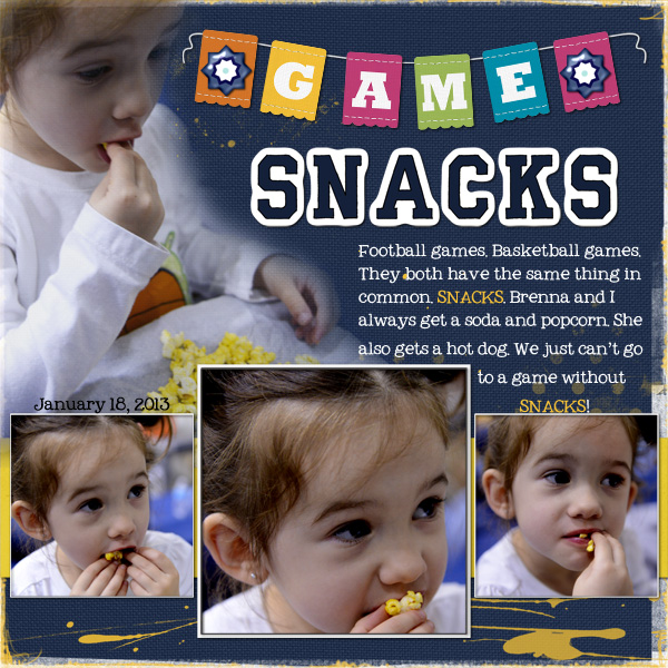
Game Snacks created by Terry Billman| Maplebrook Studios: Just Linens 30; Anna Aspnes: 12 x 12 Artist Edge 6, Artist Edge 2, Art Play Palette 9, OMG, Art Play Great Outdoors, Art Play Storm; L. Sanford: School Spirit Alpha; Patti Knox: Banner Alpha; Jesse Edwards: Angione
Brenda Becknell says, “I often find working with square photos to be challenging, because I try to fill the whole (rectangular) frame when I’m taking pictures, and it can be hard to crop to a square. In this case, I wanted to focus on my grandchildren’s faces, so cropped in close to get 4″ x 4″ squares. I didn’t worry about cropping out the background. To soften the many straight lines in this layout, I added round number stickers and buttons and a scalloped border sticker.”
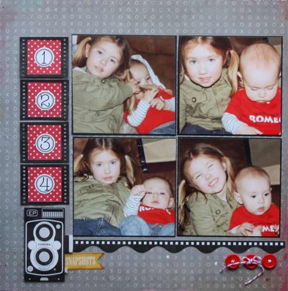
1-2-3-4 Snapshots by Brenda Becknell | Supplies: Patterned Paper: Crate Paper, October Afternoon; Stickers: Echo Park: Twine: the Twinery
Stefanie Semple says, “I like to celebrate the ‘in-between’ birthdays, and this layout is about my 42nd — and the food at the party. It’s often difficult for me to crop my rectangular photos to square since I tend to fill the frame when taking photos. With these food snaps, though, it doesn’t matter if something gets cut off, and square crops were great for this subject.”
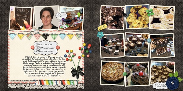
Birthday celebrations by Stefanie/ Supplies: Amy Stoffel: Cordially invited; Memory Clips by Ramona: Super stash stitches; Little Bit Shoppe Designs: Baby Face template.
Squares balance well
Tara McKernin says, “This layout is about my love of the garden centre, gardening, and spring–and my dislike for bugs. This layout was particularly easy to work with square format photos since they are all phone shots from my Instragram feed. I love the square format because it gives you more opportunity to experiment with interesting crops. I also love the sense of balance a square brings, especially with working in a group of images.”
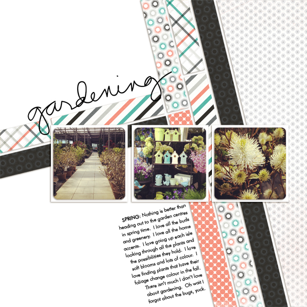
Gardening Love by Tara McKernin | Supplies: Crooked template no.1 by Simply Tiffany, Because of you by Karla Dudley, In the Garden by Ali Edwards, font Future Lt BT.
Audrey Tan says, “This page is about celebrating Chinese New Year with a traditional meal. I documented the dishes that we enjoy and how we serve them.” A series of three square photos balances well on the canvas.
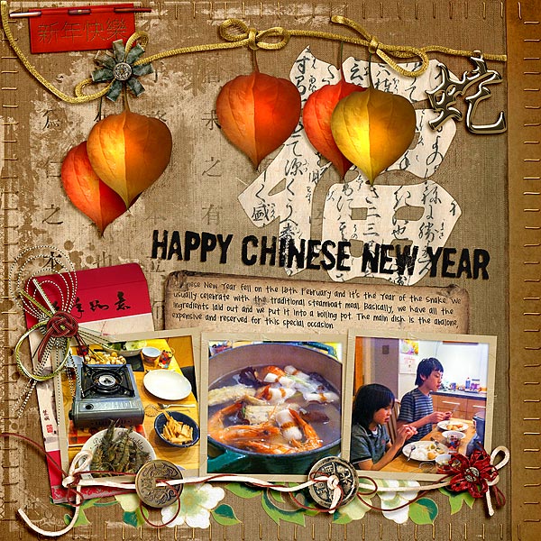
Happy Chinese New Year by Audrey Tan | Supplies: Viva Artistry: Confuscius Says, Sheng Xiao, Silk Road; Maya de Groot: Stamped Alpha; Font: Pea Jannda
Get more photos on the page with squares
Kiki Kougioumtzi says, “The layout is about an exhibition of old cars. Since the older photo format was a square, I found it appropriate for this subject. It adds to the nostalgic tone. Working with a square photo yields a page that is organised, more in order than one with rectangles. You can also fit more photos in a layout if they are square.”
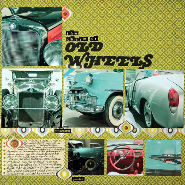
Old Wheels by Kiki Kougioumtzi|Supplies:Patterned paper,Brads:Basic Grey;Cardstock:Canson;Alpha Stickers:Cosmo Cricket;Other:QuicKutz Alhabet dies.
Vicki Walters says, “On this layout I have repeated the same photo ten times. On the first side is the photo with two different photo effects. On the opposite page are nine photos that came from combining the first two photos in a variety of ways using layering and digital blending modes. The purpose is to encourage experimentation and find how exciting it is to discover so many possibilities. I love square photos! They’re easy to place and arrange.”
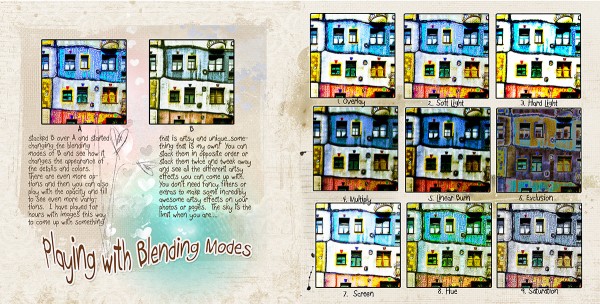
Playing with Blending Modes by Vicki Walters | Supplies: Anna Aspnes Designs: 6×8 ArtsyKardz Why Not?,LoveGlows no 1, Monoblendz Paperie Origins 2, and
Distressed ToolSet no 8; Font: Bopee.
Katie Scott says, “Square photos are trendy right now but they are also an old standby. I love to use up the odds and ends photos from an event by cutting them into 3″ x 3″ squares and matting them with 3.5″ x 3.5” patterned paper to create a grid layout that I use as a filler page in an album. On these types of pages, I also use up leftover patterned papers and stickers, so just about nothing matches.”
“These are leftover photos from my daughter’s field trip from 2 years ago. I’ve already made a scrapbook layout and a minibook about this event so this page was just a way to use up the remaining photos.”
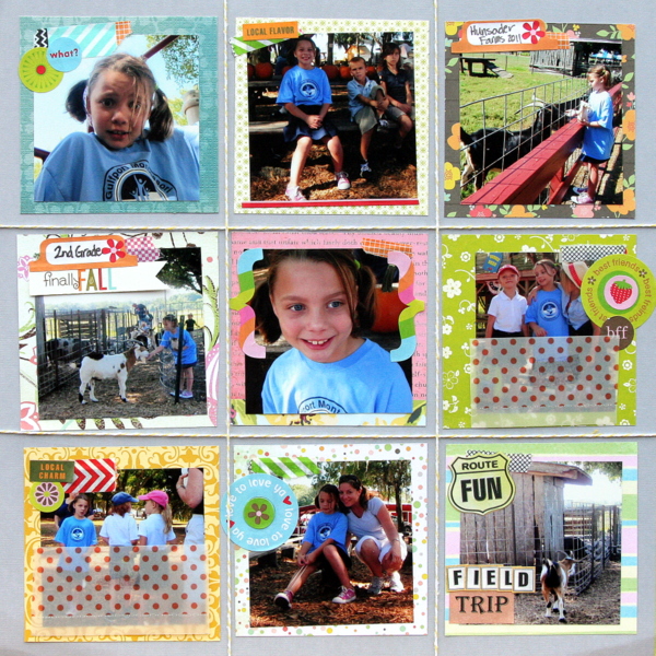
Field Trip by Katie Scott | Supplies: Supplies: American Crafts twine and patterned papers; K&Company Smash Washi Tape.
Square is the shape of the Instagram photo
Barb Brookbank says, “I’m really having fun with Instagram and I think it’s a fantastic way to document little everyday moments. Here I ‘lifted’ the layout of my Instagram page and added hashtags, words, and hearts. The Instagram font isn’t a free font so I used Rickles for the “I” and Reklame Script for ‘nstagram.'”
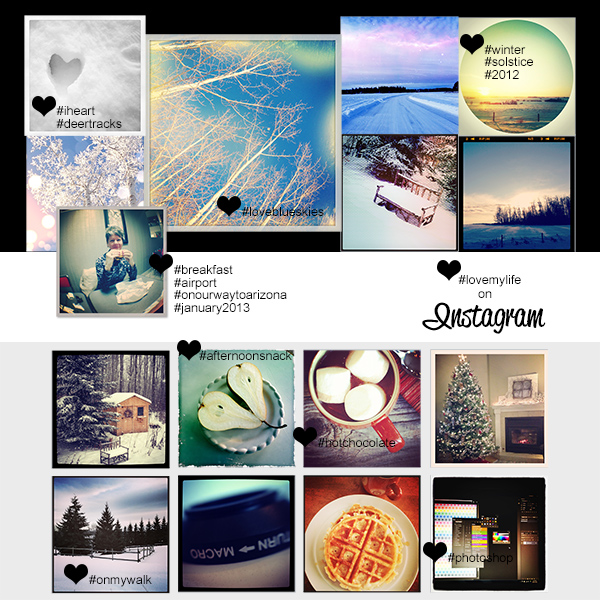
#lovemylife by Barb Brookbank | Supplies: Photos: Instagram Profile Page; Fonts: Rickles and Reklame Script.
Doris Sander says “I tend to tilt my camera at an angle when I photograph with it, so the photos will fit nicely into a square when I upload them to Instagram. This photo of my son had a little too much tilt, however, and I was wondering how I was going to make it look good on the page. When I lined it up with the first photo and the heart, I just naturally placed it in the middle as a diamond. I really liked the look of square, diamond, and heart all in a row and felt like the diamond tilt gave the photo a lot more presence on the page.”
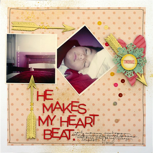
He Makes My Heart Beat by Doris Sander | Supplies: cardstock – Bazzill, patterned paper, sticker – Crate Paper, chipboard alphabet – American Crafts, chipboard heart – Jenni Bowlin Studio, sequins – Pebbles Inc., doily, arrow – German Foil, mist – Heidi Swapp, other – embroidery floss
[current]

