
 Tone-on-tone print patterns combine different shades and tones of the same color. Using these prints on your page adds interest without the busy-ness of a many-colored print.
Another approach to getting tone-on-tone effects on your pages is through the layering of elements in varying shades and tones of the same color. This a great way to add subtle texture and dimension to your pages.
Adryane Driscoll‘s “By the Sea” is a digital page with tone-on-tone effects by attaching papers in the same color family to digital masks. She layered the maskes and varied the levels of opacity for each.
She says, “This is an old photo I found of family members and friends at the Jersey shore. I started with a cream background then positioned a variety of masks under my photo. To achieve the different saturation levels on the mixed prints, which were all in my color range, I varied the opacity of each of the masks. The masks for the waves were left at 100% to add some bolder color.”

By the Sea by Adryane Driscoll: Anna Aspnes I MonoBlendz Aqua Paperie, Scalloped Scissor Masks No.2, MonoBlendz Avalanche Paperie, Stitched LoopdaLoops White No.1, Salty Sea No.1, and TornNTattered Paper Templates No.1
Jennifer Matott‘ layered neutrals for a tone-on-tone look on “Await.” A single spot of blue accents the tranquil page.
Jennifer says, “I wanted a soft, feminine feel. The photo is a maternity photo from my second son, and I wanted the focus to be on the photo. I used soft greys, kraft, and whites with a hint of teal as a pop of color. The tags were stamped and embossed with white Opaque WOW Embossing powders. They were colored with Faber-Castell Design Memory Craft Stamper’s Big Brush pens and water added to spread the color around the tag. I also splattered white gesso and used a doily for white.”

Await by Jennifer Matott | Supplies: Cardstock: Bazzill Kraft; WOW! Embossing Powders; Faber-Castell Design Memory Craft Stamper’s Big Brush Pens in Cool Grey and Warm Grey; PITT Artist Pen in Black; American Crafts: Thickers; Gesso: Faber-Castell DMC Textural Accents; Other: Tags ,Doily, Lace, Tape.
Amanda Jones combined bold and pale yellows on a layered mat at page center. The tone-on-tone foundation pops against a grey canvas.
Amanda says, “This page is a reminder for me of the similarities and differences between my cat and her kitten at this age. I used grey cardstock with gesso as my neutral background. I added splatters of yellow mist and layers of yellow papers. I cut my title which also serves as a mat for my photo from pale yellow cardstock, using my Cameo machine, and backed it with a yellow patterned paper. Over the top of this I attached a transparency featuring little flocked yellow stars to add another layer of color and interest. I added a mix of yellow and grey papers along with subtly misted doilies and a couple of yellow die-cuts.”

Symmetry by Amanda Jones | Supplies: Patterned paper – Carta Bella, My Mind’s Eye, Studio Calico; Die-cuts – Teresa Collins Designs, Transparency – Fancy Pants; Cardstock – Bazzill Basics; Die-cutting machine – Silhouette Cameo; Font – Impact; Other – Gesso, Doilies.
Audrey Tan used shades of black and grey on a white canvas. She says, “This page is about communication with my family as they live in another country. Thankfully ‘FaceTime’ allows me to see them frequently. This page has a photo of my dad during one of our conversations.”

Face To Face by Audrey Tan | Supplies: Anna Aspnes: ArtPlay Palette Social Network, Skinny Lined Overlays No2, Script Tease Happiness Overlays No1, Labeled Words Social Network; Font: Sketch Nice & Stars From Our Eyes.
Brenda Becknell layered tone-on-tone and solid papers all in shades of orange to brown on this page about moving her daughter to Alaska in the Fall of 2006. She says, “During the move we visited the viewing station for the Alaska pipeline and took photos.”
“I wanted to capture the feeling of Fall on this page and since there isn’t a lot of color in the photos, I used shades of orange and rust, with some kraft as a neutral. In addition to varying the shades of orange, I used different textures of cardstock, along with one small piece of patterned paper. Everything was inked with the same shade of brown to give a bit of continuity. The kraft neutral was echoed in the zigzag stitching, the title alphas, and the buttons and twine.”

At the Pipline by Brenda Becknell | Patterned paper: Basic Grey, SEI; Cardstock: Bazzill, C’ordinations; Ink: Ranger Vintage Photo; Alpha stickers: Jenni Bowlin, Studio Calico; Stickers: Jillibean Soup, Pebbles; Transparency: Making Memories
Deborah Wagner recolored digital papers and elements for a brown tone-on-tone page great for a “guy” subject.
She says, “This is a page about what a wonderful stepfather my brother-in-law is to my nephew. For the tone-on-tone effect, I used varying shades of brown. I re-colored many of my elements, and adjusted the hue and saturation of my photo to coordinate with my color scheme. I brought in 3 gold elements (button, lace and bottom border) to create a visual triangle, and keep the eye focused on the photo and journaling.”

I’ll Be There by Deborah Wagner. Supplies by Designer Digitals: Katie Pertiet – Mixed Messages No.1, In Stitches Hearts No.1, Clean Stitched White No.3, Clean Stitched Black No.1, Artistry d’Amour, Carte Post Kit, Alandia Rancheros Kit, Stitched Word Strips Everyday, Yesteryear Add -on Lace; Maplebrook Studios – Annelise Neutrals; Andrea Victoria – Essential Tapes; Ali Edwards – Hand Drawn Arrows Brushes & Stamps
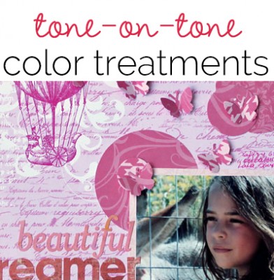
Kiki Kougioumtzi used tone-on-tone prints and layering in the “absolute girly color of pink.”
She says, “I caught my daughter daydreaming. and I was able to capture her look. I used tone-on-tone pinks to keep it soft. I even used pink pen for my journaling. And because my alpha stickers weren’t in the color I needed, I used ink to recolor them. For the big circles I used a circle cutter.I didn’t want to add bulky embellishments, so I used punches to cut butterflies from the papers I had already used.”

Beautiful dreamer by Kiki Kougioumtzi|Supplies:Patterned paper:Echo Park; Alphas:Basic Grey,Bo Bunny;Paper punch EK Success;Circle cutter:Martha Stewart;Rub-on:Imaginisce;Ink:Tsukineko.
Katie Scott started with “one of my lesser-loved papers with a tone-on-tone snowman” as her base and then gathered random blue papers from her stash.
She says, “I went to Durango, Colorado last year and promised I would bring my native Floridian kids skiing in Colorado this year. It would cost a lot, but I promised, and I saved, and I’m bringing them this year! So exited.”
“I punched circles from the blue papers and arranged them in lines. For extra fun and excitement, I scattered brads and bling–like snow flurry. While this layout is mostly tone-on-tone aquas and blues, I did pull the color pink from the photos and added pink in a visual triangle.”

I Promised by Katie Scott | Supplies: Circle Punch, random scraps of older patterned papers; brads, bling, and random older embellishments in the aqua blue color family, Brother Machine Stitching
Terry Billman used tone-on-tone blues in varying intensities to match the variety of attitudes her granddaughter can move through, changing in a blink of an eye. She says, “This layout is about her going from one happy little kid to throwing a fit in the next instant. The varying shades of blue, from light to dark, really matched the intensity of her attitude, going from just a pout to full blown crying.”
Terry got an artsy feel to the page by varying the blending modes on different layers, using normal, hard light and linear light to achieve the differing levels of intensity.”

Cultivating an Attitude by Terry Billman| Anna Aspnes: Foto Squared Template Album 1, Art Play Palette H2O, 4 X 6 Artsy Kardz H2O, Art Play Palette 3, Doily Edge Overlay 1, Art Play Palette Everyday, Art Play Solids Adventure; Cathy Zielske: Grateful Heart; Katie Pertiet: Drama Digital Poetry, Rounded Corner Stitching Holes, Going Away
Debbie Hodge scrapbooked a tribute to her dad with browns (ranging to rust) and neutral creams. Beiginning with a tan foundation, she built up layers using: cream misting, tone-on-tone and tone-on-neutral patterned paper strips, chipboard alphas, and embellishments that include cream stitching and three hits of rust-embellishments (bow, button and bird sticker). She says, “The restricted color scheme let my photos shine and, also, I felt it evoked a reverent tone and was a connection to land and farming.”

Big Legacy by Debbie Hodge | Supplies: Retro Mod, Treasured Moments by Sahlin Studios; Narrative, Generations, Storyteller by One Little Bird; A Very Small Alpha by Allison Pennington; Pear Perfection Classic Cardstock, Awarded Alpha, Cold Springs Element Pack; Bird Diecut, Flossy Stitches White by Katie Pertiet; Harlequin Knockout by Splendid Fiins; Bohemian font
[patterenedpaper]
