
 Most scrapbookers use neutrals in combination with colorful photos, papers and embellishments.
Reasons to use neutrals on your scrapbook pages:
- Neutrals on your scrapbook page can make other colors look brighter and deeper
- Neutrals on your scrapbook page can tone down colors that might overpower.
- Neutrals on your scapbook page can provide a backdrop for complexity (i.e., many photos and elements as well as design complexity).
What are neutral colors?
Neutral colors may be totally without color or appear to be without color while having undertones of color.
Pure cool neutrals are black, grey, and white.
Near neutrals include ivory, brown, and beige, which have undertones of warm hues.
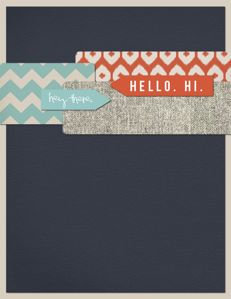
Use the color navy as a neutral
While navy blue is not a neutral, it can still help you achieve those three purposes listed above while letting you work a trendy approach to color on your pages. Of navy, Elle Decor recently wrote: “Forget black and beige. The newest neutral is crisp, cool, and forever classic, making everything around it look shipshape.”
Follow Get It Scrapped on Pinterest to keep track of color, pattern, style, and motif trends as we spot them.
Amy Kingsford says, “On “BIG,” I used a bold navy background to record this photo of my boys and their cousins looking up at the enormous locomotive on display at our train depot. I wanted the colors in this page to be very bold so I used navy in place of black because it intensified the yellow and added pop to the page. My photo also has a bit of a blueish undertone so the navy tied everything together quite nicely. “
“I used white journaling and doodling on the navy background for high contrast. As a digital scrapbooker it is easy for me to switch my text to white when using dark backgrounds like navy so that it can be more easily read. But paper scrapbookers might try a white pen for their journaling–I like the White Poster Paint Marker by Sharpie.”

BIG by Amy Kingsford | Supplies: One Little Bird Designs: Big Ideas; Amy Martin: Messy Machine Stitches No. 1; Sara Gleason: Petals No. 2; Allison Pennington: Not Pictured Elements; Sahlin Studio: Fairest of Them All, Retro Mod.
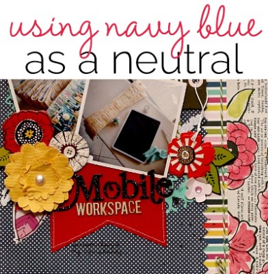
Leah Farquharson says, “Here I’ve journaled about making my workspace mobile. It’s definitely changing my life for the better! I used a navy polka dot pattern for my main background, building everything else around that. I felt the navy blue background grounded the other colors in the layout well. I find navy works well with bright or bold colors, I struggle a bit to incorporate it with lighter neutrals and soft colors.”

Mobile Workspace by Leah Farquharson | Supplies | patterned papers: Jillibean Soup, American Crafts. Flowers, diecuts, twine, silhouette cuts, foam letters, card stock, dimensional embellishments: American Crafts. Wood veneers: Studio Calico. Watercolor: craft supply.
Barb Brookbank used navy blue to bring out the colors in her photos and add drama to her page. She says, “I love the ways the navy picks up the color in Dad’s coat and the masculine feel it brings to the page. I used edgy Instagram photos and red as an accent to add even more drama and then used the visual triangle of gears to reinforce the theme of my page.”

Father-Son BMX by Barb Brookbank | Supplies: Blue Paper: Memories by Vera Lim (recolored); Red Paper: In Pursuit of Liberty by Michelle Coleman; Stamp-bicycle, tape, gear, screw: It’s a Man’s World by Manuela Zimmerman; CircleLine: Senior Yearbook by Kitty Designs; Father/Son Word Art by me.
Michelle Houghton used navy blue cardstock for her page base to show off the purples, greens and blues from the photos that she painted on the page. She says, “The dark navy popped the photos better than kraft or white and supported tone better than black.”

Breckinridge by Michelle Houghton: Supplies | cardstock – American Crafts; ink – Sharpie; paint – Liquitex and Ranger; other thread
Audrey Tan used navy blue in a light value with a tone-on-tone print pattern for the background of “Bosom Friends.” The extracted and blended photo is the brightest spot on the page and pops against the darker background. Fluttering butterflies in peach are a stand-out accent.

Bosom Friends by Audrey Tan | Supplies: Anna Aspnes: Torn & Tattered Flutterby Templates No3, Friends Word Art No2, ArtPlay Friends Addon Brush, Mod Grunge Foto Blendz No2; Julianna Kniepp Designs: Sew Mama Sew, Home Comfy Home; Julianna Kniepp & Captivated Visions: Love Is All You Need; Font: Pea Kel’s Belles
Sue Althouse says, “This page is about our nephew and how proud we are of him. The navy tone-on-tone dot serves as a neutral background that echoes the blue chair in the photo. The orange in the guitar and patterned paper provides energetic contrast. Choosing muted tones of the orange keeps the page masculine and grown up.”

Tony by Sue Althouse | Supplies: Patterned Paper: Bo Bunny, Authentique, Heidi Swapp, Lily Bee; Alphabets: American Crafts; Stickers: Echo Park; Buttons: October Afternoon; Floss: We R Memory Keepers; Wooden Arrows: Studio Calico; Circle and Star Punches: Fiskars; Corner Rounder: Creative Memories
Briana Johnson proves that navy can easily mix with white and take on its neutral character. On “Noah,” the color palette has been kept calm and serene with tan, grey, and navy. These neutrals really let the photo of the orange tom cat take center stage.

Noah by Briana Johnson | Supplies: patterned paper, rhinestone – Jenni Bowlin Studio, wooden doily – Maya Road, ephemera – vintage
Tara McKernin says, “I wanted to make a series of cards I could have printed as a set for teacher gifts, so I’m getting a head start on a series of them. I am a minimalist and tend to gravitate toward either really light clean backgrounds, or really dark clean backgrounds. Here I have combined navy with beige, turquoise and orange, and I love how they all work together. Since I kept my navy a solid cardstock background it doesn’t take away from the layout. It’s super easy to work with.”
Hello Card by Tara McKernin | Supplies: template from ChrissyW Speed Greeting Card set, papers and elements from Hello My Name is by Paislee Press.
Brenda Becknell says, “On a trip to the zoo this fall, my granddaughter had as much fun (if not more) walking and exploring the paths as she did watching the animals. To mimic the colors in her shirt, I used a navy cardstock background, and then added bright colors in the border strip, circles, and alphabet/word stickers. I think the photos needed a dark background to stand out, but black would have been too much of a contrast, while the navy added just the right touch.”

Exploring by Brenda Becknell | Cardstock: Bazzill; Patterned Paper: Echo Park, My Mind’s Eye, Fancy Pants; Alphabet and word stickers: Authentique; Brads: Making Memories
Deborah Wagner says, “This page shows my nephew having fun with his basketball team. It was an easy decision to use navy as a neutral on this page because of the team’s colors. I added some red and mint for extra oomph, and it all came together. I use navy as a neutral in many of my pages, especially beach pages. I love the nautical feel it gives, and how it complements coral, pink and orange.”

Cool Dudes by Deborah Wagner. Digital Supplies: Anna Aspnes – ArtPlay Palette Sports, ArtPlay Palette Basketball, Sports WordART No.1, Patty Knox – In the Swim Kit, A to Zoo Kit, Batter Up Solids; Katie Pertiet – Template Inspiration 040311, Art Warehouse – Basketball Papers
[current]
