Scrapbooking a little personal indulgence that you give yourself is FUN. First: you indulge. Second: you take a fun photo of that indulgence. Third, you relive the indulgence as you spend time with its memory making a page that doesn’t require getting lots of photos onto the canvas or coming up with extensive journaling or even a title with deep meaning.
Check out our Creative Team’s little indulgences and then get your own onto the page.
Michelle Houghton says, “If I had a day with no responsibilities this is what it might look like: cocoa, a pedicure, lunch out and time to create. I scrapbooked this page with a single photo and “found objects” to represent my indulgences. To represent how a day of indulgence would feel to me–full of color and fun–I used paint, ink and a little bit of messiness.”
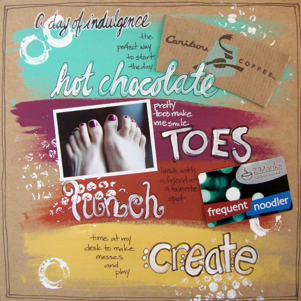
A Day of Indulgence by Michelle Houghton | Supplies: cardstock – Kraft; paint – Ranger and Liquitex; ink – Sharpie
Terry Billman says, “The small rural community I live in does not have a Starbucks. This layout is about treating myself to a Caramel Frappaccino at Starbucks when I make a trip to the city. Some time back, I took this photo for my 365 project. I used a clean graphic design and dark green paper to complement the Starbucks green logo.”
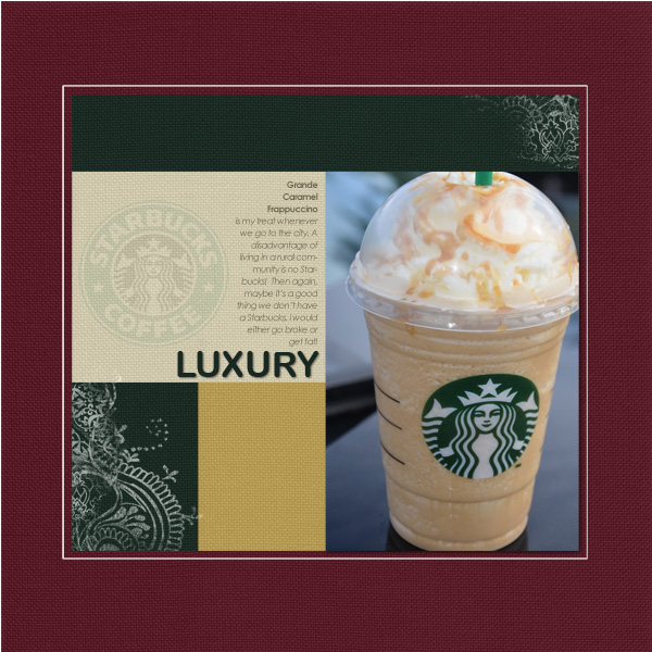
Luxury created by Terry Billman| Katie Pertiet: Template inspiration 111712; Maplbebrook Studios: Just Linens 27, Just Linens 28
Sue Althouse says, “This page is about the small pleasure of making friends with almost any cat I meet – they just like me! My husband took these photos while we were on vacation out of state, totally proving my point. For a layout about a simple pleasure, I chose a simple design scheme in happy colors.”
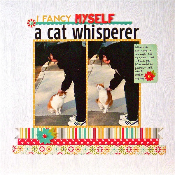
I Fancy Myself a Cat Person by Sue Althouse | Supplies:
Cardstock: Bazzill; Patterned Paper and Stickers: Pebbles; Border Punch: Fiskars; Alphabets: Basic Grey, Jillibean Soup, Pebbles; Mini Pearls: Doodlebug
Vicki Walters says, “I enjoy taking my grandchildren to the library and letting them read and check out books to take home because I don’t want to see good old fashioned reading from a book become obsolete! The one photo I used is of my granddaughter in a row of books. It wasn’t of great quality as the light was behind her, and she was almost sillouhetted. I used Rad Lab filters on it to turn it a little artsy and lighten it up so we could see her. The kit I chose is about reading so it was perfect especially with the artsy photo.”

Library by Vicki Walters | Supplies: Anna Aspnes at Oscraps: ArtPlay Palette Ex Libris and ArtPlay Palette Ex Libris AddOn No 1 Brushset; Fonts: HL Thuphap 1BK Upgrade and jailbIrD JenNa.
Ashley Horton says, “I snapped these photos while I was relaxing in front of the first fire we built in our house fireplace after living here for 7 years. The photos are not the greatest, because it was dark and I was using my phone’s camera. I still wanted to use them to tell the story, though. I knew I wanted to use woodgrains because the wood grain pattern reminds me of comfort and warmth. I chose a white-washed wood grain for the background and used Amy Tangerine’s Ready.Set.Go collection, to add in some warmth with the darker wood grain and saturated yellow.”
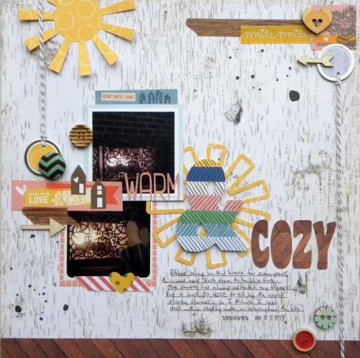
Warm & Cozy by Ashley Horton | Supplies: Patterned Paper: Amy Tangerine & Pink Paislee; Wood Veeners & Spray Mist: Studio Calico; Buttons: Dear Lizzy & Webster’s Pages; Washi Tape; Love My Tapes & Hampton Art; Baker’s Twine: The Twinery; Fonts: Fitzgerald & Coaster
Stefanie Semple says, “I love having time to myself. Being a stay-at-home-mom is the perfect job for me. I have time for me and time to care for the children and run the home. I had a photo taken in winter, snuggling up with a kitty and reading a book, which has to be one of my favorite things to do.”
“I used a template with a single photo spot. I love the large white space, and this supports my idea of time out, time to rest and recharge. There are slight titled borders top right and bottom left, and this re-iterates the feeling that my life is constrained by some things, collecting the kids, running the home etc. They may be pretty and flexible, but they are most definitely there. I chose a kit with colors that were similar to those in the photo as well as pretty and feminine.”
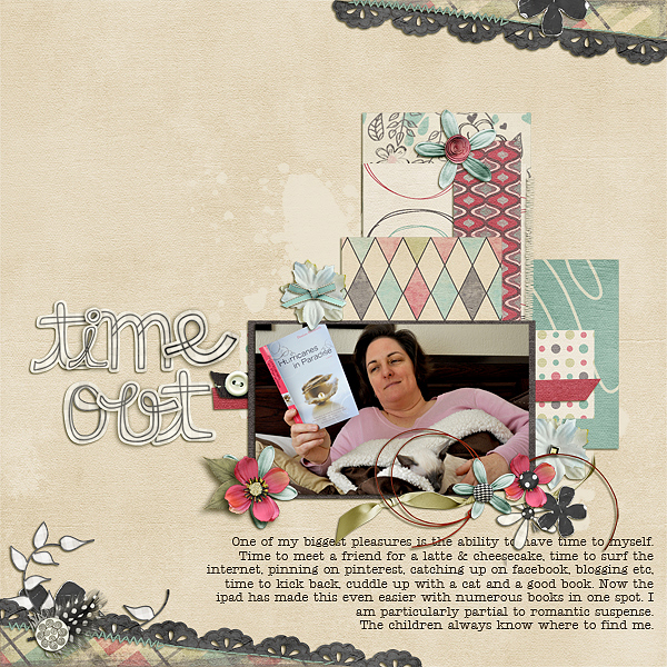
Time out by Stefanie | Supplies: L Drag Designs (kt): Snapshots of Life, geniaBeana Scraps (template): Lotsa layers v3
Katie Scott says, “We used to roast marshmallows in the backyard all the time and we’ve gotten away from it. In 2013, I am trying to schedule more family time like this – so this page is like a “note to self” to enjoy little things with my family more often (and get my kids off of all of their various screens). I used the colors in the photos and the tone of warmth as my inspiration in selecting the colors and patterns in the papers and embellishments.”

Smore Family Time by Katie Scott | Supplies: Colorbok Paper Pack (which included a coordinating letter sticker sheet).
Adriana Puckett says, “My Teavana tea is a small, somewhat guilty pleasure that I indulge in daily. I snapped these 2 pictures of my tea canisters inside and out with the Instagram app on my iPhone – very quick and easy. The Carta Bella paper that I used here had the same rich, sumptuous feeling that the tea has for me and seemed like a perfect match for the layout.”
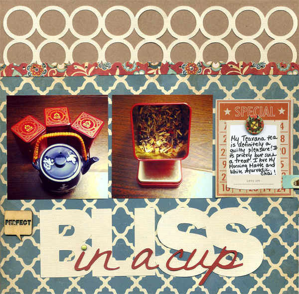
Bliss in a Cup by Adriana Puckett | Supplies: Patterned paper: Carta Bella Traditions; Cardstock: Bazzill Basics; Silhouette Cameo designs – title Franklin Gothic font and DJDeanna; circle design from store; Punch: Stampin’ Up; Wooden embellishment: Maya Road; journaling block: paper scraps layered with Bazzill Basics embellishments
[current]

