
by Debbie Hodge
Edit and crop your photos to make sure they look great, emphasize what’s important, and support the story of your scrapbook page.
We recently wrote about 5 reasons to use black-and-white photos, and here we’re sharing ideas and reasons for combining color and black-and-white photos.
Black-and-white conversion tutorials for Photoshop
1. Add variety to a collection of portraits
When you take the time to get posed shots, you want to make the most of the good ones — which means your challenge is to get variety while scrapbooking multiple similar photos. Mixing color with black-and-white is a great way to succeed with this challenge.

My Turn by Sue Althouse | Supplies: Cardstock: Bazzill; Patterned Paper: Studio Calico; Alphabets: American Crafts, Studio Calico; Inks: Hero Arts, Jenni Bowlin; Stickers, Stamps, Chipboard Shapes, Gems: Studio Calico; Floss: We Are Memory Keepers; Star Punch: Fiskars
Debbie Hodge says, “I always loves photos of me with my sons. I wanted to include both of these because I feel like the two shots together reveal more about our relationship than just one would — it’s us ‘in action’ rather than static.”
“To get variety while using these two very similar photos, I sized one larger and converted it to black-and-white. I use Totally RadLab actions to all of my photo-editing.”

I Need a Hug by Debbie Hodge | Supplies: Happygram Papers, Happygram Elements by One Little Bird; Artplay Palette Woodland by Anna Aspnes; Whimsy Borderlines by Andrea Victoria; Blackout, Mathilde fonts
2. Emphasize one photo over several others
When you’ve got several shots and want one to stand out, contrast is your friend. You can get that contrast through size, matting, content, and — you guessed it — photo editing. You can emphasize one black-and-white alongside several color shots — or the reverse. Amy found that the colors in the products she used were a great tool for pushing that emphasis.
“For basic black and white photos I use the ‘Convert to Black and White’ feature in Photoshop, and then I bump up the photo’s ‘Contrast and Brightness’ to my liking.”

You Can Do Anything by Amy Kingsford | Supplies: Gennifer Bursett and Karla Dudley: Green Lights Ahead; Robyn Meierotto: Cut It Out Stitched Frames; Audrey Neal: Currie Papers and Elements; Mye de Leon: Kraft Essentials 2; Sahlin Studio: Typeset Alpha; Simple Scrapper: Template from Premium Collection.
3. Make a photo backdrop for color photos
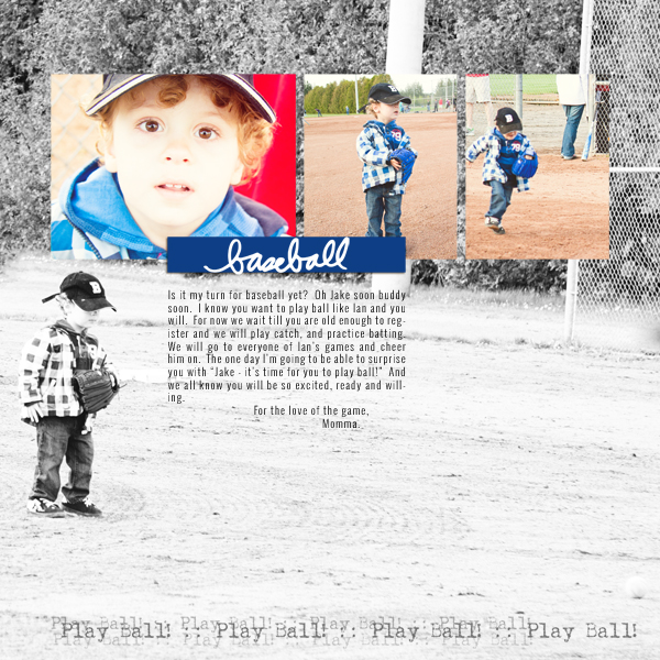
There’s nothing like an enlarged photo for impact. Using a combo of color with black-and-white means there’s enough contrast for one photo to be a backdrop for the others.
For the Love of the Game by Tara McKernin | Supplies: Template from Kitty Designs from her 365 collection, word art from Ali Edwards and Vicki Stegall.
Terry Billman says, “This layout is about my granddaughter Brenna noticing a patch of flowers and carefully picking the one bright flower that caught her attention.”
“I used a large black-and-white photo in the background to show her facial expression and layered a focal photo in color of her picking the one bright flower over it. I usually convert my photos to black-and-white in oPhoto and then fine tune them in Photoshop, adjusting the levels, brightness, and contrast. I converted this particular photo to a sketch after converting the photo to black-and-white.”

Explore by Terry Billman | Maplebrook Studios: Just Linens 19, Just Linens 21; Katie Pertiet: Letterbox Overlay No. 5, Adventures in Outlines Traveler, Word Strip Labels No. 3, Harmony Grove, Made With Paper Flowers No. 3; Anna Aspnes: FotoWallets No. 3
4. Simplify a complex story (and busy photos)
Kiki Kougioumtzi says, “This layout is about my daughter’s ballet lessons, from the many exercising hours to the end-of-season show. Her teacher tells her frequently that ‘practice makes perfect.'”
“I wanted to records all the effort she makes throughout the year which means using many different photos, in different environments, with different lighting and different clothes. Thus, I mixed colored and black-and-white photos.”
“The main photo is enlarged and in color. Next to it is a secondary photo (also in color). The rest of the photos are mixed, keeping the colored ones near my focal point. To convert my colored photos to black-and-white I used Photoshop Elements. It has an option to turn them black-and-white, and then I adjusted the brightness/contrast and shadows/highlights.”

Practise Makes Perfect by Kiki Kougioumtzi|Supplies:Patterned paper:My Mind’s Eye;Alpha stickers,Stickers:Basic Grey;Alphas:Webster’s Pages;Stamps:Kaisercraft,Viva Decor,Hampton Art;Other:Ink Clearsnap,Journaling block K&Co Smash.
Christy Strickler says, “The kids were playing in the yard with the water hose and umbrellas. I wanted to highlight each of the kids individually, separate from all of the action. I chose one photo of each child and converted it to black-and-white using Photoshop Elements–but then used selective coloring to add the blue back in.
“When I arranged the photos on the canvas, I placed the full-color shots in the center. The black and white photos bracket the action of the group shots.”

Homemade Rain by Christy Strickler Supplies| Patterned Paper, Die Cuts: My Little Shoebox; Alphas: Colorbok; Brads: Basic Grey; Buttons: Pink Paislee; Border: Sassafrass; Soft Gel: Golden; Other: Acrylic Paint, stencil
5. Support theme
Vicki Walters used four copies of the same photo, one in color, one in sepia tones, and two in black-and-white but with different contrast levels. This collection of photos represents moving out of winter to the warm summer time.
“To convert the photo to black-and-white, I desaturated it and tweaked it a little with the black-white adjustment.”

Relax by Vicki Walters | Supplies: Fonts: Lifescaps, Homegurl and Two Peas High Tide; Anna Aspnes at Oscraps: ArtPlay Palette Embrace Life; Taylor Made at Oscraps: Mere Modesty
6. Mix old photos with more recent photos
When older black-and-white photos are combined with newer color photos, the viewer immediately makes time associations.

At Ten by Debbie Hodge | Supplies: Ephemera Stacks, Retro Mod, Lined Journalers, Embroidery Yarns Retro, Autumn Frost by Sahlin Studio; These Walls by One Little Bird; You Were Here by Allison Pennington; Wood ALpha 5 by Katie Pertiet; Fairy Tale by Paislee Press; Petals 4 by Sara Gleason; Bohemian Typewriter, Mercury Script fonts
