by Debbie Hodge
[twocol_one]
Ornamental paper doilies have been traditionally used for serving pretty desserts. Crocheted doilies were used to protect furniture from the heavy pieces, like lamps or bowls, sitting atop them.
Currently trendy, you’ll find lots of ideas for home decor and crafting projects using doilies on Pinterest right now.
Doilies are also great for scrapbook pages. They work both as foundation and accent.
Use doilies on your page in a variety of ways including as:
- foundation
- layered element
- frame for photo, title, or embellishment
- photo corner
- garland
- embellishment
Use techniques and mediums with doilies:
- color, paint, die, ink your doily
- distress doilies with crumping and edge inking
- trim doilies in half, quarters, and slices
- digitally “clip” images to your doily
- use doilies as masks
- fussy-cut doilies from patterned paper
[/twocol_one]
[twocol_one_last]
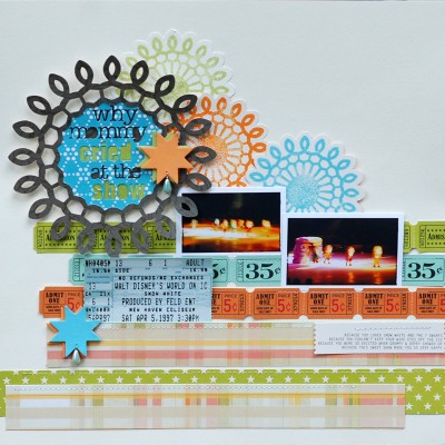
Betsy Sammarco use a doily “cut file” and her personal die cutter to frame the title and embellish the background on this page.
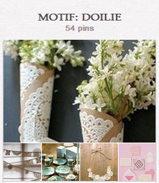
See ideas for using doilies in home decor and crafts on our MOTIF: DOILIE Pinterest Board.
[/twocol_one_last]
positive and negative: doily as mask
Jennifer Matott says, “I used doilies with both in positive- and negative-space techniques. I used a paper doily as a mask and also as a solid embellishment. I chose the doilies in bright colors and with intricate detailing for a festive and celebratory feel.”
“Use the doily as a mask by placing it temporarily on the page and pressing ink over and around it, filling in the openings and defining the edge. Remove the doily and cover the ink with bright embossing powders. Use the same doily, cut in half, at page edges.”
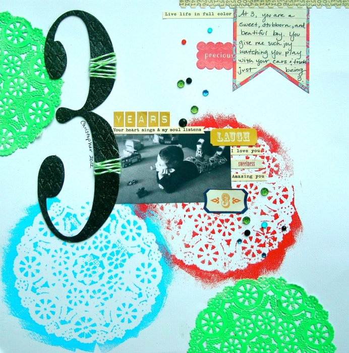
3 Years by Jennifer Matott | Supplies: Doilies: Wilton; WOW Embossing Powders, VersaMark, Tim Holtz Grungeboard number; Twine: Pink Paislee; Papers: Crate Paper; Stickers: Crate Paper & Cosmo Cricket; Crystals: Prima
doily photo corner
Debbie Hodge used one quarter of a small blue doily as a photo corner on “On the Circuit.” See it at bottom right. Gold stitching on two sides holds it down.
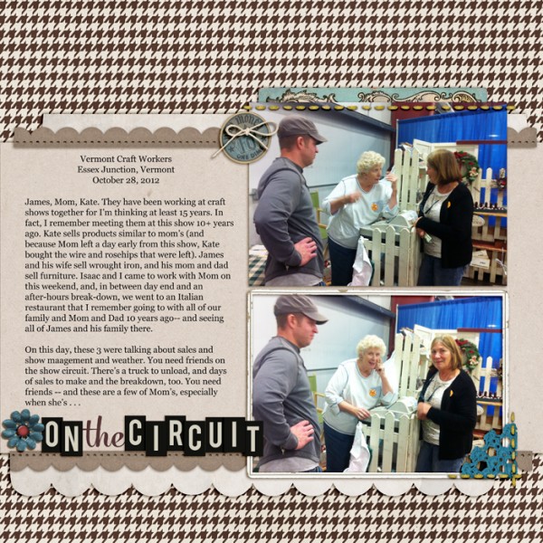
On the Circult by Debbie Hodge | Supplies: You Were Here by Allison Pennington; Autumn Frost, Typeset Alpha by Sahlin Studio; Like A Fox by Robyn Meierotto; Easy Breezy by Crisdam; Is It Friday by Paislee Press; Glitter Thread Stitches by Lynn Grieveon; Artistry del Blanco By Katie Pertiet; Sprinkles 9 by Valerie Wibbens; Georgia, Mercury Script fonts
fussy-cut doilies from patterned paper
Kiki Kougioumtzi says, “For me doilies are connected with past times, with my parents’ and grandmother’s homes.”
“I used doilies here in three ways: 1) on patterned paper, 2) hand-cut from patterned paper to embellish, and 3) to create a mat for my photo. It’s an old photo of my birthday and the doilies add to that ‘past times’ feel. I inked the edges and wrinkled them to emphasize the old-fashioned tone. The doily-patterned paper has a more modern vibe, and I hand cut some of them from that paper and spread them around the page.”
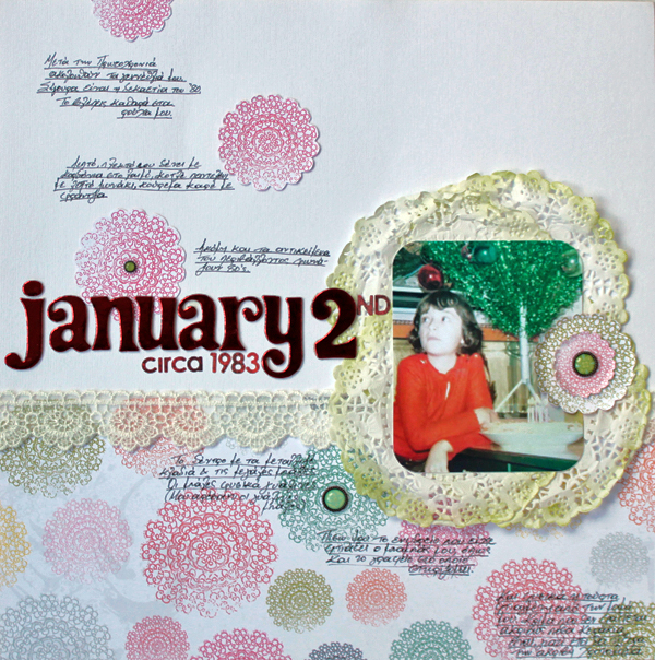
January 2nd by Kiki Kougioumtzi|Supplies:Patterned Paper: Echo Park; Cardstock: Canson; Alpha stickers: American Crafts, Basic Grey; Other: Ribbon lace, doilies; Basic Grey: brads; Ranger: ink.
doily overlays digitally blended
Audrey Tan says, “I used doilies here in two ways. The first is as an embellishment, tucked behind the photo. This is a dimensional doily. Two more ‘flat’ doilies are overlay products blended into the canvas at page top and bottom.”
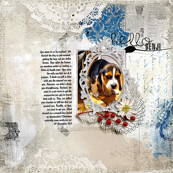
Hello Benji by Audrey Tan | Supplies: Anna Aspnes: Artsy Layered Template No75, ArtPlay Palette Remember, Spiral Skribbles No1, ArtPlay Palette Shabby Christmas, Doily Edge Overlays No1; Julianna Kniepp Designs: Mitten Weather; Mye de Leon: Be Cool Be You; Jennifer Labre: Holly Jolly; Fonts: Brody & The Main Event
crocheted doily as embellishment cluster foundation
Debbie Hodge used one crocheted doily as her embellishment foundation on “Preparations.” She says, “This page records the work my family did to prepare for my Dad’s memorial service and the doily, with its connotations with hospitality, was a good motif for the page. I layered ricrac and a button over it.”
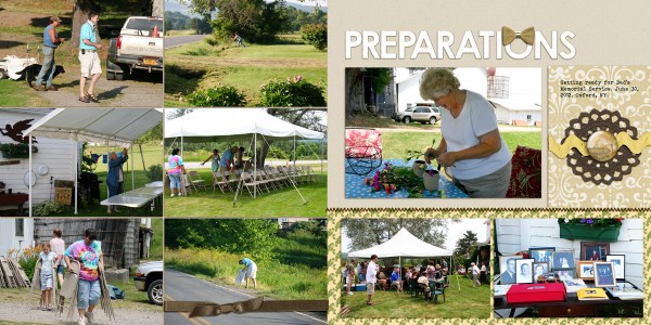
Preparations by Debbie Hodge | Supplies: Shine by Karen Funk; Bare Necessities by Creashens; Iced Cookie Alpha by Valerie Wibbens; Stitched by Anna Brown by Anna Aspnes; Photo Wraps 11, Color Study Flair Brown by Katie Pertiet; Make it Meaningful by Vinnie Pearce; Fall in Love by Robyn Meierotto; Bohemian Typewriter font
add a feminine touch to a sport page with doilies
Adriana Puckett says, “On ‘Bump and Score,’ I used doilies to feminize the very ‘sporty’ feel of the page. I used two sizes of doilies and sprayed them with a mist that coordinates with my color scheme. I found that I really enjoyed using doilies and will integrate them into more layouts in the future. I love how they layer, revealing layers below through the openings and the texture the add to the page.”
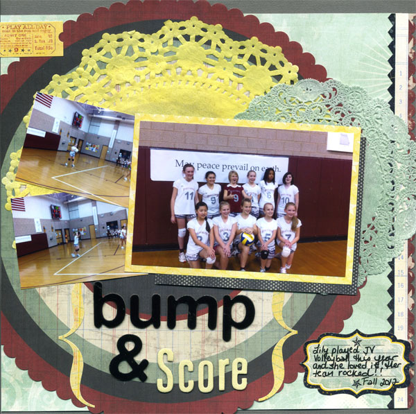
Bump & Score by Adriana Puckett | All Patterned Paper, Die-Cut paper, and embellishments: Pink Paislee Starlight; Doilies: Wilton; Mist: Studio Calico Mr. Huey Lunch Tray (green) and Tattered Angels glimmer mist – marigold; Title: AC Thickers
cut in half and punch out center for cluster frame
Debbie Hodge cut a bright blue doily in half and then punched a circle from the center to make a half-frame for the embellishment cluster on “Game Time.” “The shape of the doily echoed the Settlers of Catan game board to my mind while also supporting the idea of entertaining and getting together with friends and family at holiday time.”
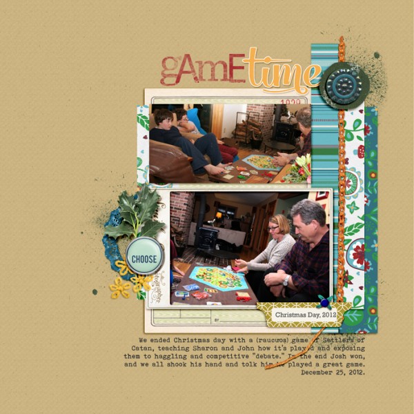
Game Time by Debbie Hodge | Supplies: Woodland Jangle by Katie Pertiet; Bare Necessities by Creashens; Trim the Tree Ephemera by Sahlin Studio; Cut It Out Masks by Robyn Meierotto; Genealogy, Sprinkles 9 by Valerie Wibbons; Embroider Me by Pink Reptile Designs; Teak Papers, Teak Embellishments by Sara Gleason; Winter Frost by Snips and Snails; A Mixed Up Alpha by Lisa Sisneros; Mercury Script font
doilies as foundation and to establish visual triangle
Ashley Horton says, “Doilies remind me of diners and coffee shops, of nostalgic touches like using them beneath a dessert. Thus, doilies were a great accent for a page about my kids’ first visit to a Krispy Kreme doughnut shop.”
“The doilies here are layered beneath other elements, providing bases for: title, a burst embellishment, and my focal point photo. The result is a visual triangle of white doilies guiding the eye around the page.
“If you don’t have store-bought doilies on hand, use your personal die-cut machine or try edger scissors around a coffee filter.”
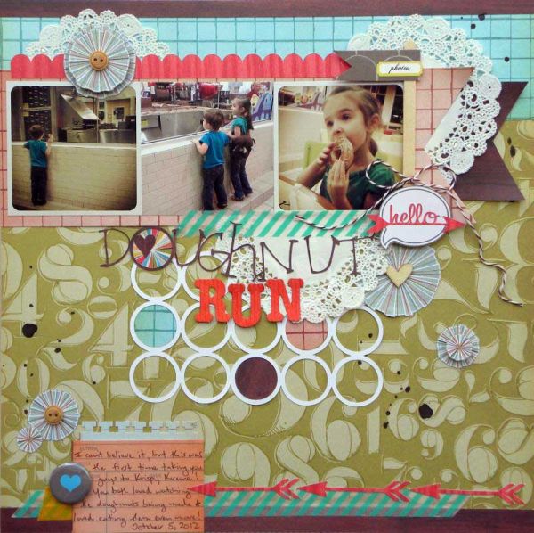
Doughnut Run by Ashley Horton | Supplies: Patterned Paper, Wood Veneers, & Spray Mist: Studio Calico; Thickers: Pebbles; Washi Tape: Love My Tapes; Flair Button: Boscie Joscie; Buttons: Stampin’ Up; Baker’s Twine: The Twinery; Punch: EK Success; Doilies: Hobby Lobby
a border of doilies
Amy Kingsford says, “I love the delicate charm that doilies can bring to a page and I chose them for just that reason on this page with a sweet photo of my youngest son on the swing. I used three doilies to create a border across the page. The middle doily doubles as a cute little frame for my circular photo, and I’ve popped just this doily out with foam squares behind it to create a bit of dimension and to further establish my focal point.”
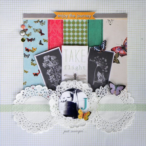
Just Swinging by Amy Kingsford | Supplies: SEI: Field Notes Collection, Washi Tape Green, Blue Raspberry Puff Alpha, Vanilla Sunshine Sundries and Diecuts; Wilton: doilies; Simple Scrapper: Premium Collection Sketch.
doily slices
Debbie Hodge added a doily “slice” to “Cute Craft.” It supports the idea of decorating for the holidays, and the slicing of it goes with the idea of crafting and the cutting up and trimming that goes along with such activity.
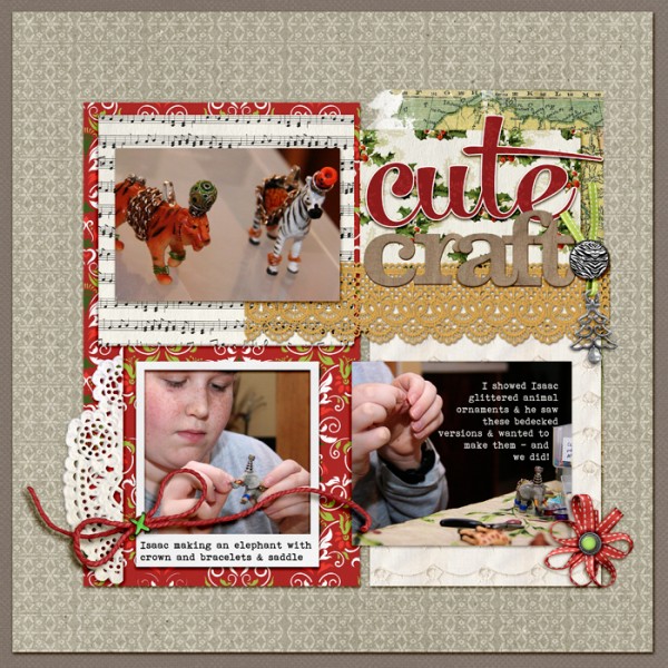
Cute Craft by Debbie Hodge | Supplies: Vintage Christmas, My Peony Classic Cardstock, Animal Park, Woodside Jangle by Katie Pertiet; Night Before Christmas by Anna Aspnes; Brad Bonanza by Pattie Knox; Mercury Script, Bohemian Typewriter fonts.
unexpected color and technique
Amber Ries says, “Doilies are a fabulous accent. I love the texture and depth they can add to a page. I started with a large doily on the far right of my page and built the design around it, tucking my photos in behind it, creating around and behind the doily, building as I went. The tangerine color and texture of doily add so much depth and fun to this happy page, the design just literally fell into place. The second doily is used as a clipping mask for the photo of the cat, adding a fun bit of swirl to the photo and helping it to pop against the collage of other photos, colors and accents.”
“I love to take a current trend item and use it in an unexpected way, such as the doily as a backdrop for stamps (bike) or as the foundation of an element cluster.”
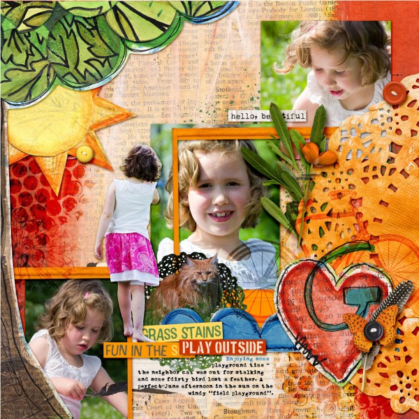
Hello Beautiful by Amber Ries | Supplies: Michelle Godin: Sunshine & Grass stains papers | Sunshine & Grass Stains | Sloppy Stencils 2; Jenn Barrette: Naturally Organic Elements ; Anna Aspnes: Journal Transfers 2
oversized doily mat
Debbie Hodge used an oversized vellum doily as the foundation for her photo on “Happy Campers.” Notice how the circular doily mimics a dinner plate and the rectangular block of white and red patterned paper mimics a napkin at a place setting.
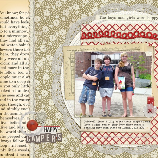
Happy Campers by Debbie Hodge | Supplies: Vellum Ellies, Vellum Doilies by Snips and Snails; Ephemera Stacks, Autumn Moon, Typeset ALpha by Sahlin Studio; Vintage Black and Cream, Mercantile Mix 4 by Jenni Bowlin Studio; Stitched by Anna White, Stitched by Anna Circles by Anna Aspnes; Mad About Paper, Worn Edges 2, Worn Edges 8.5 x 11 by Lynn Grieveson; Oiselet Rouge Elements, Collagables No 1 by Katie Pertiet; Smart Aleck by Heather Roselli; You are Here by Allison Pennington; Folded Ribbon Bits 3 by Pattie Knox; Bebas Neue, Bohemian Typewriter fonts.
doily as title frame
Betsy Sammarco framed her title with a doily digital cut that was a part of the Jennie Bowlin October 2012 kit. She cut the doily with her personal cutter and says, “I thought the detailed round shape added a lot of movement.”
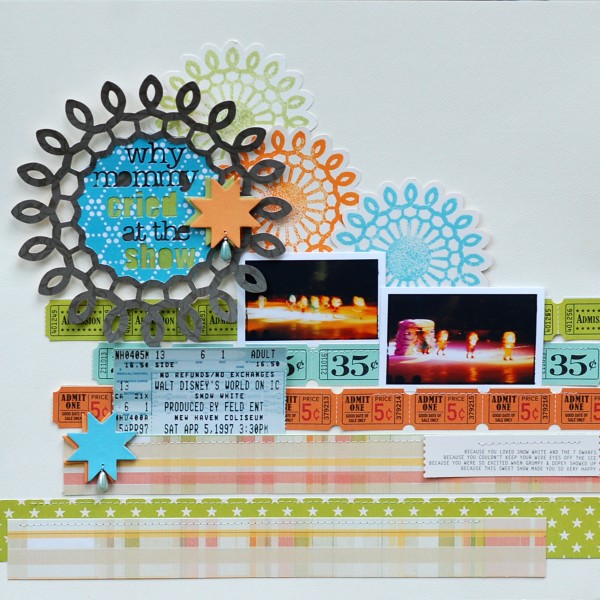
Why Mommy Cried by Betsy Sammarco | Supplies: JBS Mercantile October kit, JBS Quilt Star chipboard, Webster’s Page patterned paper, October Afternoon Midway, Paint: JB for Ranger Stick Candy, Chicken Feed, Speckled Egg, Mercantile Exclusive Stamp and Digital Cut, beads and wire
blocked corner accent
On “Christmas Tree’s” blocked design, Debbie Hodge trimmed two sides off each doily, then fit those trimmed doilies into block corners. Notice that the doily colors are matched to the papers upon which they’re matted — with red in the top left block and gold in the bottom right block. Stitching anchors with doilies on the two trimmed sides. The burst pattern backing up the red doily was trimmed so that the doily sits at burst center.
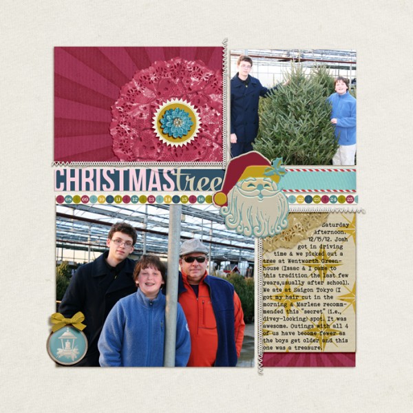
Christmas Tree by Debbie Hodge | Supplies: Wrap Star by Forever Joy and One Little Bird; Stitched by Anna White by Anna Aspnes; Woodside Jangle Elements by Katie Pertiet; Bebas Neue, Mercury Script, Bohemian Typewriter fonts
[ontrend]

