
While all of the photos here are the same size, one stands out because Marie-Pierre has emphasized it with appeal, contrast, and added weight.
A focal point is the center of a design. It is the most important part (or parts) of a piece.
A scrapbook page benefits from having a focal point because without some variation in emphasis among the elements on your page, everything takes on the same level of importance, and the viewer has to find some way into your page on their own.
When you’ve got three photos and want one of them to be the focal point, your first instinct might be to make it larger. You’ve got other options for making a focal point, though, including: 1) appeal, 2) adding weight by coupling with other elements, 3) contrast, and 4) structure.
Our creative team took the challenge to make pages three same-sized photos and to make one of them the focal point of the page.
emphasize with placement and added weight
Sue Althouse says, “The bottom photo on ‘Mt. Pilot’ is the focal point and I’ve drawn attention to it in four ways.”
- I matted the photo and adhered it to the page with raised adhesive (decoration).
- I placed the photo on the vertical patterned paper in a “sweet spot” of intersecting lines (rule of thirds).
- I placed my title on the photo.
- I placed journaling and embellishments around the photo.

Mt. Pilot by Sue Althouse | Supplies: Cardstock: Bazzill, Patterned Paper: American Crafts, Threading Water Border Punch: Fiskars, Alphabet: American Crafts, Brads: misc., Floss: We Are Memory Keepers, Wooden Elements: Studio Calico, Circle Dies: Spellbinders, Circle Cutter: Creative Memories
emphasize with appeal and added weight
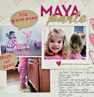
Marie-Pierre Capistran says, “My youngest daughter has had speech delays, and we had to get help, and the situation suddenly became a very big deal. Here, I recorded some of the cute things my daughter is saying as she is starting to talk more and more.”
“I used three photos of her, and the close-up of her face is the focal-point of the page. It’s emphasized by its appeal (her cute face), its framing a polaroid frame, and its placement coupled with the title. I added a small caption “and suddenly, she started to speak right on the frame.”

Maya talks by Marie-Pierre Capistran | Supplies: Cardstock: Bazzill, SU!; Patterned Paper: KI Memories, SU!; Stamps and Ink: SU!; Glitters: Ranger; Polaroid Frame: Recollections; Punch: SU!; Letters: American Crafts; Brad: Basic Grey; Buttons: from my stash; Other: sewing machine, Silhouette.
emphasize with added weight
Amy Kingsford says, “On ‘Our Nature Nerd’ I duplicated a favorite photo of my son three times in a photo strip. The viewer’s focus is drawn to the center photo with because of the framing brackets, and the embellishing cluster next to it.”

Nature Nerd by Amy Kingsford | Supplies : Template from Simple Scrapper’s Premium Collection, Blue Skies Ahead by Jenn Barrette, Love and Grace Alpha by Kate Hadfield, Brackets No. 1,Adventure Art Play Palette, Sun Fun Art Play Palette, Forget Me Not Art Play Palette by Anna Aspnes.
emphasize with contrast and added weight
Katie Scott says “These photos are of the kids playing outside after Thanksgiving. My son created a swing from a rope.”
“I used three photos to show the process of making the rope swing and then using it. I emphasized the photo at far right by:”
- reducing the saturation on the left two photos and increasing the saturation on the focal point photo (and adding a filter from Picasa called focal zoom)
- reversing the photos on the left, so that my son is facing toward the focal point photo
- aligning journaling, title, and embellishing paper strips in above and below the focal photo to create a column with added visual weight

10 by Katie Scott | Supplies: Chipboard Letters from Sassafrass; strip stickers from Studio Calico; Cardstock, sharpie, Picasa for photo editing and printing.
emphasize with contrast
Chris Asbury says, “I set the blending mode of the two outside photos to ‘luminosity blend,’ and the center photo became the focal. I also added a photo glow (in overlay mode) over the focal point photo to enhance the color even further.”

Kaitlyn’s Smile by Chris Asbury | Supplies: Anna Aspnes Designs: ArtPlay Palette Shabby Christmas, ArtPlay Palette Autumn Haze, ArtPlay Palette Sweet Pea, ArtPlay Palette Mint Blizzard, ArtPlay Palette Bask (yellow squiggle), 4X6 ArtsyKardz Shabby Christmas, Artsy Paint No.1, Warping Frames No.2, Cool Glows No.2, Warm Glows No. 5, Textured Overlays No7, ScriptTease Happiness No.1, Scanty Journal Lines No.1, Glitter AlphaNumberSet No.3
emphasize with appeal and added weight
Meghann Andrew says, “On this layout, the middle photo is the focus. The subject is looking into the camera and this photo is double matted with yellow and blue cardstock.”

Baron’s Flyover| by Meghann Andrew| Supplies: Cardstock- Bazzill, patterned paper- Echo Park (multi-colored diamond, blue diamond), Lily Bee (yellow grid); journaling & letter stickers- October Afternoon; cardstock shapes- American Crafts (blue airplane, ‘air mail’ stamp), Studio Calico (‘hello’ balloon); fabric sticker- American Crafts; buttons- Pebbles; wood veneer- Studio Calico; journaling spot- Elle’s Studio
emphasize with appeal, contrast, and added weight
Tara McKernin says, “The center photo on this page is the focal point, made so by its central placement and its appeal–his cute expression over the Christmas wrap he was playing with. I added wordart to the image, highlighted it with the colored versus grey cardstock. The images on each side are of smaller details.”

Magoo’s Joy by Tara McKernin | Supplies: Template from Tiffany Tillman’s Heart of the Holiday’s #06, Karla Dudley Heart of the holidays.
emphasize with appeal and added weight
Doris Sander says, “I easily arranged three photos on the page by using a simple 2×3 grid. The photos take up 3 sections of the grid. While the photos are all the same size and orientation, the top right one is clearly the focal point as the little girl is making direct eye contact with the viewer in that one and the title has been placed directly under it.”

Cool by Doris Sander | Supplies: patterned paper – Basic Grey, Fancy Pants, transparency – Fancy Pants, alphabet – Prima, punch – Martha Stewart, chipboard heart – Jenni Bowlin Studio, diecuts – Fancy Pants, receipt, flower, ticket – vintage, other – rhinestones
emphasize with contrast and added weight
Stefanie Semple says, “The photo on the left side of this two-pager is the focal point. I made it the focal point in several ways:”
- it’s on its own page,
- it’s embellised with a big colorful flower to draw the eye
- the title overlaps it
- it has a mat of a thin white border which makes it pop

Pounce by Stefanie Semple | Supplies: Ramona: Memory Clips Double Pager Vol. 2; Cluster Queen Creations: Splash Time.
[current]
