 by Debbie Hodge
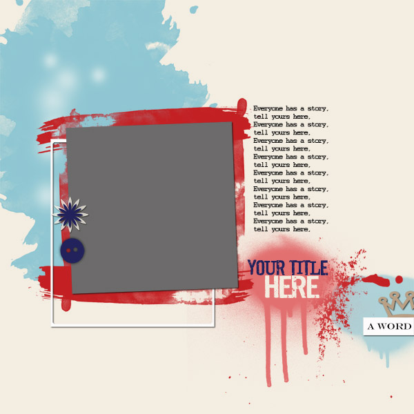
Each issue of Masterful Scrapbook Design now includes “style lifting” guides. These guides include sketches, templates, and analysis that make it possible for you to get the look of each of our teachers on your own pages. Copying successful designs is a great way to grow and develop your own style. Check out the style guide for Anna Aspnes from our current “Top 10” issue.
Anna Aspnes is a digital scrapbooker and digital scrapbook product designer with a distinctive style that incorporates lots of “blending” and artsy looks that you can get using her products like FotoMasks, ArtsyKardz, FotoGlows and more.
See Anna’s blog | See Anna’s digital store
Anna says, “Blending has always been and continues to be my top technique. I never seem to tire of the different ways you can incorporate blending into pages.”
“I’m drawn by the artsy look and feel the technique lends to my pages. It’s the very reason I switched from paper to digital scrapbooking 10 years ago. Blending allows me to quickly create pages and what I refer to as *happy accidents* that make me look more creative than I think I am.”
1. Scrapbook yourself and your world.
Of “Altered Landscapes,” Anna says, “Several times a year I take this same photo, documenting the seasons. This photo celebrates our first snow of winter 2012 and was a great opportunity to try out the panorama feature on my new iPhone. I wanted to do more with the photo than slap it on a page and call it good. There is a story connected to this photo which is so much more than just the start of a new season.”
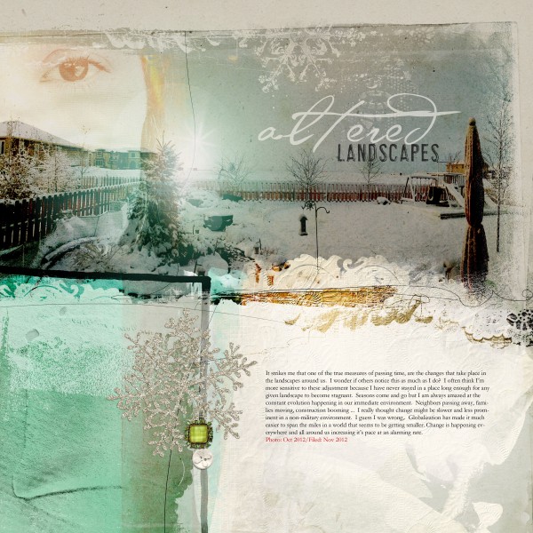
Altered Landscapes by Anna Aspnes | Supplies: ArtPlay Palette Mint Blizzard, CoolGlows No. 1. Fonts: AL Verdigris, AL Highlight, Garamond
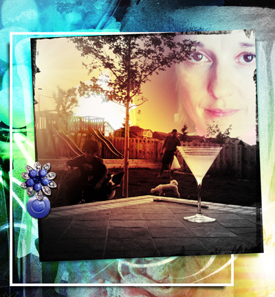
2. Take and use photos of yourself.
Anna says, “2012 was finally the year I got comfortable with me and began taking photos of myself. When you have photos of yourself you scrapbook more about yourself and more of those personal stories get told. If you don’t tell them, then who will?”
3. Journal as if telling a story to a friend.
When you journal, try not to think too hard about what you’re going to write, and type the journaling as if you were telling the story to a friend.
Anna says, “I like to give myself 15-20 minutes with a cup of tea to gather my thoughts and to arrange them in some semblance of order before I sit down and type, but it may always be helpful to jot down a few key points to guide you. A good rule of thumb is to think about what you want to say and then say it without making it harder than it needs to be.”
4. Use your phone for taking and editing photos.
Take photos with your camera and use apps that make it quick to do edits and get cool effects. Try out the panorama option on your phone. Apps Anna likes include:
- Afterglow
- Scratchcam
- Lens Flare
Anna says, “Since upgrading to the iPhone 5 I have been taking advantage of the high resolution image capture and increasing number of photo-editing apps to process my photos even before I import them into Photoshop. This has reignited my interest in photo-editing again.”
“I take the photos using my iPhone and edit them using one of the iPhone apps. Afterglow is my current favorite in which I can quickly and effectively brighten and increase the contrast of my image. I can also apply preset filters, glows and interesting frames before saving the edited results to my camera roll.”
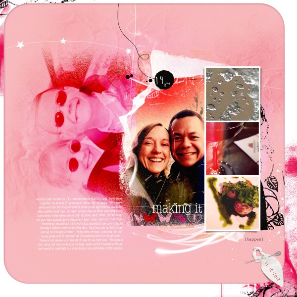
Making It by Anna Aspnes | Supplies: ArtsyKardz Socialize, ArtPlay Palette Socialize, FotoWallets No. 3. Fonts: Courier New, SlabserifXhigh, Butterflies, Arial Narrow
5. Use script, handwritten and distressed fonts. Combine fonts to create “wordart”–even within a word.
These are some of Anna’s favorite fonts:
- Pea Kadee
- SlabserifXHigh
- Youngsook BTN
- Jamaistevie
- el&font gothic!
- Sexton Sans
- AL Verdigris
- AL Highlight
Anna says, “I like the look of the currently trendy, messy, handwritten style fonts. They work well with my style and designs. I am also always looking to create artsy pages quickly. These types of fonts enable me to achieve that look simply by typing a line of text as opposed to investing the time in finding a combination of fonts that work together in terms of style, color and size.”
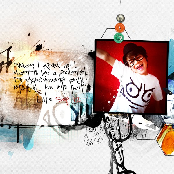
Scientist by Anna Aspnes | Supplies: ArtPlay Palette Scientist. Fonts: Pea Kadee
6. Take one bold color from your photos. Work with it and shades of it and neutrals.
Anna says, “I like to pull the prominent colors from a photo such as a bright bold color and then balance it with a lighter shade of the same color working in a neutral as desired.”
7. Use only a bit of dimension.
Blend photos and elements using blending styles and masks. Use already blended papers and elements – like Anna’s “artsy” cards and papers. Embellish with strokes and hand-drawn lines. Use digital frames and one or two brads for touches of dimension.
8. Add light.
Use digital “glows” to add light to your designs.
Anna says, “A current passion I have is introducing magic into my pages through glow-style elements. This technique is certainly not new but it doesn’t seem to be waning either. It began with my MagicSparkles product, expanded to Flares and FotoGlows and now includes a full array of colorful light-enhancing elements which really breathe a sense of life into my pages.”
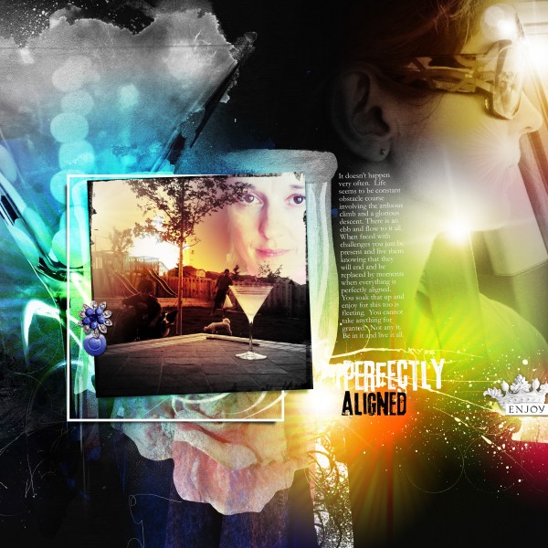
Perfectly Aligned by Anna Aspnes | Supplies: ArtPlay Palette Socialize, WarmGlows No. 1; Fonts: 3rd Man, Garamond
9. Combine one blended photo with a few framed photos.
Start with an “artsy” paper as your layout foundation. Look for a solid area on the paper and blend a photo. Add 3 frames with photos and embellish lightly with non-dimensional elements, then add a simple button or brad with title and jouranling in handwritten fonts.
Anna says, “Frames allow me to quickly and easily incorporate several more photos into my typical blended photo background designs thus turning a 1-3 photo layout into one of 4 or more. I’ve definitely made a switch to a *less is more* approach to my scrapbooking over recent years resulting in fewer but more meaningful pages. Frames have certainly facilitated this approach.”
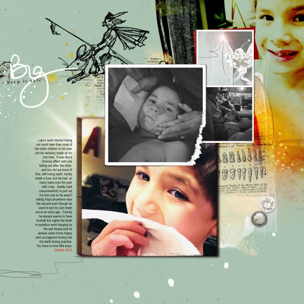
Big by Anna Aspnes | Supplies: Artsy Layered Template No. 74, ArtPlay Palette Fairy, Fairies, Imps and Elves No. 1. Fonts: Arial Narrow
10. Lift Anna with this sketch/template by Amy Kingsford.
Amy lifted Anna’s “Perfectly Aligned” to make a sketch and layered template. Use it to get a feel for Anna’s style.
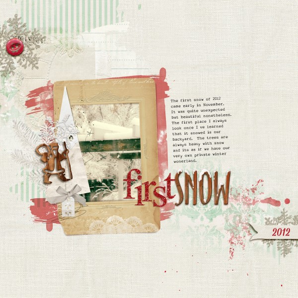
First Snow by Amy Kingsford | Supplies: Anna Aspnes: Art Play Palette Shabby Christmas, Art Play Palette Retro Holiday, Art Play Palette Mint Blizzard, Glitter Alpha Red, Christmas Woodshop No. 1, Multi-Media Trees No. 2; Katie Pertiet: Wooden Alpha No. 6; MSD: Top Ten Template Inspired by Anna Aspnes.
We’ve got 2 live webinars with Anna scheduled this month and recordings available after the fact. Join today.
[lovesketches]

