Audrey Tan says, “I saw these Christmas tags in my stash and used them to make a countdown to Christmas record starting from when my boys got out of school for break. Each of the tags represents a date, and on each tag, I mounted a photo of what we did that day.”
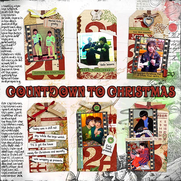
Countdown To Christmas by Audrey Tan | Supplies: Anna Aspnes: ArtPlay Palette Christmas No1, ArtPlay Palette Red White Blue, ArtPlay Palette Authentic, ArtPlay Palette Retro Holiday, Christmas Word Transfers No1, Script Tease Winter No1; Anna Aspnes & Vinnie Pearce: ArtPlay Palette Love Life; Maya de Groot: Fond Of Fastener; Viva Artistry: Signs Of Times Pisces; Katie Pertiet: Counting Christmas Tags No2, Paper Strips Words Christmas
Pink Reptile Designs: Noted; Val C. Designs: Happiness, Never Forget; Karen Funk: Paisley Pop; Oscraps Collaboration: Journey; Crystal Wilkinson: The Room Collection; Julianna Kniepp Designs: A Little Bird Told Me, Project365 2012; Tumble Fish Studio: Journaling Freebie; Fonts: Pea Beth, Pea Bev & Oliver
Kelly Purkey says, “I use a lot of color on my layouts and never miss an opportunity to layer colors together. For this page, I created a rainbow of tags which became the focus point for the layout. Arranging the tags in rainbow color helps draw the eye across the page, and it’s a bright and happy focus point.”
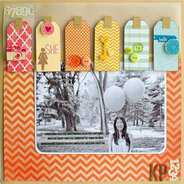
She by Kelly Purkey | Supplies: Cardstock – American Crafts; Patterned Paper – American Crafts, Bo Bunny, Studio Calico; Stickers – Studio Calico, American Crafts; Buttons – Basic Grey; Tag – Amy Tangerine; Mist – Studio Calico; Stapler – Ranger
Deborah Wagner took a photo of her niece and nephews relaxing on the grass in her backyard. To make a clean, symmetrical design, on this page, she used 4 tags of the same shape and size, clipping different black-and-white patterned papers to each tag.”
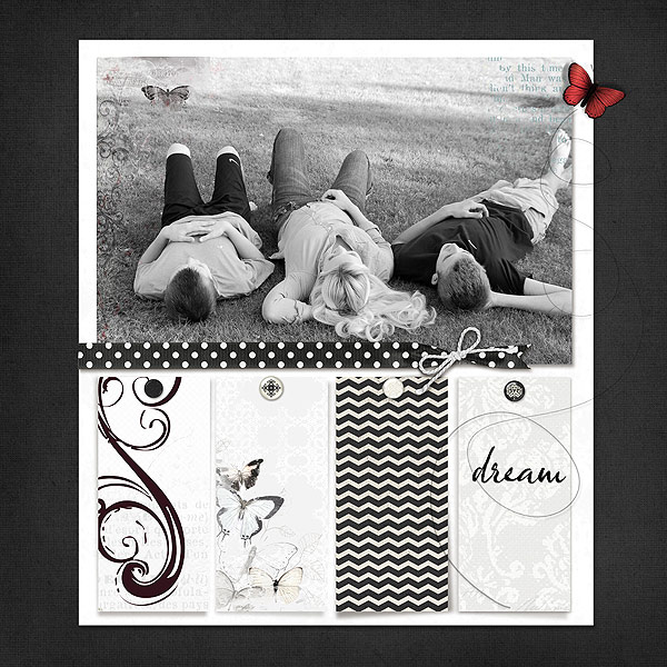
Dream by Deborah Wagner. Supplies: Katie Pertiet – Lifted Wings No. 3, Artistry Azul, Artistry deBlanco, Artistry Amour, Winter Artistry, Defining Words Brushes & Stamps, iTunes Chat Freebie; Lynn Grieveson – All White Now Paperpack, Blackett Hall Paperpack; Pattie Knox – Scrap2gether Freebie 9-1-11; Jesse Edwards – Fabric Buttons No.2,
Jennifer Matott wanted the focus of this page to be her photo and to incorporate soft beach colors and textures. She says, “Tags are used on collection bottles to label, and I thought they worked well of this subject.”
She says, “I used a craft mat to create washes of color using Faber-Castell Gelatos and water. I placed the tags face down in the puddles of color and allowed them to dry. I also stamped on them with a text stamp. I wanted these to function as my patterned paper as I didn’t use any pre-printed papers.”

Seek by Jennifer Matott | Supplies: Cardstock: Bazzill Kraft; Tags: Staples; Stamp: Prima; Letters: Prima; Word stickers: Ideology Tim Holtz; Bling: Prima
Faber-Castell Design Memory Craft Gelatos in Metallic Grape, Metallic Blueberry, and Bosenberry; Faber-Castell Design Memory Craft Stamper’s Big Brush Pens in Black; Ink: Dr. PH Martin; Adhesive: Helmar 450 Quick Dry Glue
Dina Wakley says, “I love to create a ‘collage’ foundation. I use bits of patterned paper, cardstock, and inked tags to create a collage right onto a cardstock base. The collage doesn’t have much rhyme or reason, but it does have a variety of shapes (circle, rectangles) and papers (patterned paper, cardstock, tags). I put the collage on the right side to get that asymmetrical composition that I love. I added a photograph and my title right on top of the collage. The inked stars on the tags were the perfect place to write my journaling. The result is an eclectic layout with lots of visual punch.”
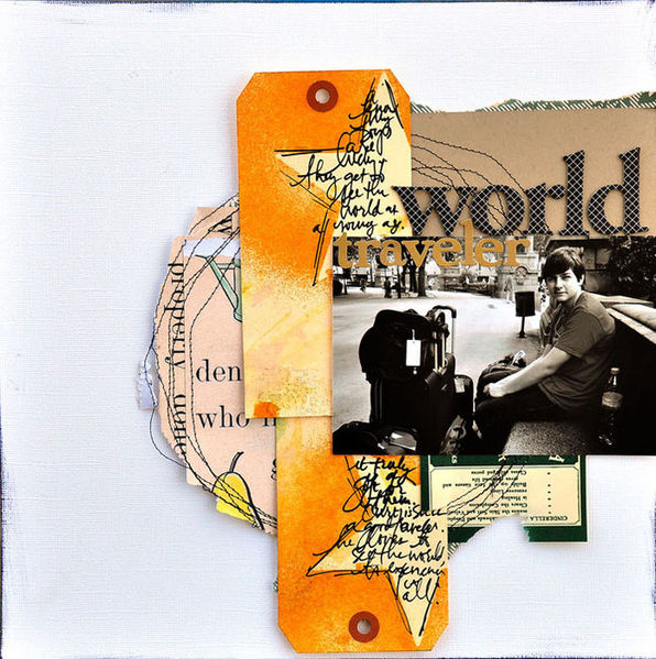
World Traveler by Dina Wakley | Supplies: Patterned Paper: Jenni Bowlin, vintage; Cardstock: Basic Grey, American Crafts; Alphabet: Jenni Bowlin; Tags: Xpress Tag; Ink: Tim Holtz Adirondack Color Wash; Star chipboard: Jenni Bowlin
Barb Brookbank says, “This layout documents that one of my grandsons comforts himself with his thumb and the other prefers his soother.”
“I found this great ampersand tag and knew that if I made it very large on the page, I could use it both to hold journaling and anchor the photo to the canvas. I added a grey tag in the upper right to add interest and to bring attention to the word art.”
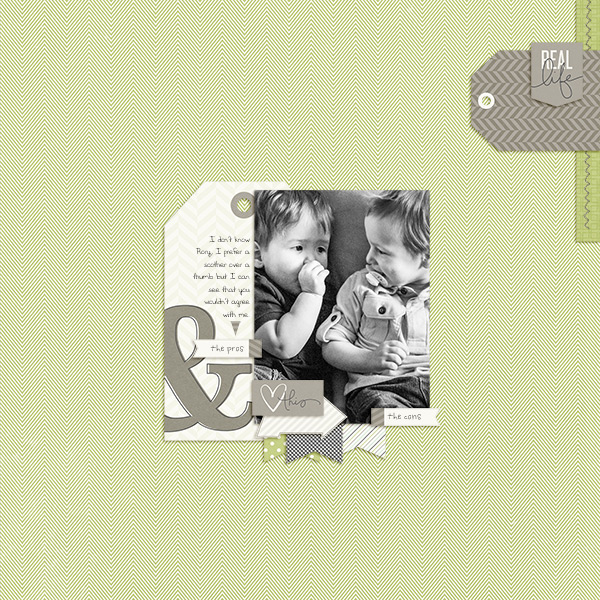
The Pros & Cons by Barb Brookbank | Supplies: Kit: Scenes From Real Life by One Little Bird; Font: CK Jot
Leah Farquharson says, “Gotta love the obligatory Christmas card photo every year! This one wasn’t stellar, but it’s got a lot of memories attached to it, so I don’t mind. Here I used three patterned tags positioned horizontally along the edge of the page to create a visual triangle.”
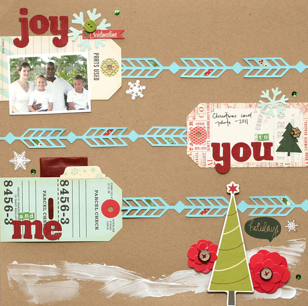
Joy to You & Me by Leah Farquharson | Supplies: cardstock, vinyl snowflakes, vellum envelope, 3D poinsettia stickers, corrugated letters, ink: American Crafts. Patterned paper, tab, diecuts snowflakes, chipboard tree, button: October Afternoon. Tags: Pink Paislee. burlap buttons: Nikki Sivils. Stamps, wooden snowflakes, “arrow” silhouette file: Studio Calico, tiny letters: Basic Grey. Modeling paste, sequins: Craft supply shop.
Paula Gilarde backed up her photo with tags that have been stamped and stenciled. They’re lined up with abutting edges making a great foundation piece for the page.

